Lambe-Lambe Brasileiro
Brazilian lambe-lambe street poster style landing page. Ideal for landing pages, saas. AI-ready template.
Use case: Landing pages, SaaS
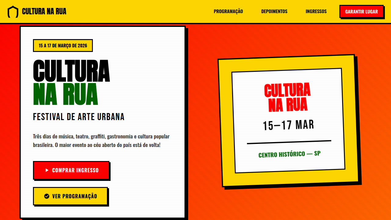
Historical Context
Lambe-lambe is glue and urgency. Before social media, before screens, Brazilian streets spoke through wheat-paste posters — hand-lettered, woodcut-printed, screen-printed overnight and slapped onto concrete by morning. The tradition pulls from cordel literature of the Northeast, from carnival typography, from political resistance during the dictatorship. It was never precious. It was fast, loud, disposable by design but permanent in memory. What makes lambe-lambe singular is the collision: folk craft meets punk ethos. Xilogravura woodcut aesthetics next to spray-painted stencil type. São Paulo's Beco do Batman, Rio's Santa Teresa — these walls became galleries without permission slips. The roughness was the point. Ink bleeding into wet paper, registration slightly off, colors oversaturated because subtlety doesn't survive rain. Now that visual language lives in brand systems, album covers, festival identities. The analog imperfection became a digital design vocabulary — distressed textures, hand-drawn lettering, high-contrast palettes that refuse to whisper. It's Brazilian popular culture refusing to be polished into silence.
When to Use
When the brief demands raw energy over refinement. Brazilian brands rooted in street culture, music festivals that need to feel underground even at scale, urban art projects, cultural institutions celebrating popular expression. Works beautifully for anything that should feel printed-last-night — event posters, limited drops, community campaigns. Avoid if the context demands corporate restraint. This language is inherently loud, democratic, and unapologetic.
Design Principles
- Embrace imperfection as authenticity — misregistration, ink bleed, and paper texture are features, not flaws
- High-contrast palettes only — lambe-lambe dies in pastels; use saturated color that fights for attention against concrete
- Typography as illustration — letters should have weight, personality, and the hand of their maker visible in every stroke
- Layer like a wall layers — overlap, tear, accumulate; compositions should feel built over time, not designed in one pass
- Respect the democratic origin — this aesthetic belongs to the street, keep it accessible, keep it urgent, never make it precious
DESIGN.md
---
version: "alpha"
name: "Lambe-Lambe Brasileiro"
description: "Brazilian lambe-lambe street poster style landing page. Ideal for landing pages, saas. AI-ready template."
colors:
  primary: "#FF0000"
  secondary: "#FFD700"
  tertiary: "#006400"
  neutral: "#000000"
  surface: "#FF6600"
  accent: "#0066CC"
typography:
  h1:
    fontFamily: Oswald
    fontSize: 2.5rem
    fontWeight: 700
  body-md:
    fontFamily: Oswald
    fontSize: 1rem
    fontWeight: 400
components:
  button-primary:
    backgroundColor: "{colors.primary}"
    textColor: "{colors.neutral}"
    padding: 12px
---

## Overview

Brazilian lambe-lambe street poster style landing page. Ideal for landing pages, saas. AI-ready template. Lambe-lambe is glue and urgency. Before social media, before screens, Brazilian streets spoke through wheat-paste posters — hand-lettered, woodcut-printed, screen-printed overnight and slapped onto concrete by morning. The tradition pulls from cordel literature of the Northeast, from carnival typography, from political resistance during the dictatorship. It was never precious. It was fast, loud, disposable by design but permanent in memory.

What makes lambe-lambe singular is the collision: folk craft meets punk ethos. Xilogravura woodcut aesthetics next to spray-painted stencil type. São Paulo's Beco do Batman, Rio's Santa Teresa — these walls became galleries without permission slips. The roughness was the point. Ink bleeding into wet paper, registration slightly off, colors oversaturated because subtlety doesn't survive rain.

Now that visual language lives in brand systems, album covers, festival identities. The analog imperfection became a digital design vocabulary — distressed textures, hand-drawn lettering, high-contrast palettes that refuse to whisper. It's Brazilian popular culture refusing to be polished into silence.

- Density: 5/10 — Balanced
- Variance: 4/10 — Moderate
- Motion: 4/10 — Subtle

- **Style:** Tropical, Vibrante, Cultural, Brasileiro
- **Keywords:** Street art, Brazilian folk, vibrant, high contrast, handcrafted, typography-driven, woodcut, xylography, urban, tropical, activist, cultural
- **Era:** Folk Urbano Brasileiro
- **Light/Dark:** ✓ Full / ✗ No

## Colors

- **Vermelho** (#FF0000) — Error states, destructive actions
- **Amarelo** (#FFD700) — Warning states, attention indicators
- **Verde** (#006400) — Supporting palette color
- **Preto** (#000000) — Dark surface, primary background
- **Laranja** (#FF6600) — Warm accent, call-to-action secondary
- **Azul Royal** (#0066CC) — Secondary accent
- **Rosa Choque** (#FF1493) — Decorative accent, highlight elements
- **Branco** (#FFFFFF) — Secondary surface


## Typography

- **Display / Hero:** Oswald — Weight 700, tight tracking, used for headline impact
- **Accent:** Anton — Used for decorative or emphasis text
- **Body:** Oswald — Weight 400, 16px/1.6 line-height, max 72ch per line
- **UI Labels / Captions:** Oswald — 0.875rem, weight 500, slight letter-spacing
- **Monospace:** JetBrains Mono — Used for code, metadata, and technical values

Scale:
- Hero: clamp(2.5rem, 5vw, 4rem)
- H1: 2.25rem
- H2: 1.5rem
- Body: 1rem / 1.6
- Small: 0.875rem


## Layout

- **Grid:** CSS Grid primary. Max-width containment: 1280px centered with 1.5rem side padding.
- **Spacing rhythm:** Balanced. Base unit: 0.5rem (8px).
- **Section vertical gaps:** clamp(4rem, 8vw, 8rem).
- **Hero layout:** Split-screen (text left, visual right).
- **Feature sections:** Zig-zag alternating text+image rows. No 3-equal-columns.
- **Mobile collapse:** All multi-column layouts collapse below 768px. No horizontal overflow.
- **z-index contract:** base (0) / sticky-nav (100) / overlay (200) / modal (300) / toast (500).


## Elevation & Depth

Tipografia ousada e bold como elemento visual principal, ilustrações xilográficas/linocut, bordas visíveis e marcadas, layouts densos e informacionais, texturas de colagem rasgada, sombras duras e sem blur, cores vibrantes de alto contraste para destaque urbano, sobreposições gráficas intencionais

- **Physics:** Ease-out curves, 200-300ms duration. Smooth and predictable.
- **Entry animations:** Fade + translate-Y (16px → 0) over 420ms ease-out. Staggered cascades for lists: 80ms between items.
- **Hover states:** Subtle color shift + shadow adjustment over 200ms.
- **Page transitions:** Fade only (200ms).
- **Performance:** Only transform and opacity animated. No layout-triggering properties.


## Shapes

Base corner radius: 8px. See rounded tokens in front matter for the full scale.


## Components

- **Primary Button:** Subtly rounded (0.5rem) shape. Accent color fill. Hover: 8% darken + subtle lift shadow. Active: -1px translate tactile press. Font weight 600. No outer glows.
- **Secondary / Ghost Button:** Outline variant. 1.5px border in muted color. Text in primary color. Hover: subtle background fill.
- **Cards:** Subtly rounded (0.5rem) corners. Surface background. Subtle shadow (0 2px 12px rgba(0,0,0,0.06)). 1px border stroke.
- **Inputs:** Label above input. 1px border stroke. Focus ring: 2px accent color offset 2px. Error text below in semantic red. No floating labels.
- **Navigation:** Primary surface background. Active item: accent color indicator. Font weight 500 when active.
- **Skeletons:** Shimmer animation matching component dimensions. No circular spinners.
- **Empty States:** Icon-based composition with descriptive text and action button.


## Do's and Don'ts

- No emojis in UI — use icon system only (Lucide, Heroicons)
- No pure black (#000000) — use off-black or charcoal variants
- No oversaturated accent colors (saturation cap: 80%)
- No 3-column equal-width feature layouts — use zig-zag or asymmetric grid
- No `h-screen` — use `min-h-[100dvh]`
- No AI copywriting clichés: "Elevate", "Seamless", "Unleash", "Next-Gen"
- No broken external image links — use picsum.photos or inline SVG
- No generic lorem ipsum in demos

- Do Tipografia bold/uppercase em headlines
- Do Cores vibrantes tropicais (vermelho
- Do amarelo
- Do verde)
- Do Sombras duras sem blur
- Do Bordas visíveis 3-4px
- Do Layout denso e informativo
- Do Alto contraste urbano
- Do Texturas de colagem/woodcut


## Use Case

Landing pages, SaaS
Technical Specs
CSS
font-family: 'Oswald', 'Anton', or bold display fonts, font-weight: 700-900, text-transform: uppercase for headlines, color: vibrant red #FF0000, yellow #FFD700, green #006400, border: 3-4px solid black, box-shadow: 4px 4px 0px #000 (hard shadow, no blur), background: warm paper tones or textured overlays, text-shadow: 2px 2px 0px rgba(0,0,0,0.3)
Variables
--color-red: #FF0000, --color-yellow: #FFD700, --color-green: #006400, --color-black: #000000, --color-orange: #FF6600, --font-display: 'Oswald', sans-serif, --font-weight-bold: 900, --border-thick: 4px solid #000, --shadow-hard: 4px 4px 0px #000, --text-shadow: 2px 2px 0px rgba(0,0,0,0.3)
Checklist
☐ Tipografia bold/uppercase em headlines, ☐ Cores vibrantes tropicais (vermelho, amarelo, verde), ☐ Sombras duras sem blur, ☐ Bordas visíveis 3-4px, ☐ Layout denso e informativo, ☐ Alto contraste urbano, ☐ Texturas de colagem/woodcut
Colors
Primary
Secondary
Effects
Tipografia ousada e bold como elemento visual principal, ilustrações xilográficas/linocut, bordas visíveis e marcadas, layouts densos e informacionais, texturas de colagem rasgada, sombras duras e sem blur, cores vibrantes de alto contraste para destaque urbano, sobreposições gráficas intencionais
Light/Dark
✓ Full / ✗ No
AI Prompt
Act as a Senior Frontend Engineer and Expert UI Designer.
Your task is to code a complete Landing Page on the first attempt.
- Landing Page Theme: <INSERT THEME>
- Sections to add: <INSERT SECTIONS>

Generate the final code immediately following these definitions:

## Style

- **Name:** Lambe-Lambe Brasileiro
- **Type:** Tropical, Vibrante, Cultural, Brasileiro
- **Keywords:** Street art, Brazilian folk, vibrant, high contrast, handcrafted, typography-driven, woodcut, xylography, urban, tropical, activist, cultural
- **Era:** Folk Urbano Brasileiro
- **Light/Dark:** ✓ Full / ✗ No

## Color Palette

- **Primary:** Vermelho #FF0000, Amarelo #FFD700, Verde #006400, Preto #000000
- **Secondary:** Laranja #FF6600, Azul Royal #0066CC, Rosa Choque #FF1493, Branco #FFFFFF

## Visual Effects

Tipografia ousada e bold como elemento visual principal, ilustrações xilográficas/linocut, bordas visíveis e marcadas, layouts densos e informacionais, texturas de colagem rasgada, sombras duras e sem blur, cores vibrantes de alto contraste para destaque urbano, sobreposições gráficas intencionais

## AI Visual Direction

Design a Brazilian lambe-lambe street poster style landing page. Use: bold typography as primary visual element, vibrant tropical colors (red, yellow, green, orange), woodcut/linocut style illustrations, visible borders, dense information layouts, high contrast for urban visibility, handcrafted folk aesthetic, graphic overlaps, textured backgrounds, activist-inspired messaging.

## CSS Technical

```css
font-family: 'Oswald', 'Anton', or bold display fonts, font-weight: 700-900, text-transform: uppercase for headlines, color: vibrant red #FF0000, yellow #FFD700, green #006400, border: 3-4px solid black, box-shadow: 4px 4px 0px #000 (hard shadow, no blur), background: warm paper tones or textured overlays, text-shadow: 2px 2px 0px rgba(0,0,0,0.3)
```

## Design System Variables

```css
--color-red: #FF0000, --color-yellow: #FFD700, --color-green: #006400, --color-black: #000000, --color-orange: #FF6600, --font-display: 'Oswald', sans-serif, --font-weight-bold: 900, --border-thick: 4px solid #000, --shadow-hard: 4px 4px 0px #000, --text-shadow: 2px 2px 0px rgba(0,0,0,0.3)
```

## Implementation Checklist

- ☐ Tipografia bold/uppercase em headlines
- ☐ Cores vibrantes tropicais (vermelho
- amarelo
- verde)
- ☐ Sombras duras sem blur
- ☐ Bordas visíveis 3-4px
- ☐ Layout denso e informativo
- ☐ Alto contraste urbano
- ☐ Texturas de colagem/woodcut

## Execution Rules

1. Strictly follow the defined visual style.
2. Use high-quality inline SVG icons (Heroicons or Lucide style) — NEVER use emojis as icons.
3. Add `cursor-pointer` and smooth `hover` states (transition-all) on all interactive elements.
4. Required Page Structure:
   - Navbar (Logo + Links + CTA)
   - Hero Section (Impactful Headline + Subtitle + 2 buttons + 3D/Abstract visual element via CSS)
   - Features (3 cards with icons)
   - Testimonials (3 cards)
   - Pricing (3 tiers, highlight the middle one)
   - Final CTA
   - Full Footer with social links, privacy policy, terms of use, contact and SEO links.
5. All text content must be in English.
6. The visual must be CLEARLY distinct — do not create a "default Bootstrap" design. Force the use of the provided design system variables.
7. Use `<style>` tags in the head for custom classes (especially for complex backdrop-filter effects and animations) that Tailwind CDN doesn't cover.
8. Full Responsiveness: Layout must adapt perfectly to Mobile, Tablet and Desktop (vertical stack on mobile).
9. Include basic SEO, Viewport and Open Graph meta tags in `<head>`.
10. Footer must contain: Copyright 2026, Secondary navigation links and Social media icons.
11. Make the creative decisions needed to deliver the complete, functional result now.
Related
Last synced: 4/1/2026