Kawaii Doodle Art
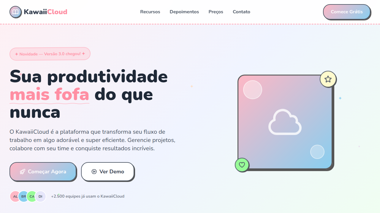
Kawaii doodle art style landing page. Ideal for projetos infantis, lojas de presentes, apps de bem-estar, fan sites, blogs criativos. AI-ready template.
Use case: Kids projects, Gift shops, Wellness apps, Fan sites, Creative blogs
Historical Context
Kawaii doodle art traces back to 1970s Japan, where the kawaii aesthetic emerged as a cultural rebellion — young women rejecting rigid formality by adopting rounded, childlike handwriting and illustration. This wasn't decoration; it was defiance dressed in soft lines. The style crystallized through Sanrio's early character work and exploded globally via sticker culture, purikura booths, and eventually LINE and emoji ecosystems. What makes kawaii doodle distinct from generic cute illustration is the deliberate imperfection — wobbly outlines, slightly off-center eyes, proportions that feel sketched on a napkin rather than constructed in software. It's warmth through roughness. Today the style lives at the intersection of indie illustration and product design. Designers like Gudetama's creator Amy understood that kawaii works precisely because it refuses polish. The hand-drawn quality signals approachability in a way that vector-perfect illustration never can. When everything on screen feels manufactured, a wobbly doodle face becomes the most honest element in the interface.
When to Use
Deploy kawaii doodle art when your product needs to feel approachable without being patronizing. It works brilliantly for children's apps where delight matters more than sophistication, sticker packs that need personality in 64px, and lifestyle brands targeting audiences who grew up on Tumblr aesthetics. Use it for empty states, onboarding flows, and error screens — anywhere tension needs dissolving. Avoid it in contexts demanding authority or precision. A banking app with doodle characters isn't charming, it's alarming.
Design Principles
- Embrace wobbly lines — uniform stroke width kills the hand-drawn illusion. Vary pressure, let corners overshoot, leave gaps where ink would skip on paper.
- Keep proportions absurd. Heads at 60-70% of total body mass, limbs as afterthoughts. The more structurally impossible the character, the more emotionally accessible it becomes.
- Limit your palette to 3-4 colors maximum per character. Kawaii doodle gains power from constraint — pastel foundations with one unexpected saturated accent creates hierarchy without complexity.
- Expressions live in the eyes alone. Mouths are optional, noses are banned. Two dots and a curve communicate more emotion than anatomically correct features ever could.
- Maintain consistent imperfection. If one character has rough edges, every element in the system needs that same energy — icons, dividers, backgrounds. Mixing doodle art with crisp geometric UI creates visual schizophrenia.
DESIGN.md
---
version: "alpha"
name: "Kawaii Doodle Art"
description: "Kawaii doodle art style landing page. Ideal for projetos infantis, lojas de presentes, apps de bem-estar, fan sites, blogs criativos. AI-ready template."
colors:
  primary: "#FFB7C5"
  secondary: "#89CFF0"
  tertiary: "#98FB98"
  neutral: "#E6E6FA"
  surface: "#FFDAB9"
  accent: "#FFFACD"
typography:
  h1:
    fontFamily: Nunito
    fontSize: 2.5rem
    fontWeight: 700
  body-md:
    fontFamily: Nunito
    fontSize: 1rem
    fontWeight: 400
rounded:
  sm: 24px
  md: 48px
  lg: 72px
components:
  button-primary:
    backgroundColor: "{colors.primary}"
    textColor: "{colors.neutral}"
    rounded: "{rounded.sm}"
    padding: 12px
---

## Overview

Kawaii doodle art style landing page. Ideal for projetos infantis, lojas de presentes, apps de bem-estar, fan sites, blogs criativos. AI-ready template. Kawaii doodle art traces back to 1970s Japan, where the kawaii aesthetic emerged as a cultural rebellion — young women rejecting rigid formality by adopting rounded, childlike handwriting and illustration. This wasn't decoration; it was defiance dressed in soft lines.

The style crystallized through Sanrio's early character work and exploded globally via sticker culture, purikura booths, and eventually LINE and emoji ecosystems. What makes kawaii doodle distinct from generic cute illustration is the deliberate imperfection — wobbly outlines, slightly off-center eyes, proportions that feel sketched on a napkin rather than constructed in software. It's warmth through roughness.

Today the style lives at the intersection of indie illustration and product design. Designers like Gudetama's creator Amy understood that kawaii works precisely because it refuses polish. The hand-drawn quality signals approachability in a way that vector-perfect illustration never can. When everything on screen feels manufactured, a wobbly doodle face becomes the most honest element in the interface.

- Density: 5/10 — Balanced
- Variance: 8/10 — Expressive
- Motion: 6/10 — Expressive

- **Style:** Cute, Playful, Hand-drawn, Japanese Pop
- **Keywords:** kawaii, cute, doodle, hand-drawn, pastel, Japanese pop, chibi, stickers, sparkles, rounded
- **Era:** Japanese Pop Culture (1970s-present)
- **Light/Dark:** ✓ Full / ✗ No

## Colors

- **Sakura Pink** (#FFB7C5) — Primary text color
- **Baby Blue** (#89CFF0) — Accent highlight, links and focus states
- **Mint Green** (#98FB98) — Supporting palette color
- **Lavender** (#E6E6FA) — Extended palette, decorative use
- **Peach** (#FFDAB9) — Extended palette, decorative use
- **Lemon Yellow** (#FFFACD) — Warning states, attention indicators
- **Coral** (#FF7F7F) — Extended palette, decorative use
- **Lilac** (#DDA0DD) — Extended palette, decorative use


## Typography

- **Display / Hero:** Nunito — Weight 700, tight tracking, used for headline impact
- **Accent:** Quicksand — Used for decorative or emphasis text
- **Body:** Nunito — Weight 400, 16px/1.6 line-height, max 72ch per line
- **UI Labels / Captions:** Nunito — 0.875rem, weight 500, slight letter-spacing
- **Monospace:** JetBrains Mono — Used for code, metadata, and technical values

Scale:
- Hero: clamp(2.5rem, 5vw, 4rem)
- H1: 2.25rem
- H2: 1.5rem
- Body: 1rem / 1.6
- Small: 0.875rem


## Layout

- **Grid:** CSS Grid primary. Max-width containment: 1280px centered with 1.5rem side padding.
- **Spacing rhythm:** Balanced. Base unit: 0.5rem (8px).
- **Section vertical gaps:** clamp(4rem, 8vw, 8rem).
- **Hero layout:** Asymmetric composition.
- **Feature sections:** Asymmetric grid with varied card sizes. No 3-equal-columns.
- **Mobile collapse:** All multi-column layouts collapse below 768px. No horizontal overflow.
- **z-index contract:** base (0) / sticky-nav (100) / overlay (200) / modal (300) / toast (500).


## Elevation & Depth

Doodle-style hand-drawn borders (wavy/irregular), sparkle/star decorations via CSS pseudo-elements, bouncy hover animations (scale + rotate), rounded everything (20-30px radius), subtle wobble animation on elements, pastel gradient backgrounds

- **Physics:** Spring — stiffness 120, damping 20. Confident, weighted transitions.
- **Entry animations:** Fade + translate-Y (16px → 0) over 480ms ease-out. Staggered cascades for lists: 100ms between items.
- **Hover states:** Scale(1.03) + shadow lift over 200ms.
- **Page transitions:** Fade + slide (300ms).
- **Performance:** Only transform and opacity animated. No layout-triggering properties.


## Shapes

Base corner radius: 24px. See rounded tokens in front matter for the full scale.


## Components

- **Primary Button:** Generously rounded (1.5rem) shape. Accent color fill. Hover: 8% darken + subtle lift shadow. Active: -1px translate tactile press. Font weight 600. No outer glows.
- **Secondary / Ghost Button:** Outline variant. 1.5px border in muted color. Text in primary color. Hover: subtle background fill.
- **Cards:** Generously rounded (1.5rem) corners. Surface background. Subtle shadow (0 2px 12px rgba(0,0,0,0.06)). 1px border stroke.
- **Inputs:** Label above input. 1px border stroke. Focus ring: 2px accent color offset 2px. Error text below in semantic red. No floating labels.
- **Navigation:** Primary surface background. Active item: accent color indicator. Font weight 500 when active.
- **Skeletons:** Shimmer animation matching component dimensions. No circular spinners.
- **Empty States:** Icon-based composition with descriptive text and action button.


## Do's and Don'ts

- No emojis in UI — use icon system only (Lucide, Heroicons)
- No pure black (#000000) — use off-black or charcoal variants
- No oversaturated accent colors (saturation cap: 80%)
- No 3-column equal-width feature layouts — use zig-zag or asymmetric grid
- No `h-screen` — use `min-h-[100dvh]`
- No AI copywriting clichés: "Elevate", "Seamless", "Unleash", "Next-Gen"
- No broken external image links — use picsum.photos or inline SVG
- No generic lorem ipsum in demos

- Do Pastel color palette consistent
- Do Doodle-style wavy borders
- Do Sparkle/star decorations
- Do Super rounded corners 20-30px
- Do Bouncy hover animations
- Do Playful bubbly typography


## Use Case

Kids projects, Gift shops, Wellness apps, Fan sites, Creative blogs
Technical Specs
CSS
border-radius: 24px, border: 3px solid with wavy SVG filter, font-family: 'Nunito' or 'Quicksand' rounded, animation: bounce 0.5s ease for hover, background: linear-gradient(135deg, pastel1, pastel2), box-shadow: 3px 3px 0 #333 for sticker outline, transform: scale(1.05) rotate(2deg) on hover
Variables
--border-radius: 24px, --doodle-border: 3px wavy, --font-kawaii: 'Nunito', --bounce-scale: 1.05, --sparkle-size: 12px, --pastel-pink: #FFB7C5, --pastel-blue: #89CFF0, --sticker-shadow: 3px 3px 0 #333
Checklist
☐ Pastel color palette consistent, ☐ Doodle-style wavy borders, ☐ Sparkle/star decorations, ☐ Super rounded corners 20-30px, ☐ Bouncy hover animations, ☐ Playful bubbly typography
Colors
Primary
Secondary
Effects
Doodle-style hand-drawn borders (wavy/irregular), sparkle/star decorations via CSS pseudo-elements, bouncy hover animations (scale + rotate), rounded everything (20-30px radius), subtle wobble animation on elements, pastel gradient backgrounds
Light/Dark
✓ Full / ✗ No
AI Prompt
Act as a Senior Frontend Engineer and Expert UI Designer.
Your task is to code a complete Landing Page on the first attempt.
- Landing Page Theme: <INSERT THEME>
- Sections to add: <INSERT SECTIONS>

Generate the final code immediately following these definitions:

## Style

- **Name:** Kawaii Doodle Art
- **Type:** Cute, Playful, Hand-drawn, Japanese Pop
- **Keywords:** kawaii, cute, doodle, hand-drawn, pastel, Japanese pop, chibi, stickers, sparkles, rounded
- **Era:** Japanese Pop Culture (1970s-present)
- **Light/Dark:** ✓ Full / ✗ No

## Color Palette

- **Primary:** Sakura Pink #FFB7C5, Baby Blue #89CFF0, Mint Green #98FB98
- **Secondary:** Lavender #E6E6FA, Peach #FFDAB9, Lemon Yellow #FFFACD, Coral #FF7F7F, Lilac #DDA0DD

## Visual Effects

Doodle-style hand-drawn borders (wavy/irregular), sparkle/star decorations via CSS pseudo-elements, bouncy hover animations (scale + rotate), rounded everything (20-30px radius), subtle wobble animation on elements, pastel gradient backgrounds

## AI Visual Direction

Design a kawaii doodle art style landing page. Use cute pastel colors (pink, baby blue, mint, lavender), hand-drawn doodle borders, sparkle and star decorations, super rounded corners (20-30px). Typography should be playful and bubbly. Include chibi-style SVG illustrations, sticker-like elements with white outlines, and bouncy hover animations. Everything should feel cute, friendly, and hand-crafted.

## CSS Technical

```css
border-radius: 24px, border: 3px solid with wavy SVG filter, font-family: 'Nunito' or 'Quicksand' rounded, animation: bounce 0.5s ease for hover, background: linear-gradient(135deg, pastel1, pastel2), box-shadow: 3px 3px 0 #333 for sticker outline, transform: scale(1.05) rotate(2deg) on hover
```

## Design System Variables

```css
--border-radius: 24px, --doodle-border: 3px wavy, --font-kawaii: 'Nunito', --bounce-scale: 1.05, --sparkle-size: 12px, --pastel-pink: #FFB7C5, --pastel-blue: #89CFF0, --sticker-shadow: 3px 3px 0 #333
```

## Implementation Checklist

- ☐ Pastel color palette consistent
- ☐ Doodle-style wavy borders
- ☐ Sparkle/star decorations
- ☐ Super rounded corners 20-30px
- ☐ Bouncy hover animations
- ☐ Playful bubbly typography

## Execution Rules

1. Strictly follow the defined visual style.
2. Use high-quality inline SVG icons (Heroicons or Lucide style) — NEVER use emojis as icons.
3. Add `cursor-pointer` and smooth `hover` states (transition-all) on all interactive elements.
4. Required Page Structure:
   - Navbar (Logo + Links + CTA)
   - Hero Section (Impactful Headline + Subtitle + 2 buttons + 3D/Abstract visual element via CSS)
   - Features (3 cards with icons)
   - Testimonials (3 cards)
   - Pricing (3 tiers, highlight the middle one)
   - Final CTA
   - Full Footer with social links, privacy policy, terms of use, contact and SEO links.
5. All text content must be in English.
6. The visual must be CLEARLY distinct — do not create a "default Bootstrap" design. Force the use of the provided design system variables.
7. Use `<style>` tags in the head for custom classes (especially for complex backdrop-filter effects and animations) that Tailwind CDN doesn't cover.
8. Full Responsiveness: Layout must adapt perfectly to Mobile, Tablet and Desktop (vertical stack on mobile).
9. Include basic SEO, Viewport and Open Graph meta tags in `<head>`.
10. Footer must contain: Copyright 2026, Secondary navigation links and Social media icons.
11. Make the creative decisions needed to deliver the complete, functional result now.
Related
Last synced: 4/1/2026