Kawaii
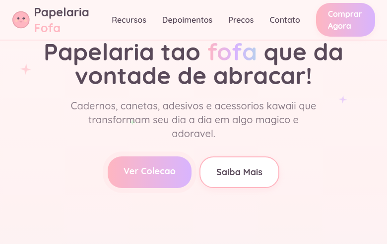
Kawaii landing page with soft pastel colors and adorable rounded aesthetics. Ideal for embalagens de brinquedos, vestuário, branding de personagens, gráficos de redes sociais. AI-ready template.
Use case: Toy packaging, Apparel, Character branding, Social media graphics
Historical Context
Kawaii didn't emerge from a corporate branding exercise — it bubbled up from Japanese teenage girls in the 1970s who started writing in a deliberately childish, rounded script that drove their teachers insane. That rebellion against formality became a cultural force. Sanrio capitalized on it with Hello Kitty in 1974, proving that simplicity and emotional warmth could move product at industrial scale. By the 1980s, kawaii had infected everything from bank advertisements to government signage in Japan. The aesthetic crossed over globally through anime, Tamagotchi, and the Harajuku street fashion explosion of the late '90s. What makes kawaii fascinating from a design systems perspective is its disciplined restraint — the proportions are precise, the color relationships are intentional, and the apparent simplicity masks rigorous craft. Today kawaii lives comfortably in digital product design. Apps like LINE proved that kawaii interaction patterns drive engagement metrics that "serious" design can't touch. The style has matured beyond novelty into a legitimate design language with its own grammar — one built on emotional accessibility rather than information hierarchy.
When to Use
Reach for kawaii when your audience needs to feel safe, delighted, or emotionally connected before they engage functionally. It's the right call for children's products where warmth reduces friction, stationery brands competing on personality, social apps targeting younger demographics who expect expressiveness, and any Japanese-market product where kawaii isn't decoration — it's baseline expectation. Don't use it when you need authority or when your users will read softness as lack of seriousness.
Design Principles
- Round everything aggressively — corners, letterforms, icons. Sharp angles signal danger in kawaii grammar; radius is trust.
- Pastel palette with one saturated accent. The pastels do emotional work (calm, approachable), the accent creates focal points without breaking the softness.
- Oversized heads, tiny bodies. Whether characters or UI elements, kawaii proportions trigger nurturing instincts — this is biology, not decoration.
- Reduce detail to emotional essence. Every element should communicate feeling first, information second. If it doesn't spark a micro-emotion, it's clutter.
- Animate with bounce and squish, never with sharp easing. Motion in kawaii systems should feel organic and slightly exaggerated — like things have weight and personality.
DESIGN.md
---
version: "alpha"
name: "Kawaii"
description: "Kawaii landing page with soft pastel colors and adorable rounded aesthetics. Ideal for embalagens de brinquedos, vestuário, branding de personagens, gráficos de redes sociais. AI-ready template."
colors:
  primary: "#FFB6C1"
  secondary: "#ADD8E6"
  tertiary: "#FFFACD"
  neutral: "#FFF5F5"
  surface: "#B2F2BB"
  accent: "#D8B4FE"
typography:
  h1:
    fontFamily: Quicksand
    fontSize: 2.5rem
    fontWeight: 700
  body-md:
    fontFamily: Quicksand
    fontSize: 1rem
    fontWeight: 400
rounded:
  sm: 28px
  md: 56px
  lg: 84px
spacing:
  sm: 1.5rem
  md: 3.0rem
  lg: 6.0rem
components:
  button-primary:
    backgroundColor: "{colors.primary}"
    textColor: "{colors.neutral}"
    rounded: "{rounded.sm}"
    padding: 12px
---

## Overview

Kawaii landing page with soft pastel colors and adorable rounded aesthetics. Ideal for embalagens de brinquedos, vestuário, branding de personagens, gráficos de redes sociais. AI-ready template. Kawaii didn't emerge from a corporate branding exercise — it bubbled up from Japanese teenage girls in the 1970s who started writing in a deliberately childish, rounded script that drove their teachers insane. That rebellion against formality became a cultural force. Sanrio capitalized on it with Hello Kitty in 1974, proving that simplicity and emotional warmth could move product at industrial scale.

By the 1980s, kawaii had infected everything from bank advertisements to government signage in Japan. The aesthetic crossed over globally through anime, Tamagotchi, and the Harajuku street fashion explosion of the late '90s. What makes kawaii fascinating from a design systems perspective is its disciplined restraint — the proportions are precise, the color relationships are intentional, and the apparent simplicity masks rigorous craft.

Today kawaii lives comfortably in digital product design. Apps like LINE proved that kawaii interaction patterns drive engagement metrics that "serious" design can't touch. The style has matured beyond novelty into a legitimate design language with its own grammar — one built on emotional accessibility rather than information hierarchy.

- Density: 5/10 — Balanced
- Variance: 7/10 — Dynamic
- Motion: 6/10 — Expressive

- **Style:** Pastel, Rounded, Adorable, Cartoon-Like
- **Keywords:** Kawaii, cute, pastel colors, rounded shapes, adorable characters, cartoon, Japanese cute culture, soft, bubbly, friendly
- **Era:** 1970s-Present Japanese Cute Culture
- **Light/Dark:** ✓ Full / ✗ Not Recommended

## Colors

- **Pastel Pink** (#FFB6C1) — Primary text color
- **Pastel Blue** (#ADD8E6) — Accent highlight, links and focus states
- **Pastel Yellow** (#FFFACD) — Warning states, attention indicators
- **Soft White** (#FFF5F5) — Light surface, card backgrounds
- **Pastel Mint** (#B2F2BB) — Extended palette, decorative use
- **Pastel Lavender** (#D8B4FE) — Extended palette, decorative use
- **Pastel Peach** (#FFDAB9) — Extended palette, decorative use
- **Soft Grey** (#E8E8E8) — Secondary text, borders, muted elements


## Typography

- **Display / Hero:** Quicksand — Weight 700, tight tracking, used for headline impact
- **Body:** Quicksand — Weight 400, 16px/1.6 line-height, max 72ch per line
- **UI Labels / Captions:** Quicksand — 0.875rem, weight 500, slight letter-spacing
- **Monospace:** JetBrains Mono — Used for code, metadata, and technical values

Scale:
- Hero: clamp(2.5rem, 5vw, 4rem)
- H1: 2.25rem
- H2: 1.5rem
- Body: 1rem / 1.6
- Small: 0.875rem


## Layout

- **Grid:** CSS Grid primary. Max-width containment: 1280px centered with 1.5rem side padding.
- **Spacing rhythm:** Balanced. Base unit: 0.5rem (8px).
- **Section vertical gaps:** clamp(4rem, 8vw, 8rem).
- **Hero layout:** Asymmetric composition.
- **Feature sections:** Asymmetric grid with varied card sizes. No 3-equal-columns.
- **Mobile collapse:** All multi-column layouts collapse below 768px. No horizontal overflow.
- **z-index contract:** base (0) / sticky-nav (100) / overlay (200) / modal (300) / toast (500).


## Elevation & Depth

Very rounded shapes (24-32px radius), bouncy hover animations (cubic-bezier overshoot), soft pastel gradients, kawaii face SVG decorations (dots for eyes, small mouth), sparkle/star decorations, gentle wobble animations, cloud-shaped section dividers

- **Physics:** Spring — stiffness 120, damping 20. Confident, weighted transitions.
- **Entry animations:** Fade + translate-Y (16px → 0) over 480ms ease-out. Staggered cascades for lists: 100ms between items.
- **Hover states:** Scale(1.03) + shadow lift over 200ms.
- **Page transitions:** Fade + slide (300ms).
- **Performance:** Only transform and opacity animated. No layout-triggering properties.


## Shapes

Base corner radius: 28px. See rounded tokens in front matter for the full scale.


## Components

- **Primary Button:** Generously rounded (1.5rem) shape. Accent color fill. Hover: 8% darken + subtle lift shadow. Active: -1px translate tactile press. Font weight 600. No outer glows.
- **Secondary / Ghost Button:** Outline variant. 1.5px border in muted color. Text in primary color. Hover: subtle background fill.
- **Cards:** Generously rounded (1.5rem) corners. Surface background. Subtle shadow (0 2px 12px rgba(0,0,0,0.06)). 1px border stroke.
- **Inputs:** Label above input. 1px border stroke. Focus ring: 2px accent color offset 2px. Error text below in semantic red. No floating labels.
- **Navigation:** Primary surface background. Active item: accent color indicator. Font weight 500 when active.
- **Skeletons:** Shimmer animation matching component dimensions. No circular spinners.
- **Empty States:** Icon-based composition with descriptive text and action button.


## Do's and Don'ts

- No emojis in UI — use icon system only (Lucide, Heroicons)
- No pure black (#000000) — use off-black or charcoal variants
- No oversaturated accent colors (saturation cap: 80%)
- No 3-column equal-width feature layouts — use zig-zag or asymmetric grid
- No `h-screen` — use `min-h-[100dvh]`
- No AI copywriting clichés: "Elevate", "Seamless", "Unleash", "Next-Gen"
- No broken external image links — use picsum.photos or inline SVG
- No generic lorem ipsum in demos

- Do Soft pastel color palette
- Do Very rounded shapes (24-32px)
- Do Bouncy overshoot animations
- Do Kawaii face decorations
- Do Sparkle/star elements
- Do Cloud-shaped dividers
- Do Rounded friendly typography
- Do Adorable bubbly atmosphere
- Do Responsive with maintained cuteness


## Use Case

Toy packaging, Apparel, Character branding, Social media graphics
Technical Specs
CSS
font-family: 'Quicksand', sans-serif, font-weight: 500-700, background: #FFF5F5, color: #5A4A5A, border: 2px solid #FFB6C1, border-radius: 28px, box-shadow: 0 4px 12px rgba(255,182,193,0.2), transition: transform 300ms cubic-bezier(0.34,1.56,0.64,1), animation: wobble 0.5s
Variables
--color-pink: #FFB6C1, --color-blue: #ADD8E6, --color-yellow: #FFFACD, --color-white: #FFF5F5, --font-primary: 'Quicksand', --border-radius: 28px, --border: 2px solid #FFB6C1, --shadow-soft: rgba(255,182,193,0.2), --bounce: cubic-bezier(0.34,1.56,0.64,1), --spacing: 1.5rem
Checklist
☐ Soft pastel color palette, ☐ Very rounded shapes (24-32px), ☐ Bouncy overshoot animations, ☐ Kawaii face decorations, ☐ Sparkle/star elements, ☐ Cloud-shaped dividers, ☐ Rounded friendly typography, ☐ Adorable bubbly atmosphere, ☐ Responsive with maintained cuteness
Colors
Primary
Secondary
Effects
Very rounded shapes (24-32px radius), bouncy hover animations (cubic-bezier overshoot), soft pastel gradients, kawaii face SVG decorations (dots for eyes, small mouth), sparkle/star decorations, gentle wobble animations, cloud-shaped section dividers
Light/Dark
✓ Full / ✗ Not Recommended
AI Prompt
Act as a Senior Frontend Engineer and Expert UI Designer.
Your task is to code a complete Landing Page on the first attempt.
- Landing Page Theme: <INSERT THEME>
- Sections to add: <INSERT SECTIONS>

Generate the final code immediately following these definitions:

## Style

- **Name:** Kawaii
- **Type:** Pastel, Rounded, Adorable, Cartoon-Like
- **Keywords:** Kawaii, cute, pastel colors, rounded shapes, adorable characters, cartoon, Japanese cute culture, soft, bubbly, friendly
- **Era:** 1970s-Present Japanese Cute Culture
- **Light/Dark:** ✓ Full / ✗ Not Recommended

## Color Palette

- **Primary:** Pastel Pink #FFB6C1, Pastel Blue #ADD8E6, Pastel Yellow #FFFACD, Soft White #FFF5F5
- **Secondary:** Pastel Mint #B2F2BB, Pastel Lavender #D8B4FE, Pastel Peach #FFDAB9, Soft Grey #E8E8E8

## Visual Effects

Very rounded shapes (24-32px radius), bouncy hover animations (cubic-bezier overshoot), soft pastel gradients, kawaii face SVG decorations (dots for eyes, small mouth), sparkle/star decorations, gentle wobble animations, cloud-shaped section dividers

## AI Visual Direction

Design a kawaii landing page with soft pastel colors and adorable rounded aesthetics. Use pastel pink, blue, yellow, soft white. Apply very rounded shapes (24-32px), bouncy overshoot animations, kawaii face SVG decorations (dot eyes, tiny mouth), sparkle/star decorations, cloud-shaped dividers, soft pastel gradients. Typography should be rounded and friendly (Nunito, Quicksand). Adorable, bubbly, Japanese cute culture atmosphere.

## CSS Technical

```css
font-family: 'Quicksand', sans-serif, font-weight: 500-700, background: #FFF5F5, color: #5A4A5A, border: 2px solid #FFB6C1, border-radius: 28px, box-shadow: 0 4px 12px rgba(255,182,193,0.2), transition: transform 300ms cubic-bezier(0.34,1.56,0.64,1), animation: wobble 0.5s
```

## Design System Variables

```css
--color-pink: #FFB6C1, --color-blue: #ADD8E6, --color-yellow: #FFFACD, --color-white: #FFF5F5, --font-primary: 'Quicksand', --border-radius: 28px, --border: 2px solid #FFB6C1, --shadow-soft: rgba(255,182,193,0.2), --bounce: cubic-bezier(0.34,1.56,0.64,1), --spacing: 1.5rem
```

## Implementation Checklist

- ☐ Soft pastel color palette
- ☐ Very rounded shapes (24-32px)
- ☐ Bouncy overshoot animations
- ☐ Kawaii face decorations
- ☐ Sparkle/star elements
- ☐ Cloud-shaped dividers
- ☐ Rounded friendly typography
- ☐ Adorable bubbly atmosphere
- ☐ Responsive with maintained cuteness

## Execution Rules

1. Strictly follow the defined visual style.
2. Use high-quality inline SVG icons (Heroicons or Lucide style) — NEVER use emojis as icons.
3. Add `cursor-pointer` and smooth `hover` states (transition-all) on all interactive elements.
4. Required Page Structure:
   - Navbar (Logo + Links + CTA)
   - Hero Section (Impactful Headline + Subtitle + 2 buttons + 3D/Abstract visual element via CSS)
   - Features (3 cards with icons)
   - Testimonials (3 cards)
   - Pricing (3 tiers, highlight the middle one)
   - Final CTA
   - Full Footer with social links, privacy policy, terms of use, contact and SEO links.
5. All text content must be in English.
6. The visual must be CLEARLY distinct — do not create a "default Bootstrap" design. Force the use of the provided design system variables.
7. Use `<style>` tags in the head for custom classes (especially for complex backdrop-filter effects and animations) that Tailwind CDN doesn't cover.
8. Full Responsiveness: Layout must adapt perfectly to Mobile, Tablet and Desktop (vertical stack on mobile).
9. Include basic SEO, Viewport and Open Graph meta tags in `<head>`.
10. Footer must contain: Copyright 2026, Secondary navigation links and Social media icons.
11. Make the creative decisions needed to deliver the complete, functional result now.
Related
Last synced: 4/1/2026