Japandi
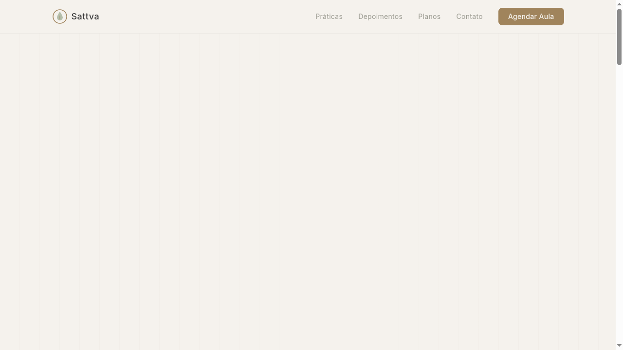
Japandi landing page blending Japanese minimalism with Scandinavian warmth. Ideal for interior design, produtos lifestyle, branding minimalista, design de pôsteres. AI-ready template.
Use case: Interior design, Lifestyle products, Minimalist branding, Poster design
Historical Context
Japandi didn't emerge from a manifesto or a design school. It crystallized slowly through parallel obsessions — Japanese craftsmen pursuing the beauty of imperfection while Scandinavian makers chased democratic warmth. Both traditions rejected ornament for its own sake, but arrived at restraint through completely different philosophies. Wabi-sabi finds grace in asymmetry, in the crack that tells a story. Hygge wraps you in texture and soft light until the outside world dissolves. The collision happened naturally once global design culture made these two worlds visible to each other. What makes Japandi genuinely interesting — not just another Pinterest trend — is the tension it holds. Japanese minimalism can feel austere, even punishing. Scandinavian warmth can drift into cozy blandness. Together they correct each other. The Japanese eye edits ruthlessly; the Nordic hand insists on comfort. You get spaces and objects that breathe without feeling cold, that comfort without clutter. The Swiss connection is real but underappreciated. That same grid discipline, that same trust in negative space — it translates directly into how Japandi compositions balance weight and void. Typography in this system wants to disappear into the material, not compete with it.
When to Use
Reach for Japandi when your brand needs to communicate quality through restraint — when you want people to feel calm authority, not minimalist coldness. It works beautifully for interior design studios, furniture makers who care about joinery, wellness brands that aren't performatively spiritual, and lifestyle companies targeting adults who've outgrown maximalism. Avoid it if your product needs energy or urgency. This system whispers. If you need to shout, look elsewhere.
Design Principles
- Material honesty over surface decoration — let wood grain, linen texture, and stone imperfection do the visual work that gradients and effects do elsewhere
- Asymmetric balance rooted in Japanese composition — reject centered symmetry in favor of weighted negative space that creates quiet tension
- Warm neutrals as a system, not a limitation — build from charcoal, sand, sage, and clay rather than pure black and white; temperature matters more than contrast
- Functional emptiness — every void is intentional, giving the eye permission to rest and elevating the few elements that remain
- Craft-forward typography — select typefaces that reference letterpress weight and calligraphic bone structure; set them large, track them open, let them breathe like objects in a room
DESIGN.md
---
version: "alpha"
name: "Japandi"
description: "Japandi landing page blending Japanese minimalism with Scandinavian warmth. Ideal for interior design, produtos lifestyle, branding minimalista, design de pôsteres. AI-ready template."
colors:
  primary: "#D4C5A9"
  secondary: "#F5F2ED"
  tertiary: "#3A3A3A"
  neutral: "#A0845C"
  surface: "#8B9E7E"
  accent: "#C9A0A0"
typography:
  h1:
    fontFamily: Inter
    fontSize: 2.5rem
    fontWeight: 700
  body-md:
    fontFamily: Inter
    fontSize: 1rem
    fontWeight: 400
rounded:
  sm: 8px
  md: 16px
  lg: 24px
spacing:
  sm: 3.0rem
  md: 6.0rem
  lg: 12.0rem
components:
  button-primary:
    backgroundColor: "{colors.primary}"
    textColor: "{colors.neutral}"
    rounded: "{rounded.sm}"
    padding: 12px
---

## Overview

Japandi landing page blending Japanese minimalism with Scandinavian warmth. Ideal for interior design, produtos lifestyle, branding minimalista, design de pôsteres. AI-ready template. Japandi didn't emerge from a manifesto or a design school. It crystallized slowly through parallel obsessions — Japanese craftsmen pursuing the beauty of imperfection while Scandinavian makers chased democratic warmth. Both traditions rejected ornament for its own sake, but arrived at restraint through completely different philosophies. Wabi-sabi finds grace in asymmetry, in the crack that tells a story. Hygge wraps you in texture and soft light until the outside world dissolves. The collision happened naturally once global design culture made these two worlds visible to each other.

What makes Japandi genuinely interesting — not just another Pinterest trend — is the tension it holds. Japanese minimalism can feel austere, even punishing. Scandinavian warmth can drift into cozy blandness. Together they correct each other. The Japanese eye edits ruthlessly; the Nordic hand insists on comfort. You get spaces and objects that breathe without feeling cold, that comfort without clutter.

The Swiss connection is real but underappreciated. That same grid discipline, that same trust in negative space — it translates directly into how Japandi compositions balance weight and void. Typography in this system wants to disappear into the material, not compete with it.

- Density: 3/10 — Airy
- Variance: 8/10 — Expressive
- Motion: 4/10 — Subtle

- **Style:** Minimal, Warm, Natural, Zen-Scandinavian
- **Keywords:** Japandi, Japanese minimalism, Scandinavian warmth, Bauhaus, natural materials, neutral colors, zen, wabi-sabi, hygge, organic
- **Era:** 2020s Fusion Design
- **Light/Dark:** ✓ Full / ✓ Full

## Colors

- **Warm Sand** (#D4C5A9) — Primary surface or dominant color
- **Soft White** (#F5F2ED) — Light surface, card backgrounds
- **Charcoal** (#3A3A3A) — Dark surface, primary background
- **Natural Wood** (#A0845C) — Supporting palette color
- **Sage Green** (#8B9E7E) — Success states, positive indicators
- **Dusty Rose** (#C9A0A0) — Extended palette, decorative use
- **Stone Grey** (#9E9E94) — Secondary text, borders, muted elements
- **Deep Indigo** (#2C3E50) — Accent color, emphasis elements


## Typography

- **Display / Hero:** Inter — Weight 700, tight tracking, used for headline impact
- **Accent:** Noto Sans JP — Used for decorative or emphasis text
- **Body:** Inter — Weight 400, 16px/1.6 line-height, max 72ch per line
- **UI Labels / Captions:** Inter — 0.875rem, weight 500, slight letter-spacing
- **Monospace:** JetBrains Mono — Used for code, metadata, and technical values

Scale:
- Hero: clamp(2.5rem, 5vw, 4rem)
- H1: 2.25rem
- H2: 1.5rem
- Body: 1rem / 1.6
- Small: 0.875rem


## Layout

- **Grid:** CSS Grid primary. Max-width containment: 1280px centered with 1.5rem side padding.
- **Spacing rhythm:** Balanced. Base unit: 0.5rem (8px).
- **Section vertical gaps:** clamp(4rem, 8vw, 8rem).
- **Hero layout:** Asymmetric composition.
- **Feature sections:** Asymmetric grid with varied card sizes. No 3-equal-columns.
- **Mobile collapse:** All multi-column layouts collapse below 768px. No horizontal overflow.
- **z-index contract:** base (0) / sticky-nav (100) / overlay (200) / modal (300) / toast (500).


## Elevation & Depth

Generous white space, subtle wood grain texture backgrounds, clean thin borders (1px), gentle fade-in on scroll (600ms), minimal shadow (0 2px 8px rgba(0,0,0,0.05)), organic rounded corners (8px)

- **Physics:** Ease-out curves, 200-300ms duration. Smooth and predictable.
- **Entry animations:** Fade + translate-Y (16px → 0) over 420ms ease-out. Staggered cascades for lists: 80ms between items.
- **Hover states:** Subtle color shift + shadow adjustment over 200ms.
- **Page transitions:** Fade only (200ms).
- **Performance:** Only transform and opacity animated. No layout-triggering properties.


## Shapes

Base corner radius: 8px. See rounded tokens in front matter for the full scale.


## Components

- **Primary Button:** Rounded (8px) shape. Accent color fill. Hover: 8% darken + subtle lift shadow. Active: -1px translate tactile press. Font weight 600. No outer glows.
- **Secondary / Ghost Button:** Outline variant. 1.5px border in muted color. Text in primary color. Hover: subtle background fill.
- **Cards:** Rounded (8px) corners. Surface background. Subtle shadow (0 2px 12px rgba(0,0,0,0.06)). 1px border stroke.
- **Inputs:** Label above input. 1px border stroke. Focus ring: 2px accent color offset 2px. Error text below in semantic red. No floating labels.
- **Navigation:** Primary surface background. Active item: accent color indicator. Font weight 500 when active.
- **Skeletons:** Shimmer animation matching component dimensions. No circular spinners.
- **Empty States:** Icon-based composition with descriptive text and action button.


## Do's and Don'ts

- No emojis in UI — use icon system only (Lucide, Heroicons)
- No decorative gradients — flat color only
- No shadows heavier than 0 2px 8px rgba(0,0,0,0.08)
- No pure black (#000000) — use off-black or charcoal variants
- No oversaturated accent colors (saturation cap: 80%)
- No 3-column equal-width feature layouts — use zig-zag or asymmetric grid
- No `h-screen` — use `min-h-[100dvh]`
- No AI copywriting clichés: "Elevate", "Seamless", "Unleash", "Next-Gen"
- No broken external image links — use picsum.photos or inline SVG
- No generic lorem ipsum in demos

- Do Neutral warm color palette
- Do Generous white space throughout
- Do Clean thin borders
- Do Natural wood texture accents
- Do Organic rounded corners (8px)
- Do Minimal shadows
- Do Zen-calm atmosphere maintained
- Do Responsive with preserved spacing


## Use Case

Interior design, Lifestyle products, Minimalist branding, Poster design
Technical Specs
CSS
font-family: 'Inter', 'Noto Sans JP', sans-serif, background: #F5F2ED, color: #3A3A3A, border: 1px solid rgba(58,58,58,0.1), border-radius: 8px, box-shadow: 0 2px 8px rgba(0,0,0,0.05), line-height: 1.8, letter-spacing: 0.02em, max-width: 1100px
Variables
--color-sand: #D4C5A9, --color-white: #F5F2ED, --color-charcoal: #3A3A3A, --color-wood: #A0845C, --font-primary: 'Inter', --border-radius: 8px, --shadow-minimal: 0 2px 8px rgba(0,0,0,0.05), --spacing: 3rem
Checklist
☐ Neutral warm color palette, ☐ Generous white space throughout, ☐ Clean thin borders, ☐ Natural wood texture accents, ☐ Organic rounded corners (8px), ☐ Minimal shadows, ☐ Zen-calm atmosphere maintained, ☐ Responsive with preserved spacing
Colors
Primary
Secondary
Effects
Generous white space, subtle wood grain texture backgrounds, clean thin borders (1px), gentle fade-in on scroll (600ms), minimal shadow (0 2px 8px rgba(0,0,0,0.05)), organic rounded corners (8px)
Light/Dark
✓ Full / ✓ Full
AI Prompt
Act as a Senior Frontend Engineer and Expert UI Designer.
Your task is to code a complete Landing Page on the first attempt.
- Landing Page Theme: <INSERT THEME>
- Sections to add: <INSERT SECTIONS>

Generate the final code immediately following these definitions:

## Style

- **Name:** Japandi
- **Type:** Minimal, Warm, Natural, Zen-Scandinavian
- **Keywords:** Japandi, Japanese minimalism, Scandinavian warmth, Bauhaus, natural materials, neutral colors, zen, wabi-sabi, hygge, organic
- **Era:** 2020s Fusion Design
- **Light/Dark:** ✓ Full / ✓ Full

## Color Palette

- **Primary:** Warm Sand #D4C5A9, Soft White #F5F2ED, Charcoal #3A3A3A, Natural Wood #A0845C
- **Secondary:** Sage Green #8B9E7E, Dusty Rose #C9A0A0, Stone Grey #9E9E94, Deep Indigo #2C3E50

## Visual Effects

Generous white space, subtle wood grain texture backgrounds, clean thin borders (1px), gentle fade-in on scroll (600ms), minimal shadow (0 2px 8px rgba(0,0,0,0.05)), organic rounded corners (8px)

## AI Visual Direction

Design a Japandi landing page blending Japanese minimalism with Scandinavian warmth. Use neutral warm tones (sand, soft white, charcoal), natural wood textures, generous white space, clean thin borders. Typography should be clean sans-serif with generous line-height. Organic rounded corners (8px), minimal shadows. Zen-like calm with hygge warmth. Bauhaus-inspired grid structure.

## CSS Technical

```css
font-family: 'Inter', 'Noto Sans JP', sans-serif, background: #F5F2ED, color: #3A3A3A, border: 1px solid rgba(58,58,58,0.1), border-radius: 8px, box-shadow: 0 2px 8px rgba(0,0,0,0.05), line-height: 1.8, letter-spacing: 0.02em, max-width: 1100px
```

## Design System Variables

```css
--color-sand: #D4C5A9, --color-white: #F5F2ED, --color-charcoal: #3A3A3A, --color-wood: #A0845C, --font-primary: 'Inter', --border-radius: 8px, --shadow-minimal: 0 2px 8px rgba(0,0,0,0.05), --spacing: 3rem
```

## Implementation Checklist

- ☐ Neutral warm color palette
- ☐ Generous white space throughout
- ☐ Clean thin borders
- ☐ Natural wood texture accents
- ☐ Organic rounded corners (8px)
- ☐ Minimal shadows
- ☐ Zen-calm atmosphere maintained
- ☐ Responsive with preserved spacing

## Execution Rules

1. Strictly follow the defined visual style.
2. Use high-quality inline SVG icons (Heroicons or Lucide style) — NEVER use emojis as icons.
3. Add `cursor-pointer` and smooth `hover` states (transition-all) on all interactive elements.
4. Required Page Structure:
   - Navbar (Logo + Links + CTA)
   - Hero Section (Impactful Headline + Subtitle + 2 buttons + 3D/Abstract visual element via CSS)
   - Features (3 cards with icons)
   - Testimonials (3 cards)
   - Pricing (3 tiers, highlight the middle one)
   - Final CTA
   - Full Footer with social links, privacy policy, terms of use, contact and SEO links.
5. All text content must be in English.
6. The visual must be CLEARLY distinct — do not create a "default Bootstrap" design. Force the use of the provided design system variables.
7. Use `<style>` tags in the head for custom classes (especially for complex backdrop-filter effects and animations) that Tailwind CDN doesn't cover.
8. Full Responsiveness: Layout must adapt perfectly to Mobile, Tablet and Desktop (vertical stack on mobile).
9. Include basic SEO, Viewport and Open Graph meta tags in `<head>`.
10. Footer must contain: Copyright 2026, Secondary navigation links and Social media icons.
11. Make the creative decisions needed to deliver the complete, functional result now.
Related
Last synced: 4/1/2026