Internet Nostalgia Y2K Revival
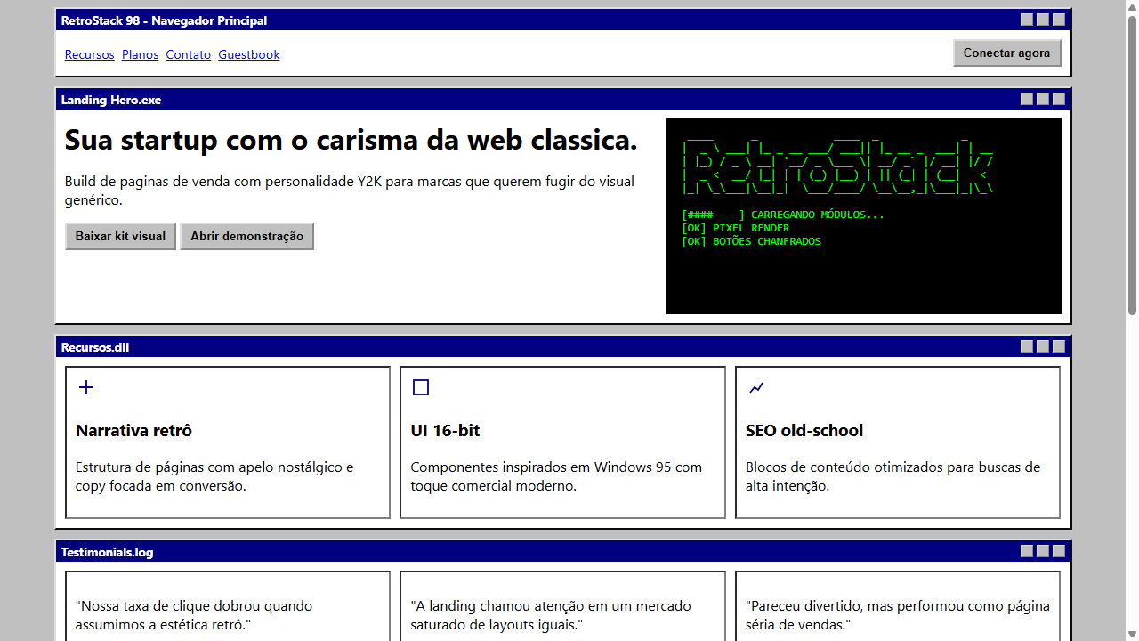
Landing page with full Windows 95/98 internet nostalgia aesthetic. Ideal for portfolios criativos retro, jogos indie, eventos tematicos, blogs pessoais nostalgicos, lancamentos de produto ironicos, comunidades de nicho. AI-ready template.
Use case: Portfolios criativos retro, Games indie, Events tematicos, Blogs personal nostalgicos, Lancamentos de produto ironicos, Comunidades de nicho
Historical Context
The early web was ugly and nobody cared. That was the point. GeoCities pages with tiled backgrounds, hit counters, "under construction" GIFs, and Comic Sans used unironically — it was a frontier built by amateurs who were genuinely excited about hyperlinks. Windows 95 gave an entire generation their first taste of personal computing through a beige box that felt like magic. The visual language was clunky system fonts, beveled buttons, 16-color palettes, and dialog boxes that asked if you were really, truly sure. Y2K revival isn't about faithfully recreating that era — it's about channeling the energy. The optimism of dial-up, the chaos of early HTML, the democratized ugliness before design became professionalized. Around 2018-2020, designers started pulling these references back not as mockery but as genuine aesthetic choice. Brutalist web design cracked the door open, and Y2K nostalgia kicked it down. Brands realized that millennials don't just remember this era — they miss the feeling of a web that wasn't optimized, surveilled, and A/B tested into sterility.
When to Use
When your audience grew up clearing their browser cache to free up disk space. Millennial-targeted brands, retro tech products, meme-native companies, and anything that needs to signal "we don't take ourselves too seriously." Works brilliantly for limited drops, nostalgic product lines, or any brand that wants to feel human and imperfect rather than polished and corporate. Avoid if your users need to actually complete complex tasks — nostalgia is a vibe, not a usability framework.
Design Principles
- System UI aesthetics over custom polish — use pixel fonts, beveled borders, window chrome, and OS-native UI patterns from Windows 95/98/XP as structural elements, not just decoration
- Embrace visible construction — show the seams with tiled backgrounds, table-based visual grids, visible borders, and elements that look hand-placed rather than algorithmically aligned
- Limit your palette to era-appropriate constraints — web-safe colors, dithered gradients, 1-bit icons, and the specific teals, purples, and silvers that defined Y2K futurism
- Motion should feel mechanical, not fluid — cursor trails, marquee scrolls, page transition wipes, and hover states that snap rather than ease. Nothing should feel like it was touched by a physics engine
- Layer irony with sincerity — the best Y2K revival work knows exactly what it's referencing and treats it with love, not condescension. A hit counter that actually counts is funnier and more committed than one that's obviously fake
DESIGN.md
---
version: "alpha"
name: "Internet Nostalgia Y2K Revival"
description: "Landing page with full Windows 95/98 internet nostalgia aesthetic. Ideal for portfolios criativos retro, jogos indie, eventos tematicos, blogs pessoais nostalgicos, lancamentos de produto ironicos, comunidades de nicho. AI-ready template."
colors:
  primary: "#C0C0C0"
  secondary: "#000080"
  tertiary: "#FFFFFF"
  neutral: "#000000"
  surface: "#00FF00"
  accent: "#00FFFF"
typography:
  h1:
    fontFamily: Courier New
    fontSize: 2.5rem
    fontWeight: 700
  body-md:
    fontFamily: Courier New
    fontSize: 1rem
    fontWeight: 400
components:
  button-primary:
    backgroundColor: "{colors.primary}"
    textColor: "{colors.neutral}"
    padding: 12px
---

## Overview

Landing page with full Windows 95/98 internet nostalgia aesthetic. Ideal for portfolios criativos retro, jogos indie, eventos tematicos, blogs pessoais nostalgicos, lancamentos de produto ironicos, comunidades de nicho. AI-ready template. The early web was ugly and nobody cared. That was the point. GeoCities pages with tiled backgrounds, hit counters, "under construction" GIFs, and Comic Sans used unironically — it was a frontier built by amateurs who were genuinely excited about hyperlinks. Windows 95 gave an entire generation their first taste of personal computing through a beige box that felt like magic. The visual language was clunky system fonts, beveled buttons, 16-color palettes, and dialog boxes that asked if you were really, truly sure.

Y2K revival isn't about faithfully recreating that era — it's about channeling the energy. The optimism of dial-up, the chaos of early HTML, the democratized ugliness before design became professionalized. Around 2018-2020, designers started pulling these references back not as mockery but as genuine aesthetic choice. Brutalist web design cracked the door open, and Y2K nostalgia kicked it down. Brands realized that millennials don't just remember this era — they miss the feeling of a web that wasn't optimized, surveilled, and A/B tested into sterility.

- Density: 5/10 — Balanced
- Variance: 7/10 — Dynamic
- Motion: 4/10 — Subtle

- **Style:** Windows 95/98, Retro Web, Pixel Art, ASCII, Table Layout, Beveled Buttons
- **Keywords:** internet nostalgia, Y2K revival, Windows 95, Windows 98, retro web, pixel art, ASCII art, table layout, beveled buttons, blue title bar, dialog box, custom cursor, 16-bit, dial-up era, system font, geocities
- **Era:** 1995-2000 Dial-Up Era Revival
- **Light/Dark:** ✓ Full / ✗ None

## Colors

- **Cinza Sistema** (#C0C0C0) — Secondary text, borders, muted elements
- **Azul Titulo** (#000080) — Accent highlight, links and focus states
- **Branco Janela** (#FFFFFF) — Light surface, card backgrounds
- **Preto Texto** (#000000) — Dark surface, primary background
- **Verde Terminal** (#00FF00) — Success states, positive indicators
- **Ciano DOS** (#00FFFF) — Extended palette, decorative use
- **Magenta Retro** (#FF00FF) — Decorative accent, highlight elements
- **Amarelo Alerta** (#FFFF00) — Error states, destructive actions
- **Prata Borda** (#808080) — Extended palette, decorative use


## Typography

- **Display / Hero:** Courier New — Weight 700, tight tracking, used for headline impact
- **Body:** Courier New — Weight 400, 16px/1.6 line-height, max 72ch per line
- **UI Labels / Captions:** Courier New — 0.875rem, weight 500, slight letter-spacing
- **Monospace:** Courier New — Used for code, metadata, and technical values

Scale:
- Hero: clamp(2.5rem, 5vw, 4rem)
- H1: 2.25rem
- H2: 1.5rem
- Body: 1rem / 1.6
- Small: 0.875rem


## Layout

- **Grid:** CSS Grid primary. Max-width containment: 1280px centered with 1.5rem side padding.
- **Spacing rhythm:** Balanced. Base unit: 0.5rem (8px).
- **Section vertical gaps:** clamp(4rem, 8vw, 8rem).
- **Hero layout:** Asymmetric composition.
- **Feature sections:** Asymmetric grid with varied card sizes. No 3-equal-columns.
- **Mobile collapse:** All multi-column layouts collapse below 768px. No horizontal overflow.
- **z-index contract:** base (0) / sticky-nav (100) / overlay (200) / modal (300) / toast (500).


## Elevation & Depth

Janelas desenhadas em tabelas com bordas chanfradas (inset/outset), botoes classicos com sombras duras indicando elevacao (border-style: outset, active: inset), barras de titulo azuis (#000080) com texto branco centralizado, caixas de dialogo pop-up literais, arte ASCII feita de caracteres textuais, graficos pixelados (image-rendering: pixelated), cursores ludicos personalizados (cursor: url()), fontes bitmap/sistema (MS Sans Serif simulado), scrollbars estilizadas retro

- **Physics:** Ease-out curves, 200-300ms duration. Smooth and predictable.
- **Entry animations:** Fade + translate-Y (16px → 0) over 420ms ease-out. Staggered cascades for lists: 80ms between items.
- **Hover states:** Subtle color shift + shadow adjustment over 200ms.
- **Page transitions:** Fade only (200ms).
- **Performance:** Only transform and opacity animated. No layout-triggering properties.


## Shapes

Base corner radius: 24px. See rounded tokens in front matter for the full scale.


## Components

- **Primary Button:** Generously rounded (1.5rem) shape. Accent color fill. Hover: 8% darken + subtle lift shadow. Active: -1px translate tactile press. Font weight 600. No outer glows.
- **Secondary / Ghost Button:** Outline variant. 1.5px border in muted color. Text in primary color. Hover: subtle background fill.
- **Cards:** Generously rounded (1.5rem) corners. Surface background. Subtle shadow (0 2px 12px rgba(0,0,0,0.06)). 1px border stroke.
- **Inputs:** Label above input. 1px border stroke. Focus ring: 2px accent color offset 2px. Error text below in semantic red. No floating labels.
- **Navigation:** Primary surface background. Active item: accent color indicator. Font weight 500 when active.
- **Skeletons:** Shimmer animation matching component dimensions. No circular spinners.
- **Empty States:** Icon-based composition with descriptive text and action button.


## Do's and Don'ts

- No emojis in UI — use icon system only (Lucide, Heroicons)
- No pure black (#000000) — use off-black or charcoal variants
- No oversaturated accent colors (saturation cap: 80%)
- No 3-column equal-width feature layouts — use zig-zag or asymmetric grid
- No `h-screen` — use `min-h-[100dvh]`
- No AI copywriting clichés: "Elevate", "Seamless", "Unleash", "Next-Gen"
- No broken external image links — use picsum.photos or inline SVG
- No generic lorem ipsum in demos

- Do Janelas com bordas chanfradas outset/inset
- Do Barras de titulo azuis #000080
- Do Botoes classicos com efeito 3D (outset/inset)
- Do Caixas de dialogo pop-up
- Do Arte ASCII em pre tags
- Do Graficos pixelados com image-rendering pixelated
- Do Fundo cinza sistema #C0C0C0
- Do Fonte monospace para ASCII e system-ui para UI
- Do Elementos decorativos Geocities-era
- Do Scrollbars retro estilizadas


## Use Case

Portfolios criativos retro, Games indie, Events tematicos, Blogs personal nostalgicos, Lancamentos de produto ironicos, Comunidades de nicho
Technical Specs
CSS
background: #C0C0C0; border: 2px outset #DFDFDF (raised) / 2px inset #808080 (pressed); font-family: 'Courier New', monospace / system-ui; image-rendering: pixelated; cursor: url('custom.cur'), auto; box-shadow: inset -1px -1px #0a0a0a, inset 1px 1px #ffffff for 3D effect; scrollbar-color: #C0C0C0 #808080; padding: 2px; letter-spacing: 0Variables
--color-system-gray: #C0C0C0; --color-title-blue: #000080; --color-window-white: #FFFFFF; --color-text-black: #000000; --color-terminal-green: #00FF00; --color-border-light: #DFDFDF; --color-border-dark: #808080; --color-border-darkest: #0A0A0A; --font-system: system-ui, sans-serif; --font-mono: 'Courier New', monospace; --border-raised: 2px outset #DFDFDF; --border-pressed: 2px inset #808080; --titlebar-height: 24px
Checklist
☐ Janelas com bordas chanfradas outset/inset, ☐ Barras de titulo azuis #000080, ☐ Botoes classicos com efeito 3D (outset/inset), ☐ Caixas de dialogo pop-up, ☐ Arte ASCII em pre tags, ☐ Graficos pixelados com image-rendering pixelated, ☐ Fundo cinza sistema #C0C0C0, ☐ Fonte monospace para ASCII e system-ui para UI, ☐ Elementos decorativos Geocities-era, ☐ Scrollbars retro estilizadas
Colors
Primary
Secondary
Effects
Janelas desenhadas em tabelas com bordas chanfradas (inset/outset), botoes classicos com sombras duras indicando elevacao (border-style: outset, active: inset), barras de titulo azuis (#000080) com texto branco centralizado, caixas de dialogo pop-up literais, arte ASCII feita de caracteres textuais, graficos pixelados (image-rendering: pixelated), cursores ludicos personalizados (cursor: url()), fontes bitmap/sistema (MS Sans Serif simulado), scrollbars estilizadas retro
Light/Dark
✓ Full / ✗ None
AI Prompt
Act as a Senior Frontend Engineer and Expert UI Designer.
Your task is to code a complete Landing Page on the first attempt.
- Landing Page Theme: <INSERT THEME>
- Sections to add: <INSERT SECTIONS>

Generate the final code immediately following these definitions:

## Style

- **Name:** Internet Nostalgia Y2K Revival
- **Type:** Windows 95/98, Retro Web, Pixel Art, ASCII, Table Layout, Beveled Buttons
- **Keywords:** internet nostalgia, Y2K revival, Windows 95, Windows 98, retro web, pixel art, ASCII art, table layout, beveled buttons, blue title bar, dialog box, custom cursor, 16-bit, dial-up era, system font, geocities
- **Era:** 1995-2000 Dial-Up Era Revival
- **Light/Dark:** ✓ Full / ✗ None

## Color Palette

- **Primary:** Cinza Sistema #C0C0C0, Azul Titulo #000080, Branco Janela #FFFFFF, Preto Texto #000000
- **Secondary:** Verde Terminal #00FF00, Ciano DOS #00FFFF, Magenta Retro #FF00FF, Amarelo Alerta #FFFF00, Prata Borda #808080

## Visual Effects

Janelas desenhadas em tabelas com bordas chanfradas (inset/outset), botoes classicos com sombras duras indicando elevacao (border-style: outset, active: inset), barras de titulo azuis (#000080) com texto branco centralizado, caixas de dialogo pop-up literais, arte ASCII feita de caracteres textuais, graficos pixelados (image-rendering: pixelated), cursores ludicos personalizados (cursor: url()), fontes bitmap/sistema (MS Sans Serif simulado), scrollbars estilizadas retro

## AI Visual Direction

Design a landing page with full Windows 95/98 internet nostalgia aesthetic. Create window-like containers with BEVELED BORDERS (border-style: outset 2px for raised, inset 2px for pressed). Blue title bars (#000080) with white text, minimize/maximize/close buttons as small squares. Classic beveled push buttons that depress on click (outset → inset on :active). Dialog box popups with exclamation/question icons. ASCII art sections using <pre> tags with monospace font. Pixel art graphics with image-rendering: pixelated and crisp-edges. System gray (#C0C0C0) as the main background color. Custom retro cursors. Scrollbar styling to match Windows 95 look. Table-based visual layout (using CSS grid that LOOKS like tables). 16-bit color palette feel. Geocities-era decorative elements: under construction GIF references, visitor counter, guestbook link. Font: 'Courier New' for ASCII, system-ui for UI elements.

## CSS Technical

```css
background: #C0C0C0; border: 2px outset #DFDFDF (raised) / 2px inset #808080 (pressed); font-family: 'Courier New', monospace / system-ui; image-rendering: pixelated; cursor: url('custom.cur'), auto; box-shadow: inset -1px -1px #0a0a0a, inset 1px 1px #ffffff for 3D effect; scrollbar-color: #C0C0C0 #808080; padding: 2px; letter-spacing: 0
```

## Design System Variables

```css
--color-system-gray: #C0C0C0; --color-title-blue: #000080; --color-window-white: #FFFFFF; --color-text-black: #000000; --color-terminal-green: #00FF00; --color-border-light: #DFDFDF; --color-border-dark: #808080; --color-border-darkest: #0A0A0A; --font-system: system-ui, sans-serif; --font-mono: 'Courier New', monospace; --border-raised: 2px outset #DFDFDF; --border-pressed: 2px inset #808080; --titlebar-height: 24px
```

## Implementation Checklist

- ☐ Janelas com bordas chanfradas outset/inset
- ☐ Barras de titulo azuis #000080
- ☐ Botoes classicos com efeito 3D (outset/inset)
- ☐ Caixas de dialogo pop-up
- ☐ Arte ASCII em pre tags
- ☐ Graficos pixelados com image-rendering pixelated
- ☐ Fundo cinza sistema #C0C0C0
- ☐ Fonte monospace para ASCII e system-ui para UI
- ☐ Elementos decorativos Geocities-era
- ☐ Scrollbars retro estilizadas

## Execution Rules

1. Strictly follow the defined visual style.
2. Use high-quality inline SVG icons (Heroicons or Lucide style) — NEVER use emojis as icons.
3. Add `cursor-pointer` and smooth `hover` states (transition-all) on all interactive elements.
4. Required Page Structure:
   - Navbar (Logo + Links + CTA)
   - Hero Section (Impactful Headline + Subtitle + 2 buttons + 3D/Abstract visual element via CSS)
   - Features (3 cards with icons)
   - Testimonials (3 cards)
   - Pricing (3 tiers, highlight the middle one)
   - Final CTA
   - Full Footer with social links, privacy policy, terms of use, contact and SEO links.
5. All text content must be in English.
6. The visual must be CLEARLY distinct — do not create a "default Bootstrap" design. Force the use of the provided design system variables.
7. Use `<style>` tags in the head for custom classes (especially for complex backdrop-filter effects and animations) that Tailwind CDN doesn't cover.
8. Full Responsiveness: Layout must adapt perfectly to Mobile, Tablet and Desktop (vertical stack on mobile).
9. Include basic SEO, Viewport and Open Graph meta tags in `<head>`.
10. Footer must contain: Copyright 2026, Secondary navigation links and Social media icons.
11. Make the creative decisions needed to deliver the complete, functional result now.Related
Last synced: 4/1/2026