Industrial Workbench Schematic
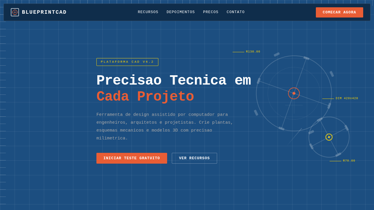
Industrial workbench landing, garage style, workshop aesthetic, metal textures, tools background, rugger design, hardware focus. Ideal for landing pages, modern websites. AI-ready template.
Use case: Landing pages, Modern websites
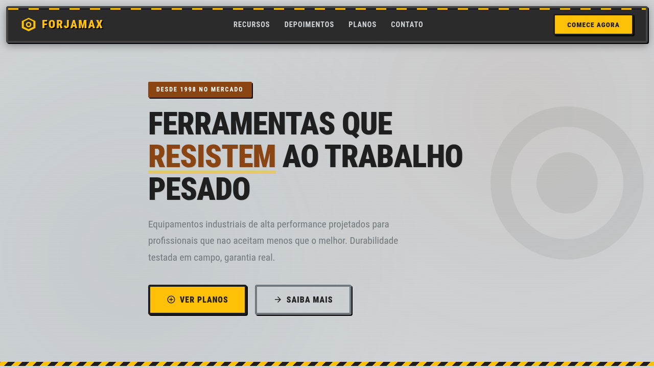
Historical Context
The workshop aesthetic didn't arrive in digital design by accident. It crawled in through the garage doors of the maker movement — circa 2005, when Instructables and Make Magazine convinced a generation that building things with your hands was punk rock again. Suddenly, brands wanted sawdust on their pixels. What's interesting is how workbench imagery functions semiotically. A schematic isn't just decoration. It signals process. It says: we prototype, we iterate, we get our hands dirty before shipping. That's powerful positioning in an era where most tech brands float in abstract gradient space. The industrial workbench is the antithesis of polish — it's raw capability made visible. Digitally, this lineage traces back further than maker culture. Think Dieter Rams' workshop documentation. Think Eames office process photography. The workbench as hero image communicates competence without arrogance. It's the visual equivalent of showing your work — and in design systems, showing your work builds trust faster than any testimonial ever could.
When to Use
Reach for this when your project needs to communicate hands-on expertise without the corporate veneer. Maker spaces, tool brands, industrial design portfolios, workshop platforms — anywhere the audience respects process over polish. It works beautifully for brands transitioning from pure-digital to physical-digital hybrid offerings. Skip it if your product is luxury or minimal. This aesthetic has weight, texture, and grit. It demands content that matches its energy.
Design Principles
- Raw materials first — expose the substrate. Steel, plywood, concrete textures ground the composition in physical reality.
- Schematic linework over photorealism. Technical drawings communicate precision and intentionality better than glossy renders ever will.
- Functional density — pack information like a real workbench. Negative space is earned, not defaulted to.
- Tool hierarchy mirrors UI hierarchy. Primary tools forward, secondary tools recede. The workbench teaches visual weight naturally.
- Patina over perfection. Wear marks, use scratches, oil stains — these aren't flaws, they're proof of capability. Let the interface age gracefully.
DESIGN.md
---
version: "alpha"
name: "Industrial Workbench Schematic"
description: "Industrial workbench landing, garage style, workshop aesthetic, metal textures, tools background, rugger design, hardware focus. Ideal for landing pages, modern websites. AI-ready template."
colors:
  primary: "#cfd3d6"
  secondary: "#1f1f1f"
  tertiary: "#ffc107"
  neutral: "#8B4513"
  surface: "#71797E"
  accent: "#2B2B2B"
typography:
  h1:
    fontFamily: Roboto Condensed
    fontSize: 2.5rem
    fontWeight: 700
  body-md:
    fontFamily: Roboto Condensed
    fontSize: 1rem
    fontWeight: 400
rounded:
  sm: 4px
  md: 8px
  lg: 12px
components:
  button-primary:
    backgroundColor: "{colors.primary}"
    textColor: "{colors.neutral}"
    rounded: "{rounded.sm}"
    padding: 12px
---

## Overview

Industrial workbench landing, garage style, workshop aesthetic, metal textures, tools background, rugger design, hardware focus. Ideal for landing pages, modern websites. AI-ready template. The workshop aesthetic didn't arrive in digital design by accident. It crawled in through the garage doors of the maker movement — circa 2005, when Instructables and Make Magazine convinced a generation that building things with your hands was punk rock again. Suddenly, brands wanted sawdust on their pixels.

What's interesting is how workbench imagery functions semiotically. A schematic isn't just decoration. It signals process. It says: we prototype, we iterate, we get our hands dirty before shipping. That's powerful positioning in an era where most tech brands float in abstract gradient space. The industrial workbench is the antithesis of polish — it's raw capability made visible.

Digitally, this lineage traces back further than maker culture. Think Dieter Rams' workshop documentation. Think Eames office process photography. The workbench as hero image communicates competence without arrogance. It's the visual equivalent of showing your work — and in design systems, showing your work builds trust faster than any testimonial ever could.

- Density: 5/10 — Balanced
- Variance: 8/10 — Expressive
- Motion: 4/10 — Subtle

- **Style:** Rugged, Industrial, Hardware
- **Keywords:** industrial, workbench, garage, metal, tools, grunge, workshop, hardware, reliable
- **Era:** Classic Industrial
- **Light/Dark:** ✓ Full / ✗ No

## Colors

- **Background** (#cfd3d6) — Primary background surface
- **Text** (#1f1f1f) — Primary text color
- **Accent** (#ffc107) — Primary accent, CTAs and interactive elements
- **Rust** (#8B4513) — Extended palette, decorative use
- **Steel** (#71797E) — Extended palette, decorative use
- **Rubber Black** (#2B2B2B) — Deep contrast surface
- **Caution Yellow** (#FFD700) — Warning states, attention indicators


## Typography

- **Display / Hero:** Roboto Condensed — Weight 700, tight tracking, used for headline impact
- **Body:** Roboto Condensed — Weight 400, 16px/1.6 line-height, max 72ch per line
- **UI Labels / Captions:** Roboto Condensed — 0.875rem, weight 500, slight letter-spacing
- **Monospace:** JetBrains Mono — Used for code, metadata, and technical values

Scale:
- Hero: clamp(2.5rem, 5vw, 4rem)
- H1: 2.25rem
- H2: 1.5rem
- Body: 1rem / 1.6
- Small: 0.875rem


## Layout

- **Grid:** CSS Grid primary. Max-width containment: 1280px centered with 1.5rem side padding.
- **Spacing rhythm:** Balanced. Base unit: 0.5rem (8px).
- **Section vertical gaps:** clamp(4rem, 8vw, 8rem).
- **Hero layout:** Asymmetric composition.
- **Feature sections:** Asymmetric grid with varied card sizes. No 3-equal-columns.
- **Mobile collapse:** All multi-column layouts collapse below 768px. No horizontal overflow.
- **z-index contract:** base (0) / sticky-nav (100) / overlay (200) / modal (300) / toast (500).


## Elevation & Depth

Brushed aluminum textures, scratches, metallic plaques, workshop tool borders, realistic soft drop shadows.

- **Physics:** Ease-out curves, 200-300ms duration. Smooth and predictable.
- **Entry animations:** Fade + translate-Y (16px → 0) over 420ms ease-out. Staggered cascades for lists: 80ms between items.
- **Hover states:** Subtle color shift + shadow adjustment over 200ms.
- **Page transitions:** Fade only (200ms).
- **Performance:** Only transform and opacity animated. No layout-triggering properties.


## Shapes

Base corner radius: 4px. See rounded tokens in front matter for the full scale.


## Components

- **Primary Button:** Rounded (4px) shape. Accent color fill. Hover: 8% darken + subtle lift shadow. Active: -1px translate tactile press. Font weight 600. No outer glows.
- **Secondary / Ghost Button:** Outline variant. 1.5px border in muted color. Text in primary color. Hover: subtle background fill.
- **Cards:** Rounded (4px) corners. Surface background. Subtle shadow (0 2px 12px rgba(0,0,0,0.06)). 1px border stroke.
- **Inputs:** Label above input. 1px border stroke. Focus ring: 2px accent color offset 2px. Error text below in semantic red. No floating labels.
- **Navigation:** Primary surface background. Active item: accent color indicator. Font weight 500 when active.
- **Skeletons:** Shimmer animation matching component dimensions. No circular spinners.
- **Empty States:** Icon-based composition with descriptive text and action button.


## Do's and Don'ts

- No emojis in UI — use icon system only (Lucide, Heroicons)
- No pure black (#000000) — use off-black or charcoal variants
- No oversaturated accent colors (saturation cap: 80%)
- No 3-column equal-width feature layouts — use zig-zag or asymmetric grid
- No `h-screen` — use `min-h-[100dvh]`
- No AI copywriting clichés: "Elevate", "Seamless", "Unleash", "Next-Gen"
- No broken external image links — use picsum.photos or inline SVG
- No generic lorem ipsum in demos

- Do Metallic/Concrete textures
- Do Warning stripes/colors
- Do Bold condensed typography
- Do Tool-like interactive elements
- Do Shadows simulating depth/screws


## Use Case

Landing pages, Modern websites
Technical Specs
CSS
background-color: #cfd3d6; color: #1f1f1f; font-family: 'Roboto Condensed', sans-serif; background-image: url('https://www.transparenttextures.com/patterns/brushed-alum.png'); border: 4px solid #444; border-radius: 4px;Variables
--metal-grey: #cfd3d6, --tool-black: #1f1f1f, --caution-yellow: #ffc107, --rust-accent: #8B4513, --shadow-hard: 2px 2px 0px #000
Checklist
☐ Metallic/Concrete textures, ☐ Warning stripes/colors, ☐ Bold condensed typography, ☐ Tool-like interactive elements, ☐ Shadows simulating depth/screws
Colors
Primary
Secondary
Effects
Brushed aluminum textures, scratches, metallic plaques, workshop tool borders, realistic soft drop shadows.
Light/Dark
✓ Full / ✗ No
AI Prompt
Act as a Senior Frontend Engineer and Expert UI Designer.
Your task is to code a complete Landing Page on the first attempt.
- Landing Page Theme: <INSERT THEME>
- Sections to add: <INSERT SECTIONS>

Generate the final code immediately following these definitions:

## Style

- **Name:** Industrial Workbench Schematic
- **Type:** Rugged, Industrial, Hardware
- **Keywords:** industrial, workbench, garage, metal, tools, grunge, workshop, hardware, reliable
- **Era:** Classic Industrial
- **Light/Dark:** ✓ Full / ✗ No

## Color Palette

- **Primary:** Background #cfd3d6, Text #1f1f1f, Accent #ffc107
- **Secondary:** Rust #8B4513, Steel #71797E, Rubber Black #2B2B2B, Caution Yellow #FFD700

## Visual Effects

Brushed aluminum textures, scratches, metallic plaques, workshop tool borders, realistic soft drop shadows.

## AI Visual Direction

industrial workbench landing, garage style, workshop aesthetic, metal textures, tools background, rugger design, hardware focus.

## CSS Technical

```css
background-color: #cfd3d6; color: #1f1f1f; font-family: 'Roboto Condensed', sans-serif; background-image: url('https://www.transparenttextures.com/patterns/brushed-alum.png'); border: 4px solid #444; border-radius: 4px;
```

## Design System Variables

```css
--metal-grey: #cfd3d6, --tool-black: #1f1f1f, --caution-yellow: #ffc107, --rust-accent: #8B4513, --shadow-hard: 2px 2px 0px #000
```

## Implementation Checklist

- ☐ Metallic/Concrete textures
- ☐ Warning stripes/colors
- ☐ Bold condensed typography
- ☐ Tool-like interactive elements
- ☐ Shadows simulating depth/screws

## Execution Rules

1. Strictly follow the defined visual style.
2. Use high-quality inline SVG icons (Heroicons or Lucide style) — NEVER use emojis as icons.
3. Add `cursor-pointer` and smooth `hover` states (transition-all) on all interactive elements.
4. Required Page Structure:
   - Navbar (Logo + Links + CTA)
   - Hero Section (Impactful Headline + Subtitle + 2 buttons + 3D/Abstract visual element via CSS)
   - Features (3 cards with icons)
   - Testimonials (3 cards)
   - Pricing (3 tiers, highlight the middle one)
   - Final CTA
   - Full Footer with social links, privacy policy, terms of use, contact and SEO links.
5. All text content must be in English.
6. The visual must be CLEARLY distinct — do not create a "default Bootstrap" design. Force the use of the provided design system variables.
7. Use `<style>` tags in the head for custom classes (especially for complex backdrop-filter effects and animations) that Tailwind CDN doesn't cover.
8. Full Responsiveness: Layout must adapt perfectly to Mobile, Tablet and Desktop (vertical stack on mobile).
9. Include basic SEO, Viewport and Open Graph meta tags in `<head>`.
10. Footer must contain: Copyright 2026, Secondary navigation links and Social media icons.
11. Make the creative decisions needed to deliver the complete, functional result now.Related
Last synced: 4/1/2026