Hero-Centric Design
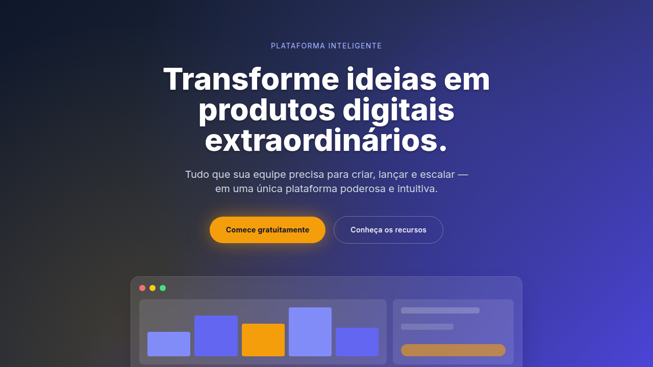
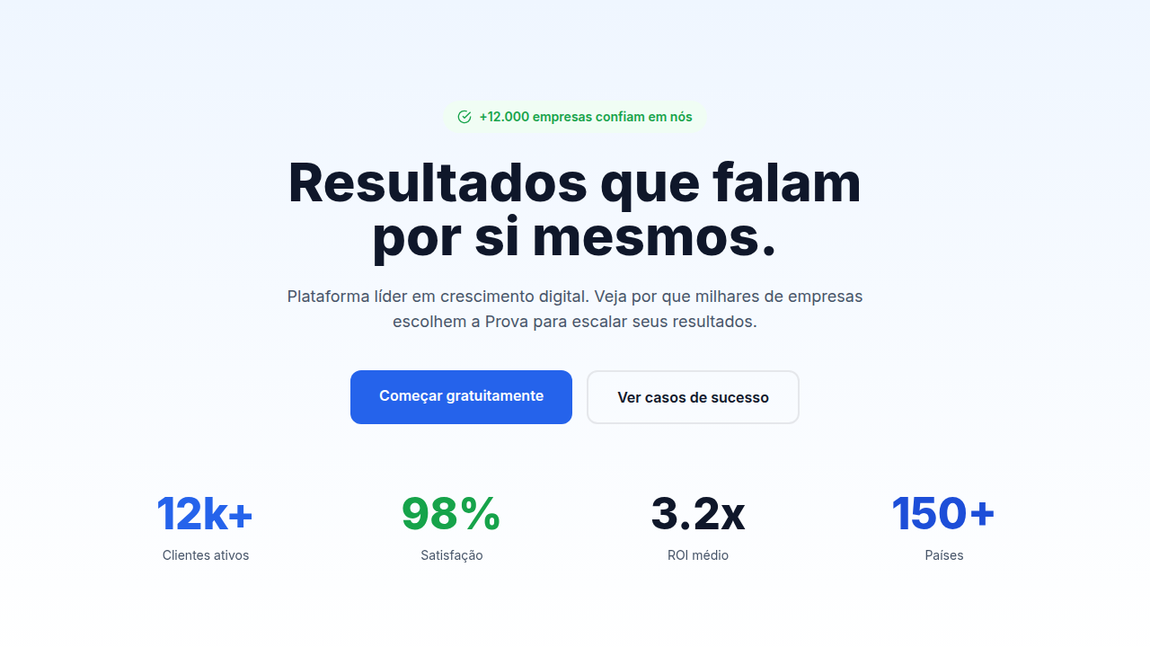
Hero-centric landing page. Ideal for marketing, conversão, lead gen. AI-ready template.
Use case: Marketing, Conversion, Lead gen
Historical Context
Remember image sliders? Those rotating carousels that every client demanded in 2010 because they couldn't pick one message? That era died slowly, painfully, replaced by the full-screen hero that said one thing and said it loud. The shift wasn't subtle. Somewhere around 2015, Apple started treating product pages like cinema — single frame, massive type, product floating in space. Everyone followed. By the 2020s, the hero section became the entire pitch compressed into a viewport. The 'above the fold' obsession never really left us — it just got dressed up in better typography. What changed is confidence. Instead of cramming five value props into 600 pixels, designers learned to trust a single statement backed by a clear action. One headline. One CTA. Maybe a product shot. That's it. But here's the tension nobody talks about enough: a 4MB hero video tanks your Core Web Vitals. The most impactful heroes are often the lightest — sharp type on a solid background loads instantly and hits harder than any stock footage ever could.
When to Use
Hero-centric works when you have one clear thing to say and the confidence to say it without hedging. Product launches, SaaS pages where the value prop is tight, agency sites selling taste. It converts when the headline does real work — not 'Welcome to our platform' but an actual reason to stay. Skip it when your product needs explanation before it needs drama. If users land confused and have to scroll past a viewport of vibes to find substance, you've traded conversion for aesthetics. Dashboard apps, documentation sites, marketplaces with browsing intent — these need content density up top, not theater.
Design Principles
- One headline, one job — if your hero needs a subtitle to make sense, the headline failed
- CTA contrast is non-negotiable — the button should be the highest-contrast element on screen, not competing with decorative elements
- Viewport height is a budget, not a target — 100vh heroes on mobile push all content into scroll oblivion; size to content, not to device
- Typography IS the design — when your hero is text-driven, the font choice, weight, and spacing carry the entire visual weight; treat type as imagery
- Speed over spectacle — a hero that loads in 200ms with system fonts beats a 3-second hero with a custom typeface every single time for conversion
DESIGN.md
---
version: "alpha"
name: "Hero-Centric Design"
description: "Hero-centric landing page. Ideal for marketing, conversão, lead gen. AI-ready template."
colors:
  primary: "#1A1A1A"
  secondary: "#4A4A4A"
  tertiary: "#0066FF"
  neutral: "#FFFFFF"
typography:
  h1:
    fontFamily: System UI stack
    fontSize: 2.25rem
    fontWeight: 700
  body-md:
    fontFamily: System UI stack
    fontSize: 1rem
    fontWeight: 400
  label-caps:
    fontFamily: System UI stack
    fontSize: 0.75rem
    fontWeight: 500
---

## Overview

Hero-centric landing page. Ideal for marketing, conversão, lead gen. AI-ready template. Remember image sliders? Those rotating carousels that every client demanded in 2010 because they couldn't pick one message? That era died slowly, painfully, replaced by the full-screen hero that said one thing and said it loud. The shift wasn't subtle. Somewhere around 2015, Apple started treating product pages like cinema — single frame, massive type, product floating in space. Everyone followed. By the 2020s, the hero section became the entire pitch compressed into a viewport.

The 'above the fold' obsession never really left us — it just got dressed up in better typography. What changed is confidence. Instead of cramming five value props into 600 pixels, designers learned to trust a single statement backed by a clear action. One headline. One CTA. Maybe a product shot. That's it.

But here's the tension nobody talks about enough: a 4MB hero video tanks your Core Web Vitals. The most impactful heroes are often the lightest — sharp type on a solid background loads instantly and hits harder than any stock footage ever could.

- Density: 5/10 — Balanced
- Variance: 4/10 — Moderate
- Motion: 8/10 — Cinematic

- **Style:** Landing Page
- **Keywords:** Large hero section, compelling headline, high-contrast CTA, product showcase, value proposition, hero image/video, dramatic visual
- **Era:** 2020s Modern
- **Light/Dark:** ✓ Full / ✓ Full

## Colors

- Palette derived from style keywords and era context


## Typography

- **Display / Hero:** System UI stack (-apple-system, sans-serif) — Weight 700, tight tracking, used for headline impact
- **Body:** System UI stack (-apple-system, sans-serif) — Weight 400, 16px/1.6 line-height, max 72ch per line
- **UI Labels / Captions:** System UI stack (-apple-system, sans-serif) — 0.875rem, weight 500, slight letter-spacing
- **Monospace:** JetBrains Mono — Used for code, metadata, and technical values

Scale:
- Hero: clamp(2.5rem, 5vw, 4rem)
- H1: 2.25rem
- H2: 1.5rem
- Body: 1rem / 1.6
- Small: 0.875rem


## Layout

- **Grid:** CSS Grid primary. Max-width containment: 1280px centered with 1.5rem side padding.
- **Spacing rhythm:** Balanced. Base unit: 0.5rem (8px).
- **Section vertical gaps:** clamp(4rem, 8vw, 8rem).
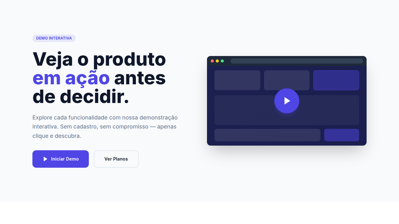
- **Hero layout:** Split-screen (text left, visual right).
- **Feature sections:** Zig-zag alternating text+image rows. No 3-equal-columns.
- **Mobile collapse:** All multi-column layouts collapse below 768px. No horizontal overflow.
- **z-index contract:** base (0) / sticky-nav (100) / overlay (200) / modal (300) / toast (500).


## Elevation & Depth

Smooth scroll reveal, fade-in animations on hero, subtle background parallax, CTA glow/pulse effect

- **Physics:** Spring — stiffness 120, damping 20. Confident, weighted transitions.
- **Entry animations:** Fade + translate-Y (16px → 0) over 540ms ease-out. Staggered cascades for lists: 120ms between items.
- **Hover states:** Scale(1.03) + shadow lift over 200ms.
- **Page transitions:** Fade + slide (300ms).
- **Performance:** Only transform and opacity animated. No layout-triggering properties.


## Shapes

Base corner radius: 8px. See rounded tokens in front matter for the full scale.


## Components

- **Primary Button:** Subtly rounded (0.5rem) shape. Accent color fill. Hover: 8% darken + subtle lift shadow. Active: -1px translate tactile press. Font weight 600. No outer glows.
- **Secondary / Ghost Button:** Outline variant. 1.5px border in muted color. Text in primary color. Hover: subtle background fill.
- **Cards:** Subtly rounded (0.5rem) corners. Surface background. Subtle shadow (0 2px 12px rgba(0,0,0,0.06)). 1px border stroke.
- **Inputs:** Label above input. 1px border stroke. Focus ring: 2px accent color offset 2px. Error text below in semantic red. No floating labels.
- **Navigation:** Primary surface background. Active item: accent color indicator. Font weight 500 when active.
- **Skeletons:** Shimmer animation matching component dimensions. No circular spinners.
- **Empty States:** Icon-based composition with descriptive text and action button.


## Do's and Don'ts

- No emojis in UI — use icon system only (Lucide, Heroicons)
- No pure black (#000000) — use off-black or charcoal variants
- No oversaturated accent colors (saturation cap: 80%)
- No 3-column equal-width feature layouts — use zig-zag or asymmetric grid
- No `h-screen` — use `min-h-[100dvh]`
- No AI copywriting clichés: "Elevate", "Seamless", "Unleash", "Next-Gen"
- No broken external image links — use picsum.photos or inline SVG
- No generic lorem ipsum in demos

- Do Hero section full viewport height
- Do Headline visible above fold
- Do CTA button high contrast
- Do Background image optimized (WebP)
- Do Text readable on background
- Do Mobile responsive layout


## Use Case

Marketing, Conversion, Lead gen
Technical Specs
CSS
min-height: 100vh, display: flex, align-items: center, background: linear-gradient or image, text-shadow for readability, max-width: 800px for text, button with hover scale (1.05)
Variables
--hero-min-height: 100vh, --headline-size: clamp(2rem, 5vw, 4rem), --cta-padding: 1rem 2rem, --overlay-opacity: 0.5, --text-shadow: 0 2px 4px rgba(0,0,0,0.3)
Checklist
☐ Hero section full viewport height, ☐ Headline visible above fold, ☐ CTA button high contrast, ☐ Background image optimized (WebP), ☐ Text readable on background, ☐ Mobile responsive layout
Colors
Effects
Smooth scroll reveal, fade-in animations on hero, subtle background parallax, CTA glow/pulse effect
Light/Dark
✓ Full / ✓ Full
AI Prompt
Act as a Senior Frontend Engineer and Expert UI Designer.
Your task is to code a complete Landing Page on the first attempt.
- Landing Page Theme: <INSERT THEME>
- Sections to add: <INSERT SECTIONS>

Generate the final code immediately following these definitions:

## Style

- **Name:** Hero-Centric Design
- **Type:** Landing Page
- **Keywords:** Large hero section, compelling headline, high-contrast CTA, product showcase, value proposition, hero image/video, dramatic visual
- **Era:** 2020s Modern
- **Light/Dark:** ✓ Full / ✓ Full

## Color Palette

- **Primary:** Brand primary color, white/light backgrounds for contrast, accent color for CTA
- **Secondary:** Supporting colors for secondary CTAs, accent highlights, trust elements (testimonials, logos)

## Visual Effects

Smooth scroll reveal, fade-in animations on hero, subtle background parallax, CTA glow/pulse effect

## AI Visual Direction

Design a hero-centric landing page. Use: full-width hero section, compelling headline (60-80 chars), high-contrast CTA button, product screenshot or video, value proposition above fold, gradient or image background, clear visual hierarchy.

## CSS Technical

```css
min-height: 100vh, display: flex, align-items: center, background: linear-gradient or image, text-shadow for readability, max-width: 800px for text, button with hover scale (1.05)
```

## Design System Variables

```css
--hero-min-height: 100vh, --headline-size: clamp(2rem, 5vw, 4rem), --cta-padding: 1rem 2rem, --overlay-opacity: 0.5, --text-shadow: 0 2px 4px rgba(0,0,0,0.3)
```

## Implementation Checklist

- ☐ Hero section full viewport height
- ☐ Headline visible above fold
- ☐ CTA button high contrast
- ☐ Background image optimized (WebP)
- ☐ Text readable on background
- ☐ Mobile responsive layout

## Execution Rules

1. Strictly follow the defined visual style.
2. Use high-quality inline SVG icons (Heroicons or Lucide style) — NEVER use emojis as icons.
3. Add `cursor-pointer` and smooth `hover` states (transition-all) on all interactive elements.
4. Required Page Structure:
   - Navbar (Logo + Links + CTA)
   - Hero Section (Impactful Headline + Subtitle + 2 buttons + 3D/Abstract visual element via CSS)
   - Features (3 cards with icons)
   - Testimonials (3 cards)
   - Pricing (3 tiers, highlight the middle one)
   - Final CTA
   - Full Footer with social links, privacy policy, terms of use, contact and SEO links.
5. All text content must be in English.
6. The visual must be CLEARLY distinct — do not create a "default Bootstrap" design. Force the use of the provided design system variables.
7. Use `<style>` tags in the head for custom classes (especially for complex backdrop-filter effects and animations) that Tailwind CDN doesn't cover.
8. Full Responsiveness: Layout must adapt perfectly to Mobile, Tablet and Desktop (vertical stack on mobile).
9. Include basic SEO, Viewport and Open Graph meta tags in `<head>`.
10. Footer must contain: Copyright 2026, Secondary navigation links and Social media icons.
11. Make the creative decisions needed to deliver the complete, functional result now.
Related
Last synced: 4/1/2026