Heat Map & Heatmap Style
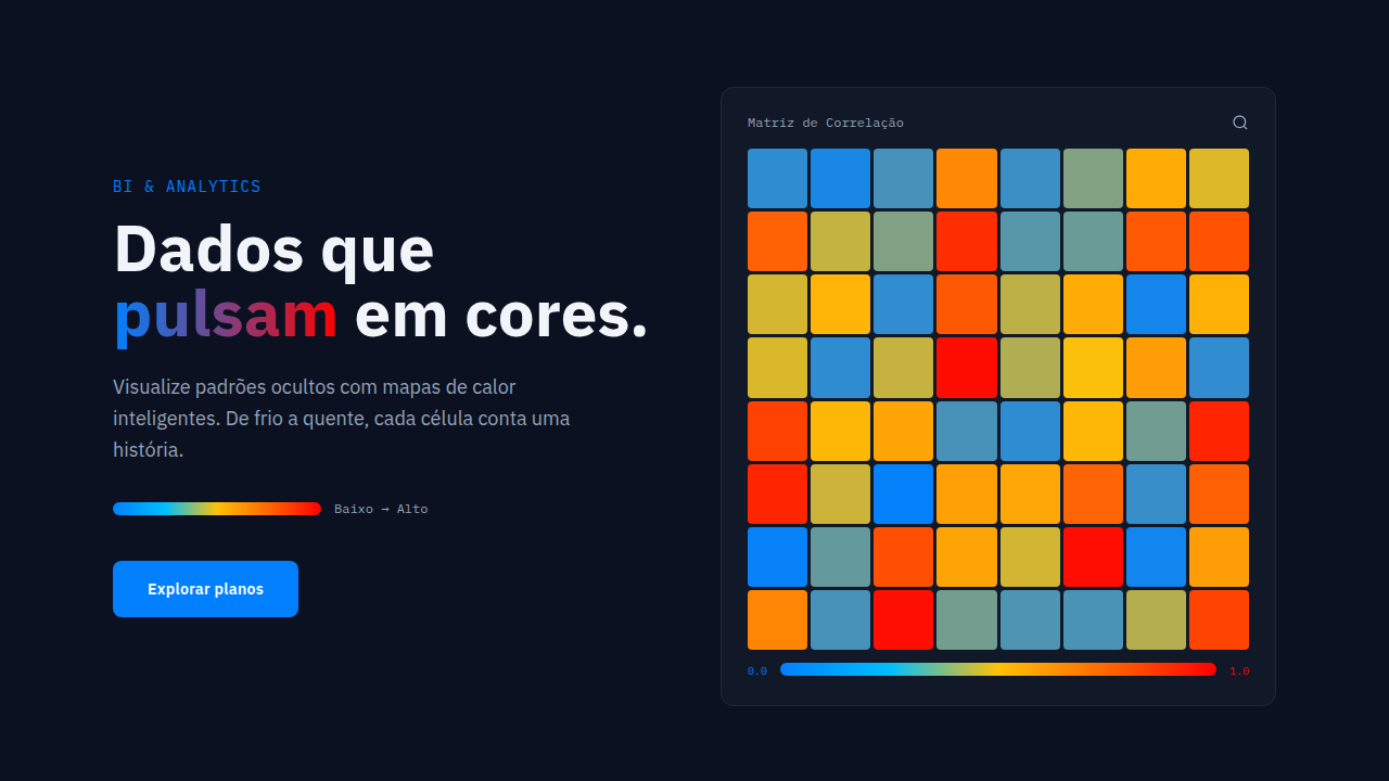
Heatmap visualization. Ideal for landing pages, modern websites. AI-ready template.
Use case: Landing pages, Modern websites
Historical Context
Heat maps predate digital interfaces by over a century. Tobler's choropleth work in the 1960s formalized what cartographers had been doing intuitively — encoding magnitude through color. The core idea is dead simple: darker means more. Lighter means less. Your brain processes it before you consciously read anything. That's the power. Then Hotjar happened. Around 2014-2015, click heatmaps exploded in UX research. Suddenly every product manager could see where users actually tapped versus where the team assumed they would. FullStory, Crazy Egg, Microsoft Clarity — they all rode the same wave. Heatmaps went from geographic tool to behavioral microscope overnight. The science underneath matters more than most designers realize. Sequential color scales (yellow-to-red, white-to-blue) work because human color perception is non-linear. We're terrible at comparing areas but excellent at reading gradients. Rainbow palettes look fun but distort data — they create false boundaries where none exist. Perceptually uniform scales like viridis exist for a reason. Use them.
When to Use
Reach for heatmaps when density and distribution matter more than individual data points. They shine in analytics dashboards showing user engagement patterns, server load across time, geographic concentration of events, or A/B test click distributions. Don't use them for small datasets — below ~50 data points, a simple table communicates better. They're also wrong for precise value comparison; if stakeholders need exact numbers, pair the heatmap with a tooltip or adjacent table. Best deployed when the question is 'where is the intensity?' not 'what is the value?'
Design Principles
- Use perceptually uniform color scales (viridis, magma, inferno) — never rainbow. Human vision creates false clusters in non-uniform gradients.
- Always include a legend with min/max values. A heatmap without scale context is decoration, not data visualization.
- Limit your matrix to what fits without scrolling. If users can't see the full pattern at once, the gestalt advantage disappears entirely.
- Provide progressive disclosure: overview first through color, then exact values on hover or focus. Two layers of information, one surface.
- Ensure accessibility beyond color alone — offer numeric overlays, pattern fills, or high-contrast mode. Roughly 8% of men have color vision deficiency.
DESIGN.md
---
version: "alpha"
name: "Heat Map & Heatmap Style"
description: "Heatmap visualization. Ideal for landing pages, modern websites. AI-ready template."
colors:
  primary: "#0080FF"
  secondary: "#FF0000"
typography:
  h1:
    fontFamily: System UI stack
    fontSize: 2.25rem
    fontWeight: 700
  body-md:
    fontFamily: System UI stack
    fontSize: 1rem
    fontWeight: 400
  label-caps:
    fontFamily: System UI stack
    fontSize: 0.75rem
    fontWeight: 500
components:
  button-primary:
    backgroundColor: "{colors.primary}"
    padding: 12px
---

## Overview

Heatmap visualization. Ideal for landing pages, modern websites. AI-ready template. Heat maps predate digital interfaces by over a century. Tobler's choropleth work in the 1960s formalized what cartographers had been doing intuitively — encoding magnitude through color. The core idea is dead simple: darker means more. Lighter means less. Your brain processes it before you consciously read anything. That's the power.

Then Hotjar happened. Around 2014-2015, click heatmaps exploded in UX research. Suddenly every product manager could see where users actually tapped versus where the team assumed they would. FullStory, Crazy Egg, Microsoft Clarity — they all rode the same wave. Heatmaps went from geographic tool to behavioral microscope overnight.

The science underneath matters more than most designers realize. Sequential color scales (yellow-to-red, white-to-blue) work because human color perception is non-linear. We're terrible at comparing areas but excellent at reading gradients. Rainbow palettes look fun but distort data — they create false boundaries where none exist. Perceptually uniform scales like viridis exist for a reason. Use them.

- Density: 8/10 — Dense
- Variance: 2/10 — Structured
- Motion: 6/10 — Expressive

- **Style:** BI/Analytics
- **Keywords:** Color-coded grid/matrix, data intensity visualization, geographical heat maps, correlation matrices, cell-based representation, gradient coloring
- **Era:** 2020s Modern
- **Light/Dark:** ✓ Full / ✓ Full (with adjustments)

## Colors

- **blue** (#0080FF) — Accent highlight, links and focus states
- **red** (#FF0000) — Error states, destructive actions


## Typography

- **Display / Hero:** System UI stack (-apple-system, sans-serif) — Weight 700, tight tracking, used for headline impact
- **Body:** System UI stack (-apple-system, sans-serif) — Weight 400, 16px/1.6 line-height, max 72ch per line
- **UI Labels / Captions:** System UI stack (-apple-system, sans-serif) — 0.875rem, weight 500, slight letter-spacing
- **Monospace:** JetBrains Mono — Used for code, metadata, and technical values

Scale:
- Hero: clamp(2.5rem, 5vw, 4rem)
- H1: 2.25rem
- H2: 1.5rem
- Body: 1rem / 1.6
- Small: 0.875rem


## Layout

- **Grid:** CSS Grid primary. Max-width containment: 1280px centered with 1.5rem side padding.
- **Spacing rhythm:** Balanced. Base unit: 0.5rem (8px).
- **Section vertical gaps:** clamp(4rem, 8vw, 8rem).
- **Hero layout:** Split-screen (text left, visual right).
- **Feature sections:** Zig-zag alternating text+image rows. No 3-equal-columns.
- **Mobile collapse:** All multi-column layouts collapse below 768px. No horizontal overflow.
- **z-index contract:** base (0) / sticky-nav (100) / overlay (200) / modal (300) / toast (500).


## Elevation & Depth

Color gradient transitions on data change, cell highlighting on hover, tooltip reveal on click, smooth color animation

- **Physics:** Spring — stiffness 120, damping 20. Confident, weighted transitions.
- **Entry animations:** Fade + translate-Y (16px → 0) over 480ms ease-out. Staggered cascades for lists: 100ms between items.
- **Hover states:** Scale(1.03) + shadow lift over 200ms.
- **Page transitions:** Fade + slide (300ms).
- **Performance:** Only transform and opacity animated. No layout-triggering properties.


## Shapes

Base corner radius: 24px. See rounded tokens in front matter for the full scale.


## Components

- **Primary Button:** Generously rounded (1.5rem) shape. Accent color fill. Hover: 8% darken + subtle lift shadow. Active: -1px translate tactile press. Font weight 600. No outer glows.
- **Secondary / Ghost Button:** Outline variant. 1.5px border in muted color. Text in primary color. Hover: subtle background fill.
- **Cards:** Generously rounded (1.5rem) corners. Surface background. Subtle shadow (0 2px 12px rgba(0,0,0,0.06)). 1px border stroke.
- **Inputs:** Label above input. 1px border stroke. Focus ring: 2px accent color offset 2px. Error text below in semantic red. No floating labels.
- **Navigation:** Primary surface background. Active item: accent color indicator. Font weight 500 when active.
- **Skeletons:** Shimmer animation matching component dimensions. No circular spinners.
- **Empty States:** Icon-based composition with descriptive text and action button.


## Do's and Don'ts

- No emojis in UI — use icon system only (Lucide, Heroicons)
- No pure black (#000000) — use off-black or charcoal variants
- No oversaturated accent colors (saturation cap: 80%)
- No 3-column equal-width feature layouts — use zig-zag or asymmetric grid
- No `h-screen` — use `min-h-[100dvh]`
- No AI copywriting clichés: "Elevate", "Seamless", "Unleash", "Next-Gen"
- No broken external image links — use picsum.photos or inline SVG
- No generic lorem ipsum in demos

- Do Color scale clear
- Do Legend visible
- Do Tooltips informative
- Do Colorblind alternatives
- Do Zoom/pan for geo
- Do Performance for large data


## Use Case

Landing pages, Modern websites
Technical Specs
CSS
display: grid, background: linear-gradient for legend, cell hover states, tooltip positioning, color scale (blue→white→red), SVG for geographic, canvas for large datasets
Variables
--heatmap-cool: #0080FF, --heatmap-neutral: #FFFFFF, --heatmap-hot: #FF0000, --cell-size: 24px, --legend-width: 200px, --tooltip-bg: rgba(0,0,0,0.9)
Checklist
☐ Color scale clear, ☐ Legend visible, ☐ Tooltips informative, ☐ Colorblind alternatives, ☐ Zoom/pan for geo, ☐ Performance for large data
Colors
Primary
Effects
Color gradient transitions on data change, cell highlighting on hover, tooltip reveal on click, smooth color animation
Light/Dark
✓ Full / ✓ Full (with adjustments)
AI Prompt
Act as a Senior Frontend Engineer and Expert UI Designer.
Your task is to code a complete Landing Page on the first attempt.
- Landing Page Theme: <INSERT THEME>
- Sections to add: <INSERT SECTIONS>

Generate the final code immediately following these definitions:

## Style

- **Name:** Heat Map & Heatmap Style
- **Type:** BI/Analytics
- **Keywords:** Color-coded grid/matrix, data intensity visualization, geographical heat maps, correlation matrices, cell-based representation, gradient coloring
- **Era:** 2020s Modern
- **Light/Dark:** ✓ Full / ✓ Full (with adjustments)

## Color Palette

- **Primary:** Gradient scale: Cool (blue #0080FF) to hot (red #FF0000), neutral middle (white/yellow)
- **Secondary:** Support gradients: Light (cool blue) to dark (warm red), divergent for positive/negative data, monochromatic options

## Visual Effects

Color gradient transitions on data change, cell highlighting on hover, tooltip reveal on click, smooth color animation

## AI Visual Direction

Design a heatmap visualization. Use: color gradient scale (cool to hot), cell-based grid, intensity legend, hover tooltips, geographic or matrix layout, divergent color scheme for +/- values, accessible color alternatives.

## CSS Technical

```css
display: grid, background: linear-gradient for legend, cell hover states, tooltip positioning, color scale (blue→white→red), SVG for geographic, canvas for large datasets
```

## Design System Variables

```css
--heatmap-cool: #0080FF, --heatmap-neutral: #FFFFFF, --heatmap-hot: #FF0000, --cell-size: 24px, --legend-width: 200px, --tooltip-bg: rgba(0,0,0,0.9)
```

## Implementation Checklist

- ☐ Color scale clear
- ☐ Legend visible
- ☐ Tooltips informative
- ☐ Colorblind alternatives
- ☐ Zoom/pan for geo
- ☐ Performance for large data

## Execution Rules

1. Strictly follow the defined visual style.
2. Use high-quality inline SVG icons (Heroicons or Lucide style) — NEVER use emojis as icons.
3. Add `cursor-pointer` and smooth `hover` states (transition-all) on all interactive elements.
4. Required Page Structure:
   - Navbar (Logo + Links + CTA)
   - Hero Section (Impactful Headline + Subtitle + 2 buttons + 3D/Abstract visual element via CSS)
   - Features (3 cards with icons)
   - Testimonials (3 cards)
   - Pricing (3 tiers, highlight the middle one)
   - Final CTA
   - Full Footer with social links, privacy policy, terms of use, contact and SEO links.
5. All text content must be in English.
6. The visual must be CLEARLY distinct — do not create a "default Bootstrap" design. Force the use of the provided design system variables.
7. Use `<style>` tags in the head for custom classes (especially for complex backdrop-filter effects and animations) that Tailwind CDN doesn't cover.
8. Full Responsiveness: Layout must adapt perfectly to Mobile, Tablet and Desktop (vertical stack on mobile).
9. Include basic SEO, Viewport and Open Graph meta tags in `<head>`.
10. Footer must contain: Copyright 2026, Secondary navigation links and Social media icons.
11. Make the creative decisions needed to deliver the complete, functional result now.
Related
Last synced: 4/1/2026