Figma Vibrant Monochrome
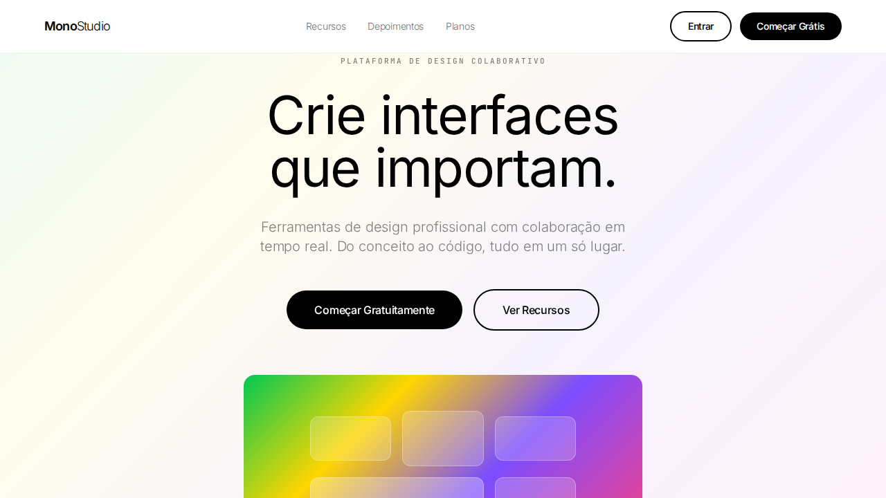
Figma-inspired landing page with strictly black-and-white interface chrome. Ideal for ferramentas de design, plataformas criativas, editores visuais, portfolios de design. AI-ready template.
Use case: Tools de design, Platforms creative, Editores visuais, Design portfolios
Historical Context
Before Figma showed up, design tools looked like design tools — meaning they looked boring. Sketch had its diamond icon on a yellow background, Adobe was stuck in its dark-UI-with-colored-splashes era, and InVision was doing that safe startup gradient thing everyone did in 2016. Figma broke the pattern by committing to something genuinely weird: electric, almost aggressive gradients floating on stark monochrome surfaces. The early brand (around 2016-2017) was restrained, but by the time Config became a thing, they'd fully embraced this tension between black/white structural clarity and these molten, almost liquid color moments. What made it stick wasn't just the palette — it was the confidence. The gradients weren't decorative; they were the entire personality layer. Everything structural (type, layout, UI chrome) stayed monochrome and Swiss-grid disciplined, while color existed only as energy, as punctuation. This created a visual language that said 'serious tool, creative soul' without ever feeling like it was trying too hard. The influence was immediate. Suddenly every dev tool, every collaborative platform, every startup with 'for teams' in its tagline was doing vibrant-on-monochrome. Linear, Raycast, Arc — they all owe something to Figma proving you could look both professional and alive. The gradient-as-brand-accent became the default aesthetic for an entire generation of tools.
When to Use
Reach for this when you're building something that needs to feel both technically credible and creatively energetic. It works best for design tools, developer platforms, and collaborative products where the audience expects craft but rejects corporate sterility. The monochrome foundation keeps information hierarchy clean — critical for complex UIs — while gradient accents create memorable brand moments without competing with user content. Avoid it if your product is content-heavy or editorial; the gradients will fight with imagery.
Design Principles
- Color is punctuation, not prose — use vibrant gradients only at intentional moments (CTAs, brand marks, state changes), never as background fills or ambient decoration
- Monochrome does the structural work — typography, layout, borders, and hierarchy live entirely in the black/white/gray system; color never carries informational weight
- Gradients must feel physical — avoid flat linear sweeps; use radial, conic, or mesh gradients that suggest depth, light refraction, or liquid movement
- Contrast is the entire trick — the vibrance only works because the surrounding context is restrained; if you add color elsewhere, you kill the effect
- Motion amplifies the palette — static gradients feel like decoration, but subtle animation (hue rotation, shimmer, parallax displacement) makes them feel like living brand elements
DESIGN.md
---
version: "alpha"
name: "Figma Vibrant Monochrome"
description: "Figma-inspired landing page with strictly black-and-white interface chrome. Ideal for ferramentas de design, plataformas criativas, editores visuais, portfolios de design. AI-ready template."
colors:
  primary: "#000000"
  secondary: "#ffffff"
typography:
  h1:
    fontFamily: System UI stack
    fontSize: 2.25rem
    fontWeight: 700
  body-md:
    fontFamily: System UI stack
    fontSize: 1rem
    fontWeight: 400
  label-caps:
    fontFamily: System UI stack
    fontSize: 0.75rem
    fontWeight: 500
rounded:
  sm: 50px
  md: 100px
  lg: 150px
components:
  button-primary:
    backgroundColor: "{colors.primary}"
    rounded: "{rounded.sm}"
    padding: 12px
---

## Overview

Figma-inspired landing page with strictly black-and-white interface chrome. Ideal for ferramentas de design, plataformas criativas, editores visuais, portfolios de design. AI-ready template. Before Figma showed up, design tools looked like design tools — meaning they looked boring. Sketch had its diamond icon on a yellow background, Adobe was stuck in its dark-UI-with-colored-splashes era, and InVision was doing that safe startup gradient thing everyone did in 2016. Figma broke the pattern by committing to something genuinely weird: electric, almost aggressive gradients floating on stark monochrome surfaces. The early brand (around 2016-2017) was restrained, but by the time Config became a thing, they'd fully embraced this tension between black/white structural clarity and these molten, almost liquid color moments.

What made it stick wasn't just the palette — it was the confidence. The gradients weren't decorative; they were the entire personality layer. Everything structural (type, layout, UI chrome) stayed monochrome and Swiss-grid disciplined, while color existed only as energy, as punctuation. This created a visual language that said 'serious tool, creative soul' without ever feeling like it was trying too hard.

The influence was immediate. Suddenly every dev tool, every collaborative platform, every startup with 'for teams' in its tagline was doing vibrant-on-monochrome. Linear, Raycast, Arc — they all owe something to Figma proving you could look both professional and alive. The gradient-as-brand-accent became the default aesthetic for an entire generation of tools.

- Density: 5/10 — Balanced
- Variance: 4/10 — Moderate
- Motion: 4/10 — Subtle

- **Style:** Monochrome Interface, Vibrant Gradients, Variable Font, Pill Geometry
- **Keywords:** figma, monochrome, vibrant gradients, variable font, pill buttons, dashed focus, kern, negative tracking, design tool aesthetic
- **Era:** 2024-2026 Design Tool Aesthetic
- **Light/Dark:** ✓ Full / ✗ Not Recommended

## Colors

- **Preto Puro** (#000000) — Dark surface, primary background
- **Branco Puro** (#ffffff) — Light surface, card backgrounds
- **Vidro Escuro** (rgba(0,0,0,0.08)) — Dark surface, primary background
- **Vidro Claro** (rgba(255,255,255,0.16)) — Supporting palette color


## Typography

- **Display / Hero:** System UI stack (-apple-system, sans-serif) — Weight 700, tight tracking, used for headline impact
- **Body:** System UI stack (-apple-system, sans-serif) — Weight 400, 16px/1.6 line-height, max 72ch per line
- **UI Labels / Captions:** System UI stack (-apple-system, sans-serif) — 0.875rem, weight 500, slight letter-spacing
- **Monospace:** JetBrains Mono — Used for code, metadata, and technical values

Scale:
- Hero: clamp(2.5rem, 5vw, 4rem)
- H1: 2.25rem
- H2: 1.5rem
- Body: 1rem / 1.6
- Small: 0.875rem


## Layout

- **Grid:** CSS Grid primary. Max-width containment: 1280px centered with 1.5rem side padding.
- **Spacing rhythm:** Balanced. Base unit: 0.5rem (8px).
- **Section vertical gaps:** clamp(4rem, 8vw, 8rem).
- **Hero layout:** Split-screen (text left, visual right).
- **Feature sections:** Zig-zag alternating text+image rows. No 3-equal-columns.
- **Mobile collapse:** All multi-column layouts collapse below 768px. No horizontal overflow.
- **z-index contract:** base (0) / sticky-nav (100) / overlay (200) / modal (300) / toast (500).


## Elevation & Depth

Interface estritamente preto-e-branco — cor existe apenas no conteúdo do produto. Hero com gradiente vibrante multi-cor (verde, amarelo, roxo, rosa). Botões pill (50px) e circulares (50%). Focus indicators com outline dashed 2px (referência ao editor Figma). Font variable com pesos incomuns (320, 330, 340, 450, 480, 540). Letter-spacing negativo em todo texto (-0.1px a -1.72px).

- **Physics:** Ease-out curves, 200-300ms duration. Smooth and predictable.
- **Entry animations:** Fade + translate-Y (16px → 0) over 420ms ease-out. Staggered cascades for lists: 80ms between items.
- **Hover states:** Subtle color shift + shadow adjustment over 200ms.
- **Page transitions:** Fade only (200ms).
- **Performance:** Only transform and opacity animated. No layout-triggering properties.


## Shapes

Base corner radius: 50px. See rounded tokens in front matter for the full scale.


## Components

- **Primary Button:** Pill-shaped (9999px) shape. Accent color fill. Hover: 8% darken + subtle lift shadow. Active: -1px translate tactile press. Font weight 600. No outer glows.
- **Secondary / Ghost Button:** Outline variant. 1.5px border in muted color. Text in primary color. Hover: subtle background fill.
- **Cards:** Pill-shaped (9999px) corners. Surface background. Subtle shadow (0 2px 12px rgba(0,0,0,0.06)). 1px border stroke.
- **Inputs:** Label above input. 1px border stroke. Focus ring: 2px accent color offset 2px. Error text below in semantic red. No floating labels.
- **Navigation:** Primary surface background. Active item: accent color indicator. Font weight 500 when active.
- **Skeletons:** Shimmer animation matching component dimensions. No circular spinners.
- **Empty States:** Icon-based composition with descriptive text and action button.


## Do's and Don'ts

- No emojis in UI — use icon system only (Lucide, Heroicons)
- No pure black (#000000) — use off-black or charcoal variants
- No oversaturated accent colors (saturation cap: 80%)
- No 3-column equal-width feature layouts — use zig-zag or asymmetric grid
- No `h-screen` — use `min-h-[100dvh]`
- No AI copywriting clichés: "Elevate", "Seamless", "Unleash", "Next-Gen"
- No broken external image links — use picsum.photos or inline SVG
- No generic lorem ipsum in demos

- Do Interface apenas preto e branco
- Do Hero gradiente vibrante multi-cor
- Do Font variable pesos 320-540
- Do Pill buttons 50px
- Do Focus dashed 2px
- Do Letter-spacing negativo
- Do Monospace labels uppercase
- Do Responsivo


## Use Case

Tools de design, Platforms creative, Editores visuais, Design portfolios
Technical Specs
CSS
color: #000000 or #ffffff only; background: #ffffff; hero-gradient: multi-color; border-radius: 50px pills, 50% circles; outline: dashed 2px; font-feature-settings: 'kern'; letter-spacing: -1.72px at 86px; font-weight: 320-540 variable
Variables
--text: #000000; --bg: #ffffff; --glass-dark: rgba(0,0,0,0.08); --glass-light: rgba(255,255,255,0.16); --radius-pill: 50px; --radius-circle: 50%; --focus: dashed 2px
Checklist
☐ Interface apenas preto e branco, ☐ Hero gradiente vibrante multi-cor, ☐ Font variable pesos 320-540, ☐ Pill buttons 50px, ☐ Focus dashed 2px, ☐ Letter-spacing negativo, ☐ Monospace labels uppercase, ☐ Responsivo
Colors
Primary
Effects
Interface estritamente preto-e-branco — cor existe apenas no conteúdo do produto. Hero com gradiente vibrante multi-cor (verde, amarelo, roxo, rosa). Botões pill (50px) e circulares (50%). Focus indicators com outline dashed 2px (referência ao editor Figma). Font variable com pesos incomuns (320, 330, 340, 450, 480, 540). Letter-spacing negativo em todo texto (-0.1px a -1.72px).
Light/Dark
✓ Full / ✗ Not Recommended
AI Prompt
Act as a Senior Frontend Engineer and Expert UI Designer.
Your task is to code a complete Landing Page on the first attempt.
- Landing Page Theme: <INSERT THEME>
- Sections to add: <INSERT SECTIONS>

Generate the final code immediately following these definitions:

## Style

- **Name:** Figma Vibrant Monochrome
- **Type:** Monochrome Interface, Vibrant Gradients, Variable Font, Pill Geometry
- **Keywords:** figma, monochrome, vibrant gradients, variable font, pill buttons, dashed focus, kern, negative tracking, design tool aesthetic
- **Era:** 2024-2026 Design Tool Aesthetic
- **Light/Dark:** ✓ Full / ✗ Not Recommended

## Color Palette

- **Primary:** Preto Puro #000000, Branco Puro #ffffff, Vidro Escuro rgba(0,0,0,0.08), Vidro Claro rgba(255,255,255,0.16)
- **Secondary:** Verde Elétrico, Amarelo Brilhante, Roxo Profundo, Rosa Quente (gradientes hero)

## Visual Effects

Interface estritamente preto-e-branco — cor existe apenas no conteúdo do produto. Hero com gradiente vibrante multi-cor (verde, amarelo, roxo, rosa). Botões pill (50px) e circulares (50%). Focus indicators com outline dashed 2px (referência ao editor Figma). Font variable com pesos incomuns (320, 330, 340, 450, 480, 540). Letter-spacing negativo em todo texto (-0.1px a -1.72px).

## AI Visual Direction

Design a Figma-inspired landing page with strictly black-and-white interface chrome. Hero section with vibrant multi-color gradient (green, yellow, purple, pink). Variable font with unusual weight stops (320-540). Pill buttons (50px radius) and circular icon buttons (50%). Dashed 2px focus outlines. Negative letter-spacing throughout (-0.1px to -1.72px). Display headline at 86px weight 400 line-height 1.0. Monospace labels uppercase with positive letter-spacing.

## CSS Technical

```css
color: #000000 or #ffffff only; background: #ffffff; hero-gradient: multi-color; border-radius: 50px pills, 50% circles; outline: dashed 2px; font-feature-settings: 'kern'; letter-spacing: -1.72px at 86px; font-weight: 320-540 variable
```

## Design System Variables

```css
--text: #000000; --bg: #ffffff; --glass-dark: rgba(0,0,0,0.08); --glass-light: rgba(255,255,255,0.16); --radius-pill: 50px; --radius-circle: 50%; --focus: dashed 2px
```

## Implementation Checklist

- ☐ Interface apenas preto e branco
- ☐ Hero gradiente vibrante multi-cor
- ☐ Font variable pesos 320-540
- ☐ Pill buttons 50px
- ☐ Focus dashed 2px
- ☐ Letter-spacing negativo
- ☐ Monospace labels uppercase
- ☐ Responsivo

## Execution Rules

1. Strictly follow the defined visual style.
2. Use high-quality inline SVG icons (Heroicons or Lucide style) — NEVER use emojis as icons.
3. Add `cursor-pointer` and smooth `hover` states (transition-all) on all interactive elements.
4. Required Page Structure:
   - Navbar (Logo + Links + CTA)
   - Hero Section (Impactful Headline + Subtitle + 2 buttons + 3D/Abstract visual element via CSS)
   - Features (3 cards with icons)
   - Testimonials (3 cards)
   - Pricing (3 tiers, highlight the middle one)
   - Final CTA
   - Full Footer with social links, privacy policy, terms of use, contact and SEO links.
5. All text content must be in English.
6. The visual must be CLEARLY distinct — do not create a "default Bootstrap" design. Force the use of the provided design system variables.
7. Use `<style>` tags in the head for custom classes (especially for complex backdrop-filter effects and animations) that Tailwind CDN doesn't cover.
8. Full Responsiveness: Layout must adapt perfectly to Mobile, Tablet and Desktop (vertical stack on mobile).
9. Include basic SEO, Viewport and Open Graph meta tags in `<head>`.
10. Footer must contain: Copyright 2026, Secondary navigation links and Social media icons.
11. Make the creative decisions needed to deliver the complete, functional result now.
Related
Last synced: 4/1/2026