Dark Portfolio Hero
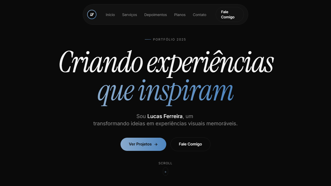
Dark portfolio with animated loading screen (2.7s): counter 000→100 via rAF, rotating words with AnimatePresence, gradient progress bar (#89AACC to #4E85BF) with glow. Ideal for portfólios de desenvolvedores, designers criativos, freelancers fullstack, sites pessoais premium. AI-ready template.
Use case: Developer portfolios, Designers criativos, Freelancers fullstack, Sites personal premium
Historical Context
The dark cinematic hero owes its DNA to two parallel lineages: demo scene culture and film title sequences. In the early 2000s, Flash portfolios weaponized loading screens — turning wait time into theater. Designers like Joshua Davis and 2Advanced Studios proved that the entrance *was* the portfolio. The loading bar became a stage curtain. When Flash died, that theatrical energy went dormant until GSAP and WebGL revived it around 2016. The second thread is Saul Bass through Kyle Cooper through Ash Thorp. Title sequences taught us that mood precedes content. A dark field with precise typography and choreographed motion tells the viewer: this person controls every pixel. The dark portfolio hero isn't decoration — it's a credibility signal. It says you understand timing, contrast, and restraint before anyone scrolls. Today these heroes dominate Awwwards and creative studio sites because they solve a real problem: establishing artistic authority in under three seconds. The darkness isn't aesthetic preference — it's functional. It kills distraction and forces the eye to follow motion.
When to Use
Deploy when the work speaks louder than words — illustration portfolios, motion reels, creative dev showcases. Ideal when your audience judges craft before content. Works beautifully as a loading-to-hero transition where the reveal *is* the first impression. Skip it for anything requiring immediate information density, e-commerce, or contexts where dark UI creates accessibility friction. Best paired with a single focal animation or typographic statement — never both competing.
Design Principles
- Darkness as negative space — black isn't a color choice, it's the removal of everything that isn't your focal point
- Choreographed reveals over instant loads — earn attention through sequenced motion, never dump everything on screen simultaneously
- Typography as architecture — one typeface at cinematic scale anchors the composition more than any illustration could
- GSAP as instrument, not crutch — every tween must have narrative purpose; if you can't explain why something moves, kill it
- Loading state as first act — treat the pre-content moment as designed space, not technical debt to apologize for
DESIGN.md
---
version: "alpha"
name: "Dark Portfolio Hero"
description: "Dark portfolio with animated loading screen (2.7s): counter 000→100 via rAF, rotating words with AnimatePresence, gradient progress bar (#89AACC to #4E85BF) with glow. Ideal for portfólios de desenvolvedores, designers criativos, freelancers fullstack, sites pessoais premium. AI-ready template."
colors:
  primary: "#0a0a0a"
  secondary: "#141414"
  tertiary: "#f5f5f5"
  neutral: "#888888"
  surface: "#f5f5f5"
  accent: "#1f1f1f"
typography:
  h1:
    fontFamily: Inter
    fontSize: 2.5rem
    fontWeight: 700
  body-md:
    fontFamily: Inter
    fontSize: 1rem
    fontWeight: 400
components:
  button-primary:
    backgroundColor: "{colors.primary}"
    textColor: "{colors.neutral}"
    padding: 12px
---

## Overview

Dark portfolio with animated loading screen (2.7s): counter 000→100 via rAF, rotating words with AnimatePresence, gradient progress bar (#89AACC to #4E85BF) with glow. Ideal for portfólios de desenvolvedores, designers criativos, freelancers fullstack, sites pessoais premium. AI-ready template. The dark cinematic hero owes its DNA to two parallel lineages: demo scene culture and film title sequences. In the early 2000s, Flash portfolios weaponized loading screens — turning wait time into theater. Designers like Joshua Davis and 2Advanced Studios proved that the entrance *was* the portfolio. The loading bar became a stage curtain. When Flash died, that theatrical energy went dormant until GSAP and WebGL revived it around 2016.

The second thread is Saul Bass through Kyle Cooper through Ash Thorp. Title sequences taught us that mood precedes content. A dark field with precise typography and choreographed motion tells the viewer: this person controls every pixel. The dark portfolio hero isn't decoration — it's a credibility signal. It says you understand timing, contrast, and restraint before anyone scrolls.

Today these heroes dominate Awwwards and creative studio sites because they solve a real problem: establishing artistic authority in under three seconds. The darkness isn't aesthetic preference — it's functional. It kills distraction and forces the eye to follow motion.

- Density: 5/10 — Balanced
- Variance: 4/10 — Moderate
- Motion: 8/10 — Cinematic

- **Style:** Portfolio, Loading Screen, GSAP Animations, HLS Video, Gradient Accent, Role Cycling
- **Keywords:** portfolio, loading screen, GSAP, HLS video, gradient accent azul, role cycling, Instrument Serif italic, Inter font, scroll indicator, counter animation, pill navbar
- **Era:** 2024-2026 Creative Portfolio Premium
- **Light/Dark:** ✗ Not Recommended / ✓ Full

## Colors

- **Preto Fundo** (#0a0a0a) — Primary background surface
- **Superfície** (#141414) — Secondary surface or text color
- **Texto** (#f5f5f5) — Primary text color
- **Muted** (#888888) — Secondary text, borders, muted elements
- **Acento** (#f5f5f5) — Extended palette, decorative use
- **Stroke** (#1f1f1f) — Extended palette, decorative use
- **Gradiente Azul from** (#89AACC) — Secondary accent
- **to** (#4E85BF) — Extended palette, decorative use
- **Glow** (rgba(137,170,204,0.35)) — Extended palette, decorative use


## Typography

- **Display / Hero:** Inter — Weight 700, tight tracking, used for headline impact
- **Accent:** Instrument Serif — Used for decorative or emphasis text
- **Body:** Inter — Weight 400, 16px/1.6 line-height, max 72ch per line
- **UI Labels / Captions:** Inter — 0.875rem, weight 500, slight letter-spacing
- **Monospace:** JetBrains Mono — Used for code, metadata, and technical values

Scale:
- Hero: clamp(2.5rem, 5vw, 4rem)
- H1: 2.25rem
- H2: 1.5rem
- Body: 1rem / 1.6
- Small: 0.875rem


## Layout

- **Grid:** CSS Grid primary. Max-width containment: 1280px centered with 1.5rem side padding.
- **Spacing rhythm:** Balanced. Base unit: 0.5rem (8px).
- **Section vertical gaps:** clamp(4rem, 8vw, 8rem).
- **Hero layout:** Split-screen (text left, visual right).
- **Feature sections:** Zig-zag alternating text+image rows. No 3-equal-columns.
- **Mobile collapse:** All multi-column layouts collapse below 768px. No horizontal overflow.
- **z-index contract:** base (0) / sticky-nav (100) / overlay (200) / modal (300) / toast (500).


## Elevation & Depth

VÍDEO: Stream HLS (~17s loop) com animação abstrata de fluido escuro. Ondas e gradientes orgânicos em tons de azul marinho profundo (#1a2a4a) e preto, com movimento suave e contínuo sem texto ou objetos. Aspect ratio ~2:1 (332x160px storyboard). Overlay preto 20% sutil e gradient fade inferior (h-48 from bg to transparent) fundem o vídeo no fundo #0a0a0a da página. Cria atmosfera contemplativa e premium para o portfólio. | EFEITOS CSS: Loading screen animado (2.7s): contador 000→100 via requestAnimationFrame, palavras rotativas (Design→Create→Inspire) com AnimatePresence, barra de progresso gradiente azul com glow, fade-out 0.6s. Hero com vídeo HLS de fundo (fluid/wave dark blue), overlay preto 20%, gradient fade inferior h-48. Pill navbar flutuante com logo gradiente azul ring 36x36px, links pill active state, botão Say hi com gradient border hover. Headline massiva Instrument Serif italic com GSAP entrance (y 50→0, 1.2s). Role cycling a cada 2s com fade-in. Scroll indicator com dot animado translateY loop 1.5s. Botões CTA com gradient border hover technique

- **Physics:** Spring — stiffness 120, damping 20. Confident, weighted transitions.
- **Entry animations:** Fade + translate-Y (16px → 0) over 540ms ease-out. Staggered cascades for lists: 120ms between items.
- **Hover states:** Scale(1.03) + shadow lift over 200ms.
- **Page transitions:** Fade + slide (300ms).
- **Performance:** Only transform and opacity animated. No layout-triggering properties.


## Shapes

Base corner radius: 9999px. See rounded tokens in front matter for the full scale.


## Components

- **Primary Button:** Pill-shaped (9999px) shape. Accent color fill. Hover: 8% darken + subtle lift shadow. Active: -1px translate tactile press. Font weight 600. No outer glows.
- **Secondary / Ghost Button:** Outline variant. 1.5px border in muted color. Text in primary color. Hover: subtle background fill.
- **Cards:** Pill-shaped (9999px) corners. Surface background. Subtle shadow (0 2px 12px rgba(0,0,0,0.06)). 1px border stroke.
- **Inputs:** Label above input. 1px border stroke. Focus ring: 2px accent color offset 2px. Error text below in semantic red. No floating labels.
- **Navigation:** Primary surface background. Active item: accent color indicator. Font weight 500 when active.
- **Skeletons:** Shimmer animation matching component dimensions. No circular spinners.
- **Empty States:** Icon-based composition with descriptive text and action button.


## Do's and Don'ts

- No emojis in UI — use icon system only (Lucide, Heroicons)
- No pure black (#000000) — use off-black or charcoal variants
- No oversaturated accent colors (saturation cap: 80%)
- No 3-column equal-width feature layouts — use zig-zag or asymmetric grid
- No `h-screen` — use `min-h-[100dvh]`
- No AI copywriting clichés: "Elevate", "Seamless", "Unleash", "Next-Gen"
- No broken external image links — use picsum.photos or inline SVG
- No generic lorem ipsum in demos

- Do Loading screen 2.7s contador + palavras rotativas
- Do Barra progresso gradiente azul glow
- Do Vídeo HLS fundo overlay 20%
- Do Gradient fade inferior h-48
- Do Pill navbar logo gradiente ring
- Do Headline Instrument Serif GSAP
- Do Role cycling 2s
- Do Scroll indicator dot animado
- Do Botões gradient border hover
- Do Responsivo


## Use Case

Developer portfolios, Designers criativos, Freelancers fullstack, Sites personal premium
Technical Specs
CSS
font-family: 'Inter' / 'Instrument Serif' italic, --bg: #0a0a0a, --surface: #141414, --text: #f5f5f5, --stroke: #1f1f1f, gradient: linear-gradient(90deg, #89AACC, #4E85BF), video: HLS with bg-black/20, GSAP: power3.out y 50→0 1.2s, animation: scroll-down 1.5s infinite, loading: 2.7s counter + words + progress
Variables
--bg: #0a0a0a, --surface: #141414, --text: #f5f5f5, --muted: #888888, --accent: #f5f5f5, --stroke: #1f1f1f, --gradient-accent: linear-gradient(90deg, #89AACC, #4E85BF), --glow: rgba(137,170,204,0.35), --font-body: 'Inter', --font-display: 'Instrument Serif', --loading-duration: 2.7s
Checklist
☐ Loading screen 2.7s contador + palavras rotativas, ☐ Barra progresso gradiente azul glow, ☐ Vídeo HLS fundo overlay 20%, ☐ Gradient fade inferior h-48, ☐ Pill navbar logo gradiente ring, ☐ Headline Instrument Serif GSAP, ☐ Role cycling 2s, ☐ Scroll indicator dot animado, ☐ Botões gradient border hover, ☐ Responsivo
Colors
Primary
Secondary
Effects
VÍDEO: Stream HLS (~17s loop) com animação abstrata de fluido escuro. Ondas e gradientes orgânicos em tons de azul marinho profundo (#1a2a4a) e preto, com movimento suave e contínuo sem texto ou objetos. Aspect ratio ~2:1 (332x160px storyboard). Overlay preto 20% sutil e gradient fade inferior (h-48 from bg to transparent) fundem o vídeo no fundo #0a0a0a da página. Cria atmosfera contemplativa e premium para o portfólio. | EFEITOS CSS: Loading screen animado (2.7s): contador 000→100 via requestAnimationFrame, palavras rotativas (Design→Create→Inspire) com AnimatePresence, barra de progresso gradiente azul com glow, fade-out 0.6s. Hero com vídeo HLS de fundo (fluid/wave dark blue), overlay preto 20%, gradient fade inferior h-48. Pill navbar flutuante com logo gradiente azul ring 36x36px, links pill active state, botão Say hi com gradient border hover. Headline massiva Instrument Serif italic com GSAP entrance (y 50→0, 1.2s). Role cycling a cada 2s com fade-in. Scroll indicator com dot animado translateY loop 1.5s. Botões CTA com gradient border hover technique
Light/Dark
✗ Not Recommended / ✓ Full
AI Prompt
Act as a Senior Frontend Engineer and Expert UI Designer.
Your task is to code a complete Landing Page on the first attempt.
- Landing Page Theme: <INSERT THEME>
- Sections to add: <INSERT SECTIONS>

Generate the final code immediately following these definitions:

## Style

- **Name:** Dark Portfolio Hero
- **Type:** Portfolio, Loading Screen, GSAP Animations, HLS Video, Gradient Accent, Role Cycling
- **Keywords:** portfolio, loading screen, GSAP, HLS video, gradient accent azul, role cycling, Instrument Serif italic, Inter font, scroll indicator, counter animation, pill navbar
- **Era:** 2024-2026 Creative Portfolio Premium
- **Light/Dark:** ✗ Not Recommended / ✓ Full

## Color Palette

- **Primary:** Preto Fundo #0a0a0a, Superfície #141414, Texto #f5f5f5, Muted #888888
- **Secondary:** Acento #f5f5f5, Stroke #1f1f1f, Gradiente Azul from #89AACC to #4E85BF, Glow rgba(137,170,204,0.35)

## Visual Effects

VÍDEO: Stream HLS (~17s loop) com animação abstrata de fluido escuro. Ondas e gradientes orgânicos em tons de azul marinho profundo (#1a2a4a) e preto, com movimento suave e contínuo sem texto ou objetos. Aspect ratio ~2:1 (332x160px storyboard). Overlay preto 20% sutil e gradient fade inferior (h-48 from bg to transparent) fundem o vídeo no fundo #0a0a0a da página. Cria atmosfera contemplativa e premium para o portfólio. | EFEITOS CSS: Loading screen animado (2.7s): contador 000→100 via requestAnimationFrame, palavras rotativas (Design→Create→Inspire) com AnimatePresence, barra de progresso gradiente azul com glow, fade-out 0.6s. Hero com vídeo HLS de fundo (fluid/wave dark blue), overlay preto 20%, gradient fade inferior h-48. Pill navbar flutuante com logo gradiente azul ring 36x36px, links pill active state, botão Say hi com gradient border hover. Headline massiva Instrument Serif italic com GSAP entrance (y 50→0, 1.2s). Role cycling a cada 2s com fade-in. Scroll indicator com dot animado translateY loop 1.5s. Botões CTA com gradient border hover technique

## AI Visual Direction

Design a dark portfolio with animated loading screen (2.7s): counter 000→100 via rAF, rotating words with AnimatePresence, gradient progress bar (#89AACC to #4E85BF) with glow. Hero with HLS video (dark fluid waves), 20% black overlay, bottom fade h-48. Floating pill navbar with gradient blue ring logo 36x36, pill links, gradient border hover. Massive headline Instrument Serif italic with GSAP y 50→0. Role cycling every 2s. Scroll indicator animated dot. CTA gradient border hover.

## CSS Technical

```css
font-family: 'Inter' / 'Instrument Serif' italic, --bg: #0a0a0a, --surface: #141414, --text: #f5f5f5, --stroke: #1f1f1f, gradient: linear-gradient(90deg, #89AACC, #4E85BF), video: HLS with bg-black/20, GSAP: power3.out y 50→0 1.2s, animation: scroll-down 1.5s infinite, loading: 2.7s counter + words + progress
```

## Design System Variables

```css
--bg: #0a0a0a, --surface: #141414, --text: #f5f5f5, --muted: #888888, --accent: #f5f5f5, --stroke: #1f1f1f, --gradient-accent: linear-gradient(90deg, #89AACC, #4E85BF), --glow: rgba(137,170,204,0.35), --font-body: 'Inter', --font-display: 'Instrument Serif', --loading-duration: 2.7s
```

## Implementation Checklist

- ☐ Loading screen 2.7s contador + palavras rotativas
- ☐ Barra progresso gradiente azul glow
- ☐ Vídeo HLS fundo overlay 20%
- ☐ Gradient fade inferior h-48
- ☐ Pill navbar logo gradiente ring
- ☐ Headline Instrument Serif GSAP
- ☐ Role cycling 2s
- ☐ Scroll indicator dot animado
- ☐ Botões gradient border hover
- ☐ Responsivo

## Execution Rules

1. Strictly follow the defined visual style.
2. Use high-quality inline SVG icons (Heroicons or Lucide style) — NEVER use emojis as icons.
3. Add `cursor-pointer` and smooth `hover` states (transition-all) on all interactive elements.
4. Required Page Structure:
   - Navbar (Logo + Links + CTA)
   - Hero Section (Impactful Headline + Subtitle + 2 buttons + 3D/Abstract visual element via CSS)
   - Features (3 cards with icons)
   - Testimonials (3 cards)
   - Pricing (3 tiers, highlight the middle one)
   - Final CTA
   - Full Footer with social links, privacy policy, terms of use, contact and SEO links.
5. All text content must be in English.
6. The visual must be CLEARLY distinct — do not create a "default Bootstrap" design. Force the use of the provided design system variables.
7. Use `<style>` tags in the head for custom classes (especially for complex backdrop-filter effects and animations) that Tailwind CDN doesn't cover.
8. Full Responsiveness: Layout must adapt perfectly to Mobile, Tablet and Desktop (vertical stack on mobile).
9. Include basic SEO, Viewport and Open Graph meta tags in `<head>`.
10. Footer must contain: Copyright 2026, Secondary navigation links and Social media icons.
11. Make the creative decisions needed to deliver the complete, functional result now.
Related
Last synced: 4/1/2026