Cyber Core
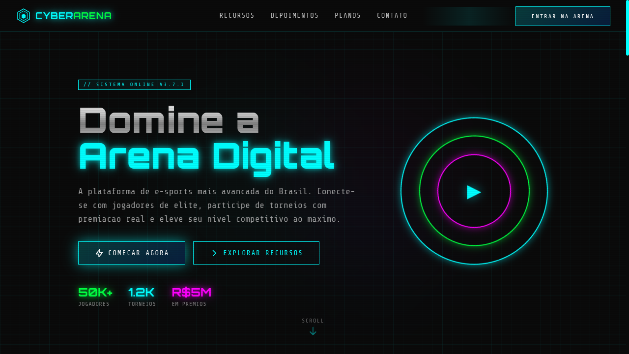
Cyber core landing page with neon-lit, high-speed digital aesthetics. Ideal for marcas de gaming, design de pôsteres, branding digital edgy, portfólios tech. AI-ready template.
Use case: Gaming brands, Poster design, Edgy digital branding, Tech portfolios
Historical Context
Cyber Core didn't emerge from design studios — it crawled out of late-90s hacker culture, IRC channels, and the visual language of early intrusion detection systems. The aesthetic owes everything to films like Hackers (1995) and The Matrix (1999), but its real DNA lives in the interfaces nobody was supposed to see: packet sniffers, hex editors, terminal emulators with phosphor burn. Neon on black wasn't a style choice — it was a constraint of CRT monitors running at 2AM. The revival we're seeing now is driven by cybersecurity's mainstream moment. Every breach headline, every ransomware attack, every CTF competition reinforces the visual vocabulary. Circuit board traces became ornamental. Matrix rain became shorthand for 'digital.' But the best Cyber Core work remembers that the original aesthetic was functional — high contrast for readability, monospace for alignment, color-coding for threat levels. The style works because it was never decorative to begin with.
When to Use
Deploy Cyber Core when your audience already lives in terminals and thinks in hexadecimal. Cybersecurity conferences, CTF platforms, ethical hacking tools, gaming tournaments with a tech-forward identity. It works for developer-facing products that want edge without sacrificing legibility. Avoid it for anything requiring warmth or approachability — this aesthetic deliberately alienates casual users. That's the point. If your product needs mass-market appeal, pick something else.
Design Principles
- Contrast is survival — neon accents exist against true black because readability in low-light environments isn't negotiable, it's the entire premise
- Monospace is structural — use it for data, grids, and alignment; proportional fonts enter only for hierarchy breaks, never as default
- Animation implies process — glitch effects, scan lines, and typing animations must suggest computation happening, not decoration sitting idle
- Circuit traces are connective tissue — use PCB-inspired line work to link related elements, creating visual pathways that mirror data flow
- Depth through glow, not shadow — light bleeds outward from elements like backlit displays; drop shadows belong to a different material reality entirely
DESIGN.md
---
version: "alpha"
name: "Cyber Core"
description: "Cyber core landing page with neon-lit, high-speed digital aesthetics. Ideal for marcas de gaming, design de pôsteres, branding digital edgy, portfólios tech. AI-ready template."
colors:
  primary: "#00FFFF"
  secondary: "#00FF41"
  tertiary: "#0A0A0A"
  neutral: "#C0C0C0"
  surface: "#FF00FF"
  accent: "#0066FF"
typography:
  h1:
    fontFamily: Share Tech Mono
    fontSize: 2.5rem
    fontWeight: 700
  body-md:
    fontFamily: Share Tech Mono
    fontSize: 1rem
    fontWeight: 400
rounded:
  sm: 2px
  md: 4px
  lg: 8px
spacing:
  sm: 1.5rem
  md: 3.0rem
  lg: 6.0rem
components:
  button-primary:
    backgroundColor: "{colors.primary}"
    textColor: "{colors.neutral}"
    rounded: "{rounded.sm}"
    padding: 12px
---

## Overview

Cyber core landing page with neon-lit, high-speed digital aesthetics. Ideal for marcas de gaming, design de pôsteres, branding digital edgy, portfólios tech. AI-ready template. Cyber Core didn't emerge from design studios — it crawled out of late-90s hacker culture, IRC channels, and the visual language of early intrusion detection systems. The aesthetic owes everything to films like Hackers (1995) and The Matrix (1999), but its real DNA lives in the interfaces nobody was supposed to see: packet sniffers, hex editors, terminal emulators with phosphor burn. Neon on black wasn't a style choice — it was a constraint of CRT monitors running at 2AM.

The revival we're seeing now is driven by cybersecurity's mainstream moment. Every breach headline, every ransomware attack, every CTF competition reinforces the visual vocabulary. Circuit board traces became ornamental. Matrix rain became shorthand for 'digital.' But the best Cyber Core work remembers that the original aesthetic was functional — high contrast for readability, monospace for alignment, color-coding for threat levels. The style works because it was never decorative to begin with.

- Density: 5/10 — Balanced
- Variance: 7/10 — Dynamic
- Motion: 6/10 — Expressive

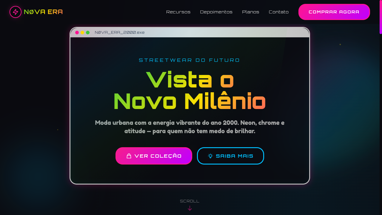
- **Style:** Neon-Lit, Circuit, Metallic, High-Speed Digital
- **Keywords:** Cyber core, neon, circuit board, metallic, heavy shadows, pop-up windows, OS-style, digital, gaming, edgy, high-speed
- **Era:** 2010s-2020s Digital Subculture
- **Light/Dark:** ◐ Partial / ✓ Full

## Colors

- **Neon Cyan** (#00FFFF) — Accent highlight, links and focus states
- **Matrix Green** (#00FF41) — Secondary surface or text color
- **Deep Black** (#0A0A0A) — Dark surface, primary background
- **Chrome Silver** (#C0C0C0) — Supporting palette color
- **Neon Pink** (#FF00FF) — Primary text color
- **Electric Blue** (#0066FF) — Secondary accent
- **Warning Red** (#FF3333) — Error states, destructive actions
- **Dark Grey** (#1A1A2E) — Deep contrast surface


## Typography

- **Display / Hero:** Share Tech Mono — Weight 700, tight tracking, used for headline impact
- **Body:** Share Tech Mono — Weight 400, 16px/1.6 line-height, max 72ch per line
- **UI Labels / Captions:** Share Tech Mono — 0.875rem, weight 500, slight letter-spacing
- **Monospace:** Share Tech Mono — Used for code, metadata, and technical values

Scale:
- Hero: clamp(2.5rem, 5vw, 4rem)
- H1: 2.25rem
- H2: 1.5rem
- Body: 1rem / 1.6
- Small: 0.875rem


## Layout

- **Grid:** CSS Grid primary. Max-width containment: 1280px centered with 1.5rem side padding.
- **Spacing rhythm:** Balanced. Base unit: 0.5rem (8px).
- **Section vertical gaps:** clamp(4rem, 8vw, 8rem).
- **Hero layout:** Asymmetric composition.
- **Feature sections:** Asymmetric grid with varied card sizes. No 3-equal-columns.
- **Mobile collapse:** All multi-column layouts collapse below 768px. No horizontal overflow.
- **z-index contract:** base (0) / sticky-nav (100) / overlay (200) / modal (300) / toast (500).


## Elevation & Depth

Neon glow borders (box-shadow: 0 0 15px), circuit board pattern backgrounds via CSS, metallic gradient text, OS-style window frame sections with title bars, scanline overlay, glitch animation on hover, heavy drop shadows

- **Physics:** Spring — stiffness 120, damping 20. Confident, weighted transitions.
- **Entry animations:** Fade + translate-Y (16px → 0) over 480ms ease-out. Staggered cascades for lists: 100ms between items.
- **Hover states:** Scale(1.03) + shadow lift over 200ms.
- **Page transitions:** Fade + slide (300ms).
- **Performance:** Only transform and opacity animated. No layout-triggering properties.


## Shapes

Base corner radius: 2px. See rounded tokens in front matter for the full scale.


## Components

- **Primary Button:** Generously rounded (1.5rem) shape. Accent color fill. Hover: 8% darken + subtle lift shadow. Active: -1px translate tactile press. Font weight 600. No outer glows.
- **Secondary / Ghost Button:** Outline variant. 1.5px border in muted color. Text in primary color. Hover: subtle background fill.
- **Cards:** Generously rounded (1.5rem) corners. Surface background. Subtle shadow (0 2px 12px rgba(0,0,0,0.06)). 1px border stroke.
- **Inputs:** Label above input. 1px border stroke. Focus ring: 2px accent color offset 2px. Error text below in semantic red. No floating labels.
- **Navigation:** Primary surface background. Active item: accent color indicator. Font weight 500 when active.
- **Skeletons:** Shimmer animation matching component dimensions. No circular spinners.
- **Empty States:** Icon-based composition with descriptive text and action button.


## Do's and Don'ts

- No emojis in UI — use icon system only (Lucide, Heroicons)
- No pure white (#FFFFFF) backgrounds — use off-white or dark surfaces
- No oversaturated accent colors (saturation cap: 80%)
- No 3-column equal-width feature layouts — use zig-zag or asymmetric grid
- No `h-screen` — use `min-h-[100dvh]`
- No AI copywriting clichés: "Elevate", "Seamless", "Unleash", "Next-Gen"
- No broken external image links — use picsum.photos or inline SVG
- No generic lorem ipsum in demos

- Do Neon glow borders and text
- Do Circuit board pattern backgrounds
- Do OS-style window frame sections
- Do Metallic gradient text effects
- Do Scanline overlay
- Do Glitch hover animations
- Do Monospace tech typography
- Do Dark base with neon accents
- Do Responsive with maintained digital edge


## Use Case

Gaming brands, Poster design, Edgy digital branding, Tech portfolios
Technical Specs
CSS
font-family: 'Share Tech Mono', monospace, background: #0A0A0A, color: #00FFFF, border: 1px solid #00FFFF, box-shadow: 0 0 15px rgba(0,255,255,0.5), text-shadow: 0 0 10px rgba(0,255,255,0.5), background-clip: text for metallic gradients, animation: glitch 0.3s on hover
Variables
--color-cyan: #00FFFF, --color-green: #00FF41, --color-black: #0A0A0A, --color-chrome: #C0C0C0, --font-mono: 'Share Tech Mono', --glow-cyan: rgba(0,255,255,0.5), --border: 1px solid #00FFFF, --spacing: 1.5rem, --border-radius: 2px
Checklist
☐ Neon glow borders and text, ☐ Circuit board pattern backgrounds, ☐ OS-style window frame sections, ☐ Metallic gradient text effects, ☐ Scanline overlay, ☐ Glitch hover animations, ☐ Monospace tech typography, ☐ Dark base with neon accents, ☐ Responsive with maintained digital edge
Colors
Primary
Secondary
Effects
Neon glow borders (box-shadow: 0 0 15px), circuit board pattern backgrounds via CSS, metallic gradient text, OS-style window frame sections with title bars, scanline overlay, glitch animation on hover, heavy drop shadows
Light/Dark
◐ Partial / ✓ Full
AI Prompt
Act as a Senior Frontend Engineer and Expert UI Designer.
Your task is to code a complete Landing Page on the first attempt.
- Landing Page Theme: <INSERT THEME>
- Sections to add: <INSERT SECTIONS>

Generate the final code immediately following these definitions:

## Style

- **Name:** Cyber Core
- **Type:** Neon-Lit, Circuit, Metallic, High-Speed Digital
- **Keywords:** Cyber core, neon, circuit board, metallic, heavy shadows, pop-up windows, OS-style, digital, gaming, edgy, high-speed
- **Era:** 2010s-2020s Digital Subculture
- **Light/Dark:** ◐ Partial / ✓ Full

## Color Palette

- **Primary:** Neon Cyan #00FFFF, Matrix Green #00FF41, Deep Black #0A0A0A, Chrome Silver #C0C0C0
- **Secondary:** Neon Pink #FF00FF, Electric Blue #0066FF, Warning Red #FF3333, Dark Grey #1A1A2E

## Visual Effects

Neon glow borders (box-shadow: 0 0 15px), circuit board pattern backgrounds via CSS, metallic gradient text, OS-style window frame sections with title bars, scanline overlay, glitch animation on hover, heavy drop shadows

## AI Visual Direction

Design a cyber core landing page with neon-lit, high-speed digital aesthetics. Use neon cyan, matrix green, deep black, chrome silver. Apply neon glow borders, circuit board CSS patterns, metallic gradient text, OS-style window frames with title bars, scanline overlays, glitch hover animations. Typography should be monospace or tech-style. Dark, edgy, gaming-inspired atmosphere.

## CSS Technical

```css
font-family: 'Share Tech Mono', monospace, background: #0A0A0A, color: #00FFFF, border: 1px solid #00FFFF, box-shadow: 0 0 15px rgba(0,255,255,0.5), text-shadow: 0 0 10px rgba(0,255,255,0.5), background-clip: text for metallic gradients, animation: glitch 0.3s on hover
```

## Design System Variables

```css
--color-cyan: #00FFFF, --color-green: #00FF41, --color-black: #0A0A0A, --color-chrome: #C0C0C0, --font-mono: 'Share Tech Mono', --glow-cyan: rgba(0,255,255,0.5), --border: 1px solid #00FFFF, --spacing: 1.5rem, --border-radius: 2px
```

## Implementation Checklist

- ☐ Neon glow borders and text
- ☐ Circuit board pattern backgrounds
- ☐ OS-style window frame sections
- ☐ Metallic gradient text effects
- ☐ Scanline overlay
- ☐ Glitch hover animations
- ☐ Monospace tech typography
- ☐ Dark base with neon accents
- ☐ Responsive with maintained digital edge

## Execution Rules

1. Strictly follow the defined visual style.
2. Use high-quality inline SVG icons (Heroicons or Lucide style) — NEVER use emojis as icons.
3. Add `cursor-pointer` and smooth `hover` states (transition-all) on all interactive elements.
4. Required Page Structure:
   - Navbar (Logo + Links + CTA)
   - Hero Section (Impactful Headline + Subtitle + 2 buttons + 3D/Abstract visual element via CSS)
   - Features (3 cards with icons)
   - Testimonials (3 cards)
   - Pricing (3 tiers, highlight the middle one)
   - Final CTA
   - Full Footer with social links, privacy policy, terms of use, contact and SEO links.
5. All text content must be in English.
6. The visual must be CLEARLY distinct — do not create a "default Bootstrap" design. Force the use of the provided design system variables.
7. Use `<style>` tags in the head for custom classes (especially for complex backdrop-filter effects and animations) that Tailwind CDN doesn't cover.
8. Full Responsiveness: Layout must adapt perfectly to Mobile, Tablet and Desktop (vertical stack on mobile).
9. Include basic SEO, Viewport and Open Graph meta tags in `<head>`.
10. Footer must contain: Copyright 2026, Secondary navigation links and Social media icons.
11. Make the creative decisions needed to deliver the complete, functional result now.
Related
Last synced: 4/1/2026