Culinária Afetiva Brasileira
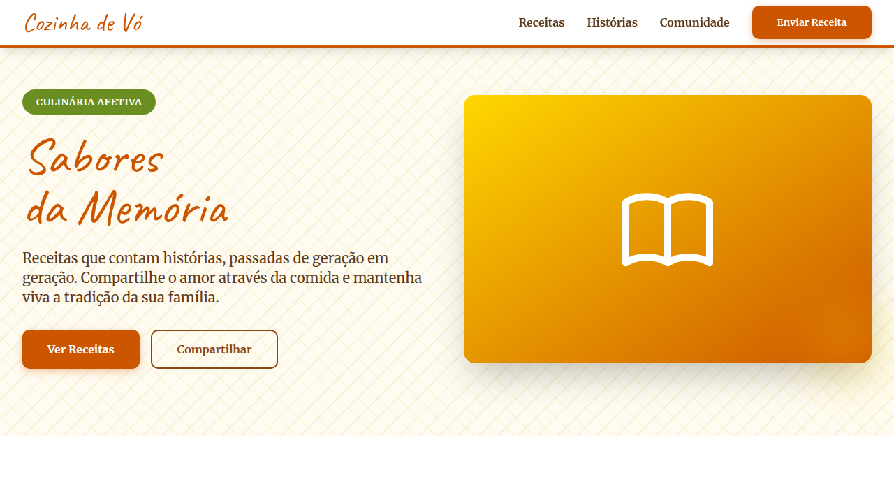
Warm and authentic landing page for a homemade and affective recipe sharing platform, inspired by Brazilian vernacular culture. Ideal for landing pages, saas. AI-ready template.
Use case: Landing pages, SaaS
Historical Context
Brazilian affective cuisine — comida afetiva — isn't a trend. It's a design philosophy rooted in memory. The visual language comes from kitchens with chipped enamel pots, handwritten recipe cards yellowed at the edges, and tables where mismatched chairs somehow belong together. This aesthetic emerged organically from family food blogs in the early 2010s, rejecting the sterile overhead shots of international food media in favor of something messier, warmer, more honest. The palette is unmistakable: turmeric yellows, terracotta, the deep brown of a well-seasoned panela de barro. Typography leans handwritten or serif — never geometric sans. Textures reference linen tablecloths, wood grain, ceramic glazes. Photography favors natural light, steam rising, hands in frame. It's deliberately imperfect because perfection feels cold, and cold is the opposite of what this food represents. What makes it powerful for digital platforms is the emotional shortcut. Users see these visual cues and immediately feel grandmother's kitchen. That's not nostalgia as decoration — it's trust architecture built from cultural memory.
When to Use
Deploy this system when your platform needs to feel like home. Recipe blogs targeting Brazilian diaspora communities. Family restaurant sites where the food predates the business. Cooking apps that prioritize story over efficiency. Food delivery platforms wanting to differentiate comfort food categories from everything else. Skip it for fine dining, molecular gastronomy, or anything positioning itself as modern-first. This language says 'come as you are' — if your brand says 'dress code required,' look elsewhere.
Design Principles
- Imperfection as intention — asymmetric layouts, hand-drawn elements, and organic shapes signal authenticity over production value
- Warmth through materiality — reference physical textures (ceramic, wood, linen, aged paper) in backgrounds, borders, and UI surfaces rather than flat digital minimalism
- Hands visible, process honored — photography and illustration should show making, not just the finished plate; the journey is the emotional hook
- Color from the kitchen — derive palettes from ingredients and cookware (açafrão gold, clay red, café brown, farinha cream) never from abstract color theory
- Typography that breathes — mix a warm serif or script for headings with a readable body face; generous line-height mirrors the unhurried pace of slow-cooked meals
DESIGN.md
---
version: "alpha"
name: "Culinária Afetiva Brasileira"
description: "Warm and authentic landing page for a homemade and affective recipe sharing platform, inspired by Brazilian vernacular culture. Ideal for landing pages, saas. AI-ready template."
colors:
  primary: "#FFD700"
  secondary: "#6B8E23"
  tertiary: "#ED7014"
  neutral: "#FFFFFF"
  surface: "#FF6347"
  accent: "#87CEEB"
typography:
  h1:
    fontFamily: Caveat
    fontSize: 2.5rem
    fontWeight: 700
  body-md:
    fontFamily: Caveat
    fontSize: 1rem
    fontWeight: 400
rounded:
  sm: 10px
  md: 20px
  lg: 30px
components:
  button-primary:
    backgroundColor: "{colors.primary}"
    textColor: "{colors.neutral}"
    rounded: "{rounded.sm}"
    padding: 12px
---

## Overview

Warm and authentic landing page for a homemade and affective recipe sharing platform, inspired by Brazilian vernacular culture. Ideal for landing pages, saas. AI-ready template. Brazilian affective cuisine — comida afetiva — isn't a trend. It's a design philosophy rooted in memory. The visual language comes from kitchens with chipped enamel pots, handwritten recipe cards yellowed at the edges, and tables where mismatched chairs somehow belong together. This aesthetic emerged organically from family food blogs in the early 2010s, rejecting the sterile overhead shots of international food media in favor of something messier, warmer, more honest.

The palette is unmistakable: turmeric yellows, terracotta, the deep brown of a well-seasoned panela de barro. Typography leans handwritten or serif — never geometric sans. Textures reference linen tablecloths, wood grain, ceramic glazes. Photography favors natural light, steam rising, hands in frame. It's deliberately imperfect because perfection feels cold, and cold is the opposite of what this food represents.

What makes it powerful for digital platforms is the emotional shortcut. Users see these visual cues and immediately feel grandmother's kitchen. That's not nostalgia as decoration — it's trust architecture built from cultural memory.

- Density: 5/10 — Balanced
- Variance: 4/10 — Moderate
- Motion: 8/10 — Cinematic

- **Style:** Warm, Authentic, Community, Cozy
- **Keywords:** homemade recipes, affective cuisine, Brazilian, warm, authentic, community, cozy, traditional, shared, friendly
- **Era:** 2026+ Sabores da Memória
- **Light/Dark:** ✓ Full / ✗ No

## Colors

- **Amarelo Milho** (#FFD700) — Warning states, attention indicators
- **Verde Erva** (#6B8E23) — Secondary surface or text color
- **Laranja Cenoura** (#ED7014) — Warm accent, call-to-action secondary
- **Branco** (#FFFFFF) — Light surface, card backgrounds
- **Vermelho Tomate** (#FF6347) — Error states, destructive actions
- **Azul Céu** (#87CEEB) — Secondary accent
- **Marrom Terra** (#8B4513) — Extended palette, decorative use
- **Cinza Claro** (#F0F0F0) — Secondary text, borders, muted elements


## Typography

- **Display / Hero:** Caveat — Weight 700, tight tracking, used for headline impact
- **Body:** Caveat — Weight 400, 16px/1.6 line-height, max 72ch per line
- **UI Labels / Captions:** Caveat — 0.875rem, weight 500, slight letter-spacing
- **Monospace:** JetBrains Mono — Used for code, metadata, and technical values

Scale:
- Hero: clamp(2.5rem, 5vw, 4rem)
- H1: 2.25rem
- H2: 1.5rem
- Body: 1rem / 1.6
- Small: 0.875rem


## Layout

- **Grid:** CSS Grid primary. Max-width containment: 1280px centered with 1.5rem side padding.
- **Spacing rhythm:** Balanced. Base unit: 0.5rem (8px).
- **Section vertical gaps:** clamp(4rem, 8vw, 8rem).
- **Hero layout:** Split-screen (text left, visual right).
- **Feature sections:** Zig-zag alternating text+image rows. No 3-equal-columns.
- **Mobile collapse:** All multi-column layouts collapse below 768px. No horizontal overflow.
- **z-index contract:** base (0) / sticky-nav (100) / overlay (200) / modal (300) / toast (500).


## Elevation & Depth

Texturas de toalha de mesa de chita e utensílios de cozinha antigos, tipografia que simula escrita manual e receitas de caderno, fotografias de pratos caseiros com foco no aconchego, micro-interações de hover com efeito de "vapor" ou "aroma" visual, transições de seção suaves e com efeito de "folhear" um livro de receitas.

- **Physics:** Spring — stiffness 120, damping 20. Confident, weighted transitions.
- **Entry animations:** Fade + translate-Y (16px → 0) over 540ms ease-out. Staggered cascades for lists: 120ms between items.
- **Hover states:** Scale(1.03) + shadow lift over 200ms.
- **Page transitions:** Fade + slide (300ms).
- **Performance:** Only transform and opacity animated. No layout-triggering properties.


## Shapes

Base corner radius: 10px. See rounded tokens in front matter for the full scale.


## Components

- **Primary Button:** Rounded (10px) shape. Accent color fill. Hover: 8% darken + subtle lift shadow. Active: -1px translate tactile press. Font weight 600. No outer glows.
- **Secondary / Ghost Button:** Outline variant. 1.5px border in muted color. Text in primary color. Hover: subtle background fill.
- **Cards:** Rounded (10px) corners. Surface background. Subtle shadow (0 2px 12px rgba(0,0,0,0.06)). 1px border stroke.
- **Inputs:** Label above input. 1px border stroke. Focus ring: 2px accent color offset 2px. Error text below in semantic red. No floating labels.
- **Navigation:** Primary surface background. Active item: accent color indicator. Font weight 500 when active.
- **Skeletons:** Shimmer animation matching component dimensions. No circular spinners.
- **Empty States:** Icon-based composition with descriptive text and action button.


## Do's and Don'ts

- No emojis in UI — use icon system only (Lucide, Heroicons)
- No pure black (#000000) — use off-black or charcoal variants
- No oversaturated accent colors (saturation cap: 80%)
- No 3-column equal-width feature layouts — use zig-zag or asymmetric grid
- No `h-screen` — use `min-h-[100dvh]`
- No AI copywriting clichés: "Elevate", "Seamless", "Unleash", "Next-Gen"
- No broken external image links — use picsum.photos or inline SVG
- No generic lorem ipsum in demos

- Do Paleta de cores brasileira verificada
- Do Autenticidade cultural brasileira verificada
- Do Atmosfera acolhedora e calorosa verificada
- Do Elementos de comunidade presentes
- Do Tipografia hierárquica clara
- Do Responsividade mobile verificada
- Do Contraste WCAG AA verificado
- Do Conteúdo em PT-BR verificado


## Use Case

Landing pages, SaaS
Technical Specs
CSS
background: #FFFFFF, color: #ED7014, border: 1px dashed #D2B48C, border-radius: 10px, font-family: "Caveat, cursive", transition: all 0.7s ease-in-out, .chita-texture-bg, .handwritten-recipe, .cookbook-flip-transition.
Variables
--corn-yellow: #FFD700, --herb-green: #6B8E23, --carrot-orange: #ED7014, --white-bg: #FFFFFF, --border-dashed-brown: 1px dashed #D2B48C, --font-handwritten: "Caveat, cursive", --chita-texture-bg: url("chita-texture.png"), --cookbook-flip-duration: 0.7s.Checklist
☐ Paleta de cores brasileira verificada, ☐ Autenticidade cultural brasileira verificada, ☐ Atmosfera acolhedora e calorosa verificada, ☐ Elementos de comunidade presentes, ☐ Tipografia hierárquica clara, ☐ Responsividade mobile verificada, ☐ Contraste WCAG AA verificado, ☐ Conteúdo em PT-BR verificado
Colors
Primary
Secondary
Effects
Texturas de toalha de mesa de chita e utensílios de cozinha antigos, tipografia que simula escrita manual e receitas de caderno, fotografias de pratos caseiros com foco no aconchego, micro-interações de hover com efeito de "vapor" ou "aroma" visual, transições de seção suaves e com efeito de "folhear" um livro de receitas.
Light/Dark
✓ Full / ✗ No
AI Prompt
Act as a Senior Frontend Engineer and Expert UI Designer.
Your task is to code a complete Landing Page on the first attempt.
- Landing Page Theme: <INSERT THEME>
- Sections to add: <INSERT SECTIONS>

Generate the final code immediately following these definitions:

## Style

- **Name:** Culinária Afetiva Brasileira
- **Type:** Warm, Authentic, Community, Cozy
- **Keywords:** homemade recipes, affective cuisine, Brazilian, warm, authentic, community, cozy, traditional, shared, friendly
- **Era:** 2026+ Sabores da Memória
- **Light/Dark:** ✓ Full / ✗ No

## Color Palette

- **Primary:** Amarelo Milho #FFD700, Verde Erva #6B8E23, Laranja Cenoura #ED7014, Branco #FFFFFF
- **Secondary:** Vermelho Tomate #FF6347, Azul Céu #87CEEB, Marrom Terra #8B4513, Cinza Claro #F0F0F0

## Visual Effects

Texturas de toalha de mesa de chita e utensílios de cozinha antigos, tipografia que simula escrita manual e receitas de caderno, fotografias de pratos caseiros com foco no aconchego, micro-interações de hover com efeito de "vapor" ou "aroma" visual, transições de seção suaves e com efeito de "folhear" um livro de receitas.

## AI Visual Direction

Design a warm and authentic landing page for a homemade and affective recipe sharing platform, inspired by Brazilian vernacular culture. Use: chita tablecloth and old kitchen utensil textures, handwritten/notebook recipe-style typography, photographs of homemade dishes focusing on coziness, visual "steam" or "aroma" hover micro-interactions, smooth "flipping through a cookbook" section transitions, corn yellow and herb green accents, community and friendly feel.

## CSS Technical

```css
background: #FFFFFF, color: #ED7014, border: 1px dashed #D2B48C, border-radius: 10px, font-family: "Caveat, cursive", transition: all 0.7s ease-in-out, .chita-texture-bg, .handwritten-recipe, .cookbook-flip-transition.
```

## Design System Variables

```css
--corn-yellow: #FFD700, --herb-green: #6B8E23, --carrot-orange: #ED7014, --white-bg: #FFFFFF, --border-dashed-brown: 1px dashed #D2B48C, --font-handwritten: "Caveat, cursive", --chita-texture-bg: url("chita-texture.png"), --cookbook-flip-duration: 0.7s.
```

## Implementation Checklist

- ☐ Paleta de cores brasileira verificada
- ☐ Autenticidade cultural brasileira verificada
- ☐ Atmosfera acolhedora e calorosa verificada
- ☐ Elementos de comunidade presentes
- ☐ Tipografia hierárquica clara
- ☐ Responsividade mobile verificada
- ☐ Contraste WCAG AA verificado
- ☐ Conteúdo em PT-BR verificado

## Execution Rules

1. Strictly follow the defined visual style.
2. Use high-quality inline SVG icons (Heroicons or Lucide style) — NEVER use emojis as icons.
3. Add `cursor-pointer` and smooth `hover` states (transition-all) on all interactive elements.
4. Required Page Structure:
   - Navbar (Logo + Links + CTA)
   - Hero Section (Impactful Headline + Subtitle + 2 buttons + 3D/Abstract visual element via CSS)
   - Features (3 cards with icons)
   - Testimonials (3 cards)
   - Pricing (3 tiers, highlight the middle one)
   - Final CTA
   - Full Footer with social links, privacy policy, terms of use, contact and SEO links.
5. All text content must be in English.
6. The visual must be CLEARLY distinct — do not create a "default Bootstrap" design. Force the use of the provided design system variables.
7. Use `<style>` tags in the head for custom classes (especially for complex backdrop-filter effects and animations) that Tailwind CDN doesn't cover.
8. Full Responsiveness: Layout must adapt perfectly to Mobile, Tablet and Desktop (vertical stack on mobile).
9. Include basic SEO, Viewport and Open Graph meta tags in `<head>`.
10. Footer must contain: Copyright 2026, Secondary navigation links and Social media icons.
11. Make the creative decisions needed to deliver the complete, functional result now.Related
Last synced: 4/1/2026