Conforto Artesanal Brasileiro
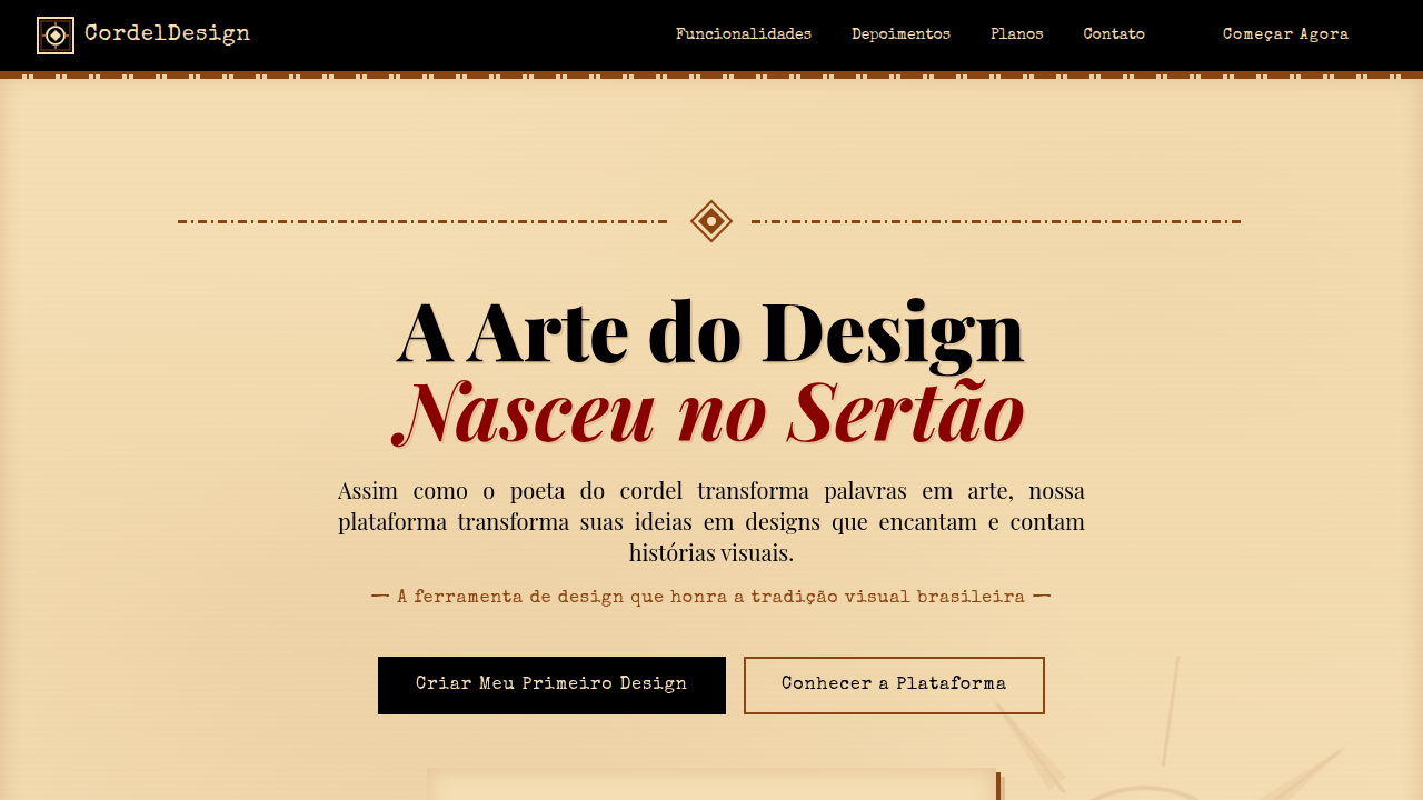
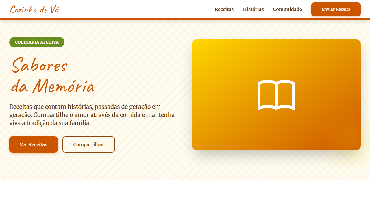
Warm and authentic landing page for an online store of handmade Brazilian furniture, inspired by Sérgio Rodrigues and Irmãos Campana. Ideal for landing pages, saas. AI-ready template.
Use case: Landing pages, SaaS
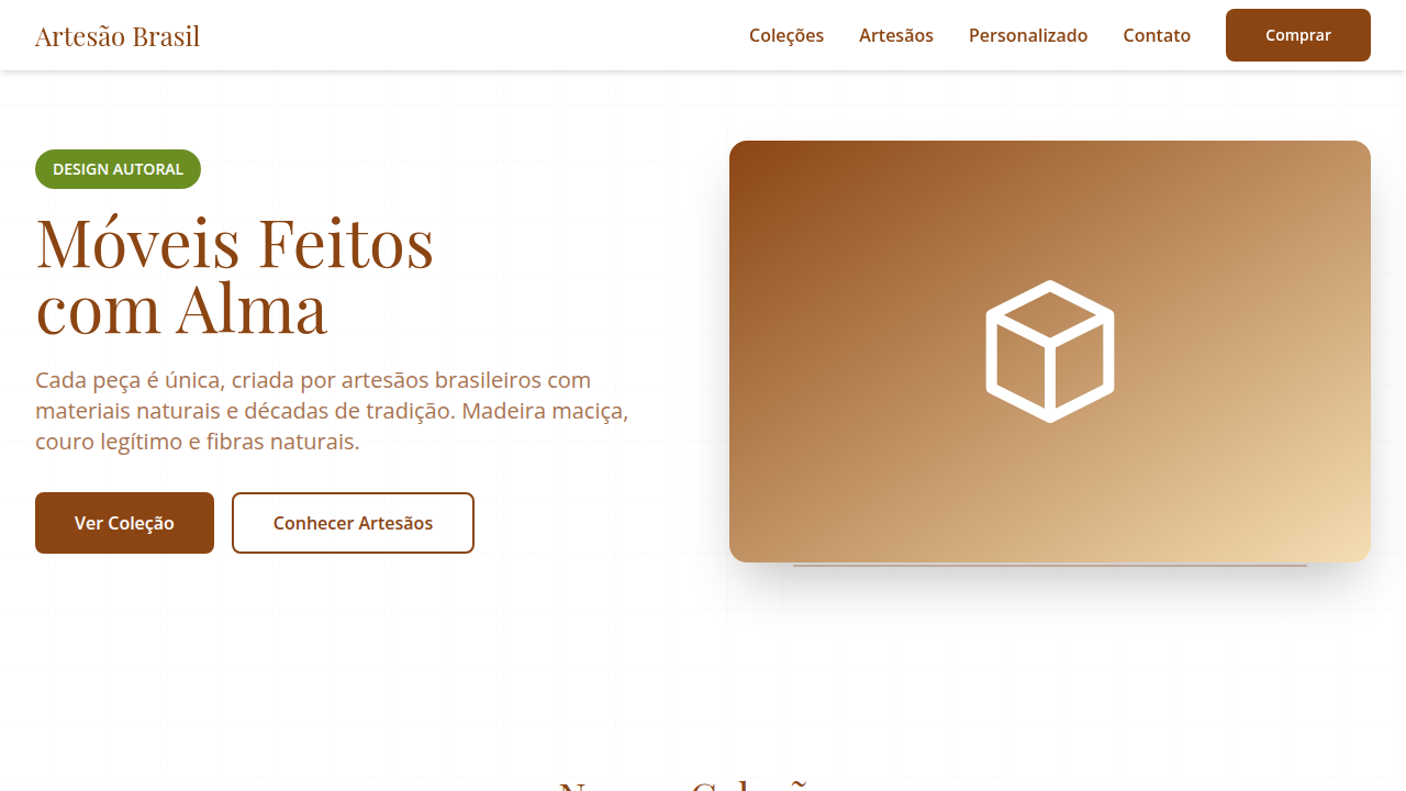
Historical Context
Brazilian furniture design never asked permission. Sergio Rodrigues built the Mole chair in 1957 — leather slung over jacaranda like a hammock that decided to stay indoors — and suddenly the world noticed that comfort could carry intellectual weight. His work proved that tropical informality wasn't the absence of rigor. It was a different kind of rigor entirely. Then the Campana Brothers arrived and broke the remaining rules. Favela chairs from scrap wood. Vermelha seats woven from hundreds of meters of rope. They treated craft as provocation, not nostalgia. The hand wasn't precious — it was urgent. This lineage matters for digital brand presence because it establishes a specific tension: warmth without softness, craft without preciousness, comfort without laziness. When a furniture brand carries this DNA into screens, the design system must hold that same contradiction. Generous whitespace that still feels intentional. Textures that reference the hand without cosplaying rusticity. Typography that breathes like wood grain — organic rhythm, structural confidence.
When to Use
Reach for this when the brand lives in the body as much as the eye. Furniture companies, interior design studios, Brazilian craftsmanship labels, home decor brands that sell touch and weight through pixels. Works when the product story involves material honesty — real wood, real leather, real hands. Also fits editorial platforms covering design culture where the visual language needs to feel inhabited rather than curated. Skip it for minimalist tech or anything that fears warmth.
Design Principles
- Material honesty — let textures reference physical craft without faking analog artifacts. Show the grain, not a filter.
- Generous negative space that reads as confidence, not emptiness. The pause between elements should feel like a deep seat cushion — intentional support.
- Warm neutrals anchored by one saturated accent pulled from natural dyes: indigo, terracotta, raw sienna. Never cool gray as a foundation.
- Typography pairings that contrast organic serifs with clean geometric sans — mirroring the tension between handcraft and modern production.
- Interaction rhythms that favor ease over speed. Transitions should settle like weight into upholstery — smooth deceleration, no hard stops.
DESIGN.md
---
version: "alpha"
name: "Conforto Artesanal Brasileiro"
description: "Warm and authentic landing page for an online store of handmade Brazilian furniture, inspired by Sérgio Rodrigues and Irmãos Campana. Ideal for landing pages, saas. AI-ready template."
colors:
  primary: "#8B4513"
  secondary: "#F5DEB3"
  tertiary: "#6B8E23"
  neutral: "#FFFFFF"
  surface: "#CC5500"
  accent: "#001F3F"
typography:
  h1:
    fontFamily: Playfair Display
    fontSize: 2.25rem
    fontWeight: 700
  body-md:
    fontFamily: Playfair Display
    fontSize: 1rem
    fontWeight: 400
  label-caps:
    fontFamily: Playfair Display
    fontSize: 0.75rem
    fontWeight: 500
rounded:
  sm: 8px
  md: 16px
  lg: 24px
components:
  button-primary:
    backgroundColor: "{colors.primary}"
    textColor: "{colors.neutral}"
    rounded: "{rounded.sm}"
    padding: 12px
---

## Overview

Warm and authentic landing page for an online store of handmade Brazilian furniture, inspired by Sérgio Rodrigues and Irmãos Campana. Ideal for landing pages, saas. AI-ready template. Brazilian furniture design never asked permission. Sergio Rodrigues built the Mole chair in 1957 — leather slung over jacaranda like a hammock that decided to stay indoors — and suddenly the world noticed that comfort could carry intellectual weight. His work proved that tropical informality wasn't the absence of rigor. It was a different kind of rigor entirely.

Then the Campana Brothers arrived and broke the remaining rules. Favela chairs from scrap wood. Vermelha seats woven from hundreds of meters of rope. They treated craft as provocation, not nostalgia. The hand wasn't precious — it was urgent.

This lineage matters for digital brand presence because it establishes a specific tension: warmth without softness, craft without preciousness, comfort without laziness. When a furniture brand carries this DNA into screens, the design system must hold that same contradiction. Generous whitespace that still feels intentional. Textures that reference the hand without cosplaying rusticity. Typography that breathes like wood grain — organic rhythm, structural confidence.

- Density: 5/10 — Balanced
- Variance: 4/10 — Moderate
- Motion: 4/10 — Subtle

- **Style:** Warm, Authentic, Crafted, Comfortable
- **Keywords:** handmade furniture, Brazilian design, comfort, authentic, crafted, natural materials, robust, unique, cozy, inviting
- **Era:** 2026+ Design Afetivo
- **Light/Dark:** ✓ Full / ✗ No

## Colors

- **Marrom Madeira** (#8B4513) — Primary surface or dominant color
- **Bege Palha** (#F5DEB3) — Secondary surface or text color
- **Verde Oliva** (#6B8E23) — Supporting palette color
- **Branco** (#FFFFFF) — Light surface, card backgrounds
- **Laranja Queimado** (#CC5500) — Warm accent, call-to-action secondary
- **Azul Profundo** (#001F3F) — Primary background surface
- **Cinza Concreto** (#A9A9A9) — Secondary text, borders, muted elements
- **Preto** (#000000) — Deep contrast surface


## Typography

- **Display / Hero:** Playfair Display — Weight 700, tight tracking, used for headline impact
- **Body:** Playfair Display — Weight 400, 16px/1.6 line-height, max 72ch per line
- **UI Labels / Captions:** Playfair Display — 0.875rem, weight 500, slight letter-spacing
- **Monospace:** JetBrains Mono — Used for code, metadata, and technical values

Scale:
- Hero: clamp(2.5rem, 5vw, 4rem)
- H1: 2.25rem
- H2: 1.5rem
- Body: 1rem / 1.6
- Small: 0.875rem


## Layout

- **Grid:** CSS Grid primary. Max-width containment: 1280px centered with 1.5rem side padding.
- **Spacing rhythm:** Balanced. Base unit: 0.5rem (8px).
- **Section vertical gaps:** clamp(4rem, 8vw, 8rem).
- **Hero layout:** Split-screen (text left, visual right).
- **Feature sections:** Zig-zag alternating text+image rows. No 3-equal-columns.
- **Mobile collapse:** All multi-column layouts collapse below 768px. No horizontal overflow.
- **z-index contract:** base (0) / sticky-nav (100) / overlay (200) / modal (300) / toast (500).


## Elevation & Depth

Texturas de madeira, couro e palha em elementos de UI, tipografia serifada robusta e sans-serif orgânica, fotografias de móveis em ambientes aconchegantes, micro-interações de hover com destaque de textura ou detalhe do material, transições de seção suaves e com efeito de "montagem" de peças.

- **Physics:** Ease-out curves, 200-300ms duration. Smooth and predictable.
- **Entry animations:** Fade + translate-Y (16px → 0) over 420ms ease-out. Staggered cascades for lists: 80ms between items.
- **Hover states:** Subtle color shift + shadow adjustment over 200ms.
- **Page transitions:** Fade only (200ms).
- **Performance:** Only transform and opacity animated. No layout-triggering properties.


## Shapes

Base corner radius: 8px. See rounded tokens in front matter for the full scale.


## Components

- **Primary Button:** Rounded (8px) shape. Accent color fill. Hover: 8% darken + subtle lift shadow. Active: -1px translate tactile press. Font weight 600. No outer glows.
- **Secondary / Ghost Button:** Outline variant. 1.5px border in muted color. Text in primary color. Hover: subtle background fill.
- **Cards:** Rounded (8px) corners. Surface background. Subtle shadow (0 2px 12px rgba(0,0,0,0.06)). 1px border stroke.
- **Inputs:** Label above input. 1px border stroke. Focus ring: 2px accent color offset 2px. Error text below in semantic red. No floating labels.
- **Navigation:** Primary surface background. Active item: accent color indicator. Font weight 500 when active.
- **Skeletons:** Shimmer animation matching component dimensions. No circular spinners.
- **Empty States:** Icon-based composition with descriptive text and action button.


## Do's and Don'ts

- No emojis in UI — use icon system only (Lucide, Heroicons)
- No pure black (#000000) — use off-black or charcoal variants
- No oversaturated accent colors (saturation cap: 80%)
- No 3-column equal-width feature layouts — use zig-zag or asymmetric grid
- No `h-screen` — use `min-h-[100dvh]`
- No AI copywriting clichés: "Elevate", "Seamless", "Unleash", "Next-Gen"
- No broken external image links — use picsum.photos or inline SVG
- No generic lorem ipsum in demos

- Do Paleta de cores brasileira verificada
- Do Elementos orgânicos/naturais presentes
- Do Autenticidade cultural brasileira verificada
- Do Atmosfera acolhedora e calorosa verificada
- Do Texturas artesanais/rústicas aplicadas
- Do Tipografia hierárquica clara
- Do Responsividade mobile verificada
- Do Contraste WCAG AA verificado
- Do Conteúdo em PT-BR verificado


## Use Case

Landing pages, SaaS
Technical Specs
CSS
background: #FFFFFF, color: #8B4513, border: 1px solid #D2B48C, border-radius: 8px, font-family: "Playfair Display, serif", transition: all 0.6s ease-in-out, .wood-texture-bg, .leather-accent, .furniture-card-crafted.
Variables
--wood-brown: #8B4513, --straw-beige: #F5DEB3, --olive-green: #6B8E23, --white-bg: #FFFFFF, --border-radius-md: 8px, --font-serif-robust: "Playfair Display, serif", --font-sans-organic: "Open Sans, sans-serif", --assembly-transition: all 0.6s ease-in-out.
Checklist
☐ Paleta de cores brasileira verificada, ☐ Elementos orgânicos/naturais presentes, ☐ Autenticidade cultural brasileira verificada, ☐ Atmosfera acolhedora e calorosa verificada, ☐ Texturas artesanais/rústicas aplicadas, ☐ Tipografia hierárquica clara, ☐ Responsividade mobile verificada, ☐ Contraste WCAG AA verificado, ☐ Conteúdo em PT-BR verificado
Colors
Primary
Secondary
Effects
Texturas de madeira, couro e palha em elementos de UI, tipografia serifada robusta e sans-serif orgânica, fotografias de móveis em ambientes aconchegantes, micro-interações de hover com destaque de textura ou detalhe do material, transições de seção suaves e com efeito de "montagem" de peças.
Light/Dark
✓ Full / ✗ No
AI Prompt
Act as a Senior Frontend Engineer and Expert UI Designer.
Your task is to code a complete Landing Page on the first attempt.
- Landing Page Theme: <INSERT THEME>
- Sections to add: <INSERT SECTIONS>

Generate the final code immediately following these definitions:

## Style

- **Name:** Conforto Artesanal Brasileiro
- **Type:** Warm, Authentic, Crafted, Comfortable
- **Keywords:** handmade furniture, Brazilian design, comfort, authentic, crafted, natural materials, robust, unique, cozy, inviting
- **Era:** 2026+ Design Afetivo
- **Light/Dark:** ✓ Full / ✗ No

## Color Palette

- **Primary:** Marrom Madeira #8B4513, Bege Palha #F5DEB3, Verde Oliva #6B8E23, Branco #FFFFFF
- **Secondary:** Laranja Queimado #CC5500, Azul Profundo #001F3F, Cinza Concreto #A9A9A9, Preto #000000

## Visual Effects

Texturas de madeira, couro e palha em elementos de UI, tipografia serifada robusta e sans-serif orgânica, fotografias de móveis em ambientes aconchegantes, micro-interações de hover com destaque de textura ou detalhe do material, transições de seção suaves e com efeito de "montagem" de peças.

## AI Visual Direction

Design a warm and authentic landing page for an online store of handmade Brazilian furniture, inspired by Sérgio Rodrigues and Irmãos Campana. Use: wood, leather, and straw textures in UI elements, robust serif and organic sans-serif typography, photographs of furniture in cozy settings, texture/material detail highlight hover micro-interactions, smooth "assembly" section transitions, wood brown and straw beige accents, comfortable and inviting feel.

## CSS Technical

```css
background: #FFFFFF, color: #8B4513, border: 1px solid #D2B48C, border-radius: 8px, font-family: "Playfair Display, serif", transition: all 0.6s ease-in-out, .wood-texture-bg, .leather-accent, .furniture-card-crafted.
```

## Design System Variables

```css
--wood-brown: #8B4513, --straw-beige: #F5DEB3, --olive-green: #6B8E23, --white-bg: #FFFFFF, --border-radius-md: 8px, --font-serif-robust: "Playfair Display, serif", --font-sans-organic: "Open Sans, sans-serif", --assembly-transition: all 0.6s ease-in-out.
```

## Implementation Checklist

- ☐ Paleta de cores brasileira verificada
- ☐ Elementos orgânicos/naturais presentes
- ☐ Autenticidade cultural brasileira verificada
- ☐ Atmosfera acolhedora e calorosa verificada
- ☐ Texturas artesanais/rústicas aplicadas
- ☐ Tipografia hierárquica clara
- ☐ Responsividade mobile verificada
- ☐ Contraste WCAG AA verificado
- ☐ Conteúdo em PT-BR verificado

## Execution Rules

1. Strictly follow the defined visual style.
2. Use high-quality inline SVG icons (Heroicons or Lucide style) — NEVER use emojis as icons.
3. Add `cursor-pointer` and smooth `hover` states (transition-all) on all interactive elements.
4. Required Page Structure:
   - Navbar (Logo + Links + CTA)
   - Hero Section (Impactful Headline + Subtitle + 2 buttons + 3D/Abstract visual element via CSS)
   - Features (3 cards with icons)
   - Testimonials (3 cards)
   - Pricing (3 tiers, highlight the middle one)
   - Final CTA
   - Full Footer with social links, privacy policy, terms of use, contact and SEO links.
5. All text content must be in English.
6. The visual must be CLEARLY distinct — do not create a "default Bootstrap" design. Force the use of the provided design system variables.
7. Use `<style>` tags in the head for custom classes (especially for complex backdrop-filter effects and animations) that Tailwind CDN doesn't cover.
8. Full Responsiveness: Layout must adapt perfectly to Mobile, Tablet and Desktop (vertical stack on mobile).
9. Include basic SEO, Viewport and Open Graph meta tags in `<head>`.
10. Footer must contain: Copyright 2026, Secondary navigation links and Social media icons.
11. Make the creative decisions needed to deliver the complete, functional result now.
Related
Last synced: 4/1/2026