Comparative Analysis Dashboard
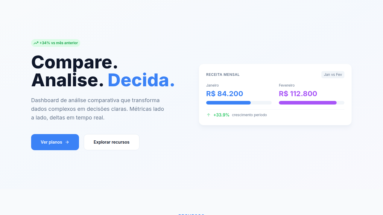
Comparison dashboard. Ideal for landing pages, modern websites. AI-ready template.
Use case: Landing pages, Modern websites
Historical Context
Comparison is the oldest analytical act. Before we had dashboards, we had ledgers with columns — last year next to this year, theirs next to ours. Tufte formalized what accountants already knew: small multiples work because they offload memory. You stop asking "what did that other chart look like?" and start seeing differences directly. The eye does the math. The A/B testing boom of the 2010s turned comparison from an analytical technique into a product category. Optimizely, VWO, Google Optimize — they all needed interfaces that could answer one question fast: which variant won? That pressure produced a specific visual language: paired metrics, confidence intervals rendered inline, green-versus-red delta arrows. The dashboard became a verdict machine. What's interesting now is how that pattern leaked everywhere. Marketing dashboards compare periods. Competitive intel tools compare brands. The comparative layout isn't a feature anymore — it's an expectation. Users arrive already knowing how to read side-by-side panels because every SaaS product trained them to.
When to Use
Reach for this when users need to evaluate two or more things against each other — variants in a test, this quarter versus last, your product against a competitor. It works best when the decision is binary or ranked: pick a winner, spot the outlier, confirm a trend. Don't use it for exploratory analysis where the user doesn't yet know what to compare. Comparison dashboards assume the question is already framed. If it isn't, you'll just overwhelm people with parallel noise.
Design Principles
- Align axes and scales ruthlessly — a comparison where the Y-axis differs between panels is a lie dressed up as insight
- Make the delta visible, not just the values — users came to see the difference, so surface it explicitly with inline annotations or dedicated delta rows
- Limit to 2-3 comparisons maximum per view — beyond that, small multiples degrade into wallpaper and nobody reads wallpaper
- Use consistent color coding across all compared entities — if Variant A is blue in one chart, it stays blue everywhere or you've broken the user's mental model
- Provide a clear "winner" signal when the data supports it — don't make users do statistical interpretation; surface confidence levels in plain language
DESIGN.md
---
version: "alpha"
name: "Comparative Analysis Dashboard"
description: "Comparison dashboard. Ideal for landing pages, modern websites. AI-ready template."
colors:
  primary: "#1A1A1A"
  secondary: "#4A4A4A"
  tertiary: "#0066FF"
  neutral: "#FFFFFF"
typography:
  h1:
    fontFamily: System UI stack
    fontSize: 2.25rem
    fontWeight: 700
  body-md:
    fontFamily: System UI stack
    fontSize: 1rem
    fontWeight: 400
  label-caps:
    fontFamily: System UI stack
    fontSize: 0.75rem
    fontWeight: 500
spacing:
  sm: 2.0rem
  md: 4.0rem
  lg: 8.0rem
---

## Overview

Comparison dashboard. Ideal for landing pages, modern websites. AI-ready template. Comparison is the oldest analytical act. Before we had dashboards, we had ledgers with columns — last year next to this year, theirs next to ours. Tufte formalized what accountants already knew: small multiples work because they offload memory. You stop asking "what did that other chart look like?" and start seeing differences directly. The eye does the math.

The A/B testing boom of the 2010s turned comparison from an analytical technique into a product category. Optimizely, VWO, Google Optimize — they all needed interfaces that could answer one question fast: which variant won? That pressure produced a specific visual language: paired metrics, confidence intervals rendered inline, green-versus-red delta arrows. The dashboard became a verdict machine.

What's interesting now is how that pattern leaked everywhere. Marketing dashboards compare periods. Competitive intel tools compare brands. The comparative layout isn't a feature anymore — it's an expectation. Users arrive already knowing how to read side-by-side panels because every SaaS product trained them to.

- Density: 8/10 — Dense
- Variance: 4/10 — Moderate
- Motion: 6/10 — Expressive

- **Style:** BI/Analytics
- **Keywords:** Side-by-side comparisons, period-over-period metrics, A/B test results, regional comparisons, performance benchmarks
- **Era:** 2020s Modern
- **Light/Dark:** ✓ Full / ✓ Full

## Colors

- Palette derived from style keywords and era context


## Typography

- **Display / Hero:** System UI stack (-apple-system, sans-serif) — Weight 700, tight tracking, used for headline impact
- **Body:** System UI stack (-apple-system, sans-serif) — Weight 400, 16px/1.6 line-height, max 72ch per line
- **UI Labels / Captions:** System UI stack (-apple-system, sans-serif) — 0.875rem, weight 500, slight letter-spacing
- **Monospace:** JetBrains Mono — Used for code, metadata, and technical values

Scale:
- Hero: clamp(2.5rem, 5vw, 4rem)
- H1: 2.25rem
- H2: 1.5rem
- Body: 1rem / 1.6
- Small: 0.875rem


## Layout

- **Grid:** CSS Grid primary. Max-width containment: 1280px centered with 1.5rem side padding.
- **Spacing rhythm:** Balanced. Base unit: 0.5rem (8px).
- **Section vertical gaps:** clamp(4rem, 8vw, 8rem).
- **Hero layout:** Split-screen (text left, visual right).
- **Feature sections:** Zig-zag alternating text+image rows. No 3-equal-columns.
- **Mobile collapse:** All multi-column layouts collapse below 768px. No horizontal overflow.
- **z-index contract:** base (0) / sticky-nav (100) / overlay (200) / modal (300) / toast (500).


## Elevation & Depth

Comparison bar animations (grow to value), delta indicator animations (direction arrows), highlight on compare

- **Physics:** Spring — stiffness 120, damping 20. Confident, weighted transitions.
- **Entry animations:** Fade + translate-Y (16px → 0) over 480ms ease-out. Staggered cascades for lists: 100ms between items.
- **Hover states:** Scale(1.03) + shadow lift over 200ms.
- **Page transitions:** Fade + slide (300ms).
- **Performance:** Only transform and opacity animated. No layout-triggering properties.


## Shapes

Base corner radius: 8px. See rounded tokens in front matter for the full scale.


## Components

- **Primary Button:** Subtly rounded (0.5rem) shape. Accent color fill. Hover: 8% darken + subtle lift shadow. Active: -1px translate tactile press. Font weight 600. No outer glows.
- **Secondary / Ghost Button:** Outline variant. 1.5px border in muted color. Text in primary color. Hover: subtle background fill.
- **Cards:** Subtly rounded (0.5rem) corners. Surface background. Subtle shadow (0 2px 12px rgba(0,0,0,0.06)). 1px border stroke.
- **Inputs:** Label above input. 1px border stroke. Focus ring: 2px accent color offset 2px. Error text below in semantic red. No floating labels.
- **Navigation:** Primary surface background. Active item: accent color indicator. Font weight 500 when active.
- **Skeletons:** Shimmer animation matching component dimensions. No circular spinners.
- **Empty States:** Icon-based composition with descriptive text and action button.


## Do's and Don'ts

- No emojis in UI — use icon system only (Lucide, Heroicons)
- No pure black (#000000) — use off-black or charcoal variants
- No oversaturated accent colors (saturation cap: 80%)
- No 3-column equal-width feature layouts — use zig-zag or asymmetric grid
- No `h-screen` — use `min-h-[100dvh]`
- No AI copywriting clichés: "Elevate", "Seamless", "Unleash", "Next-Gen"
- No broken external image links — use picsum.photos or inline SVG
- No generic lorem ipsum in demos

- Do Period selector works
- Do Deltas calculated
- Do Colors meaningful
- Do Benchmarks shown
- Do Mobile stacks properly
- Do Export comparison


## Use Case

Landing pages, Modern websites
Technical Specs
CSS
display: flex for side-by-side, gap for comparison spacing, color coding (green up, red down), arrow indicators, diff highlighting, comparison table zebra striping
Variables
--positive-color: #22C55E, --negative-color: #EF4444, --neutral-color: #6B7280, --comparison-gap: 2rem, --arrow-size: 16px, --badge-padding: 4px 8px
Checklist
☐ Period selector works, ☐ Deltas calculated, ☐ Colors meaningful, ☐ Benchmarks shown, ☐ Mobile stacks properly, ☐ Export comparison
Colors
Effects
Comparison bar animations (grow to value), delta indicator animations (direction arrows), highlight on compare
Light/Dark
✓ Full / ✓ Full
AI Prompt
Act as a Senior Frontend Engineer and Expert UI Designer.
Your task is to code a complete Landing Page on the first attempt.
- Landing Page Theme: <INSERT THEME>
- Sections to add: <INSERT SECTIONS>

Generate the final code immediately following these definitions:

## Style

- **Name:** Comparative Analysis Dashboard
- **Type:** BI/Analytics
- **Keywords:** Side-by-side comparisons, period-over-period metrics, A/B test results, regional comparisons, performance benchmarks
- **Era:** 2020s Modern
- **Light/Dark:** ✓ Full / ✓ Full

## Color Palette

- **Primary:** Comparison colors: primary (blue), comparison (orange/purple), delta indicator (green/red)
- **Secondary:** Winning metric color (green), losing metric color (red), neutral comparison (grey), benchmark colors

## Visual Effects

Comparison bar animations (grow to value), delta indicator animations (direction arrows), highlight on compare

## AI Visual Direction

Design a comparison dashboard. Use: side-by-side metrics, period selectors (vs last month), delta indicators (+/-), benchmark lines, A/B comparison tables, winning/losing highlights, percentage change badges.

## CSS Technical

```css
display: flex for side-by-side, gap for comparison spacing, color coding (green up, red down), arrow indicators, diff highlighting, comparison table zebra striping
```

## Design System Variables

```css
--positive-color: #22C55E, --negative-color: #EF4444, --neutral-color: #6B7280, --comparison-gap: 2rem, --arrow-size: 16px, --badge-padding: 4px 8px
```

## Implementation Checklist

- ☐ Period selector works
- ☐ Deltas calculated
- ☐ Colors meaningful
- ☐ Benchmarks shown
- ☐ Mobile stacks properly
- ☐ Export comparison

## Execution Rules

1. Strictly follow the defined visual style.
2. Use high-quality inline SVG icons (Heroicons or Lucide style) — NEVER use emojis as icons.
3. Add `cursor-pointer` and smooth `hover` states (transition-all) on all interactive elements.
4. Required Page Structure:
   - Navbar (Logo + Links + CTA)
   - Hero Section (Impactful Headline + Subtitle + 2 buttons + 3D/Abstract visual element via CSS)
   - Features (3 cards with icons)
   - Testimonials (3 cards)
   - Pricing (3 tiers, highlight the middle one)
   - Final CTA
   - Full Footer with social links, privacy policy, terms of use, contact and SEO links.
5. All text content must be in English.
6. The visual must be CLEARLY distinct — do not create a "default Bootstrap" design. Force the use of the provided design system variables.
7. Use `<style>` tags in the head for custom classes (especially for complex backdrop-filter effects and animations) that Tailwind CDN doesn't cover.
8. Full Responsiveness: Layout must adapt perfectly to Mobile, Tablet and Desktop (vertical stack on mobile).
9. Include basic SEO, Viewport and Open Graph meta tags in `<head>`.
10. Footer must contain: Copyright 2026, Secondary navigation links and Social media icons.
11. Make the creative decisions needed to deliver the complete, functional result now.
Related
Last synced: 4/1/2026