Claude Warm Parchment
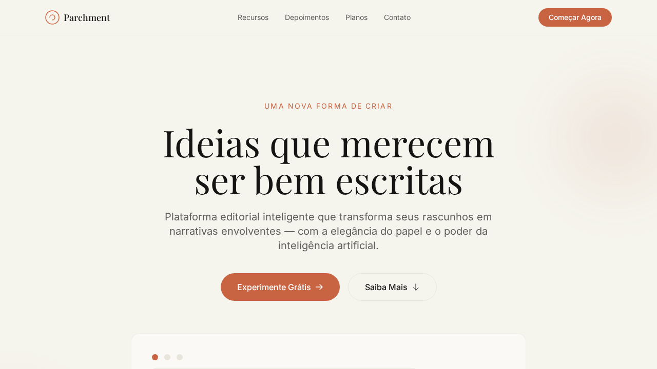
Warm editorial landing page inspired by Claude/Anthropic. Ideal for plataformas de ia, education, editoras, produtos literários. AI-ready template.
Use case: Platforms de IA, Education, Publishers, Products literários
Historical Context
When every AI company was racing to look like a sci-fi movie — dark interfaces, neon accents, cold sans-serifs screaming "I am the future" — Anthropic walked in wearing a linen shirt. Claude's warm parchment palette wasn't an accident. It was a deliberate rejection of the Silicon Valley playbook that equates intelligence with coldness. The choice to ground their interface in cream tones, warm serifs, and paper-like textures communicated something radical: that an AI could feel approachable rather than intimidating. While competitors optimized for looking powerful, Anthropic optimized for feeling safe. The parchment aesthetic borrows from centuries of bookmaking and scholarly tradition — it says "I'm here to help you think," not "I'm here to replace you." This wasn't just branding. It was a philosophical position rendered in HSL values. The warmth signals patience. The serif typography signals care with language. The muted, organic palette signals that technology doesn't have to feel alien to be advanced. It proved you could build a frontier AI product that looks like it belongs in a library, not a spaceship.
When to Use
Reach for this palette when your product needs to feel intelligent without feeling cold. It's perfect for AI-powered writing tools, reading apps, research platforms, and any product where users spend long sessions with text. Works beautifully for brands that want to signal thoughtfulness over raw power — think digital journals, educational platforms, or any tech product that respects its users' attention rather than demanding it. Avoid if you need high-energy, action-oriented interfaces.
Design Principles
- Warmth as trust signal — cream and parchment tones reduce cognitive threat response that cold blues trigger in AI contexts
- Serif typography carries semantic weight — it tells users their words (and the AI's words) are being treated with the care of published text
- Restrained contrast ratios — never harsh black-on-white, always softened to reduce eye strain during the long reading sessions these products demand
- Organic color temperature throughout the stack — backgrounds, borders, hover states, and even shadows should lean warm, never neutral gray
- Negative space as a design material — generous margins and padding echo the margins of a well-typeset book page, giving content room to breathe
DESIGN.md
---
version: "alpha"
name: "Claude Warm Parchment"
description: "Warm editorial landing page inspired by Claude/Anthropic. Ideal for plataformas de ia, education, editoras, produtos literários. AI-ready template."
colors:
  primary: "#f5f4ed"
  secondary: "#141413"
  tertiary: "#c96442"
  neutral: "#faf9f5"
  surface: "#d97757"
  accent: "#5e5d59"
typography:
  h1:
    fontFamily: Georgia
    fontSize: 2.5rem
    fontWeight: 700
  body-md:
    fontFamily: Georgia
    fontSize: 1rem
    fontWeight: 400
components:
  button-primary:
    backgroundColor: "{colors.primary}"
    textColor: "{colors.neutral}"
    padding: 12px
---

## Overview

Warm editorial landing page inspired by Claude/Anthropic. Ideal for plataformas de ia, education, editoras, produtos literários. AI-ready template. When every AI company was racing to look like a sci-fi movie — dark interfaces, neon accents, cold sans-serifs screaming "I am the future" — Anthropic walked in wearing a linen shirt. Claude's warm parchment palette wasn't an accident. It was a deliberate rejection of the Silicon Valley playbook that equates intelligence with coldness.

The choice to ground their interface in cream tones, warm serifs, and paper-like textures communicated something radical: that an AI could feel approachable rather than intimidating. While competitors optimized for looking powerful, Anthropic optimized for feeling safe. The parchment aesthetic borrows from centuries of bookmaking and scholarly tradition — it says "I'm here to help you think," not "I'm here to replace you."

This wasn't just branding. It was a philosophical position rendered in HSL values. The warmth signals patience. The serif typography signals care with language. The muted, organic palette signals that technology doesn't have to feel alien to be advanced. It proved you could build a frontier AI product that looks like it belongs in a library, not a spaceship.

- Density: 5/10 — Balanced
- Variance: 8/10 — Expressive
- Motion: 8/10 — Cinematic

- **Style:** Editorial, Warm Parchment, Serif Headlines, Terracotta Accent
- **Keywords:** claude, anthropic, parchment, warm neutrals, serif headlines, terracotta, editorial, literary, ring shadows, organic illustrations
- **Era:** 2024-2026 Literary AI
- **Light/Dark:** ✓ Full / ✓ Full

## Colors

- **Pergaminho** (#f5f4ed) — Primary surface or dominant color
- **Quase Preto** (#141413) — Dark surface, primary background
- **Terracotta** (#c96442) — Supporting palette color
- **Marfim** (#faf9f5) — Supporting palette color
- **Coral** (#d97757) — Extended palette, decorative use
- **Cinza Oliva** (#5e5d59) — Secondary text, borders, muted elements
- **Cinza Pedra** (#87867f) — Secondary text, borders, muted elements
- **Borda Creme** (#f0eee6) — Extended palette, decorative use


## Typography

- **Display / Hero:** Georgia — Weight 700, tight tracking, used for headline impact
- **Accent:** Arial — Used for decorative or emphasis text
- **Body:** Georgia — Weight 400, 16px/1.6 line-height, max 72ch per line
- **UI Labels / Captions:** Georgia — 0.875rem, weight 500, slight letter-spacing
- **Monospace:** JetBrains Mono — Used for code, metadata, and technical values

Scale:
- Hero: clamp(2.5rem, 5vw, 4rem)
- H1: 2.25rem
- H2: 1.5rem
- Body: 1rem / 1.6
- Small: 0.875rem


## Layout

- **Grid:** CSS Grid primary. Max-width containment: 1280px centered with 1.5rem side padding.
- **Spacing rhythm:** Balanced. Base unit: 0.5rem (8px).
- **Section vertical gaps:** clamp(4rem, 8vw, 8rem).
- **Hero layout:** Asymmetric composition.
- **Feature sections:** Asymmetric grid with varied card sizes. No 3-equal-columns.
- **Mobile collapse:** All multi-column layouts collapse below 768px. No horizontal overflow.
- **z-index contract:** base (0) / sticky-nav (100) / overlay (200) / modal (300) / toast (500).


## Elevation & Depth

Canvas cor de pergaminho (#f5f4ed) evocando papel premium. Headlines em serif customizada weight 500 com gravitas de título de livro. Acento terracotta (#c96442) para CTAs — deliberadamente terroso e anti-tech. Todos os cinzas com subtom amarelo-marrom. Ring shadows (0px 0px 0px 1px) criando bordas-sombra suaves. Alternância light/dark entre seções como capítulos de um livro.

- **Physics:** Spring — stiffness 120, damping 20. Confident, weighted transitions.
- **Entry animations:** Fade + translate-Y (16px → 0) over 540ms ease-out. Staggered cascades for lists: 120ms between items.
- **Hover states:** Scale(1.03) + shadow lift over 200ms.
- **Page transitions:** Fade + slide (300ms).
- **Performance:** Only transform and opacity animated. No layout-triggering properties.


## Shapes

Base corner radius: 8px. See rounded tokens in front matter for the full scale.


## Components

- **Primary Button:** Subtly rounded (0.5rem) shape. Accent color fill. Hover: 8% darken + subtle lift shadow. Active: -1px translate tactile press. Font weight 600. No outer glows.
- **Secondary / Ghost Button:** Outline variant. 1.5px border in muted color. Text in primary color. Hover: subtle background fill.
- **Cards:** Subtly rounded (0.5rem) corners. Surface background. Subtle shadow (0 2px 12px rgba(0,0,0,0.06)). 1px border stroke.
- **Inputs:** Label above input. 1px border stroke. Focus ring: 2px accent color offset 2px. Error text below in semantic red. No floating labels.
- **Navigation:** Primary surface background. Active item: accent color indicator. Font weight 500 when active.
- **Skeletons:** Shimmer animation matching component dimensions. No circular spinners.
- **Empty States:** Icon-based composition with descriptive text and action button.


## Do's and Don'ts

- No emojis in UI — use icon system only (Lucide, Heroicons)
- No pure black (#000000) — use off-black or charcoal variants
- No oversaturated accent colors (saturation cap: 80%)
- No 3-column equal-width feature layouts — use zig-zag or asymmetric grid
- No `h-screen` — use `min-h-[100dvh]`
- No AI copywriting clichés: "Elevate", "Seamless", "Unleash", "Next-Gen"
- No broken external image links — use picsum.photos or inline SVG
- No generic lorem ipsum in demos

- Do Fundo pergaminho #f5f4ed
- Do Headlines serif weight 500
- Do Acento terracotta #c96442
- Do Cinzas com subtom quente
- Do Ring shadows
- Do Alternância light/dark
- Do Body line-height 1.60
- Do Responsivo


## Use Case

Platforms de IA, Education, Publishers, Products literários
Technical Specs
CSS
background: #f5f4ed; color: #141413; accent: #c96442; font-family: Georgia, serif for headlines; font-family: Arial, sans-serif for body; border: 1px solid #f0eee6; box-shadow: 0px 0px 0px 1px warm-grays; line-height: 1.60 body, 1.10 headlines
Variables
--bg-parchment: #f5f4ed; --bg-ivory: #faf9f5; --text-primary: #141413; --accent-terracotta: #c96442; --accent-coral: #d97757; --text-secondary: #5e5d59; --text-tertiary: #87867f; --border-cream: #f0eee6; --border-warm: #e8e6dc; --dark-surface: #30302e
Checklist
☐ Fundo pergaminho #f5f4ed, ☐ Headlines serif weight 500, ☐ Acento terracotta #c96442, ☐ Cinzas com subtom quente, ☐ Ring shadows, ☐ Alternância light/dark, ☐ Body line-height 1.60, ☐ Responsivo
Colors
Primary
Secondary
Effects
Canvas cor de pergaminho (#f5f4ed) evocando papel premium. Headlines em serif customizada weight 500 com gravitas de título de livro. Acento terracotta (#c96442) para CTAs — deliberadamente terroso e anti-tech. Todos os cinzas com subtom amarelo-marrom. Ring shadows (0px 0px 0px 1px) criando bordas-sombra suaves. Alternância light/dark entre seções como capítulos de um livro.
Light/Dark
✓ Full / ✓ Full
AI Prompt
Act as a Senior Frontend Engineer and Expert UI Designer.
Your task is to code a complete Landing Page on the first attempt.
- Landing Page Theme: <INSERT THEME>
- Sections to add: <INSERT SECTIONS>

Generate the final code immediately following these definitions:

## Style

- **Name:** Claude Warm Parchment
- **Type:** Editorial, Warm Parchment, Serif Headlines, Terracotta Accent
- **Keywords:** claude, anthropic, parchment, warm neutrals, serif headlines, terracotta, editorial, literary, ring shadows, organic illustrations
- **Era:** 2024-2026 Literary AI
- **Light/Dark:** ✓ Full / ✓ Full

## Color Palette

- **Primary:** Pergaminho #f5f4ed, Quase Preto #141413, Terracotta #c96442, Marfim #faf9f5
- **Secondary:** Coral #d97757, Cinza Oliva #5e5d59, Cinza Pedra #87867f, Borda Creme #f0eee6

## Visual Effects

Canvas cor de pergaminho (#f5f4ed) evocando papel premium. Headlines em serif customizada weight 500 com gravitas de título de livro. Acento terracotta (#c96442) para CTAs — deliberadamente terroso e anti-tech. Todos os cinzas com subtom amarelo-marrom. Ring shadows (0px 0px 0px 1px) criando bordas-sombra suaves. Alternância light/dark entre seções como capítulos de um livro.

## AI Visual Direction

Design a warm editorial landing page inspired by Claude/Anthropic. Parchment background (#f5f4ed) evoking premium paper. Serif headlines (Georgia fallback) at weight 500 for all headings with book-title gravitas. Terracotta (#c96442) as the sole accent for CTAs. All grays warm-toned with yellow-brown undertones (#5e5d59, #87867f). Ring-based shadows (0px 0px 0px 1px) instead of drop shadows. Light/dark section alternation like book chapters. Body text at 1.60 line-height for comfortable reading.

## CSS Technical

```css
background: #f5f4ed; color: #141413; accent: #c96442; font-family: Georgia, serif for headlines; font-family: Arial, sans-serif for body; border: 1px solid #f0eee6; box-shadow: 0px 0px 0px 1px warm-grays; line-height: 1.60 body, 1.10 headlines
```

## Design System Variables

```css
--bg-parchment: #f5f4ed; --bg-ivory: #faf9f5; --text-primary: #141413; --accent-terracotta: #c96442; --accent-coral: #d97757; --text-secondary: #5e5d59; --text-tertiary: #87867f; --border-cream: #f0eee6; --border-warm: #e8e6dc; --dark-surface: #30302e
```

## Implementation Checklist

- ☐ Fundo pergaminho #f5f4ed
- ☐ Headlines serif weight 500
- ☐ Acento terracotta #c96442
- ☐ Cinzas com subtom quente
- ☐ Ring shadows
- ☐ Alternância light/dark
- ☐ Body line-height 1.60
- ☐ Responsivo

## Execution Rules

1. Strictly follow the defined visual style.
2. Use high-quality inline SVG icons (Heroicons or Lucide style) — NEVER use emojis as icons.
3. Add `cursor-pointer` and smooth `hover` states (transition-all) on all interactive elements.
4. Required Page Structure:
   - Navbar (Logo + Links + CTA)
   - Hero Section (Impactful Headline + Subtitle + 2 buttons + 3D/Abstract visual element via CSS)
   - Features (3 cards with icons)
   - Testimonials (3 cards)
   - Pricing (3 tiers, highlight the middle one)
   - Final CTA
   - Full Footer with social links, privacy policy, terms of use, contact and SEO links.
5. All text content must be in English.
6. The visual must be CLEARLY distinct — do not create a "default Bootstrap" design. Force the use of the provided design system variables.
7. Use `<style>` tags in the head for custom classes (especially for complex backdrop-filter effects and animations) that Tailwind CDN doesn't cover.
8. Full Responsiveness: Layout must adapt perfectly to Mobile, Tablet and Desktop (vertical stack on mobile).
9. Include basic SEO, Viewport and Open Graph meta tags in `<head>`.
10. Footer must contain: Copyright 2026, Secondary navigation links and Social media icons.
11. Make the creative decisions needed to deliver the complete, functional result now.
Related
Last synced: 4/1/2026