CAD-Inspired Blueprint
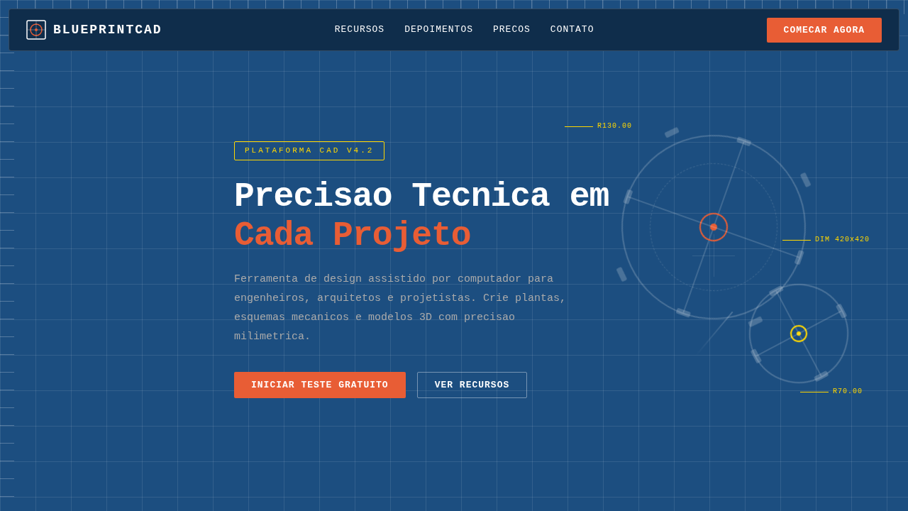
CAD landing page style, blueprint aesthetic, dark blue background, white technical lines, mechanical details, engineering look. Ideal for landing pages, modern websites. AI-ready template.
Use case: Landing pages, Modern websites
Historical Context
AutoCAD shipped in 1982 and quietly rewired how an entire generation thinks about precision. Those cyan lines on dark backgrounds, the obsessive dimensioning, the grid snaps — none of it was designed to be beautiful. It was designed to be correct. And yet, decades later, web designers keep returning to that visual language because correctness has its own magnetism. SolidWorks and CATIA pushed things further into 3D, but the flat blueprint aesthetic stuck around. There's something about the orthographic projection — that flattened, annotated view of complex geometry — that translates remarkably well to screen interfaces. It communicates: we built this with intention. Every measurement exists for a reason. The influence shows up in subtle ways across modern UI. Monospaced type for data. Hairline rules instead of heavy borders. Coordinate-based layouts that feel plotted rather than placed. When a product needs to signal engineering rigor without drowning users in complexity, CAD aesthetics deliver that credibility instantly. The blueprint doesn't lie.
When to Use
Reach for this when your product lives in technical territory — engineering platforms, 3D printing dashboards, manufacturing tools, anything where users already think in tolerances and specifications. It works beautifully for developer tools that want to feel precise without feeling cold. Also strong for hardware startups and robotics companies trying to bridge the gap between physical engineering and digital interface. Skip it for consumer apps or anything targeting casual users. This aesthetic rewards attention; it punishes skimming.
Design Principles
- Precision over decoration — every line, dimension, and annotation must serve a structural purpose, never ornamental
- Dark canvas with high-contrast linework — deep navy or near-black backgrounds with cyan, white, or amber strokes that reference plotter output
- Monospaced typography as default — technical data demands fixed-width type; proportional fonts feel imprecise in this context
- Grid as visible infrastructure — expose the underlying coordinate system rather than hiding it; the grid IS the design
- Annotation-driven hierarchy — use dimension lines, callouts, and technical labels to guide attention instead of conventional UI patterns like cards or shadows
DESIGN.md
---
version: "alpha"
name: "CAD-Inspired Blueprint"
description: "CAD landing page style, blueprint aesthetic, dark blue background, white technical lines, mechanical details, engineering look. Ideal for landing pages, modern websites. AI-ready template."
colors:
  primary: "#1C4E80"
  secondary: "#FFFFFF"
  tertiary: "#E85D35"
  neutral: "#FFD700"
  surface: "#AAAAAA"
typography:
  h1:
    fontFamily: Consolas
    fontSize: 2.5rem
    fontWeight: 700
  body-md:
    fontFamily: Consolas
    fontSize: 1rem
    fontWeight: 400
components:
  button-primary:
    backgroundColor: "{colors.primary}"
    textColor: "{colors.neutral}"
    padding: 12px
---

## Overview

CAD landing page style, blueprint aesthetic, dark blue background, white technical lines, mechanical details, engineering look. Ideal for landing pages, modern websites. AI-ready template. AutoCAD shipped in 1982 and quietly rewired how an entire generation thinks about precision. Those cyan lines on dark backgrounds, the obsessive dimensioning, the grid snaps — none of it was designed to be beautiful. It was designed to be correct. And yet, decades later, web designers keep returning to that visual language because correctness has its own magnetism.

SolidWorks and CATIA pushed things further into 3D, but the flat blueprint aesthetic stuck around. There's something about the orthographic projection — that flattened, annotated view of complex geometry — that translates remarkably well to screen interfaces. It communicates: we built this with intention. Every measurement exists for a reason.

The influence shows up in subtle ways across modern UI. Monospaced type for data. Hairline rules instead of heavy borders. Coordinate-based layouts that feel plotted rather than placed. When a product needs to signal engineering rigor without drowning users in complexity, CAD aesthetics deliver that credibility instantly. The blueprint doesn't lie.

- Density: 7/10 — Compact
- Variance: 2/10 — Structured
- Motion: 1/10 — Static

- **Style:** Computer Aided Design, Technical, Structured
- **Keywords:** CAD, blueprint, autocad, dark blue, white lines, technical, gears, mechanical
- **Era:** Digital CAD
- **Light/Dark:** ✗ No / ✓ Full

## Colors

- **Background** (#1C4E80) — Primary background surface
- **Text** (#FFFFFF) — Primary text color
- **Accent** (#E85D35) — Primary accent, CTAs and interactive elements
- **Grid Light** (#FFFFFF1A) — Extended palette, decorative use
- **Guide Line** (#FFD700) — Extended palette, decorative use
- **Dim** (#AAAAAA) — Extended palette, decorative use


## Typography

- **Display / Hero:** Consolas — Weight 700, tight tracking, used for headline impact
- **Accent:** Monaco — Used for decorative or emphasis text
- **Body:** Consolas — Weight 400, 16px/1.6 line-height, max 72ch per line
- **UI Labels / Captions:** Consolas — 0.875rem, weight 500, slight letter-spacing
- **Monospace:** Consolas — Used for code, metadata, and technical values

Scale:
- Hero: clamp(2.5rem, 5vw, 4rem)
- H1: 2.25rem
- H2: 1.5rem
- Body: 1rem / 1.6
- Small: 0.875rem


## Layout

- **Grid:** CSS Grid primary. Max-width containment: 1280px centered with 1.5rem side padding.
- **Spacing rhythm:** Balanced. Base unit: 0.5rem (8px).
- **Section vertical gaps:** clamp(4rem, 8vw, 8rem).
- **Hero layout:** Split-screen (text left, visual right).
- **Feature sections:** Zig-zag alternating text+image rows. No 3-equal-columns.
- **Mobile collapse:** All multi-column layouts collapse below 768px. No horizontal overflow.
- **z-index contract:** base (0) / sticky-nav (100) / overlay (200) / modal (300) / toast (500).


## Elevation & Depth

Mechanical gear motifs, flowchart connectors, modular blocks, white square mesh overlay, precise fine-line vector grid.

- Minimal motion design. Hover states use color transitions only (150ms).
- No entry animations. No page transitions. Instant, utilitarian feedback.
- Performance: No animation overhead. Static-first approach.


## Shapes

Base corner radius: 8px. See rounded tokens in front matter for the full scale.


## Components

- **Primary Button:** Subtly rounded (0.5rem) shape. Accent color fill. Hover: 8% darken + subtle lift shadow. Active: -1px translate tactile press. Font weight 600. No outer glows.
- **Secondary / Ghost Button:** Outline variant. 1.5px border in muted color. Text in primary color. Hover: subtle background fill.
- **Cards:** Subtly rounded (0.5rem) corners. Surface background. Subtle shadow (0 2px 12px rgba(0,0,0,0.06)). 1px border stroke.
- **Inputs:** Label above input. 1px border stroke. Focus ring: 2px accent color offset 2px. Error text below in semantic red. No floating labels.
- **Navigation:** Primary surface background. Active item: accent color indicator. Font weight 500 when active.
- **Skeletons:** Shimmer animation matching component dimensions. No circular spinners.
- **Empty States:** Icon-based composition with descriptive text and action button.


## Do's and Don'ts

- No emojis in UI — use icon system only (Lucide, Heroicons)
- No pure white (#FFFFFF) backgrounds — use off-white or dark surfaces
- No oversaturated accent colors (saturation cap: 80%)
- No 3-column equal-width feature layouts — use zig-zag or asymmetric grid
- No `h-screen` — use `min-h-[100dvh]`
- No AI copywriting clichés: "Elevate", "Seamless", "Unleash", "Next-Gen"
- No broken external image links — use picsum.photos or inline SVG
- No generic lorem ipsum in demos

- Do Dark blue blueprint background
- Do White thin lines for elements
- Do Mechanical/Gear decorative elements
- Do Monospace fonts
- Do Measurement ticks on borders


## Use Case

Landing pages, Modern websites
Technical Specs
CSS
background-color: #1C4E80; color: #FFFFFF; font-family: 'Consolas', 'Monaco', monospace; background-image: linear-gradient(rgba(255,255,255,0.1) 1px, transparent 1px), linear-gradient(90deg, rgba(255,255,255,0.1) 1px, transparent 1px); background-size: 50px 50px;
Variables
--cad-blue: #1C4E80, --line-white: #FFFFFF, --alert-orange: #E85D35, --grid-opacity: 0.1, --font-mono: 'Consolas', monospace
Checklist
☐ Dark blue blueprint background, ☐ White thin lines for elements, ☐ Mechanical/Gear decorative elements, ☐ Monospace fonts, ☐ Measurement ticks on borders
Colors
Primary
Secondary
Effects
Mechanical gear motifs, flowchart connectors, modular blocks, white square mesh overlay, precise fine-line vector grid.
Light/Dark
✗ No / ✓ Full
AI Prompt
Act as a Senior Frontend Engineer and Expert UI Designer.
Your task is to code a complete Landing Page on the first attempt.
- Landing Page Theme: <INSERT THEME>
- Sections to add: <INSERT SECTIONS>

Generate the final code immediately following these definitions:

## Style

- **Name:** CAD-Inspired Blueprint
- **Type:** Computer Aided Design, Technical, Structured
- **Keywords:** CAD, blueprint, autocad, dark blue, white lines, technical, gears, mechanical
- **Era:** Digital CAD
- **Light/Dark:** ✗ No / ✓ Full

## Color Palette

- **Primary:** Background #1C4E80, Text #FFFFFF, Accent #E85D35
- **Secondary:** Grid Light #FFFFFF1A, Guide Line #FFD700, Dim #AAAAAA

## Visual Effects

Mechanical gear motifs, flowchart connectors, modular blocks, white square mesh overlay, precise fine-line vector grid.

## AI Visual Direction

CAD landing page style, blueprint aesthetic, dark blue background, white technical lines, mechanical details, engineering look.

## CSS Technical

```css
background-color: #1C4E80; color: #FFFFFF; font-family: 'Consolas', 'Monaco', monospace; background-image: linear-gradient(rgba(255,255,255,0.1) 1px, transparent 1px), linear-gradient(90deg, rgba(255,255,255,0.1) 1px, transparent 1px); background-size: 50px 50px;
```

## Design System Variables

```css
--cad-blue: #1C4E80, --line-white: #FFFFFF, --alert-orange: #E85D35, --grid-opacity: 0.1, --font-mono: 'Consolas', monospace
```

## Implementation Checklist

- ☐ Dark blue blueprint background
- ☐ White thin lines for elements
- ☐ Mechanical/Gear decorative elements
- ☐ Monospace fonts
- ☐ Measurement ticks on borders

## Execution Rules

1. Strictly follow the defined visual style.
2. Use high-quality inline SVG icons (Heroicons or Lucide style) — NEVER use emojis as icons.
3. Add `cursor-pointer` and smooth `hover` states (transition-all) on all interactive elements.
4. Required Page Structure:
   - Navbar (Logo + Links + CTA)
   - Hero Section (Impactful Headline + Subtitle + 2 buttons + 3D/Abstract visual element via CSS)
   - Features (3 cards with icons)
   - Testimonials (3 cards)
   - Pricing (3 tiers, highlight the middle one)
   - Final CTA
   - Full Footer with social links, privacy policy, terms of use, contact and SEO links.
5. All text content must be in English.
6. The visual must be CLEARLY distinct — do not create a "default Bootstrap" design. Force the use of the provided design system variables.
7. Use `<style>` tags in the head for custom classes (especially for complex backdrop-filter effects and animations) that Tailwind CDN doesn't cover.
8. Full Responsiveness: Layout must adapt perfectly to Mobile, Tablet and Desktop (vertical stack on mobile).
9. Include basic SEO, Viewport and Open Graph meta tags in `<head>`.
10. Footer must contain: Copyright 2026, Secondary navigation links and Social media icons.
11. Make the creative decisions needed to deliver the complete, functional result now.
Related
Last synced: 4/1/2026