Bossa Nova Lounge
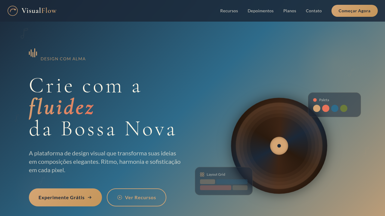
Bossa Nova lounge style landing page. Ideal for landing pages musicais, projetos culturais, sites sofisticados. AI-ready template.
Use case: Music landing pages, Cultural projects, Sophisticated websites
Historical Context
Bossa nova didn't arrive loud. It slipped in through apartment windows in Copacabana, 1958 — a whisper against the big band roar. Tom Jobim composed with negative space. João Gilberto stripped the guitar to its skeleton. The visual culture that surrounded them followed suit: album covers by César Villela used flat color fields, asymmetric type, and breathing room that European modernists would envy. This was Brazilian sophistication refusing to perform sophistication. Translating that restraint into digital design means understanding what bossa nova actually rejected — excess, ornamentation, volume for its own sake. The palette lives in warm midtones: tobacco, aged ivory, deep teal, the amber of a whiskey glass under low light. Typography leans serif but never decorative. Layouts favor horizontal rhythm, mimicking the syncopation of Gilberto's guitar — elements landing slightly off the expected beat. The whole system breathes. It never crowds. It trusts the user the way Jobim trusted silence between notes.
When to Use
Deploy when the brief calls for grown-up elegance without stuffiness. Cocktail bars that don't need to shout their cocktail-bar-ness. Jazz venues where the music matters more than the branding. Brazilian restaurants operating above the caipirinhas-and-carnival register. Any space where the audience already has taste and the design's job is to confirm it, not perform it. Works best at night — metaphorically and literally. If your client says "sophisticated but warm," this is the answer.
Design Principles
- Syncopated layout rhythm — elements placed on the off-beat, asymmetric but never chaotic, mirroring bossa nova's displaced accents against steady pulse
- Warm restraint over cool minimalism — tobacco, amber, deep teal, aged paper tones; sophistication through temperature, not through absence
- Typographic confidence at low volume — serif headlines that whisper authority, generous tracking, weight contrast doing the work that color won't
- Negative space as instrument — silence is compositional; every margin is a rest note, every gap intentional as the pause between Jobim's chords
- Motion like a slow blink — transitions unhurried, easing curves that decelerate into position, nothing snaps, nothing bounces, everything arrives
DESIGN.md
---
version: "alpha"
name: "Bossa Nova Lounge"
description: "Bossa Nova lounge style landing page. Ideal for landing pages musicais, projetos culturais, sites sofisticados. AI-ready template."
colors:
  primary: "#1B2838"
  secondary: "#D4A574"
  tertiary: "#FFF8E7"
  neutral: "#3C2415"
  surface: "#E8735A"
  accent: "#6B7B3A"
typography:
  h1:
    fontFamily: Cormorant Garamond
    fontSize: 2.5rem
    fontWeight: 700
  body-md:
    fontFamily: Cormorant Garamond
    fontSize: 1rem
    fontWeight: 400
components:
  button-primary:
    backgroundColor: "{colors.primary}"
    textColor: "{colors.neutral}"
    padding: 12px
---

## Overview

Bossa Nova lounge style landing page. Ideal for landing pages musicais, projetos culturais, sites sofisticados. AI-ready template. Bossa nova didn't arrive loud. It slipped in through apartment windows in Copacabana, 1958 — a whisper against the big band roar. Tom Jobim composed with negative space. João Gilberto stripped the guitar to its skeleton. The visual culture that surrounded them followed suit: album covers by César Villela used flat color fields, asymmetric type, and breathing room that European modernists would envy. This was Brazilian sophistication refusing to perform sophistication.

Translating that restraint into digital design means understanding what bossa nova actually rejected — excess, ornamentation, volume for its own sake. The palette lives in warm midtones: tobacco, aged ivory, deep teal, the amber of a whiskey glass under low light. Typography leans serif but never decorative. Layouts favor horizontal rhythm, mimicking the syncopation of Gilberto's guitar — elements landing slightly off the expected beat. The whole system breathes. It never crowds. It trusts the user the way Jobim trusted silence between notes.

- Density: 5/10 — Balanced
- Variance: 4/10 — Moderate
- Motion: 4/10 — Subtle

- **Style:** Elegant, Musical, Warm, Sophisticated
- **Keywords:** bossa nova, jazz, lounge, elegant, musical, warm, sophisticated, mid-century, vinyl, acoustic, Rio de Janeiro, Copacabana, sunset, smooth
- **Era:** Bossa Nova Era (1958-1970) Reimaginada
- **Light/Dark:** ✗ No / ✓ Full

## Colors

- **Azul Noturno** (#1B2838) — Accent highlight, links and focus states
- **Dourado Quente** (#D4A574) — Premium accent, decorative highlights
- **Creme Suave** (#FFF8E7) — Supporting palette color
- **Marrom Café** (#3C2415) — Supporting palette color
- **Coral Sunset** (#E8735A) — Extended palette, decorative use
- **Verde Oliva** (#6B7B3A) — Success states, positive indicators
- **Azul Oceano** (#2E6B8A) — Secondary accent
- **Rosa Antigo** (#C9A0A0) — Decorative accent, highlight elements


## Typography

- **Display / Hero:** Cormorant Garamond — Weight 700, tight tracking, used for headline impact
- **Accent:** Playfair Display — Used for decorative or emphasis text
- **Body:** Cormorant Garamond — Weight 400, 16px/1.6 line-height, max 72ch per line
- **UI Labels / Captions:** Cormorant Garamond — 0.875rem, weight 500, slight letter-spacing
- **Monospace:** JetBrains Mono — Used for code, metadata, and technical values

Scale:
- Hero: clamp(2.5rem, 5vw, 4rem)
- H1: 2.25rem
- H2: 1.5rem
- Body: 1rem / 1.6
- Small: 0.875rem


## Layout

- **Grid:** CSS Grid primary. Max-width containment: 1280px centered with 1.5rem side padding.
- **Spacing rhythm:** Balanced. Base unit: 0.5rem (8px).
- **Section vertical gaps:** clamp(4rem, 8vw, 8rem).
- **Hero layout:** Split-screen (text left, visual right).
- **Feature sections:** Zig-zag alternating text+image rows. No 3-equal-columns.
- **Mobile collapse:** All multi-column layouts collapse below 768px. No horizontal overflow.
- **z-index contract:** base (0) / sticky-nav (100) / overlay (200) / modal (300) / toast (500).


## Elevation & Depth

Tipografia elegante e fluida com serifas refinadas, layouts com ritmo visual que remete a partituras musicais, elementos curvos e orgânicos inspirados em ondas sonoras, fundos com gradientes quentes de pôr-do-sol, ícones e ilustrações com traços finos e delicados, micro-animações suaves como notas musicais flutuantes, texturas sutis de vinil ou madeira, espaçamento generoso e respiração visual.

- **Physics:** Ease-out curves, 200-300ms duration. Smooth and predictable.
- **Entry animations:** Fade + translate-Y (16px → 0) over 420ms ease-out. Staggered cascades for lists: 80ms between items.
- **Hover states:** Subtle color shift + shadow adjustment over 200ms.
- **Page transitions:** Fade only (200ms).
- **Performance:** Only transform and opacity animated. No layout-triggering properties.


## Shapes

Base corner radius: 9999px. See rounded tokens in front matter for the full scale.


## Components

- **Primary Button:** Rounded (50% for circular elements) shape. Accent color fill. Hover: 8% darken + subtle lift shadow. Active: -1px translate tactile press. Font weight 600. No outer glows.
- **Secondary / Ghost Button:** Outline variant. 1.5px border in muted color. Text in primary color. Hover: subtle background fill.
- **Cards:** Rounded (50% for circular elements) corners. Surface background. Subtle shadow (0 2px 12px rgba(0,0,0,0.06)). 1px border stroke.
- **Inputs:** Label above input. 1px border stroke. Focus ring: 2px accent color offset 2px. Error text below in semantic red. No floating labels.
- **Navigation:** Primary surface background. Active item: accent color indicator. Font weight 500 when active.
- **Skeletons:** Shimmer animation matching component dimensions. No circular spinners.
- **Empty States:** Icon-based composition with descriptive text and action button.


## Do's and Don'ts

- No emojis in UI — use icon system only (Lucide, Heroicons)
- No pure black (#000000) — use off-black or charcoal variants
- No oversaturated accent colors (saturation cap: 80%)
- No 3-column equal-width feature layouts — use zig-zag or asymmetric grid
- No `h-screen` — use `min-h-[100dvh]`
- No AI copywriting clichés: "Elevate", "Seamless", "Unleash", "Next-Gen"
- No broken external image links — use picsum.photos or inline SVG
- No generic lorem ipsum in demos

- Do Tipografia elegante serifada
- Do Ritmo visual musical
- Do Elementos curvos orgânicos
- Do Gradientes de pôr-do-sol
- Do Micro-animações de notas musicais
- Do Texturas de vinil/madeira.


## Use Case

Music landing pages, Cultural projects, Sophisticated websites
Technical Specs
CSS
font-family: 'Cormorant Garamond', 'Playfair Display', serif for headings, 'Lato', sans-serif for body, background: linear-gradient(135deg, #1B2838, #2E6B8A, #D4A574) for hero, color: #FFF8E7 on dark backgrounds, border-radius: 50% for circular elements, box-shadow: 0 8px 32px rgba(27,40,56,0.3), letter-spacing: 0.1em for headings, animation: float 6s ease-in-out infinite for decorative elements, backdrop-filter: blur(10px) for glass effects.
Variables
--color-night-blue: #1B2838, --color-warm-gold: #D4A574, --color-soft-cream: #FFF8E7, --color-coffee: #3C2415, --color-coral: #E8735A, --color-olive: #6B7B3A, --font-heading: 'Cormorant Garamond', serif, --font-body: 'Lato', sans-serif, --shadow-warm: 0 8px 32px rgba(27,40,56,0.3), --gradient-sunset: linear-gradient(135deg, #1B2838, #2E6B8A, #D4A574), --spacing-generous: 6rem.
Checklist
☐ Tipografia elegante serifada, ☐ Ritmo visual musical, ☐ Elementos curvos orgânicos, ☐ Gradientes de pôr-do-sol, ☐ Micro-animações de notas musicais, ☐ Texturas de vinil/madeira.
Colors
Primary
Secondary
Effects
Tipografia elegante e fluida com serifas refinadas, layouts com ritmo visual que remete a partituras musicais, elementos curvos e orgânicos inspirados em ondas sonoras, fundos com gradientes quentes de pôr-do-sol, ícones e ilustrações com traços finos e delicados, micro-animações suaves como notas musicais flutuantes, texturas sutis de vinil ou madeira, espaçamento generoso e respiração visual.
Light/Dark
✗ No / ✓ Full
AI Prompt
Act as a Senior Frontend Engineer and Expert UI Designer.
Your task is to code a complete Landing Page on the first attempt.
- Landing Page Theme: <INSERT THEME>
- Sections to add: <INSERT SECTIONS>

Generate the final code immediately following these definitions:

## Style

- **Name:** Bossa Nova Lounge
- **Type:** Elegant, Musical, Warm, Sophisticated
- **Keywords:** bossa nova, jazz, lounge, elegant, musical, warm, sophisticated, mid-century, vinyl, acoustic, Rio de Janeiro, Copacabana, sunset, smooth
- **Era:** Bossa Nova Era (1958-1970) Reimaginada
- **Light/Dark:** ✗ No / ✓ Full

## Color Palette

- **Primary:** Azul Noturno #1B2838, Dourado Quente #D4A574, Creme Suave #FFF8E7, Marrom Café #3C2415
- **Secondary:** Coral Sunset #E8735A, Verde Oliva #6B7B3A, Azul Oceano #2E6B8A, Rosa Antigo #C9A0A0

## Visual Effects

Tipografia elegante e fluida com serifas refinadas, layouts com ritmo visual que remete a partituras musicais, elementos curvos e orgânicos inspirados em ondas sonoras, fundos com gradientes quentes de pôr-do-sol, ícones e ilustrações com traços finos e delicados, micro-animações suaves como notas musicais flutuantes, texturas sutis de vinil ou madeira, espaçamento generoso e respiração visual.

## AI Visual Direction

Design a Bossa Nova lounge style landing page. Use: elegant fluid serif typography, layouts with musical visual rhythm like sheet music, curved organic elements inspired by sound waves, warm sunset gradient backgrounds (deep blue to golden), thin delicate line illustrations and icons, smooth floating musical note micro-animations, subtle vinyl or wood textures, generous spacing and visual breathing, sophisticated mid-century modern aesthetic, Rio de Janeiro Copacabana sunset mood.

## CSS Technical

```css
font-family: 'Cormorant Garamond', 'Playfair Display', serif for headings, 'Lato', sans-serif for body, background: linear-gradient(135deg, #1B2838, #2E6B8A, #D4A574) for hero, color: #FFF8E7 on dark backgrounds, border-radius: 50% for circular elements, box-shadow: 0 8px 32px rgba(27,40,56,0.3), letter-spacing: 0.1em for headings, animation: float 6s ease-in-out infinite for decorative elements, backdrop-filter: blur(10px) for glass effects.
```

## Design System Variables

```css
--color-night-blue: #1B2838, --color-warm-gold: #D4A574, --color-soft-cream: #FFF8E7, --color-coffee: #3C2415, --color-coral: #E8735A, --color-olive: #6B7B3A, --font-heading: 'Cormorant Garamond', serif, --font-body: 'Lato', sans-serif, --shadow-warm: 0 8px 32px rgba(27,40,56,0.3), --gradient-sunset: linear-gradient(135deg, #1B2838, #2E6B8A, #D4A574), --spacing-generous: 6rem.
```

## Implementation Checklist

- ☐ Tipografia elegante serifada
- ☐ Ritmo visual musical
- ☐ Elementos curvos orgânicos
- ☐ Gradientes de pôr-do-sol
- ☐ Micro-animações de notas musicais
- ☐ Texturas de vinil/madeira.

## Execution Rules

1. Strictly follow the defined visual style.
2. Use high-quality inline SVG icons (Heroicons or Lucide style) — NEVER use emojis as icons.
3. Add `cursor-pointer` and smooth `hover` states (transition-all) on all interactive elements.
4. Required Page Structure:
   - Navbar (Logo + Links + CTA)
   - Hero Section (Impactful Headline + Subtitle + 2 buttons + 3D/Abstract visual element via CSS)
   - Features (3 cards with icons)
   - Testimonials (3 cards)
   - Pricing (3 tiers, highlight the middle one)
   - Final CTA
   - Full Footer with social links, privacy policy, terms of use, contact and SEO links.
5. All text content must be in English.
6. The visual must be CLEARLY distinct — do not create a "default Bootstrap" design. Force the use of the provided design system variables.
7. Use `<style>` tags in the head for custom classes (especially for complex backdrop-filter effects and animations) that Tailwind CDN doesn't cover.
8. Full Responsiveness: Layout must adapt perfectly to Mobile, Tablet and Desktop (vertical stack on mobile).
9. Include basic SEO, Viewport and Open Graph meta tags in `<head>`.
10. Footer must contain: Copyright 2026, Secondary navigation links and Social media icons.
11. Make the creative decisions needed to deliver the complete, functional result now.
Related
Last synced: 4/1/2026