BMW Angular Precision
BMW-inspired angular precision landing page. Ideal for automotivo de luxo, engenharia, marcas premium, produtos industriais. AI-ready template.
Use case: Luxury automotive, Engineering, Premium brands, Industrial products
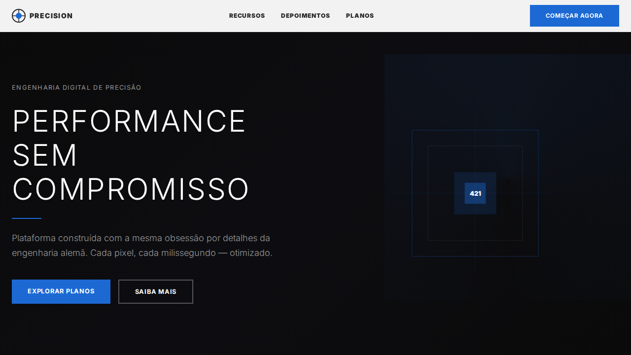
Historical Context
BMW's design language didn't arrive at angular precision by accident. It's the result of decades of tension between aerodynamic necessity and brand identity — a deliberate rejection of the soft, melted-soap aesthetic that consumed automotive design in the early 2000s. The Hofmeister kink, introduced in the 1961 BMW 1500, established that a single geometric decision could define an entire marque. That crease in the C-pillar wasn't decorative; it was ideological. Chris Bangle's controversial tenure (1992–2009) pushed BMW into flame surfacing — complex concave-convex transitions that made sheet metal feel tensioned rather than stamped. The industry hated it, then copied it wholesale. Post-Bangle, under Adrian van Hooydonk, the language sharpened further: fewer curves, more decisive intersections. The i8's flying buttresses, the current 4 Series' vertical kidney grille — these are statements that precision isn't about restraint, it's about commitment to an angle. What makes BMW's approach distinct from, say, Audi's cold rationalism is that BMW angles always imply motion. Every crease has a vector. Every surface termination suggests the car is already moving. It's geometry with intent, not geometry for geometry's sake.
When to Use
Deploy this system when the brand needs to communicate engineered confidence — not warmth, not approachability, but the quiet authority of something built without compromise. It works for luxury automotive interfaces, premium engineering firms, German precision manufacturing, high-end audio equipment, and any context where the audience equates sharp geometry with competence. Avoid it for anything that needs to feel human, handmade, or emotionally accessible. This is a system that rewards sophistication and punishes casualness.
Design Principles
- Every angle must have directional intent — no arbitrary intersections, no decorative geometry. If a line changes direction, it's because force demanded it.
- Surface tension over surface decoration. Flat planes gain interest through precise termination points and controlled light behavior, never through applied texture or gradient.
- Asymmetric confidence: compositions should feel dynamically balanced rather than statically centered. Weight shifts forward, implying momentum even in stillness.
- Material honesty through contrast — dark voids against machined surfaces, matte against polished. The system communicates quality through juxtaposition, not embellishment.
- Typographic sharpness: letterforms should be geometric, medium-to-high weight, with tight tracking. The type doesn't whisper — it states.
DESIGN.md
---
version: "alpha"
name: "BMW Angular Precision"
description: "BMW-inspired angular precision landing page. Ideal for automotivo de luxo, engenharia, marcas premium, produtos industriais. AI-ready template."
colors:
  primary: "#ffffff"
  secondary: "#262626"
  tertiary: "#1c69d4"
  neutral: "#757575"
  surface: "#0653b6"
  accent: "#bbbbbb"
typography:
  h1:
    fontFamily: system-ui
    fontSize: 2.25rem
    fontWeight: 700
  body-md:
    fontFamily: system-ui
    fontSize: 1rem
    fontWeight: 400
  label-caps:
    fontFamily: system-ui
    fontSize: 0.75rem
    fontWeight: 500
rounded:
  sm: 2px
  md: 4px
  lg: 8px
components:
  button-primary:
    backgroundColor: "{colors.primary}"
    textColor: "{colors.neutral}"
    rounded: "{rounded.sm}"
    padding: 12px
---

## Overview

BMW-inspired angular precision landing page. Ideal for automotivo de luxo, engenharia, marcas premium, produtos industriais. AI-ready template. BMW's design language didn't arrive at angular precision by accident. It's the result of decades of tension between aerodynamic necessity and brand identity — a deliberate rejection of the soft, melted-soap aesthetic that consumed automotive design in the early 2000s. The Hofmeister kink, introduced in the 1961 BMW 1500, established that a single geometric decision could define an entire marque. That crease in the C-pillar wasn't decorative; it was ideological.

Chris Bangle's controversial tenure (1992–2009) pushed BMW into flame surfacing — complex concave-convex transitions that made sheet metal feel tensioned rather than stamped. The industry hated it, then copied it wholesale. Post-Bangle, under Adrian van Hooydonk, the language sharpened further: fewer curves, more decisive intersections. The i8's flying buttresses, the current 4 Series' vertical kidney grille — these are statements that precision isn't about restraint, it's about commitment to an angle.

What makes BMW's approach distinct from, say, Audi's cold rationalism is that BMW angles always imply motion. Every crease has a vector. Every surface termination suggests the car is already moving. It's geometry with intent, not geometry for geometry's sake.

- Density: 5/10 — Balanced
- Variance: 4/10 — Moderate
- Motion: 4/10 — Subtle

- **Style:** Zero Radius Angular, Light 300 Uppercase Display, BMW Blue Accent, Full-Bleed Photography, German Engineering
- **Keywords:** bmw, angular, precision, zero radius, BMWTypeNext, weight 300, uppercase display, BMW Blue, full-bleed photography, German engineering, weight 900 nav
- **Era:** 2024-2026 Luxury Automotive
- **Light/Dark:** ✓ Full / ✓ Full

## Colors

- **Branco** (#ffffff) — Light surface, card backgrounds
- **Near Black** (#262626) — Dark surface, primary background
- **BMW Blue** (#1c69d4) — Accent highlight, links and focus states
- **Meta Gray** (#757575) — Secondary text, borders, muted elements
- **BMW Focus Blue** (#0653b6) — Secondary accent
- **Silver** (#bbbbbb) — Extended palette, decorative use
- **Preto** (#000000) — Deep contrast surface
- **Borda** (#ffffff) — Extended palette, decorative use


## Typography

- **Display / Hero:** system-ui — Weight 700, tight tracking, used for headline impact
- **Body:** system-ui — Weight 400, 16px/1.6 line-height, max 72ch per line
- **UI Labels / Captions:** system-ui — 0.875rem, weight 500, slight letter-spacing
- **Monospace:** JetBrains Mono — Used for code, metadata, and technical values

Scale:
- Hero: clamp(2.5rem, 5vw, 4rem)
- H1: 2.25rem
- H2: 1.5rem
- Body: 1rem / 1.6
- Small: 0.875rem


## Layout

- **Grid:** CSS Grid primary. Max-width containment: 1280px centered with 1.5rem side padding.
- **Spacing rhythm:** Balanced. Base unit: 0.5rem (8px).
- **Section vertical gaps:** clamp(4rem, 8vw, 8rem).
- **Hero layout:** Split-screen (text left, visual right).
- **Feature sections:** Zig-zag alternating text+image rows. No 3-equal-columns.
- **Mobile collapse:** All multi-column layouts collapse below 768px. No horizontal overflow.
- **z-index contract:** base (0) / sticky-nav (100) / overlay (200) / modal (300) / toast (500).


## Elevation & Depth

Zero border-radius em TUDO — o design mais angular analisado. Headlines weight 300 (Light) uppercase — autoridade sussurrada em vez de gritada. BMW Blue (#1c69d4) apenas para elementos interativos, nunca decorativo. Fotografia automotiva full-bleed como conteúdo primário. Weight 900 para navegação — contraste extremo com 300 display. Line-heights tight (1.15-1.30) em todo sistema. Seções alternando dark photography + white content como showroom. CSS variables --site-context-* para theming multi-marca.

- **Physics:** Ease-out curves, 200-300ms duration. Smooth and predictable.
- **Entry animations:** Fade + translate-Y (16px → 0) over 420ms ease-out. Staggered cascades for lists: 80ms between items.
- **Hover states:** Subtle color shift + shadow adjustment over 200ms.
- **Page transitions:** Fade only (200ms).
- **Performance:** Only transform and opacity animated. No layout-triggering properties.


## Shapes

Base corner radius: 0px. See rounded tokens in front matter for the full scale.


## Components

- **Primary Button:** Sharp edges (0px) shape. Accent color fill. Hover: 8% darken + subtle lift shadow. Active: -1px translate tactile press. Font weight 600. No outer glows.
- **Secondary / Ghost Button:** Outline variant. 1.5px border in muted color. Text in primary color. Hover: subtle background fill.
- **Cards:** Sharp edges (0px) corners. Surface background. Subtle shadow (0 2px 12px rgba(0,0,0,0.06)). 1px border stroke.
- **Inputs:** Label above input. 1px border stroke. Focus ring: 2px accent color offset 2px. Error text below in semantic red. No floating labels.
- **Navigation:** Primary surface background. Active item: accent color indicator. Font weight 500 when active.
- **Skeletons:** Shimmer animation matching component dimensions. No circular spinners.
- **Empty States:** Icon-based composition with descriptive text and action button.


## Do's and Don'ts

- No emojis in UI — use icon system only (Lucide, Heroicons)
- No pure black (#000000) — use off-black or charcoal variants
- No oversaturated accent colors (saturation cap: 80%)
- No 3-column equal-width feature layouts — use zig-zag or asymmetric grid
- No `h-screen` — use `min-h-[100dvh]`
- No AI copywriting clichés: "Elevate", "Seamless", "Unleash", "Next-Gen"
- No broken external image links — use picsum.photos or inline SVG
- No generic lorem ipsum in demos

- Do Zero radius em tudo
- Do Weight 300 uppercase display
- Do BMW Blue #1c69d4 interativo
- Do Fotografia full-bleed
- Do Weight 900 navegação
- Do Line-heights tight 1.15-1.30
- Do Alternância dark/white showroom
- Do Responsivo


## Use Case

Luxury automotive, Engineering, Premium brands, Industrial products
Technical Specs
CSS
background:#ffffff;color:#262626;accent:#1c69d4;border-radius:0px;box-shadow:none;font-family:system-ui,Helvetica,Arial;font-weight:300 display,900 nav,700 buttons,400 body;text-transform:uppercase display;line-height:1.15-1.30
Variables
--bg:#ffffff;--text:#262626;--blue:#1c69d4;--focus:#0653b6;--meta:#757575;--silver:#bbbbbb;--radius:0px;--shadow:none
Checklist
☐ Zero radius em tudo, ☐ Weight 300 uppercase display, ☐ BMW Blue #1c69d4 interativo, ☐ Fotografia full-bleed, ☐ Weight 900 navegação, ☐ Line-heights tight 1.15-1.30, ☐ Alternância dark/white showroom, ☐ Responsivo
Colors
Primary
Secondary
Effects
Zero border-radius em TUDO — o design mais angular analisado. Headlines weight 300 (Light) uppercase — autoridade sussurrada em vez de gritada. BMW Blue (#1c69d4) apenas para elementos interativos, nunca decorativo. Fotografia automotiva full-bleed como conteúdo primário. Weight 900 para navegação — contraste extremo com 300 display. Line-heights tight (1.15-1.30) em todo sistema. Seções alternando dark photography + white content como showroom. CSS variables --site-context-* para theming multi-marca.
Light/Dark
✓ Full / ✓ Full
AI Prompt
Act as a Senior Frontend Engineer and Expert UI Designer.
Your task is to code a complete Landing Page on the first attempt.
- Landing Page Theme: <INSERT THEME>
- Sections to add: <INSERT SECTIONS>

Generate the final code immediately following these definitions:

## Style

- **Name:** BMW Angular Precision
- **Type:** Zero Radius Angular, Light 300 Uppercase Display, BMW Blue Accent, Full-Bleed Photography, German Engineering
- **Keywords:** bmw, angular, precision, zero radius, BMWTypeNext, weight 300, uppercase display, BMW Blue, full-bleed photography, German engineering, weight 900 nav
- **Era:** 2024-2026 Luxury Automotive
- **Light/Dark:** ✓ Full / ✓ Full

## Color Palette

- **Primary:** Branco #ffffff, Near Black #262626, BMW Blue #1c69d4, Meta Gray #757575
- **Secondary:** BMW Focus Blue #0653b6, Silver #bbbbbb, Preto #000000, Borda #ffffff

## Visual Effects

Zero border-radius em TUDO — o design mais angular analisado. Headlines weight 300 (Light) uppercase — autoridade sussurrada em vez de gritada. BMW Blue (#1c69d4) apenas para elementos interativos, nunca decorativo. Fotografia automotiva full-bleed como conteúdo primário. Weight 900 para navegação — contraste extremo com 300 display. Line-heights tight (1.15-1.30) em todo sistema. Seções alternando dark photography + white content como showroom. CSS variables --site-context-* para theming multi-marca.

## AI Visual Direction

Design a BMW-inspired angular precision landing page. ZERO border-radius on everything — sharp corners only. BMWTypeNext Light (weight 300) uppercase for display headings at 60px, line-height 1.30. BMW Blue (#1c69d4) for interactive elements only. Full-bleed automotive photography for hero sections. Weight 900 for navigation emphasis — extreme contrast with 300 display. Tight line-heights (1.15-1.30) throughout. Dark photography sections + white content sections like a showroom. No shadows — depth from photography contrast.

## CSS Technical

```css
background:#ffffff;color:#262626;accent:#1c69d4;border-radius:0px;box-shadow:none;font-family:system-ui,Helvetica,Arial;font-weight:300 display,900 nav,700 buttons,400 body;text-transform:uppercase display;line-height:1.15-1.30
```

## Design System Variables

```css
--bg:#ffffff;--text:#262626;--blue:#1c69d4;--focus:#0653b6;--meta:#757575;--silver:#bbbbbb;--radius:0px;--shadow:none
```

## Implementation Checklist

- ☐ Zero radius em tudo
- ☐ Weight 300 uppercase display
- ☐ BMW Blue #1c69d4 interativo
- ☐ Fotografia full-bleed
- ☐ Weight 900 navegação
- ☐ Line-heights tight 1.15-1.30
- ☐ Alternância dark/white showroom
- ☐ Responsivo

## Execution Rules

1. Strictly follow the defined visual style.
2. Use high-quality inline SVG icons (Heroicons or Lucide style) — NEVER use emojis as icons.
3. Add `cursor-pointer` and smooth `hover` states (transition-all) on all interactive elements.
4. Required Page Structure:
   - Navbar (Logo + Links + CTA)
   - Hero Section (Impactful Headline + Subtitle + 2 buttons + 3D/Abstract visual element via CSS)
   - Features (3 cards with icons)
   - Testimonials (3 cards)
   - Pricing (3 tiers, highlight the middle one)
   - Final CTA
   - Full Footer with social links, privacy policy, terms of use, contact and SEO links.
5. All text content must be in English.
6. The visual must be CLEARLY distinct — do not create a "default Bootstrap" design. Force the use of the provided design system variables.
7. Use `<style>` tags in the head for custom classes (especially for complex backdrop-filter effects and animations) that Tailwind CDN doesn't cover.
8. Full Responsiveness: Layout must adapt perfectly to Mobile, Tablet and Desktop (vertical stack on mobile).
9. Include basic SEO, Viewport and Open Graph meta tags in `<head>`.
10. Footer must contain: Copyright 2026, Secondary navigation links and Social media icons.
11. Make the creative decisions needed to deliver the complete, functional result now.
Related
Last synced: 4/1/2026