Belle Époque Lithograph
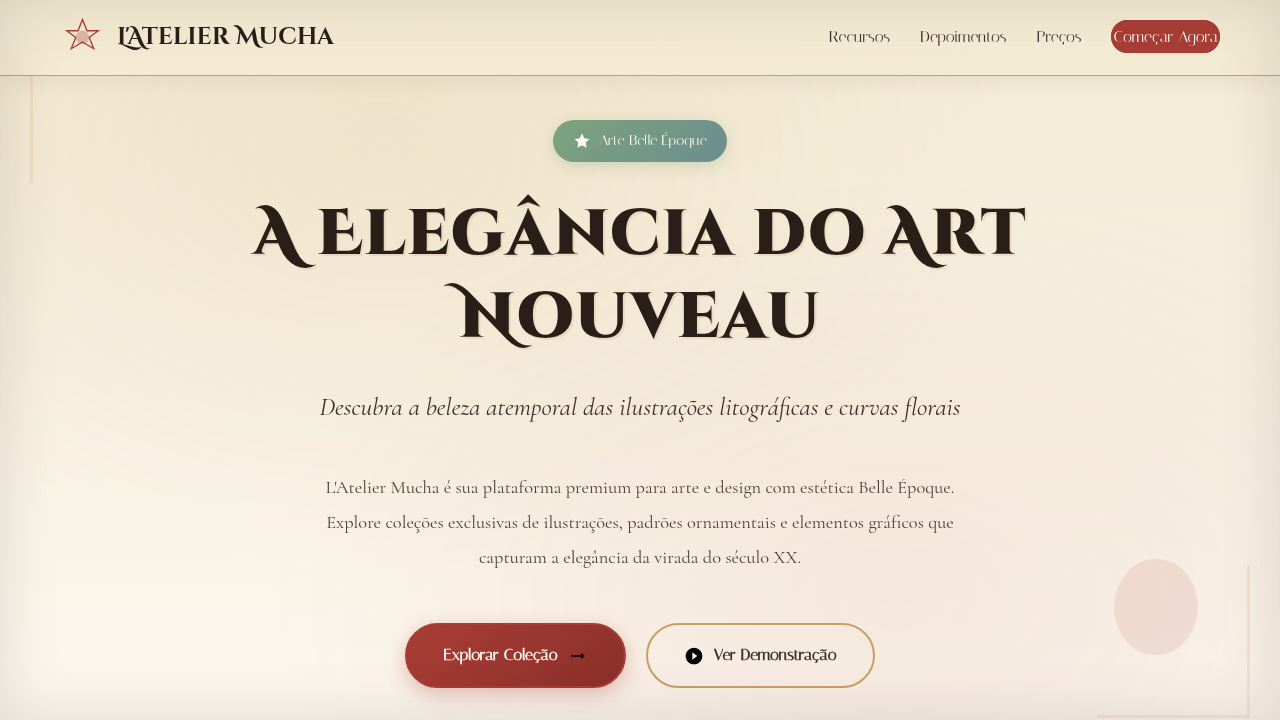
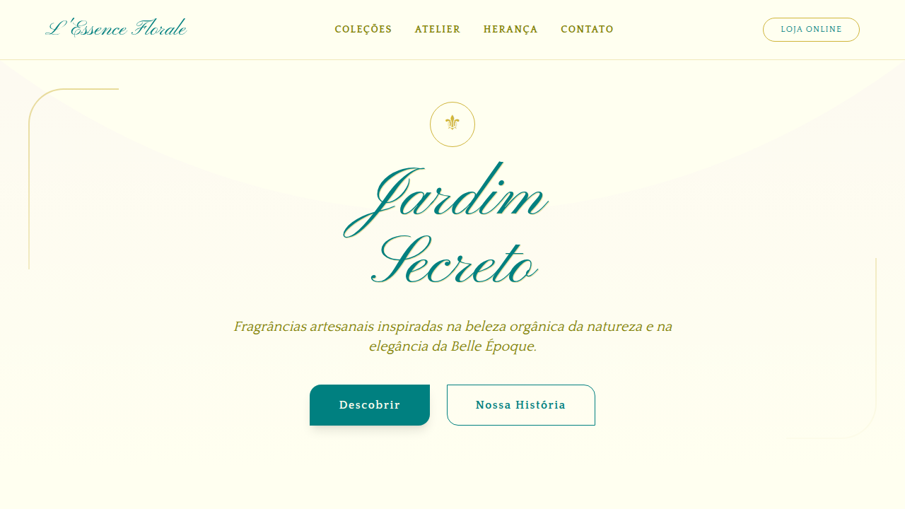
Belle epoque landing page, art nouveau style, alphonse mucha aesthetic, lithograph texture, floral borders, vintage elegance, pastel colors. Ideal for landing pages, modern websites. AI-ready template.
Use case: Landing pages, Modern websites
Historical Context
The Belle Époque gave us the poster as art object. Before Mucha draped his Byzantine-haired women across Parisian kiosks, before Toulouse-Lautrec flattened the Moulin Rouge into pure graphic punch — advertising was forgettable. Lithography changed that. Suddenly color was cheap, scale was possible, and the street became a gallery. Mucha's genius wasn't just ornament for ornament's sake. Those sinuous borders, the botanical halos, the layered frames — they created hierarchy. They told your eye exactly where to land. Translated to digital, this vocabulary is absurdly potent for luxury branding. The ornamental frame becomes a container component. The flowing hair becomes a decorative divider. The muted metallics and dusty pastels signal craft without screaming wealth. What works is restraint within excess — every curl has a job. The frame-as-UI-pattern deserves special attention. In lithographic posters, borders weren't decoration — they were architecture. They separated title from figure from background. Modern card components, modal overlays, even navigation wells can borrow this logic: use ornamental borders not as flair, but as structural rhythm that guides the viewer through content zones.
When to Use
Reach for this when the brief says heritage, indulgence, or ceremony. Wine labels, theater programs, boutique hotel sites, cultural festival identities — anywhere the audience expects craft and doesn't mind density. It pairs naturally with serif typography and muted, aged color palettes. Avoid it for speed-first interfaces or minimal SaaS dashboards. This style rewards slow looking. If your user is scanning a feed at thumb-speed, the ornamental detail becomes noise. But for a spirits landing page or an opera season announcement? Nothing else carries this weight.
Design Principles
- Ornament as structure — every decorative element must serve hierarchy, not just fill space
- Contained excess — richness lives inside strict frames; let borders do the architectural work
- Muted opulence — dusty golds, aged ivories, deep burgundies; luxury whispers through patina, not saturation
- Typographic ceremony — pair display serifs with generous spacing; let letterforms breathe inside ornamental containers
- Layered depth — foreground figure, midground frame, background texture; the lithographic z-axis creates presence even on flat screens
DESIGN.md
---
version: "alpha"
name: "Belle Époque Lithograph"
description: "Belle epoque landing page, art nouveau style, alphonse mucha aesthetic, lithograph texture, floral borders, vintage elegance, pastel colors. Ideal for landing pages, modern websites. AI-ready template."
colors:
  primary: "#F3EAD3"
  secondary: "#3E2F26"
  tertiary: "#A83E36"
  neutral: "#7DA37D"
  surface: "#D48C8C"
  accent: "#C5A065"
typography:
  h1:
    fontFamily: Cinzel Decorative
    fontSize: 2.25rem
    fontWeight: 700
  body-md:
    fontFamily: Cinzel Decorative
    fontSize: 1rem
    fontWeight: 400
  label-caps:
    fontFamily: Cinzel Decorative
    fontSize: 0.75rem
    fontWeight: 500
components:
  button-primary:
    backgroundColor: "{colors.primary}"
    textColor: "{colors.neutral}"
    padding: 12px
---

## Overview

Belle epoque landing page, art nouveau style, alphonse mucha aesthetic, lithograph texture, floral borders, vintage elegance, pastel colors. Ideal for landing pages, modern websites. AI-ready template. The Belle Époque gave us the poster as art object. Before Mucha draped his Byzantine-haired women across Parisian kiosks, before Toulouse-Lautrec flattened the Moulin Rouge into pure graphic punch — advertising was forgettable. Lithography changed that. Suddenly color was cheap, scale was possible, and the street became a gallery. Mucha's genius wasn't just ornament for ornament's sake. Those sinuous borders, the botanical halos, the layered frames — they created hierarchy. They told your eye exactly where to land.

Translated to digital, this vocabulary is absurdly potent for luxury branding. The ornamental frame becomes a container component. The flowing hair becomes a decorative divider. The muted metallics and dusty pastels signal craft without screaming wealth. What works is restraint within excess — every curl has a job.

The frame-as-UI-pattern deserves special attention. In lithographic posters, borders weren't decoration — they were architecture. They separated title from figure from background. Modern card components, modal overlays, even navigation wells can borrow this logic: use ornamental borders not as flair, but as structural rhythm that guides the viewer through content zones.

- Density: 5/10 — Balanced
- Variance: 4/10 — Moderate
- Motion: 4/10 — Subtle

- **Style:** Nostalgic, Aristocratic, Elegant
- **Keywords:** belle epoque, lithograph, much, art nouveau, vintage, floral, elegant, ornamental
- **Era:** Late 19th Century
- **Light/Dark:** ✓ Full / ✗ No

## Colors

- **Background** (#F3EAD3) — Primary background surface
- **Text** (#3E2F26) — Primary text color
- **Accent** (#A83E36) — Primary accent, CTAs and interactive elements
- **Sage Green** (#7DA37D) — Success states, positive indicators
- **Dusty Rose** (#D48C8C) — Extended palette, decorative use
- **Gold** (#C5A065) — Premium accent, decorative highlights


## Typography

- **Display / Hero:** Cinzel Decorative — Weight 700, tight tracking, used for headline impact
- **Body:** Cinzel Decorative — Weight 400, 16px/1.6 line-height, max 72ch per line
- **UI Labels / Captions:** Cinzel Decorative — 0.875rem, weight 500, slight letter-spacing
- **Monospace:** JetBrains Mono — Used for code, metadata, and technical values

Scale:
- Hero: clamp(2.5rem, 5vw, 4rem)
- H1: 2.25rem
- H2: 1.5rem
- Body: 1rem / 1.6
- Small: 0.875rem


## Layout

- **Grid:** CSS Grid primary. Max-width containment: 1280px centered with 1.5rem side padding.
- **Spacing rhythm:** Balanced. Base unit: 0.5rem (8px).
- **Section vertical gaps:** clamp(4rem, 8vw, 8rem).
- **Hero layout:** Split-screen (text left, visual right).
- **Feature sections:** Zig-zag alternating text+image rows. No 3-equal-columns.
- **Mobile collapse:** All multi-column layouts collapse below 768px. No horizontal overflow.
- **z-index contract:** base (0) / sticky-nav (100) / overlay (200) / modal (300) / toast (500).


## Elevation & Depth

Hand-drawn lithograph illustrations, ornamental ribbon banners, vignette borders, fine ink hatching, watercolor wash.

- **Physics:** Ease-out curves, 200-300ms duration. Smooth and predictable.
- **Entry animations:** Fade + translate-Y (16px → 0) over 420ms ease-out. Staggered cascades for lists: 80ms between items.
- **Hover states:** Subtle color shift + shadow adjustment over 200ms.
- **Page transitions:** Fade only (200ms).
- **Performance:** Only transform and opacity animated. No layout-triggering properties.


## Shapes

Base corner radius: 8px. See rounded tokens in front matter for the full scale.


## Components

- **Primary Button:** Subtly rounded (0.5rem) shape. Accent color fill. Hover: 8% darken + subtle lift shadow. Active: -1px translate tactile press. Font weight 600. No outer glows.
- **Secondary / Ghost Button:** Outline variant. 1.5px border in muted color. Text in primary color. Hover: subtle background fill.
- **Cards:** Subtly rounded (0.5rem) corners. Surface background. Subtle shadow (0 2px 12px rgba(0,0,0,0.06)). 1px border stroke.
- **Inputs:** Label above input. 1px border stroke. Focus ring: 2px accent color offset 2px. Error text below in semantic red. No floating labels.
- **Navigation:** Primary surface background. Active item: accent color indicator. Font weight 500 when active.
- **Skeletons:** Shimmer animation matching component dimensions. No circular spinners.
- **Empty States:** Icon-based composition with descriptive text and action button.


## Do's and Don'ts

- No emojis in UI — use icon system only (Lucide, Heroicons)
- No pure black (#000000) — use off-black or charcoal variants
- No oversaturated accent colors (saturation cap: 80%)
- No 3-column equal-width feature layouts — use zig-zag or asymmetric grid
- No `h-screen` — use `min-h-[100dvh]`
- No AI copywriting clichés: "Elevate", "Seamless", "Unleash", "Next-Gen"
- No broken external image links — use picsum.photos or inline SVG
- No generic lorem ipsum in demos

- Do Cream/Parchment background
- Do Art Nouveau curves and flowers
- Do Muted vintage pastel colors
- Do Serif or Decorative fonts
- Do Ornamented borders


## Use Case

Landing pages, Modern websites
Technical Specs
CSS
background-color: #F3EAD3; color: #3E2F26; font-family: 'Cinzel Decorative', cursive; border: 1px solid #A83E36; box-shadow: inset 0 0 20px rgba(0,0,0,0.1);
Variables
--parchment: #F3EAD3, --sepia-text: #3E2F26, --rose-accent: #A83E36, --sage-green: #7DA37D, --font-art-nouveau: 'Cinzel Decorative', cursive
Checklist
☐ Cream/Parchment background, ☐ Art Nouveau curves and flowers, ☐ Muted vintage pastel colors, ☐ Serif or Decorative fonts, ☐ Ornamented borders
Colors
Primary
Secondary
Effects
Hand-drawn lithograph illustrations, ornamental ribbon banners, vignette borders, fine ink hatching, watercolor wash.
Light/Dark
✓ Full / ✗ No
AI Prompt
Act as a Senior Frontend Engineer and Expert UI Designer.
Your task is to code a complete Landing Page on the first attempt.
- Landing Page Theme: <INSERT THEME>
- Sections to add: <INSERT SECTIONS>

Generate the final code immediately following these definitions:

## Style

- **Name:** Belle Époque Lithograph
- **Type:** Nostalgic, Aristocratic, Elegant
- **Keywords:** belle epoque, lithograph, much, art nouveau, vintage, floral, elegant, ornamental
- **Era:** Late 19th Century
- **Light/Dark:** ✓ Full / ✗ No

## Color Palette

- **Primary:** Background #F3EAD3, Text #3E2F26, Accent #A83E36
- **Secondary:** Sage Green #7DA37D, Dusty Rose #D48C8C, Gold #C5A065

## Visual Effects

Hand-drawn lithograph illustrations, ornamental ribbon banners, vignette borders, fine ink hatching, watercolor wash.

## AI Visual Direction

belle epoque landing page, art nouveau style, alphonse mucha aesthetic, lithograph texture, floral borders, vintage elegance, pastel colors.

## CSS Technical

```css
background-color: #F3EAD3; color: #3E2F26; font-family: 'Cinzel Decorative', cursive; border: 1px solid #A83E36; box-shadow: inset 0 0 20px rgba(0,0,0,0.1);
```

## Design System Variables

```css
--parchment: #F3EAD3, --sepia-text: #3E2F26, --rose-accent: #A83E36, --sage-green: #7DA37D, --font-art-nouveau: 'Cinzel Decorative', cursive
```

## Implementation Checklist

- ☐ Cream/Parchment background
- ☐ Art Nouveau curves and flowers
- ☐ Muted vintage pastel colors
- ☐ Serif or Decorative fonts
- ☐ Ornamented borders

## Execution Rules

1. Strictly follow the defined visual style.
2. Use high-quality inline SVG icons (Heroicons or Lucide style) — NEVER use emojis as icons.
3. Add `cursor-pointer` and smooth `hover` states (transition-all) on all interactive elements.
4. Required Page Structure:
   - Navbar (Logo + Links + CTA)
   - Hero Section (Impactful Headline + Subtitle + 2 buttons + 3D/Abstract visual element via CSS)
   - Features (3 cards with icons)
   - Testimonials (3 cards)
   - Pricing (3 tiers, highlight the middle one)
   - Final CTA
   - Full Footer with social links, privacy policy, terms of use, contact and SEO links.
5. All text content must be in English.
6. The visual must be CLEARLY distinct — do not create a "default Bootstrap" design. Force the use of the provided design system variables.
7. Use `<style>` tags in the head for custom classes (especially for complex backdrop-filter effects and animations) that Tailwind CDN doesn't cover.
8. Full Responsiveness: Layout must adapt perfectly to Mobile, Tablet and Desktop (vertical stack on mobile).
9. Include basic SEO, Viewport and Open Graph meta tags in `<head>`.
10. Footer must contain: Copyright 2026, Secondary navigation links and Social media icons.
11. Make the creative decisions needed to deliver the complete, functional result now.
Related
Last synced: 4/1/2026