Art Deco / Golden Age
Design an Art Deco / Golden Age interface. Ideal for landing pages, saas. AI-ready template.
Use case: Landing pages, SaaS
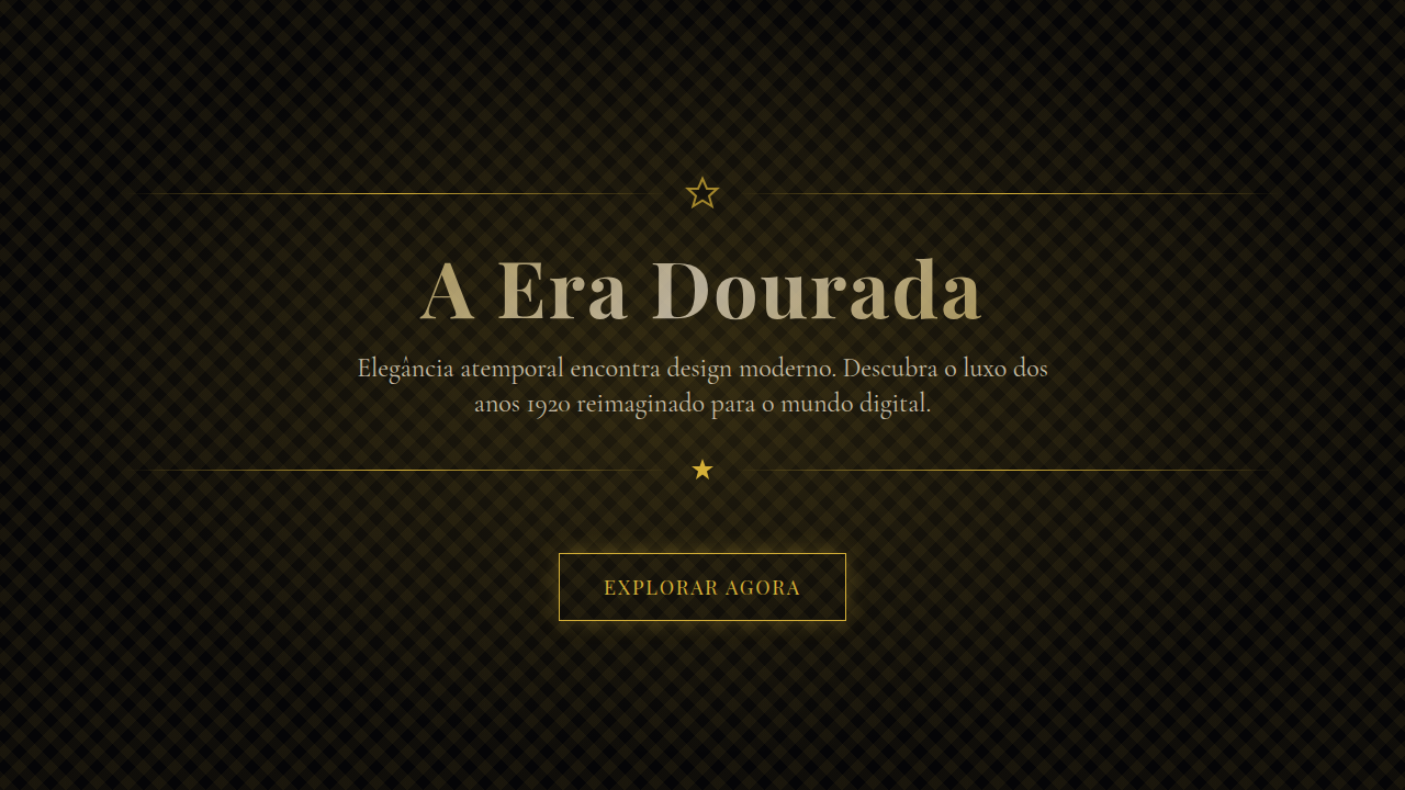
Historical Context
Art Deco didn't ask permission. It exploded out of 1920s Paris — the 1925 Exposition Internationale des Arts Décoratifs — as a full rejection of the organic curves Art Nouveau had been peddling. Sharp angles. Sunburst motifs. Chevrons stacked like declarations of intent. It was modernism dressed in a tuxedo. The movement crossed the Atlantic and went vertical. The Chrysler Building's eagle gargoyles and tiered crown became its cathedral. Hollywood adopted the vocabulary wholesale — think Gatsby's parties rendered in chrome and champagne gold. Every surface demanded ornamentation, but disciplined ornamentation. Symmetry was non-negotiable. In digital, Art Deco translates remarkably well because it was always about precision. The geometric repetition maps cleanly to grid systems. The metallic palettes — gold leaf, brass, oxidized copper — feel native to dark-mode luxury interfaces. When a hotel brand or fashion house needs to signal heritage without looking dusty, this is the visual language that delivers. It's opulence with structure. Excess with rules.
When to Use
Reach for Art Deco when the brief says "premium" and actually means it. Luxury hospitality, high-fashion editorial, spirits brands, members-only anything. It works when your audience expects to feel elevated — not welcomed, elevated. Avoid it for approachable consumer products or anything targeting Gen Z casualness. This style has a built-in velvet rope. If your product needs warmth or accessibility as a core value, look elsewhere. Art Deco is for brands that want distance as a feature.
Design Principles
- Geometric symmetry as the foundation — every element mirrors, repeats, or radiates from a central axis. Asymmetry here reads as a mistake, not a choice.
- Metallic and jewel-tone palettes only. Gold, brass, emerald, sapphire, onyx. If you're reaching for pastels, you're in the wrong style.
- Ornamentation is structural, never decorative afterthought. Borders, dividers, and frames do real compositional work — they're not garnish.
- Typography runs tall and condensed. High contrast between thick and thin strokes. Display faces dominate; body copy stays minimal and secondary.
- Negative space is deliberate luxury. Let the geometry breathe. Crowding kills the entire effect — Deco needs room to command attention.
DESIGN.md
---
version: "alpha"
name: "Art Deco / Golden Age"
description: "Design an Art Deco / Golden Age interface. Ideal for landing pages, saas. AI-ready template."
colors:
  primary: "#050507"
  secondary: "#D4AF37"
  tertiary: "#F2E6CF"
  neutral: "#0A0E27"
  surface: "#8C7348"
  accent: "#2B3A42"
typography:
  h1:
    fontFamily: serif --gold-primary: #D4AF37
    fontSize: 2.25rem
    fontWeight: 700
  body-md:
    fontFamily: serif --gold-primary: #D4AF37
    fontSize: 1rem
    fontWeight: 400
  label-caps:
    fontFamily: serif --gold-primary: #D4AF37
    fontSize: 0.75rem
    fontWeight: 500
components:
  button-primary:
    backgroundColor: "{colors.primary}"
    textColor: "{colors.neutral}"
    padding: 12px
---

## Overview

Design an Art Deco / Golden Age interface. Ideal for landing pages, saas. AI-ready template. Art Deco didn't ask permission. It exploded out of 1920s Paris — the 1925 Exposition Internationale des Arts Décoratifs — as a full rejection of the organic curves Art Nouveau had been peddling. Sharp angles. Sunburst motifs. Chevrons stacked like declarations of intent. It was modernism dressed in a tuxedo.

The movement crossed the Atlantic and went vertical. The Chrysler Building's eagle gargoyles and tiered crown became its cathedral. Hollywood adopted the vocabulary wholesale — think Gatsby's parties rendered in chrome and champagne gold. Every surface demanded ornamentation, but disciplined ornamentation. Symmetry was non-negotiable.

In digital, Art Deco translates remarkably well because it was always about precision. The geometric repetition maps cleanly to grid systems. The metallic palettes — gold leaf, brass, oxidized copper — feel native to dark-mode luxury interfaces. When a hotel brand or fashion house needs to signal heritage without looking dusty, this is the visual language that delivers. It's opulence with structure. Excess with rules.

- Density: 5/10 — Balanced
- Variance: 2/10 — Structured
- Motion: 8/10 — Cinematic

- **Style:** Ornate, Geometric, Luxurious, Golden
- **Keywords:** Elegant, sophisticated, luxurious, timeless, geometric patterns, sunburst motifs, gold accents, symmetrical, ornamental, gatsby
- **Era:** 1920s Art Deco
- **Light/Dark:** ✓ Full / ✓ Full

## Colors

- **Deep Black** (#050507) — Dark surface, primary background
- **Gold** (#D4AF37) — Premium accent, decorative highlights
- **Cream** (#F2E6CF) — Light surface, card backgrounds
- **Dark Navy** (#0A0E27) — Dark surface, primary background
- **bronze accents** (#8C7348) — Primary accent, CTAs and interactive elements
- **dark teal** (#2B3A42) — Deep contrast surface
- **muted silver** (#4A4A4A) — Secondary text, borders, muted elements


## Typography

- **Display / Hero:** serif --gold-primary: #D4AF37 — Weight 700, tight tracking, used for headline impact
- **Body:** serif --gold-primary: #D4AF37 — Weight 400, 16px/1.6 line-height, max 72ch per line
- **UI Labels / Captions:** serif --gold-primary: #D4AF37 — 0.875rem, weight 500, slight letter-spacing
- **Monospace:** JetBrains Mono — Used for code, metadata, and technical values

Scale:
- Hero: clamp(2.5rem, 5vw, 4rem)
- H1: 2.25rem
- H2: 1.5rem
- Body: 1rem / 1.6
- Small: 0.875rem


## Layout

- **Grid:** CSS Grid primary. Max-width containment: 1280px centered with 1.5rem side padding.
- **Spacing rhythm:** Balanced. Base unit: 0.5rem (8px).
- **Section vertical gaps:** clamp(4rem, 8vw, 8rem).
- **Hero layout:** Split-screen (text left, visual right).
- **Feature sections:** Zig-zag alternating text+image rows. No 3-equal-columns.
- **Mobile collapse:** All multi-column layouts collapse below 768px. No horizontal overflow.
- **z-index contract:** base (0) / sticky-nav (100) / overlay (200) / modal (300) / toast (500).


## Elevation & Depth

Dramatic spotlight effects, golden shimmer animations, geometric pattern reveals, elegant hover transitions (300ms), parallax on ornamental frames

- **Physics:** Spring — stiffness 120, damping 20. Confident, weighted transitions.
- **Entry animations:** Fade + translate-Y (16px → 0) over 540ms ease-out. Staggered cascades for lists: 120ms between items.
- **Hover states:** Scale(1.03) + shadow lift over 200ms.
- **Page transitions:** Fade + slide (300ms).
- **Performance:** Only transform and opacity animated. No layout-triggering properties.


## Shapes

Base corner radius: 8px. See rounded tokens in front matter for the full scale.


## Components

- **Primary Button:** Subtly rounded (0.5rem) shape. Accent color fill. Hover: 8% darken + subtle lift shadow. Active: -1px translate tactile press. Font weight 600. No outer glows.
- **Secondary / Ghost Button:** Outline variant. 1.5px border in muted color. Text in primary color. Hover: subtle background fill.
- **Cards:** Subtly rounded (0.5rem) corners. Surface background. Subtle shadow (0 2px 12px rgba(0,0,0,0.06)). 1px border stroke.
- **Inputs:** Label above input. 1px border stroke. Focus ring: 2px accent color offset 2px. Error text below in semantic red. No floating labels.
- **Navigation:** Primary surface background. Active item: accent color indicator. Font weight 500 when active.
- **Skeletons:** Shimmer animation matching component dimensions. No circular spinners.
- **Empty States:** Icon-based composition with descriptive text and action button.


## Do's and Don'ts

- No emojis in UI — use icon system only (Lucide, Heroicons)
- No pure black (#000000) — use off-black or charcoal variants
- No oversaturated accent colors (saturation cap: 80%)
- No 3-column equal-width feature layouts — use zig-zag or asymmetric grid
- No `h-screen` — use `min-h-[100dvh]`
- No AI copywriting clichés: "Elevate", "Seamless", "Unleash", "Next-Gen"
- No broken external image links — use picsum.photos or inline SVG
- No generic lorem ipsum in demos

- Do Geometric patterns present
- Do Gold accents consistent
- Do Symmetrical layout
- Do Ornamental frames
- Do Serif typography
- Do Dark+gold contrast verified


## Use Case

Landing pages, SaaS
Technical Specs
CSS
background: #050507, color: #F2E6CF, border: 1px solid #D4AF37, linear-gradient for gold effects, clip-path: polygon() for geometric shapes, box-shadow: 0 0 20px rgba(212,175,55,0.3), font-family: serif
Variables
--gold-primary: #D4AF37, --gold-dark: #8C7348, --bg-dark: #050507, --text-cream: #F2E6CF, --pattern-opacity: 0.15, --ornament-border: 1px solid #D4AF37
Checklist
☐ Geometric patterns present, ☐ Gold accents consistent, ☐ Symmetrical layout, ☐ Ornamental frames, ☐ Serif typography, ☐ Dark+gold contrast verified
Colors
Primary
Secondary
Effects
Dramatic spotlight effects, golden shimmer animations, geometric pattern reveals, elegant hover transitions (300ms), parallax on ornamental frames
Light/Dark
✓ Full / ✓ Full
AI Prompt
Act as a Senior Frontend Engineer and Expert UI Designer.
Your task is to code a complete Landing Page on the first attempt.
- Landing Page Theme: <INSERT THEME>
- Sections to add: <INSERT SECTIONS>

Generate the final code immediately following these definitions:

## Style

- **Name:** Art Deco / Golden Age
- **Type:** Ornate, Geometric, Luxurious, Golden
- **Keywords:** Elegant, sophisticated, luxurious, timeless, geometric patterns, sunburst motifs, gold accents, symmetrical, ornamental, gatsby
- **Era:** 1920s Art Deco
- **Light/Dark:** ✓ Full / ✓ Full

## Color Palette

- **Primary:** Deep Black #050507, Gold #D4AF37, Cream #F2E6CF, Dark Navy #0A0E27
- **Secondary:** Metallic gold gradients, bronze accents #8C7348, dark teal #2B3A42, muted silver #4A4A4A

## Visual Effects

Dramatic spotlight effects, golden shimmer animations, geometric pattern reveals, elegant hover transitions (300ms), parallax on ornamental frames

## AI Visual Direction

Design an Art Deco / Golden Age interface. Use: geometric patterns (chevrons, sunbursts, fan shapes), gold metallic accents (#D4AF37), symmetrical layouts, ornamental frames, elegant serif typography, dark backgrounds with gold highlights, Gatsby-era luxury feel.

## CSS Technical

```css
background: #050507, color: #F2E6CF, border: 1px solid #D4AF37, linear-gradient for gold effects, clip-path: polygon() for geometric shapes, box-shadow: 0 0 20px rgba(212,175,55,0.3), font-family: serif
```

## Design System Variables

```css
--gold-primary: #D4AF37, --gold-dark: #8C7348, --bg-dark: #050507, --text-cream: #F2E6CF, --pattern-opacity: 0.15, --ornament-border: 1px solid #D4AF37
```

## Implementation Checklist

- ☐ Geometric patterns present
- ☐ Gold accents consistent
- ☐ Symmetrical layout
- ☐ Ornamental frames
- ☐ Serif typography
- ☐ Dark+gold contrast verified

## Execution Rules

1. Strictly follow the defined visual style.
2. Use high-quality inline SVG icons (Heroicons or Lucide style) — NEVER use emojis as icons.
3. Add `cursor-pointer` and smooth `hover` states (transition-all) on all interactive elements.
4. Required Page Structure:
   - Navbar (Logo + Links + CTA)
   - Hero Section (Impactful Headline + Subtitle + 2 buttons + 3D/Abstract visual element via CSS)
   - Features (3 cards with icons)
   - Testimonials (3 cards)
   - Pricing (3 tiers, highlight the middle one)
   - Final CTA
   - Full Footer with social links, privacy policy, terms of use, contact and SEO links.
5. All text content must be in English.
6. The visual must be CLEARLY distinct — do not create a "default Bootstrap" design. Force the use of the provided design system variables.
7. Use `<style>` tags in the head for custom classes (especially for complex backdrop-filter effects and animations) that Tailwind CDN doesn't cover.
8. Full Responsiveness: Layout must adapt perfectly to Mobile, Tablet and Desktop (vertical stack on mobile).
9. Include basic SEO, Viewport and Open Graph meta tags in `<head>`.
10. Footer must contain: Copyright 2026, Secondary navigation links and Social media icons.
11. Make the creative decisions needed to deliver the complete, functional result now.
Related
Last synced: 4/1/2026