American Diner Americana
American diner landing page, 50s retro style, mint green and red, checkerboard pattern, chrome typography, neon signs, nostalgic. Ideal for landing pages, modern websites. AI-ready template.
Use case: Landing pages, Modern websites
Historical Context
The American diner didn't just serve food — it served an entire visual language. Post-war optimism, Eisenhower-era prosperity, the open road. Chrome everything. Formica countertops in impossible colors. Neon tubes buzzing against plate glass at 2am. The checkerboard floor wasn't a pattern choice; it was inevitability. What makes this aesthetic endure isn't accuracy — it's feeling. Nobody actually misses waiting 40 minutes for a milkshake. They miss the promise those spaces made: that America was simple, abundant, fun. The jukebox in the corner. The waitress who called you 'hon.' Red vinyl booths cracking at the seams. Every element was accidentally designed to become iconic. Nostalgia is commerce. Always has been. The diner aesthetic sells because it triggers a memory people never had — a collective false past that feels warmer than whatever's actually happening. Brands figured this out decades ago. Wrap anything in chrome and neon, suddenly it feels trustworthy. Familiar. Worth paying more for.
When to Use
Reach for this when you need instant warmth and approachability. Restaurants and food brands, obviously — but also retro gaming, craft beverages, barbershops, roadside anything. It works for apps that want personality without pretension. Use it when your brand needs to feel established even if it launched last Tuesday. Skip it for anything requiring sophistication or minimalism. This aesthetic is loud on purpose.
Design Principles
- Chrome and reflection — surfaces should feel polished, tactile, almost lickable. Metallic accents do the heavy lifting.
- Neon as hierarchy — use glowing, saturated color the way signage does: to pull attention, not decorate. One neon accent per composition maximum.
- Restricted palette with high contrast — cherry red, cream, black, turquoise. Checkerboard patterns ground the composition. No gradients pretending to be subtle.
- Typography with weight and personality — heavy serifs, hand-painted script, condensed sans in all-caps. Nothing thin. Nothing geometric-modern. Letters should feel like they belong on a menu board.
- Texture over flatness — slight grain, worn edges, halftone dots. The aesthetic lives in imperfection. Too clean and it reads as parody instead of homage.
DESIGN.md
---
version: "alpha"
name: "American Diner Americana"
description: "American diner landing page, 50s retro style, mint green and red, checkerboard pattern, chrome typography, neon signs, nostalgic. Ideal for landing pages, modern websites. AI-ready template."
colors:
primary: "#9ED9CC"
secondary: "#111111"
tertiary: "#E84E45"
neutral: "#E0E0E0"
surface: "#000000"
accent: "#FFC1CC"
typography:
h1:
fontFamily: Lobster
fontSize: 2.5rem
fontWeight: 700
body-md:
fontFamily: Lobster
fontSize: 1rem
fontWeight: 400
components:
button-primary:
backgroundColor: "{colors.primary}"
textColor: "{colors.neutral}"
padding: 12px
---
## Overview
American diner landing page, 50s retro style, mint green and red, checkerboard pattern, chrome typography, neon signs, nostalgic. Ideal for landing pages, modern websites. AI-ready template. The American diner didn't just serve food — it served an entire visual language. Post-war optimism, Eisenhower-era prosperity, the open road. Chrome everything. Formica countertops in impossible colors. Neon tubes buzzing against plate glass at 2am. The checkerboard floor wasn't a pattern choice; it was inevitability.
What makes this aesthetic endure isn't accuracy — it's feeling. Nobody actually misses waiting 40 minutes for a milkshake. They miss the promise those spaces made: that America was simple, abundant, fun. The jukebox in the corner. The waitress who called you 'hon.' Red vinyl booths cracking at the seams. Every element was accidentally designed to become iconic.
Nostalgia is commerce. Always has been. The diner aesthetic sells because it triggers a memory people never had — a collective false past that feels warmer than whatever's actually happening. Brands figured this out decades ago. Wrap anything in chrome and neon, suddenly it feels trustworthy. Familiar. Worth paying more for.
- Density: 5/10 — Balanced
- Variance: 7/10 — Dynamic
- Motion: 4/10 — Subtle
- **Style:** Nostalgic, Bold, Playful
- **Keywords:** diner, retro, 50s, americana, checkerboard, neon, chrome, red
- **Era:** 1950s Diner
- **Light/Dark:** ✓ Full / ✗ No
## Colors
- **Background** (#9ED9CC) — Primary background surface
- **Text** (#111111) — Primary text color
- **Accent** (#E84E45) — Primary accent, CTAs and interactive elements
- **Chrome Silver** (#E0E0E0) — Extended palette, decorative use
- **Check Black** (#000000) — Deep contrast surface
- **Milkshake Pink** (#FFC1CC) — Primary text color
## Typography
- **Display / Hero:** Lobster — Weight 700, tight tracking, used for headline impact
- **Body:** Lobster — Weight 400, 16px/1.6 line-height, max 72ch per line
- **UI Labels / Captions:** Lobster — 0.875rem, weight 500, slight letter-spacing
- **Monospace:** JetBrains Mono — Used for code, metadata, and technical values
Scale:
- Hero: clamp(2.5rem, 5vw, 4rem)
- H1: 2.25rem
- H2: 1.5rem
- Body: 1rem / 1.6
- Small: 0.875rem
## Layout
- **Grid:** CSS Grid primary. Max-width containment: 1280px centered with 1.5rem side padding.
- **Spacing rhythm:** Balanced. Base unit: 0.5rem (8px).
- **Section vertical gaps:** clamp(4rem, 8vw, 8rem).
- **Hero layout:** Asymmetric composition.
- **Feature sections:** Asymmetric grid with varied card sizes. No 3-equal-columns.
- **Mobile collapse:** All multi-column layouts collapse below 768px. No horizontal overflow.
- **z-index contract:** base (0) / sticky-nav (100) / overlay (200) / modal (300) / toast (500).
## Elevation & Depth
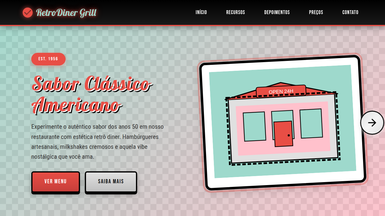
Split-screen layout (Mint/Pink), chrome arrow connectors, checkerboard borders, neon signage, subtle halftone patterns, glossy metallic rendering.
- **Physics:** Ease-out curves, 200-300ms duration. Smooth and predictable.
- **Entry animations:** Fade + translate-Y (16px → 0) over 420ms ease-out. Staggered cascades for lists: 80ms between items.
- **Hover states:** Subtle color shift + shadow adjustment over 200ms.
- **Page transitions:** Fade only (200ms).
- **Performance:** Only transform and opacity animated. No layout-triggering properties.
## Shapes
Base corner radius: 8px. See rounded tokens in front matter for the full scale.
## Components
- **Primary Button:** Subtly rounded (0.5rem) shape. Accent color fill. Hover: 8% darken + subtle lift shadow. Active: -1px translate tactile press. Font weight 600. No outer glows.
- **Secondary / Ghost Button:** Outline variant. 1.5px border in muted color. Text in primary color. Hover: subtle background fill.
- **Cards:** Subtly rounded (0.5rem) corners. Surface background. Subtle shadow (0 2px 12px rgba(0,0,0,0.06)). 1px border stroke.
- **Inputs:** Label above input. 1px border stroke. Focus ring: 2px accent color offset 2px. Error text below in semantic red. No floating labels.
- **Navigation:** Primary surface background. Active item: accent color indicator. Font weight 500 when active.
- **Skeletons:** Shimmer animation matching component dimensions. No circular spinners.
- **Empty States:** Icon-based composition with descriptive text and action button.
## Do's and Don'ts
- No emojis in UI — use icon system only (Lucide, Heroicons)
- No pure white (#FFFFFF) backgrounds — use off-white or dark surfaces
- No oversaturated accent colors (saturation cap: 80%)
- No 3-column equal-width feature layouts — use zig-zag or asymmetric grid
- No `h-screen` — use `min-h-[100dvh]`
- No AI copywriting clichés: "Elevate", "Seamless", "Unleash", "Next-Gen"
- No broken external image links — use picsum.photos or inline SVG
- No generic lorem ipsum in demos
- Do Mint/Pink/Red palette
- Do Checkerboard patterns
- Do Chrome effects/gradients
- Do Script/Diner typography
- Do Neon sign glow effects
## Use Case
Landing pages, Modern websites
Technical Specs
CSS
background-color: #9ED9CC; color: #111111; font-family: 'Lobster', cursive; border: 5px double #E84E45; background-image: repeating-linear-gradient(45deg, #ccc 25%, transparent 25%, transparent 75%, #ccc 75%, #ccc), repeating-linear-gradient(45deg, #ccc 25%, #fff 25%, #fff 75%, #ccc 75%, #ccc);
Variables
--mint-diner: #9ED9CC, --ketchup-red: #E84E45, --chrome: #E0E0E0, --font-diner: 'Lobster', cursive, --pattern-check: url('checker.png') Checklist
☐ Mint/Pink/Red palette, ☐ Checkerboard patterns, ☐ Chrome effects/gradients, ☐ Script/Diner typography, ☐ Neon sign glow effects
Colors
Primary
Secondary
Effects
Split-screen layout (Mint/Pink), chrome arrow connectors, checkerboard borders, neon signage, subtle halftone patterns, glossy metallic rendering.
Light/Dark
✓ Full / ✗ No
AI Prompt
Act as a Senior Frontend Engineer and Expert UI Designer.
Your task is to code a complete Landing Page on the first attempt.
- Landing Page Theme: <INSERT THEME>
- Sections to add: <INSERT SECTIONS>

Generate the final code immediately following these definitions:

## Style

- **Name:** American Diner Americana
- **Type:** Nostalgic, Bold, Playful
- **Keywords:** diner, retro, 50s, americana, checkerboard, neon, chrome, red
- **Era:** 1950s Diner
- **Light/Dark:** ✓ Full / ✗ No

## Color Palette

- **Primary:** Background #9ED9CC, Text #111111, Accent #E84E45
- **Secondary:** Chrome Silver #E0E0E0, Check Black #000000, Milkshake Pink #FFC1CC

## Visual Effects

Split-screen layout (Mint/Pink), chrome arrow connectors, checkerboard borders, neon signage, subtle halftone patterns, glossy metallic rendering.

## AI Visual Direction

american diner landing page, 50s retro style, mint green and red, checkerboard pattern, chrome typography, neon signs, nostalgic.

## CSS Technical

```css
background-color: #9ED9CC; color: #111111; font-family: 'Lobster', cursive; border: 5px double #E84E45; background-image: repeating-linear-gradient(45deg, #ccc 25%, transparent 25%, transparent 75%, #ccc 75%, #ccc), repeating-linear-gradient(45deg, #ccc 25%, #fff 25%, #fff 75%, #ccc 75%, #ccc);
```

## Design System Variables

```css
--mint-diner: #9ED9CC, --ketchup-red: #E84E45, --chrome: #E0E0E0, --font-diner: 'Lobster', cursive, --pattern-check: url('checker.png')
```

## Implementation Checklist

- ☐ Mint/Pink/Red palette
- ☐ Checkerboard patterns
- ☐ Chrome effects/gradients
- ☐ Script/Diner typography
- ☐ Neon sign glow effects

## Execution Rules

1. Strictly follow the defined visual style.
2. Use high-quality inline SVG icons (Heroicons or Lucide style) — NEVER use emojis as icons.
3. Add `cursor-pointer` and smooth `hover` states (transition-all) on all interactive elements.
4. Required Page Structure:
   - Navbar (Logo + Links + CTA)
   - Hero Section (Impactful Headline + Subtitle + 2 buttons + 3D/Abstract visual element via CSS)
   - Features (3 cards with icons)
   - Testimonials (3 cards)
   - Pricing (3 tiers, highlight the middle one)
   - Final CTA
   - Full Footer with social links, privacy policy, terms of use, contact and SEO links.
5. All text content must be in English.
6. The visual must be CLEARLY distinct — do not create a "default Bootstrap" design. Force the use of the provided design system variables.
7. Use `<style>` tags in the head for custom classes (especially for complex backdrop-filter effects and animations) that Tailwind CDN doesn't cover.
8. Full Responsiveness: Layout must adapt perfectly to Mobile, Tablet and Desktop (vertical stack on mobile).
9. Include basic SEO, Viewport and Open Graph meta tags in `<head>`.
10. Footer must contain: Copyright 2026, Secondary navigation links and Social media icons.
11. Make the creative decisions needed to deliver the complete, functional result now. Related
Last synced: 4/1/2026