Whiteboard
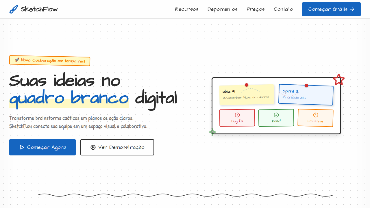
Whiteboard-style landing page that looks like a collaborative brainstorming session. Ideal for brainstorming, education, ferramentas colaborativas, startups, apresentações. AI-ready template.
Use case: Brainstorming, Education, Collaborative tools, Startups, Presentations
Historical Context
The whiteboard is one of those objects that feels like it's always existed, but it really only took over from the chalkboard in the late 1960s. Martin Heit, a Korean War veteran turned photographer, is often credited with commercializing the first melamine dry-erase surface. By the 1990s, whiteboards had colonized every conference room, classroom, and design studio on the planet — not because they were technologically impressive, but because they removed friction. No dust, no permanence, no commitment. You sketch, you erase, you sketch again. What makes the whiteboard genuinely interesting from a design perspective is how it changed collaborative thinking. Before whiteboards, shared ideation meant passing paper around or talking at each other. The whiteboard gave groups a shared canvas with zero preciousness — the impermanence is the feature. It told people: this isn't final, this is thinking out loud. That psychological permission changed how teams work together. The marker itself deserves credit too. The chisel tip that lets you switch between thick strokes and fine lines with a wrist rotation — that's a masterclass in tool versatility. Four colors became the universal constraint that somehow never feels limiting.
When to Use
Reach for whiteboard imagery when you're designing for ideation spaces, workshop interfaces, or anything where the user needs to feel that nothing is permanent yet. It signals 'draft mode' — collaborative, low-stakes, iterative. Works beautifully in education contexts, brainstorming tools, and onboarding flows where you want to communicate that exploration is encouraged. Avoid it when you need to convey precision, authority, or finality. The whiteboard aesthetic says 'we're still figuring this out,' which is powerful when true and undermining when not.
Design Principles
- Embrace impermanence — the erased ghost marks and slight smudges are features, not flaws. They communicate iteration and history.
- Limit your palette deliberately. The classic four-marker constraint (black, blue, red, green) creates visual hierarchy without overwhelming. Honor that economy.
- Prioritize gesture over precision. Whiteboard marks should feel human-speed — slightly uneven line weights, natural curves, the occasional overshoot at corners.
- Design for additive layering. Real whiteboard sessions build up: underlines, circles, arrows connecting ideas. Your compositions should feel accumulated, not composed.
- Respect the negative space. A whiteboard that's completely filled communicates chaos, not productivity. The breathing room between clusters is where the thinking lives.
DESIGN.md
---
version: "alpha"
name: "Whiteboard"
description: "Whiteboard-style landing page that looks like a collaborative brainstorming session. Ideal for brainstorming, education, ferramentas colaborativas, startups, apresentações. AI-ready template."
colors:
  primary: "#FEFEFE"
  secondary: "#2C2C2C"
  tertiary: "#1565C0"
  neutral: "#D32F2F"
  surface: "#388E3C"
  accent: "#F57C00"
typography:
  h1:
    fontFamily: Architects Daughter
    fontSize: 2.5rem
    fontWeight: 700
  body-md:
    fontFamily: Architects Daughter
    fontSize: 1rem
    fontWeight: 400
components:
  button-primary:
    backgroundColor: "{colors.primary}"
    textColor: "{colors.neutral}"
    padding: 12px
---

## Overview

Whiteboard-style landing page that looks like a collaborative brainstorming session. Ideal for brainstorming, education, ferramentas colaborativas, startups, apresentações. AI-ready template. The whiteboard is one of those objects that feels like it's always existed, but it really only took over from the chalkboard in the late 1960s. Martin Heit, a Korean War veteran turned photographer, is often credited with commercializing the first melamine dry-erase surface. By the 1990s, whiteboards had colonized every conference room, classroom, and design studio on the planet — not because they were technologically impressive, but because they removed friction. No dust, no permanence, no commitment. You sketch, you erase, you sketch again.

What makes the whiteboard genuinely interesting from a design perspective is how it changed collaborative thinking. Before whiteboards, shared ideation meant passing paper around or talking at each other. The whiteboard gave groups a shared canvas with zero preciousness — the impermanence is the feature. It told people: this isn't final, this is thinking out loud. That psychological permission changed how teams work together.

The marker itself deserves credit too. The chisel tip that lets you switch between thick strokes and fine lines with a wrist rotation — that's a masterclass in tool versatility. Four colors became the universal constraint that somehow never feels limiting.

- Density: 3/10 — Airy
- Variance: 8/10 — Expressive
- Motion: 8/10 — Cinematic

- **Style:** Clean, Sketch, Collaborative, Marker-Style
- **Keywords:** whiteboard, marker, sketch, hand-drawn, clean, collaborative, brainstorm, wireframe, dry-erase, diagram
- **Era:** Modern / Collaborative Design
- **Light/Dark:** ✓ Full / ✗ No

## Colors

- **Board White** (#FEFEFE) — Light surface, card backgrounds
- **Marker Black** (#2C2C2C) — Dark surface, primary background
- **Marker Blue** (#1565C0) — Accent highlight, links and focus states
- **Marker Red** (#D32F2F) — Error states, destructive actions
- **Marker Green** (#388E3C) — Success states, positive indicators
- **Marker Orange** (#F57C00) — Warm accent, call-to-action secondary
- **Highlight Yellow** (#FFF9C4) — Warning states, attention indicators


## Typography

- **Display / Hero:** Architects Daughter — Weight 700, tight tracking, used for headline impact
- **Accent:** Patrick Hand — Used for decorative or emphasis text
- **Body:** Architects Daughter — Weight 400, 16px/1.6 line-height, max 72ch per line
- **UI Labels / Captions:** Architects Daughter — 0.875rem, weight 500, slight letter-spacing
- **Monospace:** JetBrains Mono — Used for code, metadata, and technical values

Scale:
- Hero: clamp(2.5rem, 5vw, 4rem)
- H1: 2.25rem
- H2: 1.5rem
- Body: 1rem / 1.6
- Small: 0.875rem


## Layout

- **Grid:** CSS Grid primary. Max-width containment: 1280px centered with 1.5rem side padding.
- **Spacing rhythm:** Balanced. Base unit: 0.5rem (8px).
- **Section vertical gaps:** clamp(4rem, 8vw, 8rem).
- **Hero layout:** Asymmetric composition.
- **Feature sections:** Asymmetric grid with varied card sizes. No 3-equal-columns.
- **Mobile collapse:** All multi-column layouts collapse below 768px. No horizontal overflow.
- **z-index contract:** base (0) / sticky-nav (100) / overlay (200) / modal (300) / toast (500).


## Elevation & Depth

Hand-drawn style borders (slightly irregular via SVG filter), marker-weight typography (variable stroke), subtle grid/dot pattern background, sticky note elements with slight rotation (1-3deg), connector lines between sections, whiteboard shadow on edges

- **Physics:** Spring — stiffness 120, damping 20. Confident, weighted transitions.
- **Entry animations:** Fade + translate-Y (16px → 0) over 540ms ease-out. Staggered cascades for lists: 120ms between items.
- **Hover states:** Scale(1.03) + shadow lift over 200ms.
- **Page transitions:** Fade + slide (300ms).
- **Performance:** Only transform and opacity animated. No layout-triggering properties.


## Shapes

Base corner radius: 8px. See rounded tokens in front matter for the full scale.


## Components

- **Primary Button:** Subtly rounded (0.5rem) shape. Accent color fill. Hover: 8% darken + subtle lift shadow. Active: -1px translate tactile press. Font weight 600. No outer glows.
- **Secondary / Ghost Button:** Outline variant. 1.5px border in muted color. Text in primary color. Hover: subtle background fill.
- **Cards:** Subtly rounded (0.5rem) corners. Surface background. Subtle shadow (0 2px 12px rgba(0,0,0,0.06)). 1px border stroke.
- **Inputs:** Label above input. 1px border stroke. Focus ring: 2px accent color offset 2px. Error text below in semantic red. No floating labels.
- **Navigation:** Primary surface background. Active item: accent color indicator. Font weight 500 when active.
- **Skeletons:** Shimmer animation matching component dimensions. No circular spinners.
- **Empty States:** Icon-based composition with descriptive text and action button.


## Do's and Don'ts

- No emojis in UI — use icon system only (Lucide, Heroicons)
- No pure black (#000000) — use off-black or charcoal variants
- No oversaturated accent colors (saturation cap: 80%)
- No 3-column equal-width feature layouts — use zig-zag or asymmetric grid
- No `h-screen` — use `min-h-[100dvh]`
- No AI copywriting clichés: "Elevate", "Seamless", "Unleash", "Next-Gen"
- No broken external image links — use picsum.photos or inline SVG
- No generic lorem ipsum in demos

- Do Clean white background with dot grid
- Do Marker-style colored typography
- Do Sticky note elements with rotation
- Do Hand-drawn style borders
- Do Connector lines between sections
- Do Sketch-style SVG icons


## Use Case

Brainstorming, Education, Collaborative tools, Startups, Presentations
Technical Specs
CSS
background: #FEFEFE with radial-gradient dot pattern, border: 2px solid with slight irregularity via SVG filter, font-family: 'Architects Daughter' or 'Patrick Hand', transform: rotate(1-3deg) for sticky notes, box-shadow: 2px 2px 5px rgba(0,0,0,0.1) for pinned effect, background-color: #FFF9C4 for highlight areas
Variables
--bg-board: #FEFEFE, --marker-black: #2C2C2C, --marker-blue: #1565C0, --dot-grid: radial-gradient pattern, --note-rotation: 1-3deg, --marker-weight: 2-3px, --sticky-bg: #FFF9C4
Checklist
☐ Clean white background with dot grid, ☐ Marker-style colored typography, ☐ Sticky note elements with rotation, ☐ Hand-drawn style borders, ☐ Connector lines between sections, ☐ Sketch-style SVG icons
Colors
Primary
Secondary
Effects
Hand-drawn style borders (slightly irregular via SVG filter), marker-weight typography (variable stroke), subtle grid/dot pattern background, sticky note elements with slight rotation (1-3deg), connector lines between sections, whiteboard shadow on edges
Light/Dark
✓ Full / ✗ No
AI Prompt
Act as a Senior Frontend Engineer and Expert UI Designer.
Your task is to code a complete Landing Page on the first attempt.
- Landing Page Theme: <INSERT THEME>
- Sections to add: <INSERT SECTIONS>

Generate the final code immediately following these definitions:

## Style

- **Name:** Whiteboard
- **Type:** Clean, Sketch, Collaborative, Marker-Style
- **Keywords:** whiteboard, marker, sketch, hand-drawn, clean, collaborative, brainstorm, wireframe, dry-erase, diagram
- **Era:** Modern / Collaborative Design
- **Light/Dark:** ✓ Full / ✗ No

## Color Palette

- **Primary:** Board White #FEFEFE, Marker Black #2C2C2C, Marker Blue #1565C0
- **Secondary:** Marker Red #D32F2F, Marker Green #388E3C, Marker Orange #F57C00, Highlight Yellow #FFF9C4

## Visual Effects

Hand-drawn style borders (slightly irregular via SVG filter), marker-weight typography (variable stroke), subtle grid/dot pattern background, sticky note elements with slight rotation (1-3deg), connector lines between sections, whiteboard shadow on edges

## AI Visual Direction

Design a whiteboard-style landing page that looks like a collaborative brainstorming session. Clean white background with subtle dot grid pattern. Use marker-style typography in black, blue, red, and green. Include sticky note elements with slight rotation, hand-drawn connector lines, and sketch-style icons. Cards should look like pinned notes. Add whiteboard marker thickness variation in borders.

## CSS Technical

```css
background: #FEFEFE with radial-gradient dot pattern, border: 2px solid with slight irregularity via SVG filter, font-family: 'Architects Daughter' or 'Patrick Hand', transform: rotate(1-3deg) for sticky notes, box-shadow: 2px 2px 5px rgba(0,0,0,0.1) for pinned effect, background-color: #FFF9C4 for highlight areas
```

## Design System Variables

```css
--bg-board: #FEFEFE, --marker-black: #2C2C2C, --marker-blue: #1565C0, --dot-grid: radial-gradient pattern, --note-rotation: 1-3deg, --marker-weight: 2-3px, --sticky-bg: #FFF9C4
```

## Implementation Checklist

- ☐ Clean white background with dot grid
- ☐ Marker-style colored typography
- ☐ Sticky note elements with rotation
- ☐ Hand-drawn style borders
- ☐ Connector lines between sections
- ☐ Sketch-style SVG icons

## Execution Rules

1. Strictly follow the defined visual style.
2. Use high-quality inline SVG icons (Heroicons or Lucide style) — NEVER use emojis as icons.
3. Add `cursor-pointer` and smooth `hover` states (transition-all) on all interactive elements.
4. Required Page Structure:
   - Navbar (Logo + Links + CTA)
   - Hero Section (Impactful Headline + Subtitle + 2 buttons + 3D/Abstract visual element via CSS)
   - Features (3 cards with icons)
   - Testimonials (3 cards)
   - Pricing (3 tiers, highlight the middle one)
   - Final CTA
   - Full Footer with social links, privacy policy, terms of use, contact and SEO links.
5. All text content must be in English.
6. The visual must be CLEARLY distinct — do not create a "default Bootstrap" design. Force the use of the provided design system variables.
7. Use `<style>` tags in the head for custom classes (especially for complex backdrop-filter effects and animations) that Tailwind CDN doesn't cover.
8. Full Responsiveness: Layout must adapt perfectly to Mobile, Tablet and Desktop (vertical stack on mobile).
9. Include basic SEO, Viewport and Open Graph meta tags in `<head>`.
10. Footer must contain: Copyright 2026, Secondary navigation links and Social media icons.
11. Make the creative decisions needed to deliver the complete, functional result now.
Related
Last synced: 4/1/2026