Weblex Dark Hero
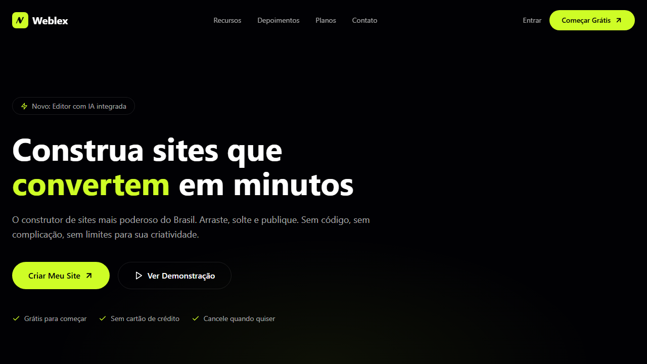
Dark hero with full-screen video with seamless loop transition via requestAnimationFrame opacity. Ideal for website builders, plataformas no-code, ferramentas de criação de sites, landing pages de produto. AI-ready template.
Use case: Website builders, Platforms no-code, Tools de criação de sites, Landing pages de produto
Historical Context
The dark hero with electric accent color is a direct descendant of the cyberpunk visual language that emerged in interface design around 2018-2019, when Stripe and Linear proved that near-black backgrounds with a single high-chroma accent could communicate both sophistication and technical credibility simultaneously. Before this shift, dark themes were treated as afterthoughts — inverted light modes with washed-out contrast. The deliberate pairing of deep charcoal with lime green specifically traces back to terminal aesthetics and hacker culture, repackaged for commercial SaaS through careful typographic hierarchy and cinematic motion. The video loop fade technique owes its popularity to the bandwidth explosion of the early 2020s. Once hero videos became feasible without destroying Core Web Vitals, designers discovered that a slow crossfade into darkness created depth without competing with foreground content. It's atmospheric, not informational — the video exists to establish mood, not to be watched. This particular combination — dark canvas, neon accent, ambient video — became the visual shorthand for 'we ship fast and our product is technical.' It works because it borrows credibility from developer tooling aesthetics while remaining accessible to non-technical buyers.
When to Use
Deploy this when your product needs to feel fast, modern, and slightly dangerous. It's ideal for developer tools, AI platforms, infrastructure products, and any SaaS where your buyer self-identifies as technical. Works beautifully for launch pages and product announcements where you need immediate visual authority. Avoid it for healthcare, education, or anything targeting users over 55 — the low contrast and neon accents create accessibility friction. If your competitor already runs this exact palette, differentiate through motion timing and type choices rather than switching palettes entirely.
Design Principles
- Contrast is hierarchy — the lime green earns its power by appearing sparingly. The moment you use it on more than two elements above the fold, you've killed the signal-to-noise ratio.
- Video loops must be felt, not seen. Keep them under 8 seconds, desaturated by at least 40%, and faded to near-invisibility at the edges. If a user consciously notices the video, it's too prominent.
- Typography does the structural work. On dark backgrounds, weight contrast between your headline and body text needs to be more extreme than on light — jump from 700 to 300, skip the middle weights entirely.
- Depth through layering, not shadows. Dark interfaces can't rely on drop shadows for elevation. Use subtle background-color shifts (2-4% lightness increments) and border opacity to create spatial separation between content planes.
- Motion must match the brand promise. If you're claiming speed and performance, your animations need to be snappy (200-300ms, ease-out). Slow, floaty transitions contradict the entire visual narrative you've built.
DESIGN.md
---
version: "alpha"
name: "Weblex Dark Hero"
description: "Dark hero with full-screen video with seamless loop transition via requestAnimationFrame opacity. Ideal for website builders, plataformas no-code, ferramentas de criação de sites, landing pages de produto. AI-ready template."
colors:
  primary: "#0A0A0A"
  secondary: "#1A1A2E"
  tertiary: "#00D4FF"
  neutral: "#FFFFFF"
typography:
  h1:
    fontFamily: System UI stack
    fontSize: 2.25rem
    fontWeight: 700
  body-md:
    fontFamily: System UI stack
    fontSize: 1rem
    fontWeight: 400
  label-caps:
    fontFamily: System UI stack
    fontSize: 0.75rem
    fontWeight: 500
rounded:
  sm: 9999px
  md: 19998px
  lg: 29997px
---

## Overview

Dark hero with full-screen video with seamless loop transition via requestAnimationFrame opacity. Ideal for website builders, plataformas no-code, ferramentas de criação de sites, landing pages de produto. AI-ready template. The dark hero with electric accent color is a direct descendant of the cyberpunk visual language that emerged in interface design around 2018-2019, when Stripe and Linear proved that near-black backgrounds with a single high-chroma accent could communicate both sophistication and technical credibility simultaneously. Before this shift, dark themes were treated as afterthoughts — inverted light modes with washed-out contrast. The deliberate pairing of deep charcoal with lime green specifically traces back to terminal aesthetics and hacker culture, repackaged for commercial SaaS through careful typographic hierarchy and cinematic motion.

The video loop fade technique owes its popularity to the bandwidth explosion of the early 2020s. Once hero videos became feasible without destroying Core Web Vitals, designers discovered that a slow crossfade into darkness created depth without competing with foreground content. It's atmospheric, not informational — the video exists to establish mood, not to be watched. This particular combination — dark canvas, neon accent, ambient video — became the visual shorthand for 'we ship fast and our product is technical.' It works because it borrows credibility from developer tooling aesthetics while remaining accessible to non-technical buyers.

- Density: 5/10 — Balanced
- Variance: 4/10 — Moderate
- Motion: 6/10 — Expressive

- **Style:** Landing Page, Lime Green Accent, Video Loop Fade, CSS Variables HSL, Bottom-Aligned Content
- **Keywords:** landing page, lime green, vídeo loop fade, CSS variables HSL, bottom-aligned, requestAnimationFrame, dark mode, ArrowUpRight, pill buttons, website builder
- **Era:** 2024-2026 Website Builder Landing
- **Light/Dark:** ✗ Not Recommended / ✓ Full

## Colors

- Palette derived from style keywords and era context


## Typography

- **Display / Hero:** System UI stack (-apple-system, sans-serif) — Weight 700, tight tracking, used for headline impact
- **Body:** System UI stack (-apple-system, sans-serif) — Weight 400, 16px/1.6 line-height, max 72ch per line
- **UI Labels / Captions:** System UI stack (-apple-system, sans-serif) — 0.875rem, weight 500, slight letter-spacing
- **Monospace:** JetBrains Mono — Used for code, metadata, and technical values

Scale:
- Hero: clamp(2.5rem, 5vw, 4rem)
- H1: 2.25rem
- H2: 1.5rem
- Body: 1rem / 1.6
- Small: 0.875rem


## Layout

- **Grid:** CSS Grid primary. Max-width containment: 1280px centered with 1.5rem side padding.
- **Spacing rhythm:** Balanced. Base unit: 0.5rem (8px).
- **Section vertical gaps:** clamp(4rem, 8vw, 8rem).
- **Hero layout:** Split-screen (text left, visual right).
- **Feature sections:** Zig-zag alternating text+image rows. No 3-equal-columns.
- **Mobile collapse:** All multi-column layouts collapse below 768px. No horizontal overflow.
- **z-index contract:** base (0) / sticky-nav (100) / overlay (200) / modal (300) / toast (500).


## Elevation & Depth

VÍDEO: Vídeo abstrato com movimento fluido e suave em tons escuros. Formas orgânicas ou gradientes em transição contínua, criando atmosfera moderna e tecnológica. Sem overlay escuro (opacity total). Implementa transição de loop seamless: fade-out para preto 1.5s antes do fim do vídeo e fade-in no primeiro 1s do restart, controlado via requestAnimationFrame para suavidade perfeita. | EFEITOS CSS: Vídeo de fundo tela cheia com transição de loop seamless: fade-out para preto 1.5s antes do fim via requestAnimationFrame, fade-in no primeiro 1s do restart, sem overlay escuro, conteúdo alinhado ao bottom com 100px bottom padding e max-width 603px, navbar transparente total, badge pill com borda, headline 62px line-height 1.1, botão primário verde lima com ArrowUpRight e secundário branco

- **Physics:** Spring — stiffness 120, damping 20. Confident, weighted transitions.
- **Entry animations:** Fade + translate-Y (16px → 0) over 480ms ease-out. Staggered cascades for lists: 100ms between items.
- **Hover states:** Scale(1.03) + shadow lift over 200ms.
- **Page transitions:** Fade + slide (300ms).
- **Performance:** Only transform and opacity animated. No layout-triggering properties.


## Shapes

Base corner radius: 9999px. See rounded tokens in front matter for the full scale.


## Components

- **Primary Button:** Pill-shaped (9999px) shape. Accent color fill. Hover: 8% darken + subtle lift shadow. Active: -1px translate tactile press. Font weight 600. No outer glows.
- **Secondary / Ghost Button:** Outline variant. 1.5px border in muted color. Text in primary color. Hover: subtle background fill.
- **Cards:** Pill-shaped (9999px) corners. Surface background. Subtle shadow (0 2px 12px rgba(0,0,0,0.06)). 1px border stroke.
- **Inputs:** Label above input. 1px border stroke. Focus ring: 2px accent color offset 2px. Error text below in semantic red. No floating labels.
- **Navigation:** Primary surface background. Active item: accent color indicator. Font weight 500 when active.
- **Skeletons:** Shimmer animation matching component dimensions. No circular spinners.
- **Empty States:** Icon-based composition with descriptive text and action button.


## Do's and Don'ts

- No emojis in UI — use icon system only (Lucide, Heroicons)
- No pure white (#FFFFFF) backgrounds — use off-white or dark surfaces
- No oversaturated accent colors (saturation cap: 80%)
- No 3-column equal-width feature layouts — use zig-zag or asymmetric grid
- No `h-screen` — use `min-h-[100dvh]`
- No AI copywriting clichés: "Elevate", "Seamless", "Unleash", "Next-Gen"
- No broken external image links — use picsum.photos or inline SVG
- No generic lorem ipsum in demos

- Do Vídeo tela cheia com loop fade seamless via rAF
- Do Sem overlay escuro
- Do Navbar transparente total
- Do Conteúdo bottom-aligned 100px
- Do Badge pill com borda
- Do Headline 62px
- Do Botão verde lima ArrowUpRight
- Do Botão secundário branco
- Do CSS variables HSL
- Do Responsivo 3 breakpoints


## Use Case

Website builders, Platforms no-code, Tools de criação de sites, Landing pages de produto
Technical Specs
CSS
video: autoplay loop muted with rAF fade transition, --background: 240 67% 1%, --primary: 73 98% 57%, font-size: 62px / 48px / 36px, line-height: 1.1, padding-bottom: 100px, max-width: 603px, border-radius: 9999px, navbar: transparent
Variables
--background: 240 67% 1%, --foreground: 0 0% 100%, --primary: 73 98% 57%, --primary-foreground: 240 67% 1%, --secondary: 0 0% 100%, --muted: 240 10% 12%, --muted-foreground: 0 0% 82% / 0.8, --border: 0 0% 100% / 0.1, --headline-size: 62px
Checklist
☐ Vídeo tela cheia com loop fade seamless via rAF, ☐ Sem overlay escuro, ☐ Navbar transparente total, ☐ Conteúdo bottom-aligned 100px, ☐ Badge pill com borda, ☐ Headline 62px, ☐ Botão verde lima ArrowUpRight, ☐ Botão secundário branco, ☐ CSS variables HSL, ☐ Responsivo 3 breakpoints
Colors
Effects
VÍDEO: Vídeo abstrato com movimento fluido e suave em tons escuros. Formas orgânicas ou gradientes em transição contínua, criando atmosfera moderna e tecnológica. Sem overlay escuro (opacity total). Implementa transição de loop seamless: fade-out para preto 1.5s antes do fim do vídeo e fade-in no primeiro 1s do restart, controlado via requestAnimationFrame para suavidade perfeita. | EFEITOS CSS: Vídeo de fundo tela cheia com transição de loop seamless: fade-out para preto 1.5s antes do fim via requestAnimationFrame, fade-in no primeiro 1s do restart, sem overlay escuro, conteúdo alinhado ao bottom com 100px bottom padding e max-width 603px, navbar transparente total, badge pill com borda, headline 62px line-height 1.1, botão primário verde lima com ArrowUpRight e secundário branco
Light/Dark
✗ Not Recommended / ✓ Full
AI Prompt
Act as a Senior Frontend Engineer and Expert UI Designer.
Your task is to code a complete Landing Page on the first attempt.
- Landing Page Theme: <INSERT THEME>
- Sections to add: <INSERT SECTIONS>

Generate the final code immediately following these definitions:

## Style

- **Name:** Weblex Dark Hero
- **Type:** Landing Page, Lime Green Accent, Video Loop Fade, CSS Variables HSL, Bottom-Aligned Content
- **Keywords:** landing page, lime green, vídeo loop fade, CSS variables HSL, bottom-aligned, requestAnimationFrame, dark mode, ArrowUpRight, pill buttons, website builder
- **Era:** 2024-2026 Website Builder Landing
- **Light/Dark:** ✗ Not Recommended / ✓ Full

## Color Palette

- **Primary:** Preto Fundo hsl(240,67%,1%), Branco hsl(0,0%,100%), Verde Lima hsl(73,98%,57%), Muted hsl(240,10%,12%)
- **Secondary:** Muted Foreground hsla(0,0%,82%,0.8), Borda hsla(0,0%,100%,0.1), Branco Secundário hsl(0,0%,100%), Preto Texto hsl(240,67%,1%)

## Visual Effects

VÍDEO: Vídeo abstrato com movimento fluido e suave em tons escuros. Formas orgânicas ou gradientes em transição contínua, criando atmosfera moderna e tecnológica. Sem overlay escuro (opacity total). Implementa transição de loop seamless: fade-out para preto 1.5s antes do fim do vídeo e fade-in no primeiro 1s do restart, controlado via requestAnimationFrame para suavidade perfeita. | EFEITOS CSS: Vídeo de fundo tela cheia com transição de loop seamless: fade-out para preto 1.5s antes do fim via requestAnimationFrame, fade-in no primeiro 1s do restart, sem overlay escuro, conteúdo alinhado ao bottom com 100px bottom padding e max-width 603px, navbar transparente total, badge pill com borda, headline 62px line-height 1.1, botão primário verde lima com ArrowUpRight e secundário branco

## AI Visual Direction

Design a dark hero with full-screen video with seamless loop transition via requestAnimationFrame opacity. No dark overlay. Fully transparent navbar. Content bottom-aligned 100px padding, max-width 603px centered. Pill badge with border. Headline 62px line-height 1.1. Primary lime green CTA with ArrowUpRight and secondary white button. HSL CSS variables.

## CSS Technical

```css
video: autoplay loop muted with rAF fade transition, --background: 240 67% 1%, --primary: 73 98% 57%, font-size: 62px / 48px / 36px, line-height: 1.1, padding-bottom: 100px, max-width: 603px, border-radius: 9999px, navbar: transparent
```

## Design System Variables

```css
--background: 240 67% 1%, --foreground: 0 0% 100%, --primary: 73 98% 57%, --primary-foreground: 240 67% 1%, --secondary: 0 0% 100%, --muted: 240 10% 12%, --muted-foreground: 0 0% 82% / 0.8, --border: 0 0% 100% / 0.1, --headline-size: 62px
```

## Implementation Checklist

- ☐ Vídeo tela cheia com loop fade seamless via rAF
- ☐ Sem overlay escuro
- ☐ Navbar transparente total
- ☐ Conteúdo bottom-aligned 100px
- ☐ Badge pill com borda
- ☐ Headline 62px
- ☐ Botão verde lima ArrowUpRight
- ☐ Botão secundário branco
- ☐ CSS variables HSL
- ☐ Responsivo 3 breakpoints

## Execution Rules

1. Strictly follow the defined visual style.
2. Use high-quality inline SVG icons (Heroicons or Lucide style) — NEVER use emojis as icons.
3. Add `cursor-pointer` and smooth `hover` states (transition-all) on all interactive elements.
4. Required Page Structure:
   - Navbar (Logo + Links + CTA)
   - Hero Section (Impactful Headline + Subtitle + 2 buttons + 3D/Abstract visual element via CSS)
   - Features (3 cards with icons)
   - Testimonials (3 cards)
   - Pricing (3 tiers, highlight the middle one)
   - Final CTA
   - Full Footer with social links, privacy policy, terms of use, contact and SEO links.
5. All text content must be in English.
6. The visual must be CLEARLY distinct — do not create a "default Bootstrap" design. Force the use of the provided design system variables.
7. Use `<style>` tags in the head for custom classes (especially for complex backdrop-filter effects and animations) that Tailwind CDN doesn't cover.
8. Full Responsiveness: Layout must adapt perfectly to Mobile, Tablet and Desktop (vertical stack on mobile).
9. Include basic SEO, Viewport and Open Graph meta tags in `<head>`.
10. Footer must contain: Copyright 2026, Secondary navigation links and Social media icons.
11. Make the creative decisions needed to deliver the complete, functional result now.
Related
Last synced: 4/1/2026