Versus Mode Anime Aesthetic
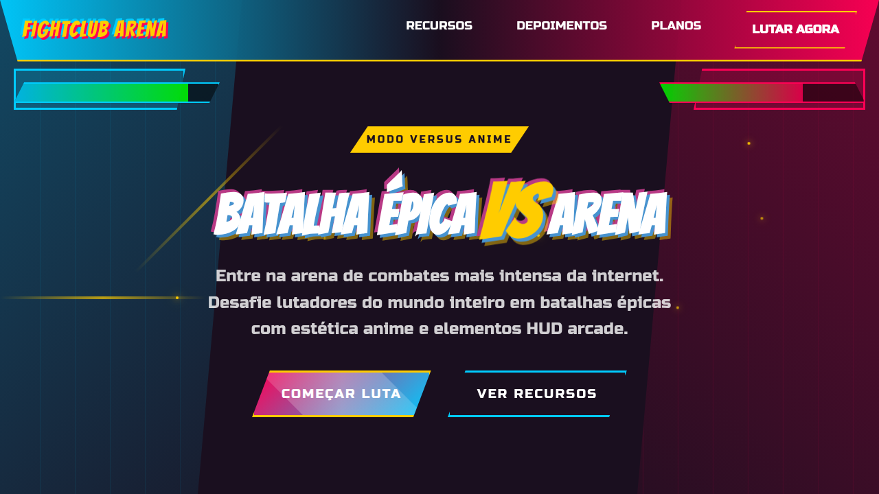
Versus mode landing page, anime fighting game style, split screen design, dynamic diagonals, high contrast, hud elements. Ideal for landing pages, modern websites. AI-ready template.
Use case: Landing pages, Modern websites
Historical Context
The VS screen is one of the most enduring UI patterns in gaming. Street Fighter II didn't invent it, but it codified the grammar: two portraits, a crackling divider, names in bold type, the whole thing vibrating with anticipation. That split-second before the fight starts? Pure tension design. Dragon Ball Z games pushed it further — speed lines, ki auras bleeding off the frame, typography that looks like it might explode. Guilty Gear and BlazBlue turned the entire interface into sequential art. Every meter, every health bar, every round indicator was drawn like a manga panel. The UI wasn't separate from the action. It was the action. This energy migrated. Esports broadcasts borrowed the split composition. Competitive apps adopted the diagonal slash. Twitch overlays, tournament brackets, player cards — all descendants of that original VS screen. The pattern works because it's fundamentally about opposition. Two forces, one frame. No ambiguity about what's happening next.
When to Use
When your product needs to feel like a challenge accepted. Fighting game tournaments, esports platforms, competitive leaderboards, PvP matchmaking screens, gaming content creators. Works for anything where two sides face off — debate apps, head-to-head comparisons, rivalry narratives. Kill it if your context demands calm. This aesthetic only knows one volume.
Design Principles
- Diagonal energy — slashes, speed lines, and angular dividers create movement even in static layouts. Nothing sits horizontal.
- Maximum contrast portraits — characters or players occupy opposing halves with clashing color temperatures. Cool vs warm. Dark vs light. The tension is chromatic.
- Typography as impact — text doesn't inform, it hits. Condensed, italic, outlined, shadowed. Letters lean forward like they're about to throw a punch.
- Controlled chaos — particle effects, halftone dots, manga screentones, burst shapes. Layer them densely but keep the focal point (the VS moment) absolutely clear.
- Frame-breaking composition — elements bleed past boundaries, overlap containers, ignore safe zones. The design should feel like it can't be contained by the viewport.
DESIGN.md
---
version: "alpha"
name: "Versus Mode Anime Aesthetic"
description: "Versus mode landing page, anime fighting game style, split screen design, dynamic diagonals, high contrast, hud elements. Ideal for landing pages, modern websites. AI-ready template."
colors:
  primary: "#1a0f1f"
  secondary: "#ffffff"
  tertiary: "#ffcc00"
  neutral: "#00ccff"
  surface: "#ff0055"
  accent: "#00ff00"
typography:
  h1:
    fontFamily: Russo One
    fontSize: 2.5rem
    fontWeight: 700
  body-md:
    fontFamily: Russo One
    fontSize: 1rem
    fontWeight: 400
components:
  button-primary:
    backgroundColor: "{colors.primary}"
    textColor: "{colors.neutral}"
    padding: 12px
---

## Overview

Versus mode landing page, anime fighting game style, split screen design, dynamic diagonals, high contrast, hud elements. Ideal for landing pages, modern websites. AI-ready template. The VS screen is one of the most enduring UI patterns in gaming. Street Fighter II didn't invent it, but it codified the grammar: two portraits, a crackling divider, names in bold type, the whole thing vibrating with anticipation. That split-second before the fight starts? Pure tension design.

Dragon Ball Z games pushed it further — speed lines, ki auras bleeding off the frame, typography that looks like it might explode. Guilty Gear and BlazBlue turned the entire interface into sequential art. Every meter, every health bar, every round indicator was drawn like a manga panel. The UI wasn't separate from the action. It was the action.

This energy migrated. Esports broadcasts borrowed the split composition. Competitive apps adopted the diagonal slash. Twitch overlays, tournament brackets, player cards — all descendants of that original VS screen. The pattern works because it's fundamentally about opposition. Two forces, one frame. No ambiguity about what's happening next.

- Density: 5/10 — Balanced
- Variance: 7/10 — Dynamic
- Motion: 4/10 — Subtle

- **Style:** Dynamic, Competitive, High-Octane
- **Keywords:** anime, versus, fighting, game, split, dynamic, action, slash
- **Era:** Arcade Fighting
- **Light/Dark:** ✗ No / ✓ Full

## Colors

- **Background** (#1a0f1f) — Primary background surface
- **Text** (#ffffff) — Primary text color
- **Accent** (#ffcc00) — Primary accent, CTAs and interactive elements
- **Player 1 Blue** (#00ccff) — Secondary accent
- **Player 2 Red** (#ff0055) — Error states, destructive actions
- **Energy Green** (#00ff00) — Success states, positive indicators


## Typography

- **Display / Hero:** Russo One — Weight 700, tight tracking, used for headline impact
- **Body:** Russo One — Weight 400, 16px/1.6 line-height, max 72ch per line
- **UI Labels / Captions:** Russo One — 0.875rem, weight 500, slight letter-spacing
- **Monospace:** JetBrains Mono — Used for code, metadata, and technical values

Scale:
- Hero: clamp(2.5rem, 5vw, 4rem)
- H1: 2.25rem
- H2: 1.5rem
- Body: 1rem / 1.6
- Small: 0.875rem


## Layout

- **Grid:** CSS Grid primary. Max-width containment: 1280px centered with 1.5rem side padding.
- **Spacing rhythm:** Balanced. Base unit: 0.5rem (8px).
- **Section vertical gaps:** clamp(4rem, 8vw, 8rem).
- **Hero layout:** Asymmetric composition.
- **Feature sections:** Asymmetric grid with varied card sizes. No 3-equal-columns.
- **Mobile collapse:** All multi-column layouts collapse below 768px. No horizontal overflow.
- **z-index contract:** base (0) / sticky-nav (100) / overlay (200) / modal (300) / toast (500).


## Elevation & Depth

Split-screen dichotomy, character avatars, fighting game HUD elements, elemental visual effects, cel-shaded illustration, jagged comic book aesthetic.

- **Physics:** Ease-out curves, 200-300ms duration. Smooth and predictable.
- **Entry animations:** Fade + translate-Y (16px → 0) over 420ms ease-out. Staggered cascades for lists: 80ms between items.
- **Hover states:** Subtle color shift + shadow adjustment over 200ms.
- **Page transitions:** Fade only (200ms).
- **Performance:** Only transform and opacity animated. No layout-triggering properties.


## Shapes

Base corner radius: 8px. See rounded tokens in front matter for the full scale.


## Components

- **Primary Button:** Subtly rounded (0.5rem) shape. Accent color fill. Hover: 8% darken + subtle lift shadow. Active: -1px translate tactile press. Font weight 600. No outer glows.
- **Secondary / Ghost Button:** Outline variant. 1.5px border in muted color. Text in primary color. Hover: subtle background fill.
- **Cards:** Subtly rounded (0.5rem) corners. Surface background. Subtle shadow (0 2px 12px rgba(0,0,0,0.06)). 1px border stroke.
- **Inputs:** Label above input. 1px border stroke. Focus ring: 2px accent color offset 2px. Error text below in semantic red. No floating labels.
- **Navigation:** Primary surface background. Active item: accent color indicator. Font weight 500 when active.
- **Skeletons:** Shimmer animation matching component dimensions. No circular spinners.
- **Empty States:** Icon-based composition with descriptive text and action button.


## Do's and Don'ts

- No emojis in UI — use icon system only (Lucide, Heroicons)
- No pure black (#000000) — use off-black or charcoal variants
- No oversaturated accent colors (saturation cap: 80%)
- No 3-column equal-width feature layouts — use zig-zag or asymmetric grid
- No `h-screen` — use `min-h-[100dvh]`
- No AI copywriting clichés: "Elevate", "Seamless", "Unleash", "Next-Gen"
- No broken external image links — use picsum.photos or inline SVG
- No generic lorem ipsum in demos

- Do Diagonal split layout
- Do Contrasting colors (Red/Blue vs)
- Do Slanted/Skewed containers
- Do Bold Energy/fire effects
- Do Arcade style typography


## Use Case

Landing pages, Modern websites
Technical Specs
CSS
background-color: #1a0f1f; color: #ffffff; font-family: 'Russo One', sans-serif; clip-path: polygon(10% 0, 100% 0, 100% 100%, 0% 100%); transform: skew(-10deg); border: 2px solid #ffcc00;
Variables
--bg-fight: #1a0f1f, --p1-blue: #00ccff, --p2-red: #ff0055, --accent-gold: #ffcc00, --font-bold: 'Russo One', sans-serif
Checklist
☐ Diagonal split layout, ☐ Contrasting colors (Red/Blue vs), ☐ Slanted/Skewed containers, ☐ Bold Energy/fire effects, ☐ Arcade style typography
Colors
Primary
Secondary
Effects
Split-screen dichotomy, character avatars, fighting game HUD elements, elemental visual effects, cel-shaded illustration, jagged comic book aesthetic.
Light/Dark
✗ No / ✓ Full
AI Prompt
Act as a Senior Frontend Engineer and Expert UI Designer.
Your task is to code a complete Landing Page on the first attempt.
- Landing Page Theme: <INSERT THEME>
- Sections to add: <INSERT SECTIONS>

Generate the final code immediately following these definitions:

## Style

- **Name:** Versus Mode Anime Aesthetic
- **Type:** Dynamic, Competitive, High-Octane
- **Keywords:** anime, versus, fighting, game, split, dynamic, action, slash
- **Era:** Arcade Fighting
- **Light/Dark:** ✗ No / ✓ Full

## Color Palette

- **Primary:** Background #1a0f1f, Text #ffffff, Accent #ffcc00
- **Secondary:** Player 1 Blue #00ccff, Player 2 Red #ff0055, Energy Green #00ff00

## Visual Effects

Split-screen dichotomy, character avatars, fighting game HUD elements, elemental visual effects, cel-shaded illustration, jagged comic book aesthetic.

## AI Visual Direction

versus mode landing page, anime fighting game style, split screen design, dynamic diagonals, high contrast, hud elements.

## CSS Technical

```css
background-color: #1a0f1f; color: #ffffff; font-family: 'Russo One', sans-serif; clip-path: polygon(10% 0, 100% 0, 100% 100%, 0% 100%); transform: skew(-10deg); border: 2px solid #ffcc00;
```

## Design System Variables

```css
--bg-fight: #1a0f1f, --p1-blue: #00ccff, --p2-red: #ff0055, --accent-gold: #ffcc00, --font-bold: 'Russo One', sans-serif
```

## Implementation Checklist

- ☐ Diagonal split layout
- ☐ Contrasting colors (Red/Blue vs)
- ☐ Slanted/Skewed containers
- ☐ Bold Energy/fire effects
- ☐ Arcade style typography

## Execution Rules

1. Strictly follow the defined visual style.
2. Use high-quality inline SVG icons (Heroicons or Lucide style) — NEVER use emojis as icons.
3. Add `cursor-pointer` and smooth `hover` states (transition-all) on all interactive elements.
4. Required Page Structure:
   - Navbar (Logo + Links + CTA)
   - Hero Section (Impactful Headline + Subtitle + 2 buttons + 3D/Abstract visual element via CSS)
   - Features (3 cards with icons)
   - Testimonials (3 cards)
   - Pricing (3 tiers, highlight the middle one)
   - Final CTA
   - Full Footer with social links, privacy policy, terms of use, contact and SEO links.
5. All text content must be in English.
6. The visual must be CLEARLY distinct — do not create a "default Bootstrap" design. Force the use of the provided design system variables.
7. Use `<style>` tags in the head for custom classes (especially for complex backdrop-filter effects and animations) that Tailwind CDN doesn't cover.
8. Full Responsiveness: Layout must adapt perfectly to Mobile, Tablet and Desktop (vertical stack on mobile).
9. Include basic SEO, Viewport and Open Graph meta tags in `<head>`.
10. Footer must contain: Copyright 2026, Secondary navigation links and Social media icons.
11. Make the creative decisions needed to deliver the complete, functional result now.
Related
Last synced: 4/1/2026