Vellum
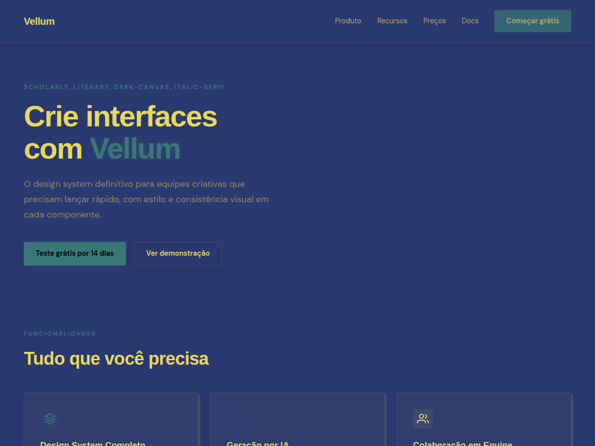
Vellum — Deep navy canvas with warm-yellow italic Cormorant serifs and a single dusty teal accent. A quiet, scholarly aesthetic. Cormorant Garamond Italic typography. deep periwinkle navy canvas with warm yellow italic-serif type and one dusty-tea. Best for research findings, white paper or longform report, academic or university deck. AI-ready design system.
Use case: research findings, white paper or longform report, academic or university deck, advisory deliverable, literary or editorial pitch, founder reflection / vision deck, bilingual EN/CN deck
Historical Context
Vellum was the surface before paper — calfskin stretched and scraped until it became translucent, holding ink with a warmth that wood pulp never replicated. The name matters here because this system is explicitly about that pre-industrial relationship between text and surface, where typography wasn't consumed but inhabited. Cormorant in italic carries the DNA of Garamond's Renaissance punchcutting, but with a contemporary optical refinement that lets it breathe at display sizes without losing its calligraphic memory. The italic specifically — not the roman — because italic was originally a separate typeface entirely, designed for continuous reading in compact Aldine pocket editions. Choosing italic as the display voice is a deliberate inversion: what was once the economical choice becomes the luxurious one. Deep navy against warm yellow isn't arbitrary. It's the color relationship of gilt lettering on cloth-bound spines — the palette of a library at dusk, where gold tooling catches the last light against indigo boards. This system doesn't reference books; it references the physical object of the book as a designed artifact.
When to Use
This belongs to literary brands, independent publishers, and editorial platforms that treat text as craft rather than content. Premium journals, poetry imprints, essay collections, literary magazines that still believe in the paragraph as a unit of thought. Book publishers whose covers are designed, not templated. Any brand where the audience reads slowly and on purpose. It fails completely in contexts that prioritize speed or scanning — this system demands the reader's time and rewards it.
Design Principles
- The italic is the voice — use Cormorant italic at display scale as the primary typographic gesture, not an accent
- Color as material memory — navy and warm yellow reference physical bookmaking, not abstract color theory
- Generous vertical rhythm — line spacing and section breaks should feel like breathing room, not efficiency
- Ornament through typography alone — no illustrations, no icons; let ligatures, swashes, and optical sizing carry all decorative weight
- Surface awareness — design as if the output will be printed on uncoated stock with visible tooth and fiber
DESIGN.md
---
version: "alpha"
name: "Vellum"
description: "Vellum — Deep navy canvas with warm-yellow italic Cormorant serifs and a single dusty teal accent. A quiet, scholarly aesthetic. Cormorant Garamond Italic typography. deep periwinkle navy canvas with warm yellow italic-serif type and one dusty-tea. Best for research findings, white paper or longform report, academic or university deck. AI-ready design system."
colors:
  primary: "#2a3870"
  secondary: "#343f80"
  tertiary: "#E8D85C"
  neutral: "#3a7878"
typography:
  h1:
    fontFamily: Cormorant Garamond
    fontSize: 2.5rem
    fontWeight: 700
  body-md:
    fontFamily: Cormorant Garamond
    fontSize: 1rem
    fontWeight: 400
spacing:
  sm: 2.0rem
  md: 4.0rem
  lg: 8.0rem
components:
  button-primary:
    backgroundColor: "{colors.primary}"
    textColor: "{colors.neutral}"
    padding: 12px
---

## Overview

Vellum — Deep navy canvas with warm-yellow italic Cormorant serifs and a single dusty teal accent. A quiet, scholarly aesthetic. Cormorant Garamond Italic typography. deep periwinkle navy canvas with warm yellow italic-serif type and one dusty-tea. Best for research findings, white paper or longform report, academic or university deck. AI-ready design system. Vellum was the surface before paper — calfskin stretched and scraped until it became translucent, holding ink with a warmth that wood pulp never replicated. The name matters here because this system is explicitly about that pre-industrial relationship between text and surface, where typography wasn't consumed but inhabited.

Cormorant in italic carries the DNA of Garamond's Renaissance punchcutting, but with a contemporary optical refinement that lets it breathe at display sizes without losing its calligraphic memory. The italic specifically — not the roman — because italic was originally a separate typeface entirely, designed for continuous reading in compact Aldine pocket editions. Choosing italic as the display voice is a deliberate inversion: what was once the economical choice becomes the luxurious one.

Deep navy against warm yellow isn't arbitrary. It's the color relationship of gilt lettering on cloth-bound spines — the palette of a library at dusk, where gold tooling catches the last light against indigo boards. This system doesn't reference books; it references the physical object of the book as a designed artifact.

- Density: 2/10 — Airy
- Variance: 8/10 — Complex
- Motion: 2/10 — Minimal

- **Style:** Scholarly, Literary, Dark-Canvas, Italic-Serif
- **Keywords:** Cormorant italic, deep navy, warm yellow, dusty teal, scholarly, literary, quiet, intellectual
- **Era:** 2010s Editorial
- **Light/Dark:** ✗ None / ✓ Full

## Colors

- **Bg** (#2a3870) — Primary surface or dominant color
- **Bg Alt** (#343f80) — Accent highlight, links and focus states
- **Fg** (#E8D85C) — Secondary accent
- **Accent** (#3a7878) — Accent color, emphasis elements


## Typography

- **Display / Hero:** Cormorant Garamond Italic — Weight 700, tight tracking, used for headline impact
- **Body:** DM Sans — Weight 400, 16px/1.6 line-height, max 72ch per line
- **UI Labels / Captions:** DM Sans — 0.875rem, weight 500, slight letter-spacing
- **Monospace:** Courier Prime — Used for code, metadata, and technical values

Scale:
- Hero: clamp(2.5rem, 5vw, 4rem)
- H1: 2.25rem
- H2: 1.5rem
- Body: 1rem / 1.6
- Small: 0.875rem


## Layout

- **Grid:** CSS Grid primary. Max-width containment: 1280px centered with 1.5rem side padding.
- **Spacing rhythm:** Balanced. Base unit: 0.5rem (8px).
- **Section vertical gaps:** clamp(4rem, 8vw, 8rem).
- **Hero layout:** Split-screen (text left, visual right).
- **Feature sections:** Zig-zag alternating text+image rows. No 3-equal-columns.
- **Mobile collapse:** All multi-column layouts collapse below 768px. No horizontal overflow.
- **z-index contract:** base (0) / sticky-nav (100) / overlay (200) / modal (300) / toast (500).


## Elevation & Depth

display font Cormorant Garamond Italic for hero headlines, subtle hover (opacity 0.8, 200ms), refined focus rings, dark canvas with glow/shadow accents, warm-yellow italic Cormorant on deep navy, dusty teal single accent, scholarly spacing, generous whitespace, clamp(4rem,8vw,8rem) section gaps

- **Physics:** Ease-out curves, 200-300ms duration. Smooth and predictable.
- **Entry animations:** Fade + translate-Y (16px → 0) over 420ms ease-out. Staggered cascades for lists: 80ms between items.
- **Hover states:** Subtle color shift + shadow adjustment over 200ms.
- **Page transitions:** Fade only (200ms).
- **Performance:** Only transform and opacity animated. No layout-triggering properties.


## Shapes

Base corner radius: 4px. See rounded tokens in front matter for the full scale.


## Components

- **Primary Button:** 4px border-radius. Accent color fill. Hover: 8% darken + subtle lift shadow. Active: -1px translate tactile press. Font weight 600. No outer glows.
- **Secondary / Ghost Button:** Outline variant. 1.5px border in muted color. Text in primary color. Hover: subtle background fill.
- **Cards:** 4px corners. Surface background. Subtle shadow (0 2px 12px rgba(0,0,0,0.06)). 1px border stroke.
- **Inputs:** Label above input. 1px border stroke. Focus ring: 2px accent color offset 2px. Error text below in semantic red. No floating labels.
- **Navigation:** Primary surface background. Active item: accent color indicator. Font weight 500 when active.
- **Skeletons:** Shimmer animation matching component dimensions. No circular spinners.
- **Empty States:** Icon-based composition with descriptive text and action button.


## Do's and Don'ts

- No emojis in UI — use icon system only (Lucide, Heroicons)
- No pure black (#000000) — use off-black or charcoal variants
- No oversaturated accent colors (saturation cap: 80%)
- No 3-column equal-width feature layouts — use zig-zag or asymmetric grid
- No `h-screen` — use `min-h-[100dvh]`
- No AI copywriting clichés: "Elevate", "Seamless", "Unleash", "Next-Gen"
- No broken external image links — use picsum.photos or inline SVG
- No generic lorem ipsum in demos

- Do Cormorant Garamond Italic display font loaded via Google Fonts
- Do Color palette variables applied consistently
- Do Typography scale: hero clamp(2.5rem,5vw,4rem)
- Do H1 2.25rem
- Do body 1rem/1.6
- Do WCAG AA contrast ratio verified (4.5:1 body text)
- Do Dark background contrast ≥ 7:1 for body text
- Do Serif typography hierarchy clear (display vs body)
- Do Whitespace generous — section gaps ≥ 5rem
- Do Mobile responsive layout (stack below 768px)


## Use Case

research findings, white paper or longform report, academic or university deck, advisory deliverable, literary or editorial pitch, founder reflection / vision deck, bilingual EN/CN deck
Technical Specs
CSS
font-family: 'Cormorant Garamond', serif; font-style: italic; background: #1c2644; color: #d4a830; --teal: #7A9A90; line-height: 1.7; letter-spacing: 0.02em
Variables
--bg: #2a3870, --fg: #E8D85C, --accent: #3a7878, --font-display: 'Cormorant Garamond Italic', --font-body: 'DM Sans', --radius: 4px, --spacing: 2rem
Checklist
☐ Cormorant Garamond Italic display font loaded via Google Fonts, ☐ Color palette variables applied consistently, ☐ Typography scale: hero clamp(2.5rem,5vw,4rem), H1 2.25rem, body 1rem/1.6, ☐ WCAG AA contrast ratio verified (4.5:1 body text), ☐ Dark background contrast ≥ 7:1 for body text, ☐ Serif typography hierarchy clear (display vs body), ☐ Whitespace generous — section gaps ≥ 5rem, ☐ Mobile responsive layout (stack below 768px)
Colors
Primary
Secondary
Effects
display font Cormorant Garamond Italic for hero headlines, subtle hover (opacity 0.8, 200ms), refined focus rings, dark canvas with glow/shadow accents, warm-yellow italic Cormorant on deep navy, dusty teal single accent, scholarly spacing, generous whitespace, clamp(4rem,8vw,8rem) section gaps
Light/Dark
✗ None / ✓ Full
AI Prompt
Act as a Senior Frontend Engineer and Expert UI Designer.
Your task is to code a complete Landing Page on the first attempt.
- Landing Page Theme: <INSERT THEME>
- Sections to add: <INSERT SECTIONS>

Generate the final code immediately following these definitions:

## Style

- **Name:** Vellum
- **Type:** Scholarly, Literary, Dark-Canvas, Italic-Serif
- **Keywords:** Cormorant italic, deep navy, warm yellow, dusty teal, scholarly, literary, quiet, intellectual
- **Era:** 2010s Editorial
- **Light/Dark:** ✗ None / ✓ Full

## Color Palette

- **Primary:** Bg #2a3870, Bg Alt #343f80, Fg #E8D85C
- **Secondary:** Accent #3a7878

## Visual Effects

display font Cormorant Garamond Italic for hero headlines, subtle hover (opacity 0.8, 200ms), refined focus rings, dark canvas with glow/shadow accents, warm-yellow italic Cormorant on deep navy, dusty teal single accent, scholarly spacing, generous whitespace, clamp(4rem,8vw,8rem) section gaps

## AI Visual Direction

Design a scholarly literary layout on deep navy (#1c2644). Use: warm-yellow italic Cormorant Garamond (#3a7878) for display type, dusty teal accent (#7A9A90) sparingly, slow generous spacing (line-height 1.7, letter-spacing 0.02em). Quiet and intellectual.

## CSS Technical

```css
font-family: 'Cormorant Garamond', serif; font-style: italic; background: #1c2644; color: #d4a830; --teal: #7A9A90; line-height: 1.7; letter-spacing: 0.02em
```

## Design System Variables

```css
--bg: #2a3870, --fg: #E8D85C, --accent: #3a7878, --font-display: 'Cormorant Garamond Italic', --font-body: 'DM Sans', --radius: 4px, --spacing: 2rem
```

## Implementation Checklist

- ☐ Cormorant Garamond Italic display font loaded via Google Fonts
- ☐ Color palette variables applied consistently
- ☐ Typography scale: hero clamp(2.5rem,5vw,4rem)
- H1 2.25rem
- body 1rem/1.6
- ☐ WCAG AA contrast ratio verified (4.5:1 body text)
- ☐ Dark background contrast ≥ 7:1 for body text
- ☐ Serif typography hierarchy clear (display vs body)
- ☐ Whitespace generous — section gaps ≥ 5rem
- ☐ Mobile responsive layout (stack below 768px)

## Execution Rules

1. Strictly follow the defined visual style.
2. Use high-quality inline SVG icons (Heroicons or Lucide style) — NEVER use emojis as icons.
3. Add `cursor-pointer` and smooth `hover` states (transition-all) on all interactive elements.
4. Required Page Structure:
   - Navbar (Logo + Links + CTA)
   - Hero Section (Impactful Headline + Subtitle + 2 buttons + 3D/Abstract visual element via CSS)
   - Features (3 cards with icons)
   - Testimonials (3 cards)
   - Pricing (3 tiers, highlight the middle one)
   - Final CTA
   - Full Footer with social links, privacy policy, terms of use, contact and SEO links.
5. All text content must be in English.
6. The visual must be CLEARLY distinct — do not create a "default Bootstrap" design. Force the use of the provided design system variables.
7. Use `<style>` tags in the head for custom classes (especially for complex backdrop-filter effects and animations) that Tailwind CDN doesn't cover.
8. Full Responsiveness: Layout must adapt perfectly to Mobile, Tablet and Desktop (vertical stack on mobile).
9. Include basic SEO, Viewport and Open Graph meta tags in `<head>`.
10. Footer must contain: Copyright 2026, Secondary navigation links and Social media icons.
11. Make the creative decisions needed to deliver the complete, functional result now.
Related

Last synced: 5/6/2026