Travel Plataforma de Viagens
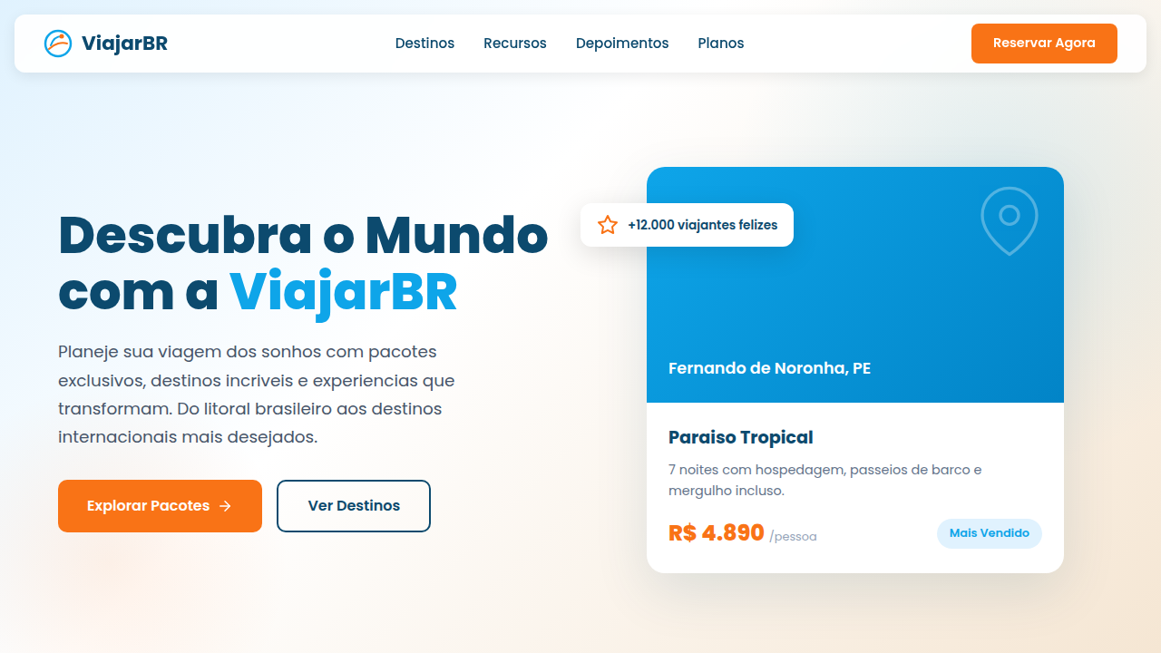
Travel landing, destinations, packages, maps, booking, adventure, blue and accent color, trips, flights, hotels. Ideal for landing pages, modern websites. AI-ready template.
Use case: Landing pages, Modern websites
Historical Context
Airbnb rewrote the rules. Before them, travel sites were search engines wearing a skin — Booking.com still is, frankly, and it works because utility wins when intent is high. But Airbnb proved that photography-first layouts could sell an emotion before a transaction. Full-bleed hero images, minimal chrome, letting the destination breathe. That shift forced the entire industry to reconsider what a listing page actually is: not a data sheet, but a story. The trust pattern evolved in parallel. Star ratings alone stopped being enough — travelers needed faces, written reviews, verified badges, host response rates. Social proof became structural, not decorative. Every serious booking platform now treats reviews as load-bearing UI, not a footnote section you scroll past. Mobile changed the math again. Sticky booking bars, progressive disclosure of pricing, thumb-friendly date pickers. When 70% of travel browsing happens on phones but conversion still skews desktop, the mobile experience has to reduce friction without hiding complexity. That tension — dreamy inspiration versus transactional clarity — defines modern travel UI.
When to Use
Reach for these components when you're building anything that sells a place or an experience. Travel agencies showcasing packages, booking platforms listing properties, tourism boards promoting regions, adventure brands selling trips. Works equally well for a boutique hotel's single-page site or a marketplace with thousands of listings. If your UI needs to balance aspirational imagery with hard logistics — dates, prices, availability, reviews — this is your vertical.
Design Principles
- Photography carries the sale — give images maximum real estate and never compress them into thumbnails when you can go full-bleed
- Trust is structural, not decorative — reviews, ratings, and verification badges belong in the decision flow, not buried below the fold
- Progressive disclosure for pricing — show the hook price early, reveal taxes and fees contextually, never surprise at checkout
- Mobile-first booking flows — sticky CTAs, collapsible details, date pickers designed for thumbs not cursors
- Atmosphere before information — let the user feel the destination first, then layer in logistics as they scroll deeper into intent
DESIGN.md
---
version: "alpha"
name: "Travel Plataforma de Viagens"
description: "Travel landing, destinations, packages, maps, booking, adventure, blue and accent color, trips, flights, hotels. Ideal for landing pages, modern websites. AI-ready template."
colors:
  primary: "#0EA5E9"
  secondary: "#F97316"
  tertiary: "#FFFFFF"
  neutral: "#0C4A6E"
  surface: "#F8FAFC"
  accent: "#F5E6D3"
typography:
  h1:
    fontFamily: Poppins
    fontSize: 2.5rem
    fontWeight: 700
  body-md:
    fontFamily: Poppins
    fontSize: 1rem
    fontWeight: 400
rounded:
  sm: 12px
  md: 24px
  lg: 36px
components:
  button-primary:
    backgroundColor: "{colors.primary}"
    textColor: "{colors.neutral}"
    rounded: "{rounded.sm}"
    padding: 12px
---

## Overview

Travel landing, destinations, packages, maps, booking, adventure, blue and accent color, trips, flights, hotels. Ideal for landing pages, modern websites. AI-ready template. Airbnb rewrote the rules. Before them, travel sites were search engines wearing a skin — Booking.com still is, frankly, and it works because utility wins when intent is high. But Airbnb proved that photography-first layouts could sell an emotion before a transaction. Full-bleed hero images, minimal chrome, letting the destination breathe. That shift forced the entire industry to reconsider what a listing page actually is: not a data sheet, but a story.

The trust pattern evolved in parallel. Star ratings alone stopped being enough — travelers needed faces, written reviews, verified badges, host response rates. Social proof became structural, not decorative. Every serious booking platform now treats reviews as load-bearing UI, not a footnote section you scroll past.

Mobile changed the math again. Sticky booking bars, progressive disclosure of pricing, thumb-friendly date pickers. When 70% of travel browsing happens on phones but conversion still skews desktop, the mobile experience has to reduce friction without hiding complexity. That tension — dreamy inspiration versus transactional clarity — defines modern travel UI.

- Density: 5/10 — Balanced
- Variance: 4/10 — Moderate
- Motion: 4/10 — Subtle

- **Style:** Inspirational, Adventurous, Warm
- **Keywords:** travel landing, destinations, packages, maps, booking, adventure, blue and accent color, trips, flights, hotels
- **Era:** 2020s Travel
- **Light/Dark:** ✓ Full / ✗ No

## Colors

- **Sky Blue** (#0EA5E9) — Accent highlight, links and focus states
- **Orange Accent** (#F97316) — Primary accent, CTAs and interactive elements
- **White** (#FFFFFF) — Light surface, card backgrounds
- **Dark Blue** (#0C4A6E) — Deep contrast surface
- **Light Grey** (#F8FAFC) — Secondary text, borders, muted elements
- **Sand** (#F5E6D3) — Extended palette, decorative use


## Typography

- **Display / Hero:** Poppins — Weight 700, tight tracking, used for headline impact
- **Body:** Poppins — Weight 400, 16px/1.6 line-height, max 72ch per line
- **UI Labels / Captions:** Poppins — 0.875rem, weight 500, slight letter-spacing
- **Monospace:** JetBrains Mono — Used for code, metadata, and technical values

Scale:
- Hero: clamp(2.5rem, 5vw, 4rem)
- H1: 2.25rem
- H2: 1.5rem
- Body: 1rem / 1.6
- Small: 0.875rem


## Layout

- **Grid:** CSS Grid primary. Max-width containment: 1280px centered with 1.5rem side padding.
- **Spacing rhythm:** Balanced. Base unit: 0.5rem (8px).
- **Section vertical gaps:** clamp(4rem, 8vw, 8rem).
- **Hero layout:** Split-screen (text left, visual right).
- **Feature sections:** Zig-zag alternating text+image rows. No 3-equal-columns.
- **Mobile collapse:** All multi-column layouts collapse below 768px. No horizontal overflow.
- **z-index contract:** base (0) / sticky-nav (100) / overlay (200) / modal (300) / toast (500).


## Elevation & Depth

Hero com grande imagem de destino e CTA de busca, cards de pacotes com preço/destino/duração, seção de categorias (praia, montanha, cidade) com ícones SVG, divisores suaves (curvas ou diagonais), carrossel simples em mobile.

- **Physics:** Ease-out curves, 200-300ms duration. Smooth and predictable.
- **Entry animations:** Fade + translate-Y (16px → 0) over 420ms ease-out. Staggered cascades for lists: 80ms between items.
- **Hover states:** Subtle color shift + shadow adjustment over 200ms.
- **Page transitions:** Fade only (200ms).
- **Performance:** Only transform and opacity animated. No layout-triggering properties.


## Shapes

Base corner radius: 12px. See rounded tokens in front matter for the full scale.


## Components

- **Primary Button:** Rounded (12px) shape. Accent color fill. Hover: 8% darken + subtle lift shadow. Active: -1px translate tactile press. Font weight 600. No outer glows.
- **Secondary / Ghost Button:** Outline variant. 1.5px border in muted color. Text in primary color. Hover: subtle background fill.
- **Cards:** Rounded (12px) corners. Surface background. Subtle shadow (0 2px 12px rgba(0,0,0,0.06)). 1px border stroke.
- **Inputs:** Label above input. 1px border stroke. Focus ring: 2px accent color offset 2px. Error text below in semantic red. No floating labels.
- **Navigation:** Primary surface background. Active item: accent color indicator. Font weight 500 when active.
- **Skeletons:** Shimmer animation matching component dimensions. No circular spinners.
- **Empty States:** Icon-based composition with descriptive text and action button.


## Do's and Don'ts

- No emojis in UI — use icon system only (Lucide, Heroicons)
- No pure black (#000000) — use off-black or charcoal variants
- No oversaturated accent colors (saturation cap: 80%)
- No 3-column equal-width feature layouts — use zig-zag or asymmetric grid
- No `h-screen` — use `min-h-[100dvh]`
- No AI copywriting clichés: "Elevate", "Seamless", "Unleash", "Next-Gen"
- No broken external image links — use picsum.photos or inline SVG
- No generic lorem ipsum in demos

- Do Navbar + Hero (busca/seleção)
- Do Destinos em destaque + Pacotes
- Do Depoimentos + CTA
- Do Meta tags SEO
- Do Tom inspirador PT-BR
- Do Ícones SVG (avião
- Do mala
- Do mapa
- Do hotel)
- Do Overlays escuros em imagens
- Do Animações discretas em cards.


## Use Case

Landing pages, Modern websites
Technical Specs
CSS
background: #FFFFFF, color: #0C4A6E, border-radius: 12px, box-shadow: 0 4px 15px rgba(0,0,0,0.08), font-family: 'Poppins, sans-serif', diagonal/curve section dividers via SVG, image overlays for text readability, simple carousel JS.
Variables
--sky-blue: #0EA5E9, --orange: #F97316, --dark-blue: #0C4A6E, --white: #FFFFFF, --radius-card: 12px, --font-travel: 'Poppins, sans-serif'.
Checklist
☐ Navbar + Hero (busca/seleção), ☐ Destinos em destaque + Pacotes, ☐ Depoimentos + CTA, ☐ Meta tags SEO, ☐ Tom inspirador PT-BR, ☐ Ícones SVG (avião, mala, mapa, hotel), ☐ Overlays escuros em imagens, ☐ Animações discretas em cards.
Colors
Primary
Secondary
Effects
Hero com grande imagem de destino e CTA de busca, cards de pacotes com preço/destino/duração, seção de categorias (praia, montanha, cidade) com ícones SVG, divisores suaves (curvas ou diagonais), carrossel simples em mobile.
Light/Dark
✓ Full / ✗ No
AI Prompt
Act as a Senior Frontend Engineer and Expert UI Designer.
Your task is to code a complete Landing Page on the first attempt.
- Landing Page Theme: <INSERT THEME>
- Sections to add: <INSERT SECTIONS>

Generate the final code immediately following these definitions:

## Style

- **Name:** Travel Plataforma de Viagens
- **Type:** Inspirational, Adventurous, Warm
- **Keywords:** travel landing, destinations, packages, maps, booking, adventure, blue and accent color, trips, flights, hotels
- **Era:** 2020s Travel
- **Light/Dark:** ✓ Full / ✗ No

## Color Palette

- **Primary:** Sky Blue #0EA5E9, Orange Accent #F97316, White #FFFFFF
- **Secondary:** Dark Blue #0C4A6E, Light Grey #F8FAFC, Sand #F5E6D3

## Visual Effects

Hero com grande imagem de destino e CTA de busca, cards de pacotes com preço/destino/duração, seção de categorias (praia, montanha, cidade) com ícones SVG, divisores suaves (curvas ou diagonais), carrossel simples em mobile.

## AI Visual Direction

travel landing, destinations, packages, maps, booking, adventure, blue and accent color, trips, flights, hotels.

## CSS Technical

```css
background: #FFFFFF, color: #0C4A6E, border-radius: 12px, box-shadow: 0 4px 15px rgba(0,0,0,0.08), font-family: 'Poppins, sans-serif', diagonal/curve section dividers via SVG, image overlays for text readability, simple carousel JS.
```

## Design System Variables

```css
--sky-blue: #0EA5E9, --orange: #F97316, --dark-blue: #0C4A6E, --white: #FFFFFF, --radius-card: 12px, --font-travel: 'Poppins, sans-serif'.
```

## Implementation Checklist

- ☐ Navbar + Hero (busca/seleção)
- ☐ Destinos em destaque + Pacotes
- ☐ Depoimentos + CTA
- ☐ Meta tags SEO
- ☐ Tom inspirador PT-BR
- ☐ Ícones SVG (avião
- mala
- mapa
- hotel)
- ☐ Overlays escuros em imagens
- ☐ Animações discretas em cards.

## Execution Rules

1. Strictly follow the defined visual style.
2. Use high-quality inline SVG icons (Heroicons or Lucide style) — NEVER use emojis as icons.
3. Add `cursor-pointer` and smooth `hover` states (transition-all) on all interactive elements.
4. Required Page Structure:
   - Navbar (Logo + Links + CTA)
   - Hero Section (Impactful Headline + Subtitle + 2 buttons + 3D/Abstract visual element via CSS)
   - Features (3 cards with icons)
   - Testimonials (3 cards)
   - Pricing (3 tiers, highlight the middle one)
   - Final CTA
   - Full Footer with social links, privacy policy, terms of use, contact and SEO links.
5. All text content must be in English.
6. The visual must be CLEARLY distinct — do not create a "default Bootstrap" design. Force the use of the provided design system variables.
7. Use `<style>` tags in the head for custom classes (especially for complex backdrop-filter effects and animations) that Tailwind CDN doesn't cover.
8. Full Responsiveness: Layout must adapt perfectly to Mobile, Tablet and Desktop (vertical stack on mobile).
9. Include basic SEO, Viewport and Open Graph meta tags in `<head>`.
10. Footer must contain: Copyright 2026, Secondary navigation links and Social media icons.
11. Make the creative decisions needed to deliver the complete, functional result now.
Related
Last synced: 4/1/2026