Terminal Green
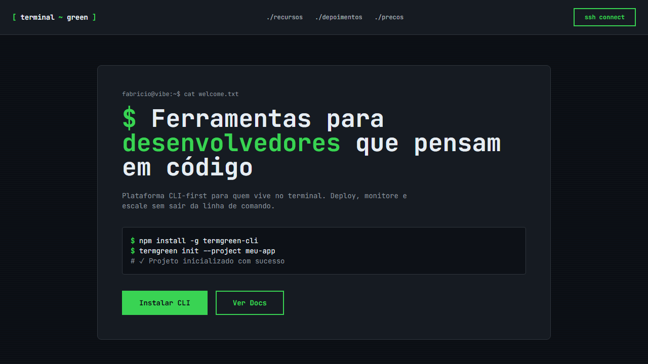
Developer-focused, hacker aesthetic landing page. Ideal for portfolios de desenvolvedores, ferramentas cli, plataformas devops, technical documentation. AI-ready template.
Use case: Developer portfolios, CLI tools, DevOps platforms, Technical documentation
Historical Context
Terminal green isn't nostalgia — it's a lineage. The phosphor glow of CRT monitors in the 1970s and 80s wasn't a design choice; it was a constraint of P1 phosphor technology. Green on black persisted because it was cheap, readable, and burned itself into the collective memory of anyone who touched a mainframe. When Hollywood needed shorthand for "computer," they reached for cascading green characters. The Matrix didn't invent the aesthetic — it canonized what every sysadmin already knew viscerally. The color carries meaning that no amount of rebranding can strip away. Green text on dark backgrounds signals competence, access, and a certain disregard for polish in favor of function. It's the visual language of people who prefer stderr over modal dialogs. Every hacker movie, every CTF competition, every SSH session reinforces the same semiotic contract: if you're reading green monospace, you're closer to the metal than most people will ever get. Today the aesthetic lives in dev tools, security dashboards, and CLI-first products that wear their technical roots openly. It's not retro — it's a deliberate rejection of the rounded-corner, pastel-gradient mainstream. It says: this tool was built by engineers, for engineers, and it doesn't apologize for that.
When to Use
Reach for terminal green when your audience self-identifies as technical and your product earns credibility by looking like infrastructure rather than consumer software. It works for CLI tools, security platforms, developer dashboards, penetration testing interfaces, and anything where "approachable" is less important than "capable." Avoid it for general audiences — this palette actively filters out non-technical users, which is either a feature or a bug depending on your positioning. If your marketing says "no-code," put this palette back.
Design Principles
- Monospace is non-negotiable — proportional fonts break the contract instantly. Pick one good monospace family and commit.
- Green isn't one color. Build a scale from near-black through dim olive to full phosphor #00FF00, and use brightness as your hierarchy instead of weight or size.
- Backgrounds stay dark and flat. The moment you add a gradient or a card shadow, you've left the terminal and entered a themed UI — those are different things.
- Motion should feel like rendering, not animation. Text appears character-by-character, elements resolve line-by-line. Nothing eases in — it either exists or it doesn't yet.
- Density is a virtue. Terminal interfaces pack information tight because screen real estate is sacred. If your layout has generous whitespace, you're cosplaying rather than committing.
DESIGN.md
---
version: "alpha"
name: "Terminal Green"
description: "Developer-focused, hacker aesthetic landing page. Ideal for portfolios de desenvolvedores, ferramentas cli, plataformas devops, technical documentation. AI-ready template."
colors:
  primary: "#0d1117"
  secondary: "#39d353"
  tertiary: "#e6edf3"
  neutral: "#30363d"
  surface: "#238636"
  accent: "#8b949e"
typography:
  h1:
    fontFamily: JetBrains Mono
    fontSize: 2.5rem
    fontWeight: 700
  body-md:
    fontFamily: JetBrains Mono
    fontSize: 1rem
    fontWeight: 400
rounded:
  sm: 6px
  md: 12px
  lg: 18px
spacing:
  sm: 4.0px
  md: 8.0px
  lg: 16.0px
components:
  button-primary:
    backgroundColor: "{colors.primary}"
    textColor: "{colors.neutral}"
    rounded: "{rounded.sm}"
    padding: 12px
---

## Overview

Developer-focused, hacker aesthetic landing page. Ideal for portfolios de desenvolvedores, ferramentas cli, plataformas devops, technical documentation. AI-ready template. Terminal green isn't nostalgia — it's a lineage. The phosphor glow of CRT monitors in the 1970s and 80s wasn't a design choice; it was a constraint of P1 phosphor technology. Green on black persisted because it was cheap, readable, and burned itself into the collective memory of anyone who touched a mainframe. When Hollywood needed shorthand for "computer," they reached for cascading green characters. The Matrix didn't invent the aesthetic — it canonized what every sysadmin already knew viscerally.

The color carries meaning that no amount of rebranding can strip away. Green text on dark backgrounds signals competence, access, and a certain disregard for polish in favor of function. It's the visual language of people who prefer stderr over modal dialogs. Every hacker movie, every CTF competition, every SSH session reinforces the same semiotic contract: if you're reading green monospace, you're closer to the metal than most people will ever get.

Today the aesthetic lives in dev tools, security dashboards, and CLI-first products that wear their technical roots openly. It's not retro — it's a deliberate rejection of the rounded-corner, pastel-gradient mainstream. It says: this tool was built by engineers, for engineers, and it doesn't apologize for that.

- Density: 8/10 — Dense
- Variance: 4/10 — Moderate
- Motion: 6/10 — Expressive

- **Style:** Developer-Focused, Hacker Aesthetic, Monospace
- **Keywords:** terminal, green, hacker, developer, monospace, JetBrains Mono, scan lines, blinking cursor, code syntax, GitHub dark, CLI
- **Era:** 2024-2026 Developer Aesthetic
- **Light/Dark:** ✗ No / ✓ Only

## Colors

- **GitHub Dark** (#0d1117) — Dark surface, primary background
- **Terminal Green** (#39d353) — Secondary surface or text color
- **White Text** (#e6edf3) — Light surface, card backgrounds
- **Dark Border** (#30363d) — Deep contrast surface
- **Muted Green** (#238636) — Secondary text, borders, muted elements
- **Dim Text** (#8b949e) — Primary text color
- **Code BG** (#161b22) — Primary background surface


## Typography

- **Display / Hero:** JetBrains Mono — Weight 700, tight tracking, used for headline impact
- **Body:** JetBrains Mono — Weight 400, 16px/1.6 line-height, max 72ch per line
- **UI Labels / Captions:** JetBrains Mono — 0.875rem, weight 500, slight letter-spacing
- **Monospace:** JetBrains Mono — Used for code, metadata, and technical values

Scale:
- Hero: clamp(2.5rem, 5vw, 4rem)
- H1: 2.25rem
- H2: 1.5rem
- Body: 1rem / 1.6
- Small: 0.875rem


## Layout

- **Grid:** CSS Grid primary. Max-width containment: 1280px centered with 1.5rem side padding.
- **Spacing rhythm:** Balanced. Base unit: 0.5rem (8px).
- **Section vertical gaps:** clamp(4rem, 8vw, 8rem).
- **Hero layout:** Split-screen (text left, visual right).
- **Feature sections:** Zig-zag alternating text+image rows. No 3-equal-columns.
- **Mobile collapse:** All multi-column layouts collapse below 768px. No horizontal overflow.
- **z-index contract:** base (0) / sticky-nav (100) / overlay (200) / modal (300) / toast (500).


## Elevation & Depth

Scan lines overlay via CSS, blinking cursor animation, code syntax styling with colored tokens, terminal-style borders, monospace everything, smooth transitions 150ms

- **Physics:** Spring — stiffness 120, damping 20. Confident, weighted transitions.
- **Entry animations:** Fade + translate-Y (16px → 0) over 480ms ease-out. Staggered cascades for lists: 100ms between items.
- **Hover states:** Scale(1.03) + shadow lift over 200ms.
- **Page transitions:** Fade + slide (300ms).
- **Performance:** Only transform and opacity animated. No layout-triggering properties.


## Shapes

Base corner radius: 6px. See rounded tokens in front matter for the full scale.


## Components

- **Primary Button:** Rounded (6px) shape. Accent color fill. Hover: 8% darken + subtle lift shadow. Active: -1px translate tactile press. Font weight 600. No outer glows.
- **Secondary / Ghost Button:** Outline variant. 1.5px border in muted color. Text in primary color. Hover: subtle background fill.
- **Cards:** Rounded (6px) corners. Surface background. Subtle shadow (0 2px 12px rgba(0,0,0,0.06)). 1px border stroke.
- **Inputs:** Label above input. 1px border stroke. Focus ring: 2px accent color offset 2px. Error text below in semantic red. No floating labels.
- **Navigation:** Primary surface background. Active item: accent color indicator. Font weight 500 when active.
- **Skeletons:** Shimmer animation matching component dimensions. No circular spinners.
- **Empty States:** Icon-based composition with descriptive text and action button.


## Do's and Don'ts

- No emojis in UI — use icon system only (Lucide, Heroicons)
- No pure white (#FFFFFF) backgrounds — use off-white or dark surfaces
- No oversaturated accent colors (saturation cap: 80%)
- No 3-column equal-width feature layouts — use zig-zag or asymmetric grid
- No `h-screen` — use `min-h-[100dvh]`
- No AI copywriting clichés: "Elevate", "Seamless", "Unleash", "Next-Gen"
- No broken external image links — use picsum.photos or inline SVG
- No generic lorem ipsum in demos

- Do JetBrains Mono como única fonte
- Do GitHub dark background #0d1117
- Do Terminal green #39d353 como accent
- Do Scan lines overlay
- Do Blinking cursor animation
- Do Code syntax styling
- Do Terminal-style borders
- Do Responsivo mobile/tablet/desktop


## Use Case

Developer portfolios, CLI tools, DevOps platforms, Technical documentation
Technical Specs
CSS
font-family: 'JetBrains Mono', monospace, background: #0d1117, color: #e6edf3, .scan-lines { background: repeating-linear-gradient(0deg, transparent, transparent 2px, rgba(0,0,0,0.1) 2px, rgba(0,0,0,0.1) 4px) }, .cursor-blink { animation: blink 1s step-end infinite }, @keyframes blink { 50% { opacity: 0 } }, .terminal-border { border: 1px solid #30363d }, .green-accent { color: #39d353 }, pre code { background: #161b22; padding: 16px; border-radius: 6px }Variables
--bg-primary: #0d1117, --accent-green: #39d353, --text-primary: #e6edf3, --text-muted: #8b949e, --border-color: #30363d, --code-bg: #161b22, --font-mono: 'JetBrains Mono', --scan-line-gap: 4px, --cursor-speed: 1s
Checklist
☐ JetBrains Mono como única fonte, ☐ GitHub dark background #0d1117, ☐ Terminal green #39d353 como accent, ☐ Scan lines overlay, ☐ Blinking cursor animation, ☐ Code syntax styling, ☐ Terminal-style borders, ☐ Responsivo mobile/tablet/desktop
Colors
Primary
Secondary
Effects
Scan lines overlay via CSS, blinking cursor animation, code syntax styling with colored tokens, terminal-style borders, monospace everything, smooth transitions 150ms
Light/Dark
✗ No / ✓ Only
AI Prompt
Act as a Senior Frontend Engineer and Expert UI Designer.
Your task is to code a complete Landing Page on the first attempt.
- Landing Page Theme: <INSERT THEME>
- Sections to add: <INSERT SECTIONS>

Generate the final code immediately following these definitions:

## Style

- **Name:** Terminal Green
- **Type:** Developer-Focused, Hacker Aesthetic, Monospace
- **Keywords:** terminal, green, hacker, developer, monospace, JetBrains Mono, scan lines, blinking cursor, code syntax, GitHub dark, CLI
- **Era:** 2024-2026 Developer Aesthetic
- **Light/Dark:** ✗ No / ✓ Only

## Color Palette

- **Primary:** GitHub Dark #0d1117, Terminal Green #39d353, White Text #e6edf3
- **Secondary:** Dark Border #30363d, Muted Green #238636, Dim Text #8b949e, Code BG #161b22

## Visual Effects

Scan lines overlay via CSS, blinking cursor animation, code syntax styling with colored tokens, terminal-style borders, monospace everything, smooth transitions 150ms

## AI Visual Direction

Design a developer-focused, hacker aesthetic landing page. Use GitHub dark background (#0d1117) with terminal green (#39d353) as primary accent. JetBrains Mono as the ONLY font (monospace throughout). Add scan lines overlay using CSS. Include blinking cursor animation. Style code blocks with syntax coloring. Terminal-style borders and UI elements. Everything should feel like a CLI/terminal interface.

## CSS Technical

```css
font-family: 'JetBrains Mono', monospace, background: #0d1117, color: #e6edf3, .scan-lines { background: repeating-linear-gradient(0deg, transparent, transparent 2px, rgba(0,0,0,0.1) 2px, rgba(0,0,0,0.1) 4px) }, .cursor-blink { animation: blink 1s step-end infinite }, @keyframes blink { 50% { opacity: 0 } }, .terminal-border { border: 1px solid #30363d }, .green-accent { color: #39d353 }, pre code { background: #161b22; padding: 16px; border-radius: 6px }
```

## Design System Variables

```css
--bg-primary: #0d1117, --accent-green: #39d353, --text-primary: #e6edf3, --text-muted: #8b949e, --border-color: #30363d, --code-bg: #161b22, --font-mono: 'JetBrains Mono', --scan-line-gap: 4px, --cursor-speed: 1s
```

## Implementation Checklist

- ☐ JetBrains Mono como única fonte
- ☐ GitHub dark background #0d1117
- ☐ Terminal green #39d353 como accent
- ☐ Scan lines overlay
- ☐ Blinking cursor animation
- ☐ Code syntax styling
- ☐ Terminal-style borders
- ☐ Responsivo mobile/tablet/desktop

## Execution Rules

1. Strictly follow the defined visual style.
2. Use high-quality inline SVG icons (Heroicons or Lucide style) — NEVER use emojis as icons.
3. Add `cursor-pointer` and smooth `hover` states (transition-all) on all interactive elements.
4. Required Page Structure:
   - Navbar (Logo + Links + CTA)
   - Hero Section (Impactful Headline + Subtitle + 2 buttons + 3D/Abstract visual element via CSS)
   - Features (3 cards with icons)
   - Testimonials (3 cards)
   - Pricing (3 tiers, highlight the middle one)
   - Final CTA
   - Full Footer with social links, privacy policy, terms of use, contact and SEO links.
5. All text content must be in English.
6. The visual must be CLEARLY distinct — do not create a "default Bootstrap" design. Force the use of the provided design system variables.
7. Use `<style>` tags in the head for custom classes (especially for complex backdrop-filter effects and animations) that Tailwind CDN doesn't cover.
8. Full Responsiveness: Layout must adapt perfectly to Mobile, Tablet and Desktop (vertical stack on mobile).
9. Include basic SEO, Viewport and Open Graph meta tags in `<head>`.
10. Footer must contain: Copyright 2026, Secondary navigation links and Social media icons.
11. Make the creative decisions needed to deliver the complete, functional result now.Related
Last synced: 4/1/2026