Targo Logistics Hero
Logistics hero with full-screen video 100% opacity no overlay. Ideal for empresas de logística, transportadoras, frotas corporativas, serviços de entrega premium. AI-ready template.
Use case: Logistics companies, Carriers, Corporate fleets, Premium delivery services
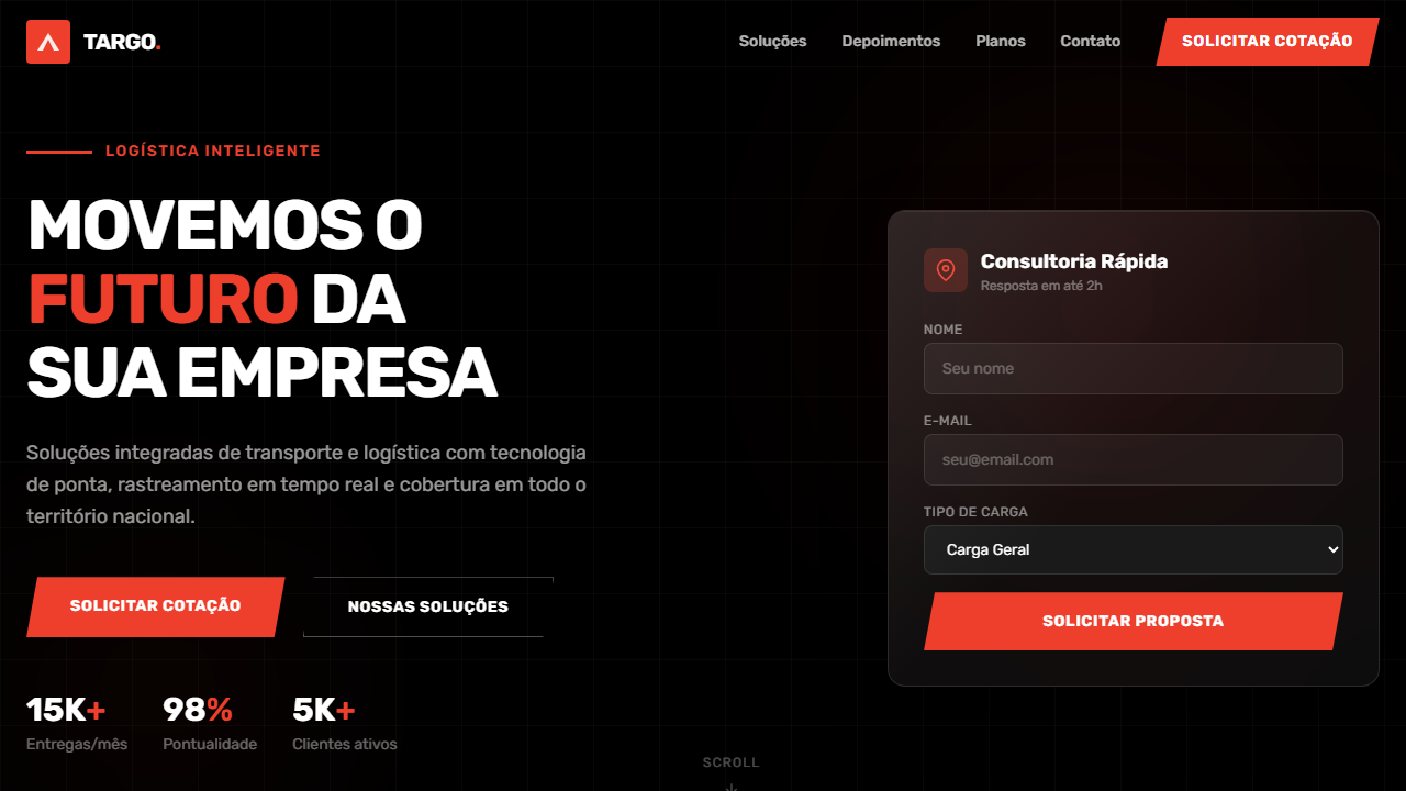
Historical Context
Logistics branding has always been caught between two impulses: the desire to feel massive and reliable, and the need to not look like every other trucking company slapping a globe icon on a navy background. The best transport brands — think Maersk's stark blue containers or DHL's aggressive yellow — understood that owning a single color at industrial scale IS the brand. Red in logistics carries specific weight. It signals urgency, operational intensity, the implicit promise that your cargo matters enough to move fast. The hero pattern here draws from that lineage of bold, single-color dominance applied to digital surfaces. It rejects the temptation to soften industrial brands with friendly illustrations or gratuitous photography of smiling warehouse workers. Instead, it treats the viewport like the side of a container ship — a surface that earns attention through sheer chromatic confidence and typographic scale. The geometric undertones reference route maps and grid systems without being literal about it.
When to Use
Deploy this when a logistics or transport brand needs to hit hard above the fold without resorting to stock photography of highways at sunset. It works for companies that have earned their red — established operators, not startups playing dress-up. Best suited for corporate sites, fleet landing pages, and supply chain platforms where the audience is B2B buyers who respect directness over decoration. Skip it if the brand palette is timid or the content strategy relies on emotional storytelling.
Design Principles
- Chromatic dominance over photographic dependency — let the brand red do the heavy lifting instead of hiding behind imagery
- Industrial type scale that treats headlines like container markings: bold, oversized, unapologetic
- Geometric negative space that implies route networks and grid logistics without illustrating them literally
- Zero decorative flourish — every element either communicates or navigates, nothing exists for ornament
- Contrast hierarchy built for scanning speed, because logistics buyers make decisions fast and respect interfaces that match their tempo
DESIGN.md
---
version: "alpha"
name: "Targo Logistics Hero"
description: "Logistics hero with full-screen video 100% opacity no overlay. Ideal for empresas de logística, transportadoras, frotas corporativas, serviços de entrega premium. AI-ready template."
colors:
  primary: "#000000"
  secondary: "#EE3F2C"
  tertiary: "#FFFFFF"
  neutral: "#1A1A1A"
typography:
  h1:
    fontFamily: Rubik
    fontSize: 2.5rem
    fontWeight: 700
  body-md:
    fontFamily: Rubik
    fontSize: 1rem
    fontWeight: 400
components:
  button-primary:
    backgroundColor: "{colors.primary}"
    textColor: "{colors.neutral}"
    padding: 12px
---

## Overview

Logistics hero with full-screen video 100% opacity no overlay. Ideal for empresas de logística, transportadoras, frotas corporativas, serviços de entrega premium. AI-ready template. Logistics branding has always been caught between two impulses: the desire to feel massive and reliable, and the need to not look like every other trucking company slapping a globe icon on a navy background. The best transport brands — think Maersk's stark blue containers or DHL's aggressive yellow — understood that owning a single color at industrial scale IS the brand. Red in logistics carries specific weight. It signals urgency, operational intensity, the implicit promise that your cargo matters enough to move fast.

The hero pattern here draws from that lineage of bold, single-color dominance applied to digital surfaces. It rejects the temptation to soften industrial brands with friendly illustrations or gratuitous photography of smiling warehouse workers. Instead, it treats the viewport like the side of a container ship — a surface that earns attention through sheer chromatic confidence and typographic scale. The geometric undertones reference route maps and grid systems without being literal about it.

- Density: 5/10 — Balanced
- Variance: 4/10 — Moderate
- Motion: 4/10 — Subtle

- **Style:** Logistics, Brand Red, Clip-Path Buttons, Liquid Glass, Video Full Opacity
- **Keywords:** logistics, transporte, brand red, clip-path buttons, liquid glass, glassmorphism avançado, Rubik font, cantos cortados, consulta gratuita, vídeo sem overlay
- **Era:** 2024-2026 Logistics Premium
- **Light/Dark:** ✗ Not Recommended / ✓ Full

## Colors

- **Preto** (#000000) — Dark surface, primary background
- **Vermelho Marca** (#EE3F2C) — Error states, destructive actions
- **Branco** (#FFFFFF) — Light surface, card backgrounds
- **Cinza Escuro** (#1A1A1A) — Dark surface, primary background
- **Vidro Borda** (rgba(255,255,255,0.12)) — Extended palette, decorative use
- **Vidro Fundo** (rgba(255,255,255,0.05)) — Primary background surface
- **Brilho Diagonal** (rgba(255,255,255,0.1)) — Extended palette, decorative use
- **Sombra Interna** (rgba(0,0,0,0.2)) — Extended palette, decorative use


## Typography

- **Display / Hero:** Rubik — Weight 700, tight tracking, used for headline impact
- **Body:** Rubik — Weight 400, 16px/1.6 line-height, max 72ch per line
- **UI Labels / Captions:** Rubik — 0.875rem, weight 500, slight letter-spacing
- **Monospace:** JetBrains Mono — Used for code, metadata, and technical values

Scale:
- Hero: clamp(2.5rem, 5vw, 4rem)
- H1: 2.25rem
- H2: 1.5rem
- Body: 1rem / 1.6
- Small: 0.875rem


## Layout

- **Grid:** CSS Grid primary. Max-width containment: 1280px centered with 1.5rem side padding.
- **Spacing rhythm:** Balanced. Base unit: 0.5rem (8px).
- **Section vertical gaps:** clamp(4rem, 8vw, 8rem).
- **Hero layout:** Split-screen (text left, visual right).
- **Feature sections:** Zig-zag alternating text+image rows. No 3-equal-columns.
- **Mobile collapse:** All multi-column layouts collapse below 768px. No horizontal overflow.
- **z-index contract:** base (0) / sticky-nav (100) / overlay (200) / modal (300) / toast (500).


## Elevation & Depth

VÍDEO: Vídeo cinematográfico de logística e transporte. Cenas de caminhões em estrada, operações de carga, armazéns ou veículos de frota em movimento. Tons escuros com iluminação dramática vermelha/branca. Exibido em opacity 100% sem overlay escuro, permitindo que o vídeo domine o visual enquanto o card de consulta com liquid glass flutua sobre ele. | EFEITOS CSS: Vídeo tela cheia opacity 100% sem overlay, botões com clip-path geométrico (corte diagonal 10-12px top-right e bottom-left), card de consulta com liquid glass avançado (backdrop-filter: blur(40px) saturate(180%), borda 1px branca 12%, gradient diagonal brilho, inner box-shadow), headline ~64px desktop / ~42px mobile, Rubik bold uppercase letter-spacing -4%

- **Physics:** Ease-out curves, 200-300ms duration. Smooth and predictable.
- **Entry animations:** Fade + translate-Y (16px → 0) over 420ms ease-out. Staggered cascades for lists: 80ms between items.
- **Hover states:** Subtle color shift + shadow adjustment over 200ms.
- **Page transitions:** Fade only (200ms).
- **Performance:** Only transform and opacity animated. No layout-triggering properties.


## Shapes

Base corner radius: 8px. See rounded tokens in front matter for the full scale.


## Components

- **Primary Button:** Subtly rounded (0.5rem) shape. Accent color fill. Hover: 8% darken + subtle lift shadow. Active: -1px translate tactile press. Font weight 600. No outer glows.
- **Secondary / Ghost Button:** Outline variant. 1.5px border in muted color. Text in primary color. Hover: subtle background fill.
- **Cards:** Subtly rounded (0.5rem) corners. Surface background. Subtle shadow (0 2px 12px rgba(0,0,0,0.06)). 1px border stroke.
- **Inputs:** Label above input. 1px border stroke. Focus ring: 2px accent color offset 2px. Error text below in semantic red. No floating labels.
- **Navigation:** Primary surface background. Active item: accent color indicator. Font weight 500 when active.
- **Skeletons:** Shimmer animation matching component dimensions. No circular spinners.
- **Empty States:** Icon-based composition with descriptive text and action button.


## Do's and Don'ts

- No emojis in UI — use icon system only (Lucide, Heroicons)
- No pure black (#000000) — use off-black or charcoal variants
- No oversaturated accent colors (saturation cap: 80%)
- No 3-column equal-width feature layouts — use zig-zag or asymmetric grid
- No `h-screen` — use `min-h-[100dvh]`
- No AI copywriting clichés: "Elevate", "Seamless", "Unleash", "Next-Gen"
- No broken external image links — use picsum.photos or inline SVG
- No generic lorem ipsum in demos

- Do Vídeo tela cheia opacity 100%
- Do Botões clip-path diagonal
- Do Card liquid glass avançado
- Do Brilho diagonal no card
- Do Inner box-shadow
- Do Rubik bold uppercase
- Do Headline 64px/42px
- Do Layout compacto
- Do Responsivo


## Use Case

Logistics companies, Carriers, Corporate fleets, Premium delivery services
Technical Specs
CSS
font-family: 'Rubik', font-weight: 700, text-transform: uppercase, letter-spacing: -0.04em, font-size: 64px / 42px, video: opacity-100 no overlay, clip-path: polygon() for diagonal cuts, backdrop-filter: blur(40px) saturate(180%), border: 1px solid rgba(255,255,255,0.12), box-shadow: inset
Variables
--bg-primary: #000000, --color-red: #EE3F2C, --text-primary: #FFFFFF, --glass-blur: 40px, --glass-saturate: 180%, --glass-border: rgba(255,255,255,0.12), --font-primary: 'Rubik', --headline-size: 64px, --clip-cut: 10px
Checklist
☐ Vídeo tela cheia opacity 100%, ☐ Botões clip-path diagonal, ☐ Card liquid glass avançado, ☐ Brilho diagonal no card, ☐ Inner box-shadow, ☐ Rubik bold uppercase, ☐ Headline 64px/42px, ☐ Layout compacto, ☐ Responsivo
Colors
Primary
Effects
VÍDEO: Vídeo cinematográfico de logística e transporte. Cenas de caminhões em estrada, operações de carga, armazéns ou veículos de frota em movimento. Tons escuros com iluminação dramática vermelha/branca. Exibido em opacity 100% sem overlay escuro, permitindo que o vídeo domine o visual enquanto o card de consulta com liquid glass flutua sobre ele. | EFEITOS CSS: Vídeo tela cheia opacity 100% sem overlay, botões com clip-path geométrico (corte diagonal 10-12px top-right e bottom-left), card de consulta com liquid glass avançado (backdrop-filter: blur(40px) saturate(180%), borda 1px branca 12%, gradient diagonal brilho, inner box-shadow), headline ~64px desktop / ~42px mobile, Rubik bold uppercase letter-spacing -4%
Light/Dark
✗ Not Recommended / ✓ Full
AI Prompt
Act as a Senior Frontend Engineer and Expert UI Designer.
Your task is to code a complete Landing Page on the first attempt.
- Landing Page Theme: <INSERT THEME>
- Sections to add: <INSERT SECTIONS>

Generate the final code immediately following these definitions:

## Style

- **Name:** Targo Logistics Hero
- **Type:** Logistics, Brand Red, Clip-Path Buttons, Liquid Glass, Video Full Opacity
- **Keywords:** logistics, transporte, brand red, clip-path buttons, liquid glass, glassmorphism avançado, Rubik font, cantos cortados, consulta gratuita, vídeo sem overlay
- **Era:** 2024-2026 Logistics Premium
- **Light/Dark:** ✗ Not Recommended / ✓ Full

## Color Palette

- **Primary:** Preto #000000, Vermelho Marca #EE3F2C, Branco #FFFFFF, Cinza Escuro #1A1A1A
- **Secondary:** Vidro Borda rgba(255,255,255,0.12), Vidro Fundo rgba(255,255,255,0.05), Brilho Diagonal rgba(255,255,255,0.1), Sombra Interna rgba(0,0,0,0.2)

## Visual Effects

VÍDEO: Vídeo cinematográfico de logística e transporte. Cenas de caminhões em estrada, operações de carga, armazéns ou veículos de frota em movimento. Tons escuros com iluminação dramática vermelha/branca. Exibido em opacity 100% sem overlay escuro, permitindo que o vídeo domine o visual enquanto o card de consulta com liquid glass flutua sobre ele. | EFEITOS CSS: Vídeo tela cheia opacity 100% sem overlay, botões com clip-path geométrico (corte diagonal 10-12px top-right e bottom-left), card de consulta com liquid glass avançado (backdrop-filter: blur(40px) saturate(180%), borda 1px branca 12%, gradient diagonal brilho, inner box-shadow), headline ~64px desktop / ~42px mobile, Rubik bold uppercase letter-spacing -4%

## AI Visual Direction

Design a logistics hero with full-screen video 100% opacity no overlay. Brand red #EE3F2C. Clip-path geometric buttons with 10-12px diagonal cuts. Liquid glass consultation card: backdrop-filter blur(40px) saturate(180%), 1px white border 12% opacity, diagonal shine gradient, inner box-shadow. Headline ~64px Rubik bold uppercase -4% tracking. Compact refined layout.

## CSS Technical

```css
font-family: 'Rubik', font-weight: 700, text-transform: uppercase, letter-spacing: -0.04em, font-size: 64px / 42px, video: opacity-100 no overlay, clip-path: polygon() for diagonal cuts, backdrop-filter: blur(40px) saturate(180%), border: 1px solid rgba(255,255,255,0.12), box-shadow: inset
```

## Design System Variables

```css
--bg-primary: #000000, --color-red: #EE3F2C, --text-primary: #FFFFFF, --glass-blur: 40px, --glass-saturate: 180%, --glass-border: rgba(255,255,255,0.12), --font-primary: 'Rubik', --headline-size: 64px, --clip-cut: 10px
```

## Implementation Checklist

- ☐ Vídeo tela cheia opacity 100%
- ☐ Botões clip-path diagonal
- ☐ Card liquid glass avançado
- ☐ Brilho diagonal no card
- ☐ Inner box-shadow
- ☐ Rubik bold uppercase
- ☐ Headline 64px/42px
- ☐ Layout compacto
- ☐ Responsivo

## Execution Rules

1. Strictly follow the defined visual style.
2. Use high-quality inline SVG icons (Heroicons or Lucide style) — NEVER use emojis as icons.
3. Add `cursor-pointer` and smooth `hover` states (transition-all) on all interactive elements.
4. Required Page Structure:
   - Navbar (Logo + Links + CTA)
   - Hero Section (Impactful Headline + Subtitle + 2 buttons + 3D/Abstract visual element via CSS)
   - Features (3 cards with icons)
   - Testimonials (3 cards)
   - Pricing (3 tiers, highlight the middle one)
   - Final CTA
   - Full Footer with social links, privacy policy, terms of use, contact and SEO links.
5. All text content must be in English.
6. The visual must be CLEARLY distinct — do not create a "default Bootstrap" design. Force the use of the provided design system variables.
7. Use `<style>` tags in the head for custom classes (especially for complex backdrop-filter effects and animations) that Tailwind CDN doesn't cover.
8. Full Responsiveness: Layout must adapt perfectly to Mobile, Tablet and Desktop (vertical stack on mobile).
9. Include basic SEO, Viewport and Open Graph meta tags in `<head>`.
10. Footer must contain: Copyright 2026, Secondary navigation links and Social media icons.
11. Make the creative decisions needed to deliver the complete, functional result now.
Related
Last synced: 4/1/2026