Tactile 3D Neumorphism
Estilo 3D tátil com neumorfismo inflado, sombras suaves multicamada e acabamento glossy. Perfeito para apps modernas, dashboards e interfaces premium.
Uso: Apps modernas, Dashboards, Interfaces premium, Produtos digitais, Fintech
Contexto Histórico
Evolução do Neumorphism (2020) combinado com tendências de design inflado e glossy. Cria interfaces que parecem táteis e pressionáveis, revivendo o skeuomorfismo de forma moderna.
Especificações Técnicas
Cores
Primárias
Secundárias
Efeitos
Multi-layer neumorphic shadows (convex + concave), glossy highlight gradient on top edge, inflated/puffy 3D appearance via border-radius 20-30px, smooth press animation (scale 0.97), subtle inner glow for glass-like finish, 200ms transitions
Light/Dark
✓ Full / ◐ Partial
CSS
border-radius: 24px, box-shadow: -8px -8px 20px rgba(255,255,255,0.8), 8px 8px 20px rgba(0,0,0,0.1), inset 0 2px 4px rgba(255,255,255,0.6), background: linear-gradient(135deg, lighter, base) for glossy top, transform: scale(0.97) on active, transition: all 200ms ease
Variáveis
--border-radius: 24px, --shadow-light: -8px -8px 20px rgba(255,255,255,0.8), --shadow-dark: 8px 8px 20px rgba(0,0,0,0.1), --glossy-highlight: inset 0 2px 4px rgba(255,255,255,0.6), --press-scale: 0.97, --transition: 200ms
Checklist
☐ Multi-layer neumorphic shadows, ☐ Large border-radius 20-30px, ☐ Glossy highlight on top edges, ☐ Inflated/puffy appearance, ☐ Press animation on interactive elements, ☐ Pastel color palette consistent
DESIGN.md
Design System: Tactile 3D Neumorphism
1. Visual Theme & Atmosphere
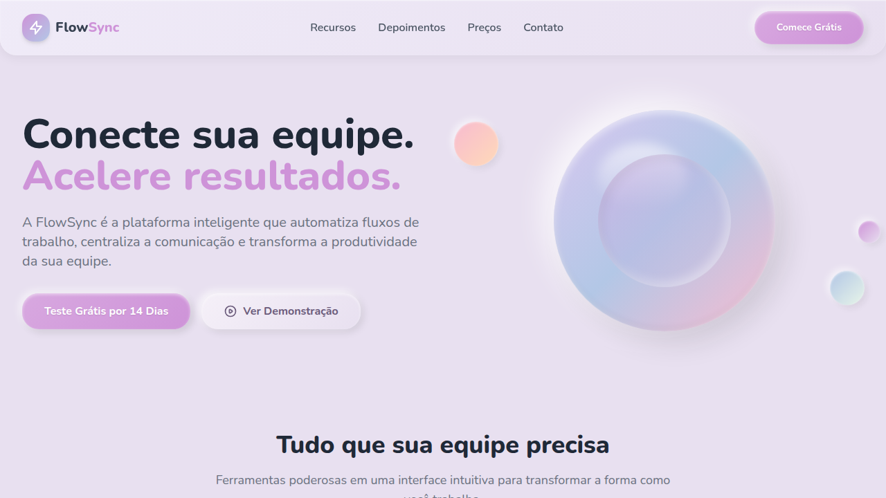
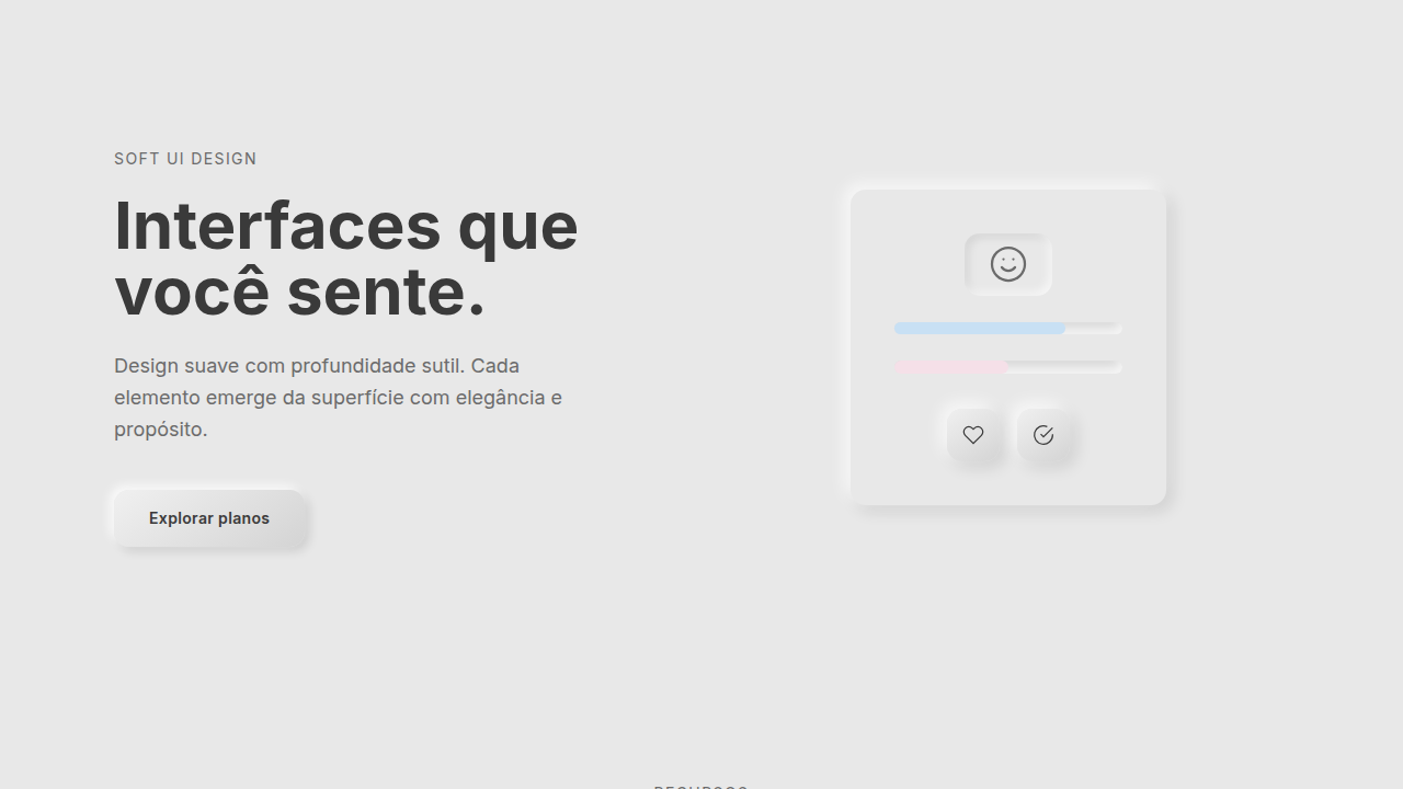
Estilo 3D tátil com neumorfismo inflado, sombras suaves multicamada e acabamento glossy. Perfeito para apps modernas, dashboards e interfaces premium. Evolução do Neumorphism (2020) combinado com tendências de design inflado e glossy. Cria interfaces que parecem táteis e pressionáveis, revivendo o skeuomorfismo de forma moderna.
- Density: 5/10 — Balanced
- Variance: 4/10 — Moderate
- Motion: 8/10 — Cinematic
2. Color Palette & Roles
- Soft Lavender (#E8E0F0) — Primary surface or dominant color
- Cloud White (#F0F0F3) — Light surface, card backgrounds
- Mint Cream (#E8F5E9) — Light surface, card backgrounds
- Bubblegum Pink (#F8BBD0) — Primary text color
- Sky Periwinkle (#B3C7E6) — Primary text color
- Soft Peach (#FFDAB9) — Extended palette, decorative use
- Lilac (#CE93D8) — Extended palette, decorative use
3. Typography Rules
- Display / Hero: System UI stack (-apple-system, sans-serif) — Weight 700, tight tracking, used for headline impact
- Body: System UI stack (-apple-system, sans-serif) — Weight 400, 16px/1.6 line-height, max 72ch per line
- UI Labels / Captions: System UI stack (-apple-system, sans-serif) — 0.875rem, weight 500, slight letter-spacing
- Monospace: JetBrains Mono — Used for code, metadata, and technical values
Scale:
- Hero: clamp(2.5rem, 5vw, 4rem)
- H1: 2.25rem
- H2: 1.5rem
- Body: 1rem / 1.6
- Small: 0.875rem
4. Component Stylings
- Primary Button: Generously rounded (1.5rem) shape. Accent color fill. Hover: 8% darken + subtle lift shadow. Active: -1px translate tactile press. Font weight 600. No outer glows.
- Secondary / Ghost Button: Outline variant. 1.5px border in muted color. Text in primary color. Hover: subtle background fill.
- Cards: Generously rounded (1.5rem) corners. Surface background. Subtle shadow (0 2px 12px rgba(0,0,0,0.06)). 1px border stroke.
- Inputs: Label above input. 1px border stroke. Focus ring: 2px accent color offset 2px. Error text below in semantic red. No floating labels.
- Navigation: Primary surface background. Active item: accent color indicator. Font weight 500 when active.
- Skeletons: Shimmer animation matching component dimensions. No circular spinners.
- Empty States: Icon-based composition with descriptive text and action button.
5. Layout Principles
- Grid: CSS Grid primary. Max-width containment: 1280px centered with 1.5rem side padding.
- Spacing rhythm: Balanced. Base unit: 0.5rem (8px).
- Section vertical gaps: clamp(4rem, 8vw, 8rem).
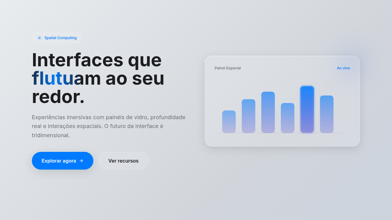
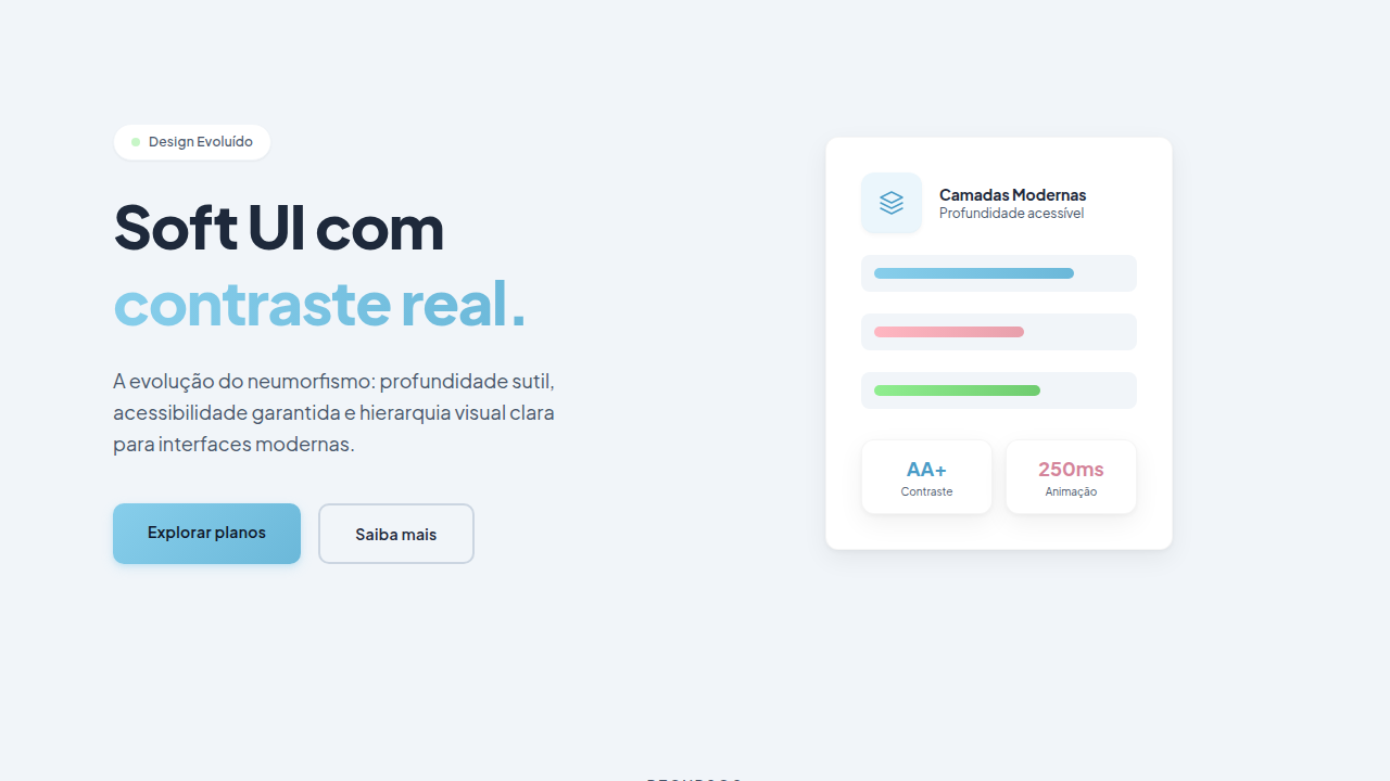
- Hero layout: Split-screen (text left, visual right).
- Feature sections: Zig-zag alternating text+image rows. No 3-equal-columns.
- Mobile collapse: All multi-column layouts collapse below 768px. No horizontal overflow.
- z-index contract: base (0) / sticky-nav (100) / overlay (200) / modal (300) / toast (500).
6. Motion & Interaction
- Physics: Spring — stiffness 120, damping 20. Confident, weighted transitions.
- Entry animations: Fade + translate-Y (16px → 0) over 540ms ease-out. Staggered cascades for lists: 120ms between items.
- Hover states: Scale(1.03) + shadow lift over 200ms.
- Page transitions: Fade + slide (300ms).
- Performance: Only transform and opacity animated. No layout-triggering properties.
7. Anti-Patterns (Banned)
- No emojis in UI — use icon system only (Lucide, Heroicons)
- No pure black (#000000) — use off-black or charcoal variants
- No oversaturated accent colors (saturation cap: 80%)
- No 3-column equal-width feature layouts — use zig-zag or asymmetric grid
- No
h-screen— usemin-h-[100dvh] - No AI copywriting clichés: "Elevate", "Seamless", "Unleash", "Next-Gen"
- No broken external image links — use picsum.photos or inline SVG
- No generic lorem ipsum in demos
Prompt para AI
Design a tactile 3D neumorphic interface with inflated, puffy shapes that look extruded from the background. Use soft multi-layer shadows for depth, glossy highlights on top edges, large border-radius (20-30px) for squishy feel. Elements should look like they can be pressed. Pastel color palette with subtle gradients. Add inner glow for glass-like finish on cards and buttons.
Relacionados
Última sincronização: 01/04/2026