Syne Typography
Render a 2D isolated text on a solid background. Ideal for cultural institutions, creative studios, posters, and edgy editorial layouts.. AI-ready template.
Use case: Cultural institutions, creative studios, posters, and edgy editorial layouts.
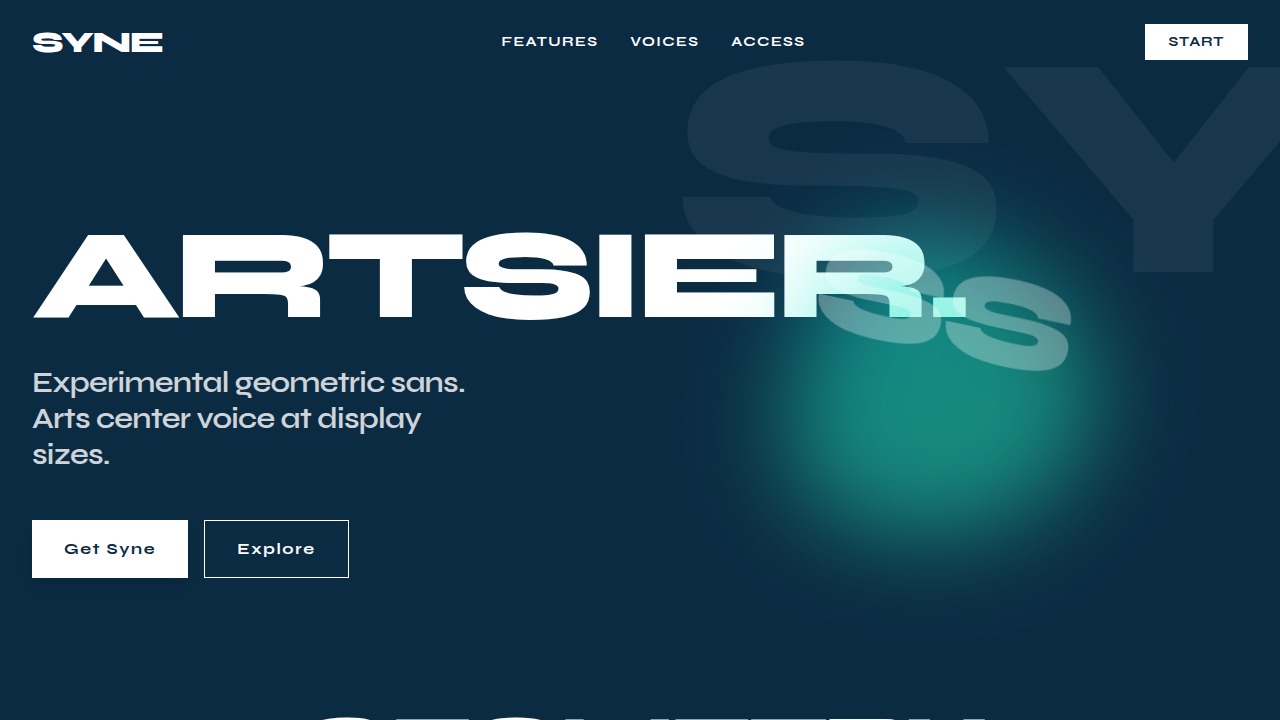
Historical Context
Syne was designed by Bonjour Monde (Lucas Descroix) for the Synesthésie art center in Saint-Denis, France. It wasn't born from a type foundry's catalog ambitions — it came from a specific cultural context that needed a voice both intellectual and unapologetically bold. The family spans five distinct styles from geometric sans to monospace, but it's Syne's condensed bold weights that became its signature in the design world. What makes Syne interesting is its refusal to be neutral. Where most geometric sans-serifs chase universality, Syne leans into personality. The letterforms carry a tension between mathematical precision and deliberate quirks — slightly unconventional proportions, terminals that don't behave exactly as expected. It reads as confident without being aggressive. Compared to Clash Display, Syne operates in a different register. Clash is maximalist, designed to dominate. Syne is more considered — it signals that you've made a deliberate typographic choice rather than reaching for the loudest thing available. Clash says 'look at me.' Syne says 'I know what I'm doing.' For creative studios that want authority without shouting, that distinction matters enormously.
When to Use
Syne belongs on projects where creative confidence needs to be communicated instantly — agency portfolios, art direction decks, exhibition identities, editorial mastheads. It works when you need geometric structure but refuse the sterility of Futura or the overexposure of Montserrat. Pair it with generous whitespace and let it breathe at large sizes. Avoid it for body text or anything requiring warmth — Syne is intentionally cool, intentionally precise. It's a headline typeface that earns its place through restraint, not volume.
Design Principles
- Set Syne at 48px minimum — it was designed to command space, not whisper in paragraphs
- Use bold and extra-bold weights exclusively for headlines; regular weight loses Syne's geometric tension at display sizes
- Pair with a humanist body typeface (Inter, Source Sans) to create contrast between the intellectual headline and readable content
- Increase letter-spacing by -0.02em to -0.04em at large sizes — Syne's default spacing runs slightly loose for display use
- Limit to two weights maximum per layout; Syne's personality is strong enough that mixing weights creates visual noise rather than hierarchy
DESIGN.md
---
version: "alpha"
name: "Syne Typography"
description: "Render a 2D isolated text on a solid background. Ideal for cultural institutions, creative studios, posters, and edgy editorial layouts.. AI-ready template."
colors:
  primary: "#FFFFFF"
  secondary: "#0B2B43"
typography:
  h1:
    fontFamily: Syne
    fontSize: 2.5rem
    fontWeight: 700
  body-md:
    fontFamily: Syne
    fontSize: 1rem
    fontWeight: 400
components:
  button-primary:
    backgroundColor: "{colors.primary}"
    padding: 12px
---

## Overview

Render a 2D isolated text on a solid background. Ideal for cultural institutions, creative studios, posters, and edgy editorial layouts.. AI-ready template. Syne was designed by Bonjour Monde (Lucas Descroix) for the Synesthésie art center in Saint-Denis, France. It wasn't born from a type foundry's catalog ambitions — it came from a specific cultural context that needed a voice both intellectual and unapologetically bold. The family spans five distinct styles from geometric sans to monospace, but it's Syne's condensed bold weights that became its signature in the design world.

What makes Syne interesting is its refusal to be neutral. Where most geometric sans-serifs chase universality, Syne leans into personality. The letterforms carry a tension between mathematical precision and deliberate quirks — slightly unconventional proportions, terminals that don't behave exactly as expected. It reads as confident without being aggressive.

Compared to Clash Display, Syne operates in a different register. Clash is maximalist, designed to dominate. Syne is more considered — it signals that you've made a deliberate typographic choice rather than reaching for the loudest thing available. Clash says 'look at me.' Syne says 'I know what I'm doing.' For creative studios that want authority without shouting, that distinction matters enormously.

- Density: 7/10 — Compact
- Variance: 4/10 — Moderate
- Motion: 4/10 — Subtle

- **Style:** Artsier, experimental geometric sans
- **Keywords:** Syne, geometric sans, condensed, graphic shapes, bold weights, art center voice
- **Era:** Modern Experimental
- **Light/Dark:** ✗ No / ✓ Full

## Colors

- **#FFFFFF** (#FFFFFF) — Primary surface or dominant color
- **#0B2B43** (#0B2B43) — Extended palette, decorative use


## Typography

- **Display / Hero:** Syne — Weight 700, tight tracking, used for headline impact
- **Body:** Syne — Weight 400, 16px/1.6 line-height, max 72ch per line
- **UI Labels / Captions:** Syne — 0.875rem, weight 500, slight letter-spacing
- **Monospace:** JetBrains Mono — Used for code, metadata, and technical values

Scale:
- Hero: clamp(2.5rem, 5vw, 4rem)
- H1: 2.25rem
- H2: 1.5rem
- Body: 1rem / 1.6
- Small: 0.875rem


## Layout

- **Grid:** CSS Grid primary. Max-width containment: 1280px centered with 1.5rem side padding.
- **Spacing rhythm:** Balanced. Base unit: 0.5rem (8px).
- **Section vertical gaps:** clamp(4rem, 8vw, 8rem).
- **Hero layout:** Split-screen (text left, visual right).
- **Feature sections:** Zig-zag alternating text+image rows. No 3-equal-columns.
- **Mobile collapse:** All multi-column layouts collapse below 768px. No horizontal overflow.
- **z-index contract:** base (0) / sticky-nav (100) / overlay (200) / modal (300) / toast (500).


## Elevation & Depth

Tight tracking (-4%), 90% leading

- **Physics:** Ease-out curves, 200-300ms duration. Smooth and predictable.
- **Entry animations:** Fade + translate-Y (16px → 0) over 420ms ease-out. Staggered cascades for lists: 80ms between items.
- **Hover states:** Subtle color shift + shadow adjustment over 200ms.
- **Page transitions:** Fade only (200ms).
- **Performance:** Only transform and opacity animated. No layout-triggering properties.


## Shapes

Base corner radius: 8px. See rounded tokens in front matter for the full scale.


## Components

- **Primary Button:** Subtly rounded (0.5rem) shape. Accent color fill. Hover: 8% darken + subtle lift shadow. Active: -1px translate tactile press. Font weight 600. No outer glows.
- **Secondary / Ghost Button:** Outline variant. 1.5px border in muted color. Text in primary color. Hover: subtle background fill.
- **Cards:** Subtly rounded (0.5rem) corners. Surface background. Subtle shadow (0 2px 12px rgba(0,0,0,0.06)). 1px border stroke.
- **Inputs:** Label above input. 1px border stroke. Focus ring: 2px accent color offset 2px. Error text below in semantic red. No floating labels.
- **Navigation:** Primary surface background. Active item: accent color indicator. Font weight 500 when active.
- **Skeletons:** Shimmer animation matching component dimensions. No circular spinners.
- **Empty States:** Icon-based composition with descriptive text and action button.


## Do's and Don'ts

- No emojis in UI — use icon system only (Lucide, Heroicons)
- No pure black (#000000) — use off-black or charcoal variants
- No oversaturated accent colors (saturation cap: 80%)
- No 3-column equal-width feature layouts — use zig-zag or asymmetric grid
- No `h-screen` — use `min-h-[100dvh]`
- No AI copywriting clichés: "Elevate", "Seamless", "Unleash", "Next-Gen"
- No broken external image links — use picsum.photos or inline SVG
- No generic lorem ipsum in demos

- Do Syne Font
- Do Color: #FFFFFF
- Do Tracking -4%
- Do Background #0B2B43


## Use Case

Cultural institutions, creative studios, posters, and edgy editorial layouts.
Technical Specs
CSS
font-family: 'Syne', sans-serif; color: #FFFFFF; font-weight: 700; letter-spacing: -0.04em; line-height: 0.9;
Variables
--font-family: 'Syne', --text-color: #FFFFFF, --bg-color: #0B2B43
Checklist
☐ Syne Font, ☐ Color: #FFFFFF, ☐ Tracking -4%, ☐ Background #0B2B43
Colors
Primary
Secondary
Effects
Tight tracking (-4%), 90% leading
Light/Dark
✗ No / ✓ Full
AI Prompt
Act as a Senior Frontend Engineer and Expert UI Designer.
Your task is to code a complete Landing Page on the first attempt.
- Landing Page Theme: <INSERT THEME>
- Sections to add: <INSERT SECTIONS>

Generate the final code immediately following these definitions:

## Style

- **Name:** Syne Typography
- **Type:** Artsier, experimental geometric sans
- **Keywords:** Syne, geometric sans, condensed, graphic shapes, bold weights, art center voice
- **Era:** Modern Experimental
- **Light/Dark:** ✗ No / ✓ Full

## Color Palette

- **Primary:** #FFFFFF
- **Secondary:** #0B2B43

## Visual Effects

Tight tracking (-4%), 90% leading

## AI Visual Direction

Render a 2D isolated text on a solid background. Font Family: @Syne Font, Color: Hex #FFFFFF, Background: #0B2B43, Tracking: Tight (-4%), Leading: 90%, Alignment: Strictly Left Aligned, Position: Center, Scale: 50%.

## CSS Technical

```css
font-family: 'Syne', sans-serif; color: #FFFFFF; font-weight: 700; letter-spacing: -0.04em; line-height: 0.9;
```

## Design System Variables

```css
--font-family: 'Syne', --text-color: #FFFFFF, --bg-color: #0B2B43
```

## Implementation Checklist

- ☐ Syne Font
- ☐ Color: #FFFFFF
- ☐ Tracking -4%
- ☐ Background #0B2B43

## Execution Rules

1. Strictly follow the defined visual style.
2. Use high-quality inline SVG icons (Heroicons or Lucide style) — NEVER use emojis as icons.
3. Add `cursor-pointer` and smooth `hover` states (transition-all) on all interactive elements.
4. Required Page Structure:
   - Navbar (Logo + Links + CTA)
   - Hero Section (Impactful Headline + Subtitle + 2 buttons + 3D/Abstract visual element via CSS)
   - Features (3 cards with icons)
   - Testimonials (3 cards)
   - Pricing (3 tiers, highlight the middle one)
   - Final CTA
   - Full Footer with social links, privacy policy, terms of use, contact and SEO links.
5. All text content must be in English.
6. The visual must be CLEARLY distinct — do not create a "default Bootstrap" design. Force the use of the provided design system variables.
7. Use `<style>` tags in the head for custom classes (especially for complex backdrop-filter effects and animations) that Tailwind CDN doesn't cover.
8. Full Responsiveness: Layout must adapt perfectly to Mobile, Tablet and Desktop (vertical stack on mobile).
9. Include basic SEO, Viewport and Open Graph meta tags in `<head>`.
10. Footer must contain: Copyright 2026, Secondary navigation links and Social media icons.
11. Make the creative decisions needed to deliver the complete, functional result now.
Last synced: 4/1/2026