SpaceX Cinematic Void
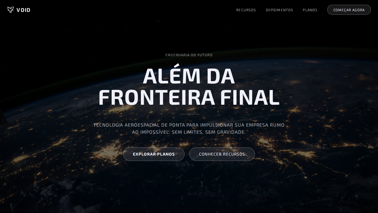
SpaceX-inspired cinematic void landing page. Ideal for aeroespacial, tecnologia espacial, marcas futuristas, engenharia avançada. AI-ready template.
Use case: Aerospace, Space technology, Futuristic brands, Advanced engineering
Historical Context
The cinematic void aesthetic didn't emerge from design studios — it came from mission control screens, launch webcasts, and the deliberate visual language SpaceX built around making rocket science feel inevitable. When SpaceX started streaming launches in the mid-2010s, they stripped everything back to black. No gradients, no NASA-blue optimism. Just void, typography, and telemetry data floating in darkness. It was brutalist by necessity: engineers designing interfaces for engineers, accidentally creating one of the most copied visual languages in tech. What makes this lineage interesting is the inversion it represents. Traditional aerospace design communicated trust through density — packed instrument panels, busy HUDs, information everywhere. SpaceX flipped it. The void became the statement. Empty space wasn't absence, it was confidence. You don't need to prove capability when you're landing rockets on drone ships. The black canvas says: we're so far ahead, we don't need to explain ourselves. Every ambitious tech brand since has been chasing that same energy — the visual equivalent of speaking quietly because you know everyone's already listening.
When to Use
Deploy this when your product operates at the frontier and needs to feel like it. Space tech, defense platforms, autonomous systems, deep-tech startups that actually have substance behind the ambition. It works when you have real data to display against the void — telemetry, metrics, status indicators that earn their place on screen. Don't use it for your SaaS dashboard. This aesthetic punishes mediocrity. If your product isn't genuinely pushing boundaries, the void just looks like you forgot to design the page.
Design Principles
- Void as architecture — black isn't background, it's the primary structural element. Every pixel of color must justify its existence against infinite darkness.
- Telemetry typography — monospaced, tabular figures, data rendered with the same clinical precision as a launch countdown. Type doesn't decorate, it reports.
- Cinematic negative space — compositions borrowed from film, not print. Wide aspect ratios, dramatic emptiness, elements placed with the tension of a single object floating in orbit.
- Brutal reduction — strip until it breaks, then add back one element. No shadows, no gradients, no comfort. Borders only when structurally necessary. The interface should feel machined, not designed.
- Light as event — in the void, any color is an event. Use illumination sparingly and with purpose: status changes, critical data, moments that demand attention. Everything else stays dark.
DESIGN.md
---
version: "alpha"
name: "SpaceX Cinematic Void"
description: "SpaceX-inspired cinematic void landing page. Ideal for aeroespacial, tecnologia espacial, marcas futuristas, engenharia avançada. AI-ready template."
colors:
  primary: "#000000"
  secondary: "#f0f0fa"
typography:
  h1:
    fontFamily: "D-DIN"
    fontSize: 2.5rem
    fontWeight: 700
  body-md:
    fontFamily: "D-DIN"
    fontSize: 1rem
    fontWeight: 400
rounded:
  sm: 32px
  md: 64px
  lg: 96px
components:
  button-primary:
    backgroundColor: "{colors.primary}"
    rounded: "{rounded.sm}"
    padding: 12px
---

## Overview

SpaceX-inspired cinematic void landing page. Ideal for aeroespacial, tecnologia espacial, marcas futuristas, engenharia avançada. AI-ready template. The cinematic void aesthetic didn't emerge from design studios — it came from mission control screens, launch webcasts, and the deliberate visual language SpaceX built around making rocket science feel inevitable. When SpaceX started streaming launches in the mid-2010s, they stripped everything back to black. No gradients, no NASA-blue optimism. Just void, typography, and telemetry data floating in darkness. It was brutalist by necessity: engineers designing interfaces for engineers, accidentally creating one of the most copied visual languages in tech.

What makes this lineage interesting is the inversion it represents. Traditional aerospace design communicated trust through density — packed instrument panels, busy HUDs, information everywhere. SpaceX flipped it. The void became the statement. Empty space wasn't absence, it was confidence. You don't need to prove capability when you're landing rockets on drone ships. The black canvas says: we're so far ahead, we don't need to explain ourselves. Every ambitious tech brand since has been chasing that same energy — the visual equivalent of speaking quietly because you know everyone's already listening.

- Density: 5/10 — Balanced
- Variance: 4/10 — Moderate
- Motion: 8/10 — Cinematic

- **Style:** Pure Black Void, Full-Viewport Photography, D-DIN Industrial, Universal Uppercase, Ghost Buttons, Zero Everything
- **Keywords:** spacex, cinematic, void, D-DIN, industrial, uppercase, positive tracking, ghost buttons, full-viewport, spectral white, aerospace stencil, zero shadows
- **Era:** 2024-2026 Aerospace Engineering
- **Light/Dark:** ✗ Not Recommended / ✓ Full

## Colors

- **Preto Espacial** (#000000) — Dark surface, primary background
- **Branco Espectral** (#f0f0fa) — Light surface, card backgrounds
- **Ghost Surface** (rgba(240,240,250,0.1)) — Supporting palette color
- **Ghost Border** (rgba(240,240,250,0.35)) — Supporting palette color
- **Overlay** (rgba(0,0,0,0.5)) — Extended palette, decorative use


## Typography

- **Display / Hero:** D-DIN — Weight 700, tight tracking, used for headline impact
- **Body:** D-DIN — Weight 400, 16px/1.6 line-height, max 72ch per line
- **UI Labels / Captions:** D-DIN — 0.875rem, weight 500, slight letter-spacing
- **Monospace:** JetBrains Mono — Used for code, metadata, and technical values

Scale:
- Hero: clamp(2.5rem, 5vw, 4rem)
- H1: 2.25rem
- H2: 1.5rem
- Body: 1rem / 1.6
- Small: 0.875rem


## Layout

- **Grid:** CSS Grid primary. Max-width containment: 1280px centered with 1.5rem side padding.
- **Spacing rhythm:** Balanced. Base unit: 0.5rem (8px).
- **Section vertical gaps:** clamp(4rem, 8vw, 8rem).
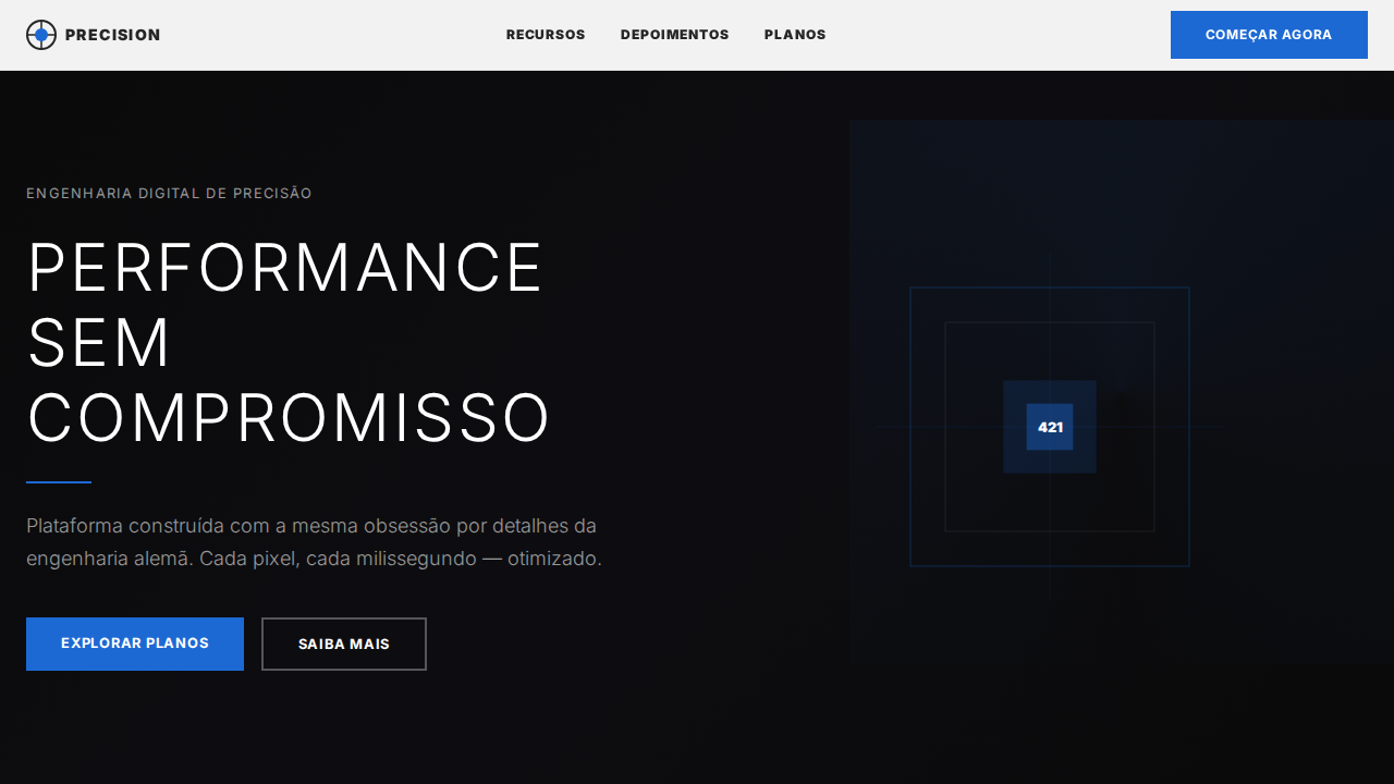
- **Hero layout:** Split-screen (text left, visual right).
- **Feature sections:** Zig-zag alternating text+image rows. No 3-equal-columns.
- **Mobile collapse:** All multi-column layouts collapse below 768px. No horizontal overflow.
- **z-index contract:** base (0) / sticky-nav (100) / overlay (200) / modal (300) / toast (500).


## Elevation & Depth

Canvas preto puro (#000000) com fotografia full-viewport (100vh) como elemento de design primário. Texto branco espectral (#f0f0fa) com leve tint blue-violet como luz estelar. TUDO em uppercase com letter-spacing positivo (0.96px-1.17px) — estética de stencil aeroespacial. D-DIN industrial com herança DIN alemã. Ghost button único: rgba(240,240,250,0.1) background com borda espectral. Zero sombras, zero cards, zero containers — texto diretamente sobre fotografia. Cada seção é uma cena cinematográfica full-viewport.

- **Physics:** Spring — stiffness 120, damping 20. Confident, weighted transitions.
- **Entry animations:** Fade + translate-Y (16px → 0) over 540ms ease-out. Staggered cascades for lists: 120ms between items.
- **Hover states:** Scale(1.03) + shadow lift over 200ms.
- **Page transitions:** Fade + slide (300ms).
- **Performance:** Only transform and opacity animated. No layout-triggering properties.


## Shapes

Base corner radius: 32px. See rounded tokens in front matter for the full scale.


## Components

- **Primary Button:** Rounded (32px ghost button only) shape. Accent color fill. Hover: 8% darken + subtle lift shadow. Active: -1px translate tactile press. Font weight 600. No outer glows.
- **Secondary / Ghost Button:** Outline variant. 1.5px border in muted color. Text in primary color. Hover: subtle background fill.
- **Cards:** Rounded (32px ghost button only) corners. Surface background. Subtle shadow (0 2px 12px rgba(0,0,0,0.06)). 1px border stroke.
- **Inputs:** Label above input. 1px border stroke. Focus ring: 2px accent color offset 2px. Error text below in semantic red. No floating labels.
- **Navigation:** Primary surface background. Active item: accent color indicator. Font weight 500 when active.
- **Skeletons:** Shimmer animation matching component dimensions. No circular spinners.
- **Empty States:** Icon-based composition with descriptive text and action button.


## Do's and Don'ts

- No emojis in UI — use icon system only (Lucide, Heroicons)
- No pure black (#000000) — use off-black or charcoal variants
- No oversaturated accent colors (saturation cap: 80%)
- No 3-column equal-width feature layouts — use zig-zag or asymmetric grid
- No `h-screen` — use `min-h-[100dvh]`
- No AI copywriting clichés: "Elevate", "Seamless", "Unleash", "Next-Gen"
- No broken external image links — use picsum.photos or inline SVG
- No generic lorem ipsum in demos

- Do Preto puro com fotografia full-viewport
- Do Branco espectral #f0f0fa
- Do TUDO uppercase
- Do Letter-spacing positivo 0.96-1.17px
- Do Ghost button único
- Do Zero sombras/cards/containers
- Do Overlay escuro para legibilidade
- Do Seções 100vh
- Do Responsivo


## Use Case

Aerospace, Space technology, Futuristic brands, Advanced engineering
Technical Specs
CSS
background:#000000;color:#f0f0fa;border-radius:32px ghost button only;box-shadow:none;font-family:'D-DIN',Arial,Verdana;text-transform:uppercase;letter-spacing:0.96px display,1.17px nav;line-height:1.00 display;background-size:cover
Variables
--bg:#000000;--text:#f0f0fa;--ghost-bg:rgba(240,240,250,0.1);--ghost-border:rgba(240,240,250,0.35);--overlay:rgba(0,0,0,0.5);--radius-ghost:32px;--shadow:none
Checklist
☐ Preto puro com fotografia full-viewport, ☐ Branco espectral #f0f0fa, ☐ TUDO uppercase, ☐ Letter-spacing positivo 0.96-1.17px, ☐ Ghost button único, ☐ Zero sombras/cards/containers, ☐ Overlay escuro para legibilidade, ☐ Seções 100vh, ☐ Responsivo
Colors
Primary
Effects
Canvas preto puro (#000000) com fotografia full-viewport (100vh) como elemento de design primário. Texto branco espectral (#f0f0fa) com leve tint blue-violet como luz estelar. TUDO em uppercase com letter-spacing positivo (0.96px-1.17px) — estética de stencil aeroespacial. D-DIN industrial com herança DIN alemã. Ghost button único: rgba(240,240,250,0.1) background com borda espectral. Zero sombras, zero cards, zero containers — texto diretamente sobre fotografia. Cada seção é uma cena cinematográfica full-viewport.
Light/Dark
✗ Not Recommended / ✓ Full
AI Prompt
Act as a Senior Frontend Engineer and Expert UI Designer.
Your task is to code a complete Landing Page on the first attempt.
- Landing Page Theme: <INSERT THEME>
- Sections to add: <INSERT SECTIONS>

Generate the final code immediately following these definitions:

## Style

- **Name:** SpaceX Cinematic Void
- **Type:** Pure Black Void, Full-Viewport Photography, D-DIN Industrial, Universal Uppercase, Ghost Buttons, Zero Everything
- **Keywords:** spacex, cinematic, void, D-DIN, industrial, uppercase, positive tracking, ghost buttons, full-viewport, spectral white, aerospace stencil, zero shadows
- **Era:** 2024-2026 Aerospace Engineering
- **Light/Dark:** ✗ Not Recommended / ✓ Full

## Color Palette

- **Primary:** Preto Espacial #000000, Branco Espectral #f0f0fa, Ghost Surface rgba(240,240,250,0.1), Ghost Border rgba(240,240,250,0.35)
- **Secondary:** Overlay rgba(0,0,0,0.5), Branco 100% var(--white-100)

## Visual Effects

Canvas preto puro (#000000) com fotografia full-viewport (100vh) como elemento de design primário. Texto branco espectral (#f0f0fa) com leve tint blue-violet como luz estelar. TUDO em uppercase com letter-spacing positivo (0.96px-1.17px) — estética de stencil aeroespacial. D-DIN industrial com herança DIN alemã. Ghost button único: rgba(240,240,250,0.1) background com borda espectral. Zero sombras, zero cards, zero containers — texto diretamente sobre fotografia. Cada seção é uma cena cinematográfica full-viewport.

## AI Visual Direction

Design a SpaceX-inspired cinematic void landing page. Pure black (#000000) with full-viewport photography as primary design element. Spectral white (#f0f0fa) text — slight blue-violet tint like starlight. ALL text uppercase with positive letter-spacing (0.96px-1.17px). D-DIN industrial font at 48px weight 700 for hero. Single ghost button: rgba(240,240,250,0.1) background, 1px solid rgba(240,240,250,0.35) border, 32px radius. Zero shadows, zero cards, zero containers. Dark gradient overlay rgba(0,0,0,0.5) for text legibility. Each section is 100vh cinematic scene.

## CSS Technical

```css
background:#000000;color:#f0f0fa;border-radius:32px ghost button only;box-shadow:none;font-family:'D-DIN',Arial,Verdana;text-transform:uppercase;letter-spacing:0.96px display,1.17px nav;line-height:1.00 display;background-size:cover
```

## Design System Variables

```css
--bg:#000000;--text:#f0f0fa;--ghost-bg:rgba(240,240,250,0.1);--ghost-border:rgba(240,240,250,0.35);--overlay:rgba(0,0,0,0.5);--radius-ghost:32px;--shadow:none
```

## Implementation Checklist

- ☐ Preto puro com fotografia full-viewport
- ☐ Branco espectral #f0f0fa
- ☐ TUDO uppercase
- ☐ Letter-spacing positivo 0.96-1.17px
- ☐ Ghost button único
- ☐ Zero sombras/cards/containers
- ☐ Overlay escuro para legibilidade
- ☐ Seções 100vh
- ☐ Responsivo

## Execution Rules

1. Strictly follow the defined visual style.
2. Use high-quality inline SVG icons (Heroicons or Lucide style) — NEVER use emojis as icons.
3. Add `cursor-pointer` and smooth `hover` states (transition-all) on all interactive elements.
4. Required Page Structure:
   - Navbar (Logo + Links + CTA)
   - Hero Section (Impactful Headline + Subtitle + 2 buttons + 3D/Abstract visual element via CSS)
   - Features (3 cards with icons)
   - Testimonials (3 cards)
   - Pricing (3 tiers, highlight the middle one)
   - Final CTA
   - Full Footer with social links, privacy policy, terms of use, contact and SEO links.
5. All text content must be in English.
6. The visual must be CLEARLY distinct — do not create a "default Bootstrap" design. Force the use of the provided design system variables.
7. Use `<style>` tags in the head for custom classes (especially for complex backdrop-filter effects and animations) that Tailwind CDN doesn't cover.
8. Full Responsiveness: Layout must adapt perfectly to Mobile, Tablet and Desktop (vertical stack on mobile).
9. Include basic SEO, Viewport and Open Graph meta tags in `<head>`.
10. Footer must contain: Copyright 2026, Secondary navigation links and Social media icons.
11. Make the creative decisions needed to deliver the complete, functional result now.
Related
Last synced: 4/1/2026