Sanity Neon Structured
Sanity-inspired nocturnal CMS landing page. Ideal for cms headless, plataformas de conteúdo estruturado, ferramentas de dados, apis de conteúdo. AI-ready template.
Use case: Headless CMS, Structured content platforms, Data tools, Content APIs
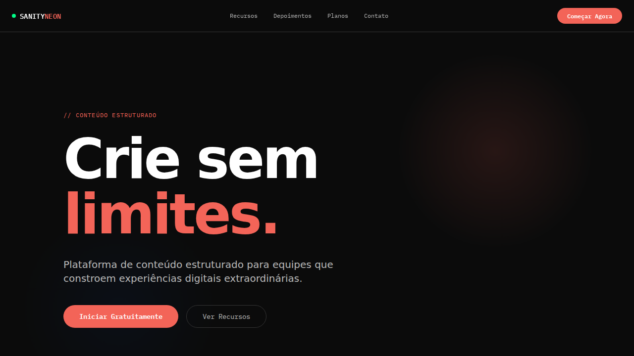
Historical Context
The marriage of neon green and structured content systems traces back to the late-2000s hacker aesthetic — terminal screens, IRC clients, and the raw energy of developers who built things at 3AM. That nocturnal culture shaped an entire visual language: dark backgrounds as canvas, electric green as signal. It was never decorative. It meant "alive," "running," "connected." Sanity's own design language tapped into this lineage when it emerged as a headless CMS. The structured content paradigm demanded interfaces that felt technical without being hostile — systems that communicated precision and flexibility simultaneously. Neon on dark isn't just a vibe choice here; it's a functional inheritance from decades of developer tooling where high-contrast meant high-legibility during long sessions. What makes this palette specifically potent for CMS platforms is the implicit promise: your content infrastructure is awake, even when you're not. The nocturnal energy isn't aesthetic indulgence — it's a statement about always-on systems, real-time sync, and the kind of tooling that respects the builder's hours.
When to Use
Deploy this system when building developer-facing content platforms, headless CMS dashboards, or API documentation that needs to signal technical sophistication without coldness. It works when your audience lives in dark-mode IDEs and expects interfaces that match their terminal energy. Particularly effective for content infrastructure products, real-time collaboration tools, and developer portals where you need to communicate both power and approachability. Avoid it for consumer-facing editorial products — this palette speaks exclusively to builders.
Design Principles
- Neon as signal, not decoration — every green element must communicate state, action, or liveness; purely ornamental glow is banned
- Structured hierarchy through luminance — use brightness levels of the accent to establish information architecture, not size alone
- Dark surfaces earn depth through subtle elevation, never through gradients that flatten the spatial model
- Typography stays neutral and high-legibility — the palette carries enough personality; type should be the sanity in the system
- Negative space is infrastructure — treat emptiness with the same intentionality as a well-designed API schema
DESIGN.md
---
version: "alpha"
name: "Sanity Neon Structured"
description: "Sanity-inspired nocturnal CMS landing page. Ideal for cms headless, plataformas de conteúdo estruturado, ferramentas de dados, apis de conteúdo. AI-ready template."
colors:
  primary: "#0b0b0b"
  secondary: "#ffffff"
  tertiary: "#f36458"
  neutral: "#0052ef"
  surface: "#212121"
  accent: "#353535"
typography:
  h1:
    fontFamily: system-ui for display
    fontSize: 2.25rem
    fontWeight: 700
  body-md:
    fontFamily: system-ui for display
    fontSize: 1rem
    fontWeight: 400
  label-caps:
    fontFamily: system-ui for display
    fontSize: 0.75rem
    fontWeight: 500
rounded:
  sm: 99999px
  md: 199998px
  lg: 299997px
components:
  button-primary:
    backgroundColor: "{colors.primary}"
    textColor: "{colors.neutral}"
    rounded: "{rounded.sm}"
    padding: 12px
---

## Overview

Sanity-inspired nocturnal CMS landing page. Ideal for cms headless, plataformas de conteúdo estruturado, ferramentas de dados, apis de conteúdo. AI-ready template. The marriage of neon green and structured content systems traces back to the late-2000s hacker aesthetic — terminal screens, IRC clients, and the raw energy of developers who built things at 3AM. That nocturnal culture shaped an entire visual language: dark backgrounds as canvas, electric green as signal. It was never decorative. It meant "alive," "running," "connected."

Sanity's own design language tapped into this lineage when it emerged as a headless CMS. The structured content paradigm demanded interfaces that felt technical without being hostile — systems that communicated precision and flexibility simultaneously. Neon on dark isn't just a vibe choice here; it's a functional inheritance from decades of developer tooling where high-contrast meant high-legibility during long sessions.

What makes this palette specifically potent for CMS platforms is the implicit promise: your content infrastructure is awake, even when you're not. The nocturnal energy isn't aesthetic indulgence — it's a statement about always-on systems, real-time sync, and the kind of tooling that respects the builder's hours.

- Density: 5/10 — Balanced
- Variance: 2/10 — Structured
- Motion: 4/10 — Subtle

- **Style:** Nocturnal CMS, Neon Green, Coral CTA, waldenburg Font, Pill Primary Buttons
- **Keywords:** sanity, nocturnal, neon green, coral CTA, waldenburg, IBM Plex Mono, structured content, achromatic grays, electric blue hover
- **Era:** 2024-2026 Structured Content CMS
- **Light/Dark:** ✗ Not Recommended / ✓ Full

## Colors

- **Sanity Black** (#0b0b0b) — Dark surface, primary background
- **Branco** (#ffffff) — Light surface, card backgrounds
- **Coral** (#f36458) — Supporting palette color
- **Azul Elétrico** (#0052ef) — Accent highlight, links and focus states
- **Cinza Escuro** (#212121) — Deep contrast surface
- **Cinza Médio** (#353535) — Secondary text, borders, muted elements
- **Silver** (#b9b9b9) — Extended palette, decorative use
- **Cinza** (#797979) — Secondary text, borders, muted elements


## Typography

- **Display / Hero:** system-ui for display — Weight 700, tight tracking, used for headline impact
- **Body:** system-ui for display — Weight 400, 16px/1.6 line-height, max 72ch per line
- **UI Labels / Captions:** system-ui for display — 0.875rem, weight 500, slight letter-spacing
- **Monospace:** JetBrains Mono — Used for code, metadata, and technical values

Scale:
- Hero: clamp(2.5rem, 5vw, 4rem)
- H1: 2.25rem
- H2: 1.5rem
- Body: 1rem / 1.6
- Small: 0.875rem


## Layout

- **Grid:** CSS Grid primary. Max-width containment: 1280px centered with 1.5rem side padding.
- **Spacing rhythm:** Balanced. Base unit: 0.5rem (8px).
- **Section vertical gaps:** clamp(4rem, 8vw, 8rem).
- **Hero layout:** Split-screen (text left, visual right).
- **Feature sections:** Zig-zag alternating text+image rows. No 3-equal-columns.
- **Mobile collapse:** All multi-column layouts collapse below 768px. No horizontal overflow.
- **z-index contract:** base (0) / sticky-nav (100) / overlay (200) / modal (300) / toast (500).


## Elevation & Depth

Canvas near-black (#0b0b0b) como ambiente natural. waldenburg font com tracking extremo negativo (-4.48px em 112px). Escala de cinzas pura acromática sem subtom. Acento neon green (display-p3) e coral-red (#f36458) como sinais vívidos contra campo escuro. Botões pill primários (99999px). Hover universal para azul elétrico (#0052ef). IBM Plex Mono para labels técnicos. Bordas escuras (#0b0b0b, #212121, #353535) criando profundidade sutil.

- **Physics:** Ease-out curves, 200-300ms duration. Smooth and predictable.
- **Entry animations:** Fade + translate-Y (16px → 0) over 420ms ease-out. Staggered cascades for lists: 80ms between items.
- **Hover states:** Subtle color shift + shadow adjustment over 200ms.
- **Page transitions:** Fade only (200ms).
- **Performance:** Only transform and opacity animated. No layout-triggering properties.


## Shapes

Base corner radius: 99999px. See rounded tokens in front matter for the full scale.


## Components

- **Primary Button:** Pill-shaped (9999px) shape. Accent color fill. Hover: 8% darken + subtle lift shadow. Active: -1px translate tactile press. Font weight 600. No outer glows.
- **Secondary / Ghost Button:** Outline variant. 1.5px border in muted color. Text in primary color. Hover: subtle background fill.
- **Cards:** Pill-shaped (9999px) corners. Surface background. Subtle shadow (0 2px 12px rgba(0,0,0,0.06)). 1px border stroke.
- **Inputs:** Label above input. 1px border stroke. Focus ring: 2px accent color offset 2px. Error text below in semantic red. No floating labels.
- **Navigation:** Primary surface background. Active item: accent color indicator. Font weight 500 when active.
- **Skeletons:** Shimmer animation matching component dimensions. No circular spinners.
- **Empty States:** Icon-based composition with descriptive text and action button.


## Do's and Don'ts

- No emojis in UI — use icon system only (Lucide, Heroicons)
- No pure white (#FFFFFF) backgrounds — use off-white or dark surfaces
- No oversaturated accent colors (saturation cap: 80%)
- No 3-column equal-width feature layouts — use zig-zag or asymmetric grid
- No `h-screen` — use `min-h-[100dvh]`
- No AI copywriting clichés: "Elevate", "Seamless", "Unleash", "Next-Gen"
- No broken external image links — use picsum.photos or inline SVG
- No generic lorem ipsum in demos

- Do Canvas near-black #0b0b0b
- Do Tracking extremo negativo
- Do Cinzas acromáticos
- Do CTA coral #f36458
- Do Hover azul elétrico
- Do Pill buttons
- Do IBM Plex Mono
- Do Responsivo


## Use Case

Headless CMS, Structured content platforms, Data tools, Content APIs
Technical Specs
CSS
background:#0b0b0b;color:#ffffff;accent:#f36458;hover:#0052ef;border-radius:99999px pills,6px secondary;font-family:system-ui for display,monospace for code;letter-spacing:-4.48px at 112px;border:1px solid #212121
Variables
--bg:#0b0b0b;--text:#ffffff;--text-secondary:#b9b9b9;--text-tertiary:#797979;--accent:#f36458;--hover:#0052ef;--surface:#212121;--border:#353535;--radius-pill:99999px
Checklist
☐ Canvas near-black #0b0b0b, ☐ Tracking extremo negativo, ☐ Cinzas acromáticos, ☐ CTA coral #f36458, ☐ Hover azul elétrico, ☐ Pill buttons, ☐ IBM Plex Mono, ☐ Responsivo
Colors
Primary
Secondary
Effects
Canvas near-black (#0b0b0b) como ambiente natural. waldenburg font com tracking extremo negativo (-4.48px em 112px). Escala de cinzas pura acromática sem subtom. Acento neon green (display-p3) e coral-red (#f36458) como sinais vívidos contra campo escuro. Botões pill primários (99999px). Hover universal para azul elétrico (#0052ef). IBM Plex Mono para labels técnicos. Bordas escuras (#0b0b0b, #212121, #353535) criando profundidade sutil.
Light/Dark
✗ Not Recommended / ✓ Full
AI Prompt
Act as a Senior Frontend Engineer and Expert UI Designer.
Your task is to code a complete Landing Page on the first attempt.
- Landing Page Theme: <INSERT THEME>
- Sections to add: <INSERT SECTIONS>

Generate the final code immediately following these definitions:

## Style

- **Name:** Sanity Neon Structured
- **Type:** Nocturnal CMS, Neon Green, Coral CTA, waldenburg Font, Pill Primary Buttons
- **Keywords:** sanity, nocturnal, neon green, coral CTA, waldenburg, IBM Plex Mono, structured content, achromatic grays, electric blue hover
- **Era:** 2024-2026 Structured Content CMS
- **Light/Dark:** ✗ Not Recommended / ✓ Full

## Color Palette

- **Primary:** Sanity Black #0b0b0b, Branco #ffffff, Coral #f36458, Azul Elétrico #0052ef
- **Secondary:** Cinza Escuro #212121, Cinza Médio #353535, Silver #b9b9b9, Cinza #797979

## Visual Effects

Canvas near-black (#0b0b0b) como ambiente natural. waldenburg font com tracking extremo negativo (-4.48px em 112px). Escala de cinzas pura acromática sem subtom. Acento neon green (display-p3) e coral-red (#f36458) como sinais vívidos contra campo escuro. Botões pill primários (99999px). Hover universal para azul elétrico (#0052ef). IBM Plex Mono para labels técnicos. Bordas escuras (#0b0b0b, #212121, #353535) criando profundidade sutil.

## AI Visual Direction

Design a Sanity-inspired nocturnal CMS landing page. Near-black canvas (#0b0b0b). Custom font with extreme negative tracking (-4.48px at 112px). Pure achromatic gray scale. Vivid coral-red (#f36458) CTA buttons. Electric blue (#0052ef) universal hover state. Pill-shaped primary buttons (99999px). IBM Plex Mono for technical labels. Dark border hierarchy (#0b0b0b → #212121 → #353535). Neon green for success states.

## CSS Technical

```css
background:#0b0b0b;color:#ffffff;accent:#f36458;hover:#0052ef;border-radius:99999px pills,6px secondary;font-family:system-ui for display,monospace for code;letter-spacing:-4.48px at 112px;border:1px solid #212121
```

## Design System Variables

```css
--bg:#0b0b0b;--text:#ffffff;--text-secondary:#b9b9b9;--text-tertiary:#797979;--accent:#f36458;--hover:#0052ef;--surface:#212121;--border:#353535;--radius-pill:99999px
```

## Implementation Checklist

- ☐ Canvas near-black #0b0b0b
- ☐ Tracking extremo negativo
- ☐ Cinzas acromáticos
- ☐ CTA coral #f36458
- ☐ Hover azul elétrico
- ☐ Pill buttons
- ☐ IBM Plex Mono
- ☐ Responsivo

## Execution Rules

1. Strictly follow the defined visual style.
2. Use high-quality inline SVG icons (Heroicons or Lucide style) — NEVER use emojis as icons.
3. Add `cursor-pointer` and smooth `hover` states (transition-all) on all interactive elements.
4. Required Page Structure:
   - Navbar (Logo + Links + CTA)
   - Hero Section (Impactful Headline + Subtitle + 2 buttons + 3D/Abstract visual element via CSS)
   - Features (3 cards with icons)
   - Testimonials (3 cards)
   - Pricing (3 tiers, highlight the middle one)
   - Final CTA
   - Full Footer with social links, privacy policy, terms of use, contact and SEO links.
5. All text content must be in English.
6. The visual must be CLEARLY distinct — do not create a "default Bootstrap" design. Force the use of the provided design system variables.
7. Use `<style>` tags in the head for custom classes (especially for complex backdrop-filter effects and animations) that Tailwind CDN doesn't cover.
8. Full Responsiveness: Layout must adapt perfectly to Mobile, Tablet and Desktop (vertical stack on mobile).
9. Include basic SEO, Viewport and Open Graph meta tags in `<head>`.
10. Footer must contain: Copyright 2026, Secondary navigation links and Social media icons.
11. Make the creative decisions needed to deliver the complete, functional result now.
Related
Last synced: 4/1/2026