Passport Travel UI
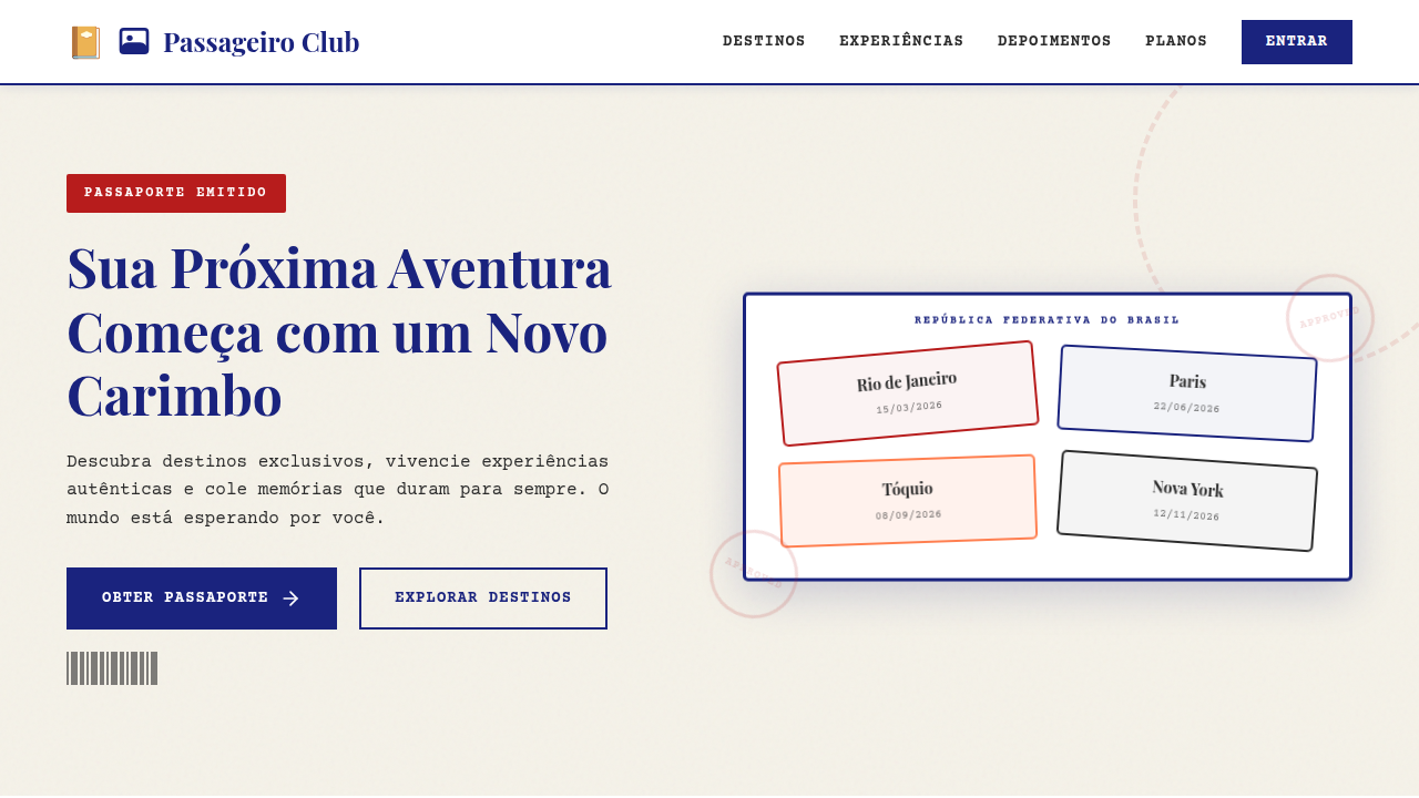
Passport style landing page, travel document aesthetic, ink stamps, visa stickers, paper texture, official look, travel theme. Ideal for landing pages, modern websites. AI-ready template.
Use case: Landing pages, Modern websites
Historical Context
Passport aesthetics in digital design trace back to the early skeuomorphic era — when iOS apps literally rendered leather-bound booklets and stamped pages. Cheesy? Sometimes. But the impulse was right. Travel documents carry an emotional weight that few other paper artifacts match. The worn edges, the ink stamps from foreign ports, the perforated boarding pass torn at the gate — these textures signal adventure before a single word is read. The stamp collection pattern deserves its own mention. Gamification borrowed it early: unlock a city, earn a stamp. Foursquare did it. Airline loyalty apps still do. It works because it mirrors a real behavior — flipping through passport pages and remembering where you've been. The metaphor doesn't need explanation. That's rare in UI. Boarding pass layouts, meanwhile, gave designers a gift: a rigid information hierarchy baked into a familiar form. Departure. Arrival. Gate. Seat. The constraint is the feature. You don't fight the format — you lean into it, and users parse it instantly because they've held the real thing a hundred times.
When to Use
Reach for passport UI when your product needs to evoke movement, anticipation, or earned progress. Travel apps and airline interfaces are obvious fits, but tourism platforms, adventure brands, and even loyalty programs benefit from the metaphor. It's particularly strong for itinerary displays, trip summaries, achievement systems, and onboarding flows where you want users to feel like they're embarking on something. Skip it if your context has zero travel association — forced metaphors always feel hollow.
Design Principles
- Respect the document: Use real passport and boarding pass proportions, typography conventions, and information hierarchy — don't just slap a stamp texture on a card and call it travel UI.
- Wear and patina over pristine: Subtle ink bleed, rounded stamp edges, slightly uneven registration marks. Perfection kills the authenticity that makes this theme work.
- Constraint as clarity: Boarding pass layouts succeed because they're rigid. Embrace fixed zones, monospaced type for codes, and clear visual separators like perforations or tear lines.
- Stamps as progressive disclosure: Each stamp should feel earned. Use them for milestones, visited destinations, or completed steps — never decoratively without meaning.
- Color from reality: Faded navy, customs-office green, red ink, kraft paper tan. Pull your palette from actual travel documents, not from what you imagine travel 'feels like.'
DESIGN.md
---
version: "alpha"
name: "Passport Travel UI"
description: "Passport style landing page, travel document aesthetic, ink stamps, visa stickers, paper texture, official look, travel theme. Ideal for landing pages, modern websites. AI-ready template."
colors:
  primary: "#F5F2E9"
  secondary: "#2D2D2D"
  tertiary: "#FF7F50"
  neutral: "#1A237E"
  surface: "#B71C1C"
  accent: "#FFFFFF"
typography:
  h1:
    fontFamily: Courier Prime
    fontSize: 2.5rem
    fontWeight: 700
  body-md:
    fontFamily: Courier Prime
    fontSize: 1rem
    fontWeight: 400
components:
  button-primary:
    backgroundColor: "{colors.primary}"
    textColor: "{colors.neutral}"
    padding: 12px
---

## Overview

Passport style landing page, travel document aesthetic, ink stamps, visa stickers, paper texture, official look, travel theme. Ideal for landing pages, modern websites. AI-ready template. Passport aesthetics in digital design trace back to the early skeuomorphic era — when iOS apps literally rendered leather-bound booklets and stamped pages. Cheesy? Sometimes. But the impulse was right. Travel documents carry an emotional weight that few other paper artifacts match. The worn edges, the ink stamps from foreign ports, the perforated boarding pass torn at the gate — these textures signal adventure before a single word is read.

The stamp collection pattern deserves its own mention. Gamification borrowed it early: unlock a city, earn a stamp. Foursquare did it. Airline loyalty apps still do. It works because it mirrors a real behavior — flipping through passport pages and remembering where you've been. The metaphor doesn't need explanation. That's rare in UI.

Boarding pass layouts, meanwhile, gave designers a gift: a rigid information hierarchy baked into a familiar form. Departure. Arrival. Gate. Seat. The constraint is the feature. You don't fight the format — you lean into it, and users parse it instantly because they've held the real thing a hundred times.

- Density: 5/10 — Balanced
- Variance: 4/10 — Moderate
- Motion: 4/10 — Subtle

- **Style:** Adventurous, Official, Textured
- **Keywords:** passport, travel, stamp, visa, official, paper, journey, document
- **Era:** Modern Travel
- **Light/Dark:** ✓ Full / ✗ No

## Colors

- **Background** (#F5F2E9) — Primary background surface
- **Text** (#2D2D2D) — Primary text color
- **Accent** (#FF7F50) — Primary accent, CTAs and interactive elements
- **Dark Blue** (#1A237E) — Deep contrast surface
- **Stamp Ink** (#B71C1C) — Primary text color
- **Paper White** (#FFFFFF) — Secondary surface


## Typography

- **Display / Hero:** Courier Prime — Weight 700, tight tracking, used for headline impact
- **Body:** Courier Prime — Weight 400, 16px/1.6 line-height, max 72ch per line
- **UI Labels / Captions:** Courier Prime — 0.875rem, weight 500, slight letter-spacing
- **Monospace:** Courier Prime — Used for code, metadata, and technical values

Scale:
- Hero: clamp(2.5rem, 5vw, 4rem)
- H1: 2.25rem
- H2: 1.5rem
- Body: 1rem / 1.6
- Small: 0.875rem


## Layout

- **Grid:** CSS Grid primary. Max-width containment: 1280px centered with 1.5rem side padding.
- **Spacing rhythm:** Balanced. Base unit: 0.5rem (8px).
- **Section vertical gaps:** clamp(4rem, 8vw, 8rem).
- **Hero layout:** Split-screen (text left, visual right).
- **Feature sections:** Zig-zag alternating text+image rows. No 3-equal-columns.
- **Mobile collapse:** All multi-column layouts collapse below 768px. No horizontal overflow.
- **z-index contract:** base (0) / sticky-nav (100) / overlay (200) / modal (300) / toast (500).


## Elevation & Depth

Passport booklet mockup, ink stamps, visa stickers, barcode elements, matte paper grain, porous ink bleed, worn edges.

- **Physics:** Ease-out curves, 200-300ms duration. Smooth and predictable.
- **Entry animations:** Fade + translate-Y (16px → 0) over 420ms ease-out. Staggered cascades for lists: 80ms between items.
- **Hover states:** Subtle color shift + shadow adjustment over 200ms.
- **Page transitions:** Fade only (200ms).
- **Performance:** Only transform and opacity animated. No layout-triggering properties.


## Shapes

Base corner radius: 8px. See rounded tokens in front matter for the full scale.


## Components

- **Primary Button:** Subtly rounded (0.5rem) shape. Accent color fill. Hover: 8% darken + subtle lift shadow. Active: -1px translate tactile press. Font weight 600. No outer glows.
- **Secondary / Ghost Button:** Outline variant. 1.5px border in muted color. Text in primary color. Hover: subtle background fill.
- **Cards:** Subtly rounded (0.5rem) corners. Surface background. Subtle shadow (0 2px 12px rgba(0,0,0,0.06)). 1px border stroke.
- **Inputs:** Label above input. 1px border stroke. Focus ring: 2px accent color offset 2px. Error text below in semantic red. No floating labels.
- **Navigation:** Primary surface background. Active item: accent color indicator. Font weight 500 when active.
- **Skeletons:** Shimmer animation matching component dimensions. No circular spinners.
- **Empty States:** Icon-based composition with descriptive text and action button.


## Do's and Don'ts

- No emojis in UI — use icon system only (Lucide, Heroicons)
- No pure black (#000000) — use off-black or charcoal variants
- No oversaturated accent colors (saturation cap: 80%)
- No 3-column equal-width feature layouts — use zig-zag or asymmetric grid
- No `h-screen` — use `min-h-[100dvh]`
- No AI copywriting clichés: "Elevate", "Seamless", "Unleash", "Next-Gen"
- No broken external image links — use picsum.photos or inline SVG
- No generic lorem ipsum in demos

- Do Passport page background
- Do Stamp/Postmark elements
- Do Monospace 'typewriter' text
- Do Sticker-like UI elements
- Do Official-looking borders


## Use Case

Landing pages, Modern websites
Technical Specs
CSS
background-color: #F5F2E9; color: #2D2D2D; font-family: 'Courier Prime', monospace; border: 1px dashed #B71C1C; padding: 10px;
Variables
--bg-paper: #F5F2E9, --text-ink: #2D2D2D, --stamp-red: #B71C1C, --passport-blue: #1A237E, --font-mono: 'Courier Prime', monospace
Checklist
☐ Passport page background, ☐ Stamp/Postmark elements, ☐ Monospace 'typewriter' text, ☐ Sticker-like UI elements, ☐ Official-looking borders
Colors
Primary
Secondary
Effects
Passport booklet mockup, ink stamps, visa stickers, barcode elements, matte paper grain, porous ink bleed, worn edges.
Light/Dark
✓ Full / ✗ No
AI Prompt
Act as a Senior Frontend Engineer and Expert UI Designer.
Your task is to code a complete Landing Page on the first attempt.
- Landing Page Theme: <INSERT THEME>
- Sections to add: <INSERT SECTIONS>

Generate the final code immediately following these definitions:

## Style

- **Name:** Passport Travel UI
- **Type:** Adventurous, Official, Textured
- **Keywords:** passport, travel, stamp, visa, official, paper, journey, document
- **Era:** Modern Travel
- **Light/Dark:** ✓ Full / ✗ No

## Color Palette

- **Primary:** Background #F5F2E9, Text #2D2D2D, Accent #FF7F50
- **Secondary:** Dark Blue #1A237E, Stamp Ink #B71C1C, Paper White #FFFFFF

## Visual Effects

Passport booklet mockup, ink stamps, visa stickers, barcode elements, matte paper grain, porous ink bleed, worn edges.

## AI Visual Direction

passport style landing page, travel document aesthetic, ink stamps, visa stickers, paper texture, official look, travel theme.

## CSS Technical

```css
background-color: #F5F2E9; color: #2D2D2D; font-family: 'Courier Prime', monospace; border: 1px dashed #B71C1C; padding: 10px;
```

## Design System Variables

```css
--bg-paper: #F5F2E9, --text-ink: #2D2D2D, --stamp-red: #B71C1C, --passport-blue: #1A237E, --font-mono: 'Courier Prime', monospace
```

## Implementation Checklist

- ☐ Passport page background
- ☐ Stamp/Postmark elements
- ☐ Monospace 'typewriter' text
- ☐ Sticker-like UI elements
- ☐ Official-looking borders

## Execution Rules

1. Strictly follow the defined visual style.
2. Use high-quality inline SVG icons (Heroicons or Lucide style) — NEVER use emojis as icons.
3. Add `cursor-pointer` and smooth `hover` states (transition-all) on all interactive elements.
4. Required Page Structure:
   - Navbar (Logo + Links + CTA)
   - Hero Section (Impactful Headline + Subtitle + 2 buttons + 3D/Abstract visual element via CSS)
   - Features (3 cards with icons)
   - Testimonials (3 cards)
   - Pricing (3 tiers, highlight the middle one)
   - Final CTA
   - Full Footer with social links, privacy policy, terms of use, contact and SEO links.
5. All text content must be in English.
6. The visual must be CLEARLY distinct — do not create a "default Bootstrap" design. Force the use of the provided design system variables.
7. Use `<style>` tags in the head for custom classes (especially for complex backdrop-filter effects and animations) that Tailwind CDN doesn't cover.
8. Full Responsiveness: Layout must adapt perfectly to Mobile, Tablet and Desktop (vertical stack on mobile).
9. Include basic SEO, Viewport and Open Graph meta tags in `<head>`.
10. Footer must contain: Copyright 2026, Secondary navigation links and Social media icons.
11. Make the creative decisions needed to deliver the complete, functional result now.
Related
Last synced: 4/1/2026