Neon Cyber
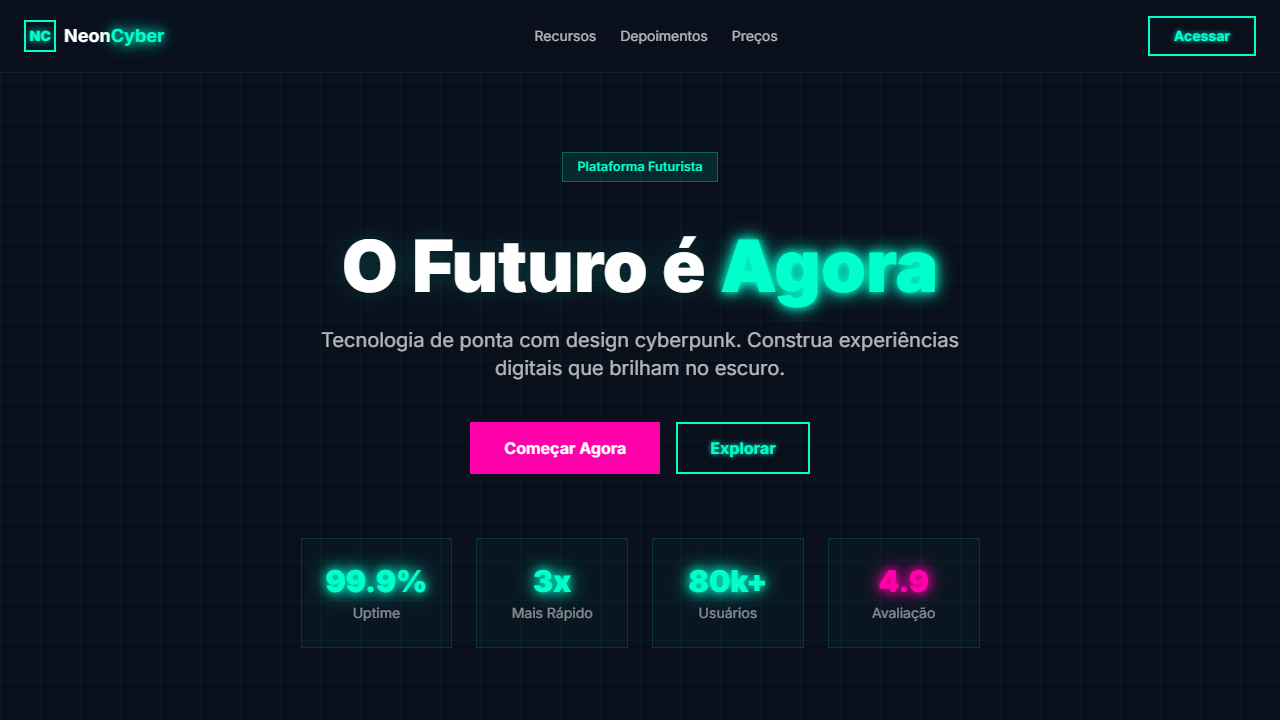
Futuristic, techy, confident landing page with neon cyber aesthetic. Ideal for plataformas gaming, startups tech, apps de criptomoeda, eventos de tecnologia. AI-ready template.
Use case: Gaming platforms, Tech startups, Crypto apps, Tech events
Historical Context
Neon as a design language didn't start with Blade Runner, but that's where it became ideology. The 1982 film crystallized decades of neon signage — from Tokyo's Kabukichō to Las Vegas strips — into a visual shorthand for futures that feel lived-in rather than sterile. Before that, neon was just commerce. After it, neon meant something. The cyber aesthetic evolved through waves. First the '80s retrofuturism of Syd Mead's production design, then the '90s rave flyer explosion where glowing type on black became the universal language of underground electronic culture. The 2000s brought a lull — Web 2.0 gradients and Apple's clean minimalism pushed neon into kitsch territory. But by 2018, the pendulum swung hard. Cyberpunk 2077's marketing, synthwave album art, and LED-drenched esports arenas brought the aesthetic back with force. What makes neon cyber work today isn't nostalgia — it's contrast. Dark interfaces with selective luminance create natural hierarchy. The human eye tracks light. Designers who understand this use glow not as decoration but as information architecture, guiding attention through darkness the way airport runway lights guide planes home.
When to Use
Deploy neon cyber when your brand lives after dark. Gaming studios, electronic music events, VR experiences, esports tournaments, nightclub identities, tech product launches that need edge. It works when your audience self-identifies as forward-looking and slightly countercultural. Kill it immediately if you're designing for healthcare, finance, or anything requiring trust signals over excitement. This palette demands commitment — half-measures look like a teenager's Discord server. Go full noir or don't go at all.
Design Principles
- Darkness is your canvas — backgrounds should sit at 90-95% depth so luminous elements actually glow rather than compete with ambient light
- Limit your glow palette to two, maximum three hues — cyan/magenta is classic, but single-color systems (pure electric blue, toxic green) often hit harder
- Glow implies energy cost — use it sparingly on interactive elements and key information, never on body text or passive containers
- Layer your light with bloom, not flat color — real neon bleeds into surrounding space, so box-shadows and gradient halos sell the illusion where flat borders fail
- Typography stays geometric and clean — the environment provides all the personality you need, so let your type be the calm anchor in visual chaos
DESIGN.md
---
version: "alpha"
name: "Neon Cyber"
description: "Futuristic, techy, confident landing page with neon cyber aesthetic. Ideal for plataformas gaming, startups tech, apps de criptomoeda, eventos de tecnologia. AI-ready template."
colors:
  primary: "#0a0f1c"
  secondary: "#00ffcc"
  tertiary: "#ff00aa"
  neutral: "#0d1a3a"
  surface: "#8b00ff"
  accent: "#0066ff"
typography:
  h1:
    fontFamily: System UI stack
    fontSize: 2.25rem
    fontWeight: 700
  body-md:
    fontFamily: System UI stack
    fontSize: 1rem
    fontWeight: 400
  label-caps:
    fontFamily: System UI stack
    fontSize: 0.75rem
    fontWeight: 500
components:
  button-primary:
    backgroundColor: "{colors.primary}"
    textColor: "{colors.neutral}"
    padding: 12px
---

## Overview

Futuristic, techy, confident landing page with neon cyber aesthetic. Ideal for plataformas gaming, startups tech, apps de criptomoeda, eventos de tecnologia. AI-ready template. Neon as a design language didn't start with Blade Runner, but that's where it became ideology. The 1982 film crystallized decades of neon signage — from Tokyo's Kabukichō to Las Vegas strips — into a visual shorthand for futures that feel lived-in rather than sterile. Before that, neon was just commerce. After it, neon meant something.

The cyber aesthetic evolved through waves. First the '80s retrofuturism of Syd Mead's production design, then the '90s rave flyer explosion where glowing type on black became the universal language of underground electronic culture. The 2000s brought a lull — Web 2.0 gradients and Apple's clean minimalism pushed neon into kitsch territory. But by 2018, the pendulum swung hard. Cyberpunk 2077's marketing, synthwave album art, and LED-drenched esports arenas brought the aesthetic back with force.

What makes neon cyber work today isn't nostalgia — it's contrast. Dark interfaces with selective luminance create natural hierarchy. The human eye tracks light. Designers who understand this use glow not as decoration but as information architecture, guiding attention through darkness the way airport runway lights guide planes home.

- Density: 5/10 — Balanced
- Variance: 2/10 — Structured
- Motion: 8/10 — Cinematic

- **Style:** Futuristic, Techy, Confident, Neon
- **Keywords:** neon, cyber, futuristic, deep navy, cyan, magenta, particle backgrounds, neon glow, grid patterns, Clash Display, Satoshi
- **Era:** 2024-2026 Cyber Future
- **Light/Dark:** ✗ No / ✓ Full

## Colors

- **Deep Navy** (#0a0f1c) — Primary surface or dominant color
- **Cyan Accent** (#00ffcc) — Primary accent, CTAs and interactive elements
- **Magenta** (#ff00aa) — Decorative accent, highlight elements
- **Dark Blue** (#0d1a3a) — Deep contrast surface
- **Neon Purple** (#8b00ff) — Accent color, emphasis elements
- **Electric Blue** (#0066ff) — Secondary accent
- **White** (#ffffff) — Secondary surface


## Typography

- **Display / Hero:** System UI stack (-apple-system, sans-serif) — Weight 700, tight tracking, used for headline impact
- **Body:** System UI stack (-apple-system, sans-serif) — Weight 400, 16px/1.6 line-height, max 72ch per line
- **UI Labels / Captions:** System UI stack (-apple-system, sans-serif) — 0.875rem, weight 500, slight letter-spacing
- **Monospace:** JetBrains Mono — Used for code, metadata, and technical values

Scale:
- Hero: clamp(2.5rem, 5vw, 4rem)
- H1: 2.25rem
- H2: 1.5rem
- Body: 1rem / 1.6
- Small: 0.875rem


## Layout

- **Grid:** CSS Grid primary. Max-width containment: 1280px centered with 1.5rem side padding.
- **Spacing rhythm:** Balanced. Base unit: 0.5rem (8px).
- **Section vertical gaps:** clamp(4rem, 8vw, 8rem).
- **Hero layout:** Split-screen (text left, visual right).
- **Feature sections:** Zig-zag alternating text+image rows. No 3-equal-columns.
- **Mobile collapse:** All multi-column layouts collapse below 768px. No horizontal overflow.
- **z-index contract:** base (0) / sticky-nav (100) / overlay (200) / modal (300) / toast (500).


## Elevation & Depth

Particle backgrounds via CSS, neon glow effects (text-shadow, box-shadow), grid patterns overlay, cyan/magenta color contrast, smooth neon pulse animations, transitions 200ms

- **Physics:** Spring — stiffness 120, damping 20. Confident, weighted transitions.
- **Entry animations:** Fade + translate-Y (16px → 0) over 540ms ease-out. Staggered cascades for lists: 120ms between items.
- **Hover states:** Scale(1.03) + shadow lift over 200ms.
- **Page transitions:** Fade + slide (300ms).
- **Performance:** Only transform and opacity animated. No layout-triggering properties.


## Shapes

Base corner radius: 9999px. See rounded tokens in front matter for the full scale.


## Components

- **Primary Button:** Rounded (50%) shape. Accent color fill. Hover: 8% darken + subtle lift shadow. Active: -1px translate tactile press. Font weight 600. No outer glows.
- **Secondary / Ghost Button:** Outline variant. 1.5px border in muted color. Text in primary color. Hover: subtle background fill.
- **Cards:** Rounded (50%) corners. Surface background. Subtle shadow (0 2px 12px rgba(0,0,0,0.06)). 1px border stroke.
- **Inputs:** Label above input. 1px border stroke. Focus ring: 2px accent color offset 2px. Error text below in semantic red. No floating labels.
- **Navigation:** Primary surface background. Active item: accent color indicator. Font weight 500 when active.
- **Skeletons:** Shimmer animation matching component dimensions. No circular spinners.
- **Empty States:** Icon-based composition with descriptive text and action button.


## Do's and Don'ts

- No emojis in UI — use icon system only (Lucide, Heroicons)
- No pure white (#FFFFFF) backgrounds — use off-white or dark surfaces
- No oversaturated accent colors (saturation cap: 80%)
- No 3-column equal-width feature layouts — use zig-zag or asymmetric grid
- No `h-screen` — use `min-h-[100dvh]`
- No AI copywriting clichés: "Elevate", "Seamless", "Unleash", "Next-Gen"
- No broken external image links — use picsum.photos or inline SVG
- No generic lorem ipsum in demos

- Do Deep navy background #0a0f1c
- Do Neon glow effects cyan/magenta
- Do Grid pattern overlay
- Do Particle backgrounds CSS
- Do Text-shadow neon em headings
- Do Box-shadow neon em cards/buttons
- Do Responsivo mobile/tablet/desktop


## Use Case

Gaming platforms, Tech startups, Crypto apps, Tech events
Technical Specs
CSS
background: #0a0f1c, color: #ffffff, .neon-text { text-shadow: 0 0 10px #00ffcc, 0 0 20px #00ffcc, 0 0 40px #00ffcc }, .neon-box { box-shadow: 0 0 15px rgba(0,255,204,0.3), inset 0 0 15px rgba(0,255,204,0.1) }, .grid-bg { background-image: linear-gradient(rgba(0,255,204,0.05) 1px, transparent 1px), linear-gradient(90deg, rgba(0,255,204,0.05) 1px, transparent 1px); background-size: 40px 40px }, .particle { position: absolute; width: 2px; height: 2px; background: #00ffcc; border-radius: 50%; animation: float 6s infinite }Variables
--bg-primary: #0a0f1c, --accent-cyan: #00ffcc, --accent-magenta: #ff00aa, --text-primary: #ffffff, --neon-glow: 0 0 10px #00ffcc, --grid-size: 40px, --particle-size: 2px, --font-display: sans-serif bold, --font-body: sans-serif
Checklist
☐ Deep navy background #0a0f1c, ☐ Neon glow effects cyan/magenta, ☐ Grid pattern overlay, ☐ Particle backgrounds CSS, ☐ Text-shadow neon em headings, ☐ Box-shadow neon em cards/buttons, ☐ Responsivo mobile/tablet/desktop
Colors
Primary
Secondary
Effects
Particle backgrounds via CSS, neon glow effects (text-shadow, box-shadow), grid patterns overlay, cyan/magenta color contrast, smooth neon pulse animations, transitions 200ms
Light/Dark
✗ No / ✓ Full
AI Prompt
Act as a Senior Frontend Engineer and Expert UI Designer.
Your task is to code a complete Landing Page on the first attempt.
- Landing Page Theme: <INSERT THEME>
- Sections to add: <INSERT SECTIONS>

Generate the final code immediately following these definitions:

## Style

- **Name:** Neon Cyber
- **Type:** Futuristic, Techy, Confident, Neon
- **Keywords:** neon, cyber, futuristic, deep navy, cyan, magenta, particle backgrounds, neon glow, grid patterns, Clash Display, Satoshi
- **Era:** 2024-2026 Cyber Future
- **Light/Dark:** ✗ No / ✓ Full

## Color Palette

- **Primary:** Deep Navy #0a0f1c, Cyan Accent #00ffcc, Magenta #ff00aa
- **Secondary:** Dark Blue #0d1a3a, Neon Purple #8b00ff, Electric Blue #0066ff, White #ffffff

## Visual Effects

Particle backgrounds via CSS, neon glow effects (text-shadow, box-shadow), grid patterns overlay, cyan/magenta color contrast, smooth neon pulse animations, transitions 200ms

## AI Visual Direction

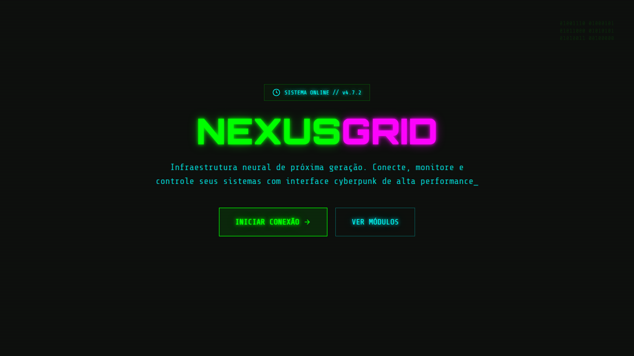
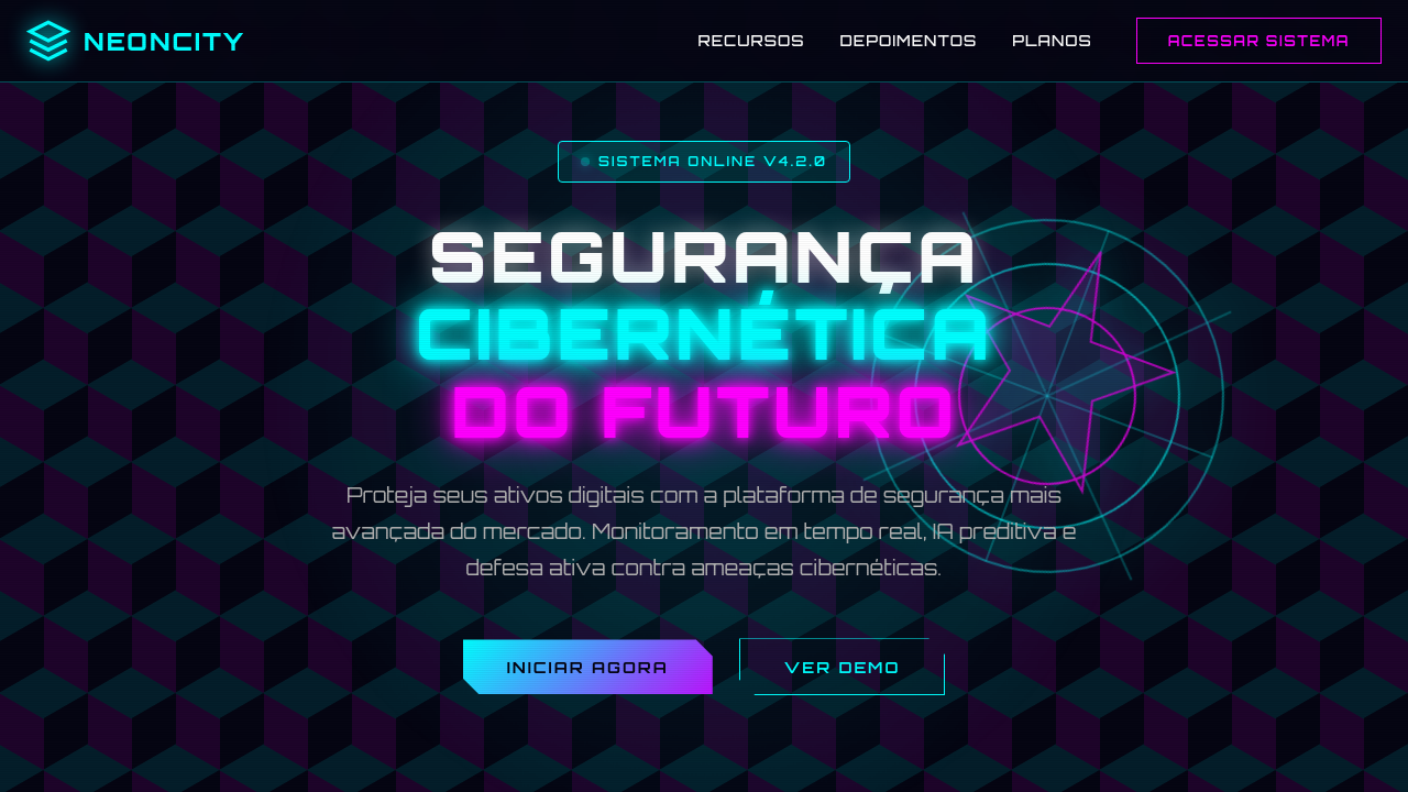
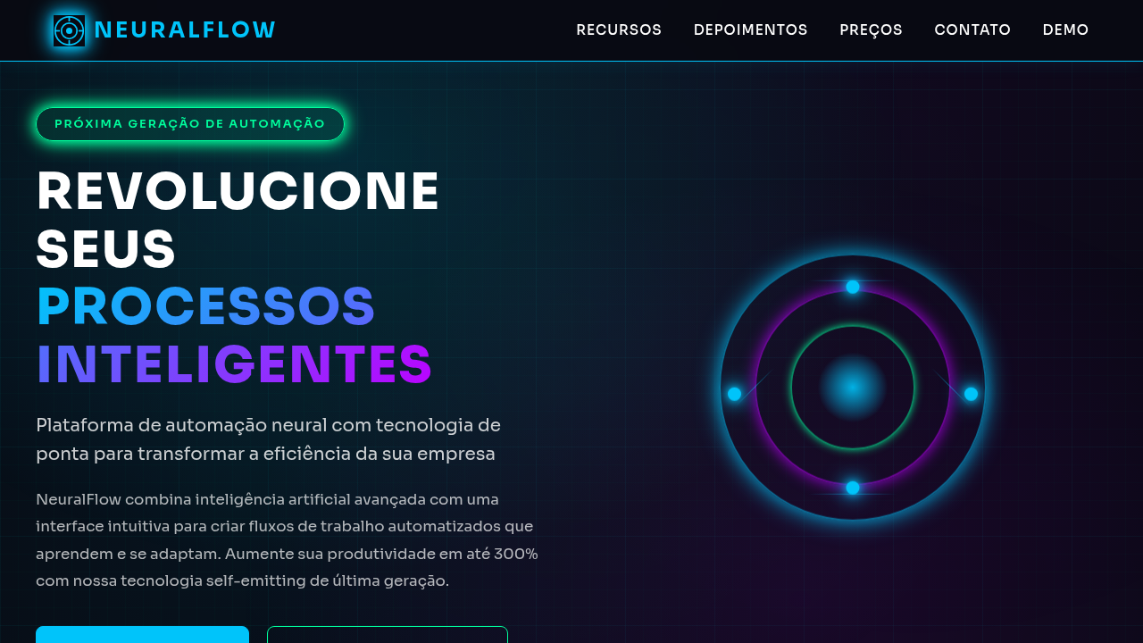
Design a futuristic, techy, confident landing page with neon cyber aesthetic. Deep navy background (#0a0f1c). Use cyan (#00ffcc) and magenta (#ff00aa) as primary accents. Add particle-like backgrounds using CSS (dots, lines). Include neon glow effects on text and buttons (text-shadow, box-shadow with neon colors). Grid pattern overlay. Use a bold sans-serif for display and clean sans for body. Confident, futuristic feel.

## CSS Technical

```css
background: #0a0f1c, color: #ffffff, .neon-text { text-shadow: 0 0 10px #00ffcc, 0 0 20px #00ffcc, 0 0 40px #00ffcc }, .neon-box { box-shadow: 0 0 15px rgba(0,255,204,0.3), inset 0 0 15px rgba(0,255,204,0.1) }, .grid-bg { background-image: linear-gradient(rgba(0,255,204,0.05) 1px, transparent 1px), linear-gradient(90deg, rgba(0,255,204,0.05) 1px, transparent 1px); background-size: 40px 40px }, .particle { position: absolute; width: 2px; height: 2px; background: #00ffcc; border-radius: 50%; animation: float 6s infinite }
```

## Design System Variables

```css
--bg-primary: #0a0f1c, --accent-cyan: #00ffcc, --accent-magenta: #ff00aa, --text-primary: #ffffff, --neon-glow: 0 0 10px #00ffcc, --grid-size: 40px, --particle-size: 2px, --font-display: sans-serif bold, --font-body: sans-serif
```

## Implementation Checklist

- ☐ Deep navy background #0a0f1c
- ☐ Neon glow effects cyan/magenta
- ☐ Grid pattern overlay
- ☐ Particle backgrounds CSS
- ☐ Text-shadow neon em headings
- ☐ Box-shadow neon em cards/buttons
- ☐ Responsivo mobile/tablet/desktop

## Execution Rules

1. Strictly follow the defined visual style.
2. Use high-quality inline SVG icons (Heroicons or Lucide style) — NEVER use emojis as icons.
3. Add `cursor-pointer` and smooth `hover` states (transition-all) on all interactive elements.
4. Required Page Structure:
   - Navbar (Logo + Links + CTA)
   - Hero Section (Impactful Headline + Subtitle + 2 buttons + 3D/Abstract visual element via CSS)
   - Features (3 cards with icons)
   - Testimonials (3 cards)
   - Pricing (3 tiers, highlight the middle one)
   - Final CTA
   - Full Footer with social links, privacy policy, terms of use, contact and SEO links.
5. All text content must be in English.
6. The visual must be CLEARLY distinct — do not create a "default Bootstrap" design. Force the use of the provided design system variables.
7. Use `<style>` tags in the head for custom classes (especially for complex backdrop-filter effects and animations) that Tailwind CDN doesn't cover.
8. Full Responsiveness: Layout must adapt perfectly to Mobile, Tablet and Desktop (vertical stack on mobile).
9. Include basic SEO, Viewport and Open Graph meta tags in `<head>`.
10. Footer must contain: Copyright 2026, Secondary navigation links and Social media icons.
11. Make the creative decisions needed to deliver the complete, functional result now.Related
Last synced: 4/1/2026