Neobrutalismo Ousado
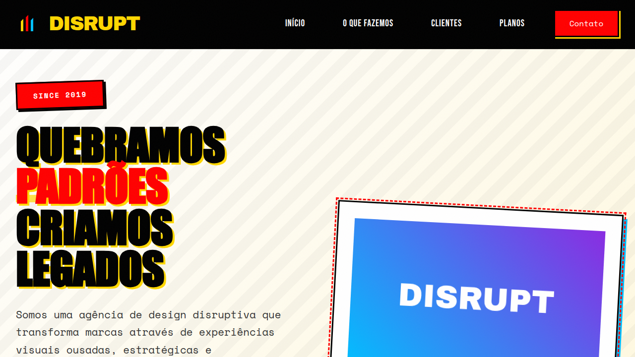
Bold and provocative neobrutalist landing page for a disruptive design agency. Ideal for landing pages, modern websites. AI-ready template.
Use case: Landing pages, Modern websites
Historical Context
When Sahil Lavingia redesigned Gumroad in 2020, he didn't just strip away the polish — he detonated it. Black borders. Saturated primaries. Drop shadows that looked like they were rendered in MS Paint. The internet lost its mind. Designers called it ugly. Then they copied it. What followed wasn't a trend. It was a permission slip. Suddenly every creative agency landing page, every Web3 project, every portfolio site that wanted to scream "we're not like them" had a formula: 4px borders, one loud color, flat illustrations with intentional roughness. The aesthetic said anti-corporate while being deployed by corporations. That tension is the point. Bold neobrutalism works because it's legible as rebellion without actually being difficult. It borrows concrete architecture's honesty — exposed structure, no decorative lies — but wraps it in candy colors. It's brutalism for people who still want to convert visitors. The thick-border-primary-color formula became a shorthand for disruption, and unlike most shorthand, it still hits when executed with conviction rather than copied from a Figma community file.
When to Use
When your brand needs to punch through the sea of rounded-corner sameness. Perfect for creative agencies that practice what they preach, startups positioning against bloated incumbents, portfolio sites where the design IS the credential, and Web3 projects that need visual credibility without corporate cosplay. Skip it if your audience expects reassurance over provocation — this style filters people out by design, which is exactly the point.
Design Principles
- Borders are structural, not decorative — use them at consistent heavy weights (3-4px) to define every element's territory on the page
- One primary color does all the heavy lifting; everything else is black, white, or a neutral — restraint in palette creates maximum impact
- Shadows are offset and solid, never blurred — they reference print and physical layering, not depth simulation
- Typography is oversized and unapologetic — headlines should feel like they're shouting across the room, body text stays readable but dense
- Whitespace is generous between sections but tight within components — this contrast creates rhythm and prevents the boldness from becoming noise
DESIGN.md
---
version: "alpha"
name: "Neobrutalismo Ousado"
description: "Bold and provocative neobrutalist landing page for a disruptive design agency. Ideal for landing pages, modern websites. AI-ready template."
colors:
  primary: "#000000"
  secondary: "#FFD700"
  tertiary: "#FF0000"
  neutral: "#FFFFFF"
  surface: "#00BFFF"
  accent: "#32CD32"
typography:
  h1:
    fontFamily: Impact
    fontSize: 2.5rem
    fontWeight: 700
  body-md:
    fontFamily: Impact
    fontSize: 1rem
    fontWeight: 400
components:
  button-primary:
    backgroundColor: "{colors.primary}"
    textColor: "{colors.neutral}"
    padding: 12px
---

## Overview

Bold and provocative neobrutalist landing page for a disruptive design agency. Ideal for landing pages, modern websites. AI-ready template. When Sahil Lavingia redesigned Gumroad in 2020, he didn't just strip away the polish — he detonated it. Black borders. Saturated primaries. Drop shadows that looked like they were rendered in MS Paint. The internet lost its mind. Designers called it ugly. Then they copied it.

What followed wasn't a trend. It was a permission slip. Suddenly every creative agency landing page, every Web3 project, every portfolio site that wanted to scream "we're not like them" had a formula: 4px borders, one loud color, flat illustrations with intentional roughness. The aesthetic said anti-corporate while being deployed by corporations. That tension is the point.

Bold neobrutalism works because it's legible as rebellion without actually being difficult. It borrows concrete architecture's honesty — exposed structure, no decorative lies — but wraps it in candy colors. It's brutalism for people who still want to convert visitors. The thick-border-primary-color formula became a shorthand for disruption, and unlike most shorthand, it still hits when executed with conviction rather than copied from a Figma community file.

- Density: 5/10 — Balanced
- Variance: 7/10 — Dynamic
- Motion: 4/10 — Subtle

- **Style:** Bold, Provocative, Disruptive
- **Keywords:** design agency, creative, disruptive, bold, provocative, edgy, raw, unconventional, experimental, strong
- **Era:** 2026+ Design Rebelde
- **Light/Dark:** ✓ Full / ✗ No (com elementos de alto contraste)

## Colors

- **Preto** (#000000) — Dark surface, primary background
- **Amarelo Vibrante** (#FFD700) — Warning states, attention indicators
- **Vermelho Brilhante** (#FF0000) — Error states, destructive actions
- **Branco** (#FFFFFF) — Light surface, card backgrounds
- **Azul Elétrico** (#00BFFF) — Secondary accent
- **Verde Limão** (#32CD32) — Success states, positive indicators
- **Roxo Profundo** (#8A2BE2) — Primary background surface
- **Cinza Escuro** (#333333) — Deep contrast surface


## Typography

- **Display / Hero:** Impact — Weight 700, tight tracking, used for headline impact
- **Body:** Impact — Weight 400, 16px/1.6 line-height, max 72ch per line
- **UI Labels / Captions:** Impact — 0.875rem, weight 500, slight letter-spacing
- **Monospace:** JetBrains Mono — Used for code, metadata, and technical values

Scale:
- Hero: clamp(2.5rem, 5vw, 4rem)
- H1: 2.25rem
- H2: 1.5rem
- Body: 1rem / 1.6
- Small: 0.875rem


## Layout

- **Grid:** CSS Grid primary. Max-width containment: 1280px centered with 1.5rem side padding.
- **Spacing rhythm:** Balanced. Base unit: 0.5rem (8px).
- **Section vertical gaps:** clamp(4rem, 8vw, 8rem).
- **Hero layout:** Asymmetric composition.
- **Feature sections:** Asymmetric grid with varied card sizes. No 3-equal-columns.
- **Mobile collapse:** All multi-column layouts collapse below 768px. No horizontal overflow.
- **z-index contract:** base (0) / sticky-nav (100) / overlay (200) / modal (300) / toast (500).


## Elevation & Depth

Cores contrastantes e jarring, tipografia oversized e ousada, elementos sobrepostos, bordas grossas, sombras duras, layouts assimétricos, micro-interações de clique agressivas, efeitos de glitch sutil.

- **Physics:** Ease-out curves, 200-300ms duration. Smooth and predictable.
- **Entry animations:** Fade + translate-Y (16px → 0) over 420ms ease-out. Staggered cascades for lists: 80ms between items.
- **Hover states:** Subtle color shift + shadow adjustment over 200ms.
- **Page transitions:** Fade only (200ms).
- **Performance:** Only transform and opacity animated. No layout-triggering properties.


## Shapes

Base corner radius: 8px. See rounded tokens in front matter for the full scale.


## Components

- **Primary Button:** Subtly rounded (0.5rem) shape. Accent color fill. Hover: 8% darken + subtle lift shadow. Active: -1px translate tactile press. Font weight 600. No outer glows.
- **Secondary / Ghost Button:** Outline variant. 1.5px border in muted color. Text in primary color. Hover: subtle background fill.
- **Cards:** Subtly rounded (0.5rem) corners. Surface background. Subtle shadow (0 2px 12px rgba(0,0,0,0.06)). 1px border stroke.
- **Inputs:** Label above input. 1px border stroke. Focus ring: 2px accent color offset 2px. Error text below in semantic red. No floating labels.
- **Navigation:** Primary surface background. Active item: accent color indicator. Font weight 500 when active.
- **Skeletons:** Shimmer animation matching component dimensions. No circular spinners.
- **Empty States:** Icon-based composition with descriptive text and action button.


## Do's and Don'ts

- No emojis in UI — use icon system only (Lucide, Heroicons)
- No pure black (#000000) — use off-black or charcoal variants
- No oversaturated accent colors (saturation cap: 80%)
- No 3-column equal-width feature layouts — use zig-zag or asymmetric grid
- No `h-screen` — use `min-h-[100dvh]`
- No AI copywriting clichés: "Elevate", "Seamless", "Unleash", "Next-Gen"
- No broken external image links — use picsum.photos or inline SVG
- No generic lorem ipsum in demos

- Do Cores contrastantes
- Do Tipografia oversized
- Do Elementos sobrepostos
- Do Bordas grossas
- Do Sombras duras
- Do Layouts assimétricos.


## Use Case

Landing pages, Modern websites
Technical Specs
CSS
background: #FFFFFF, color: #000000, border: 3px solid #000000, box-shadow: 5px 5px 0px #FFD700, font-family: "Impact, sans-serif", transition: all 0.2s ease-in-out, .oversized-text, .overlapping-element, .hard-shadow.
Variables
--black-bg: #000000, --vibrant-yellow: #FFD700, --bright-red: #FF0000, --white-text: #FFFFFF, --border-thick: 3px solid #000000, --shadow-brutal: 5px 5px 0px #FFD700, --font-bold: "Impact, sans-serif".
Checklist
☐ Cores contrastantes, ☐ Tipografia oversized, ☐ Elementos sobrepostos, ☐ Bordas grossas, ☐ Sombras duras, ☐ Layouts assimétricos.
Colors
Primary
Secondary
Effects
Cores contrastantes e jarring, tipografia oversized e ousada, elementos sobrepostos, bordas grossas, sombras duras, layouts assimétricos, micro-interações de clique agressivas, efeitos de glitch sutil.
Light/Dark
✓ Full / ✗ No (com elementos de alto contraste)
AI Prompt
Act as a Senior Frontend Engineer and Expert UI Designer.
Your task is to code a complete Landing Page on the first attempt.
- Landing Page Theme: <INSERT THEME>
- Sections to add: <INSERT SECTIONS>

Generate the final code immediately following these definitions:

## Style

- **Name:** Neobrutalismo Ousado
- **Type:** Bold, Provocative, Disruptive
- **Keywords:** design agency, creative, disruptive, bold, provocative, edgy, raw, unconventional, experimental, strong
- **Era:** 2026+ Design Rebelde
- **Light/Dark:** ✓ Full / ✗ No (com elementos de alto contraste)

## Color Palette

- **Primary:** Preto #000000, Amarelo Vibrante #FFD700, Vermelho Brilhante #FF0000, Branco #FFFFFF
- **Secondary:** Azul Elétrico #00BFFF, Verde Limão #32CD32, Roxo Profundo #8A2BE2, Cinza Escuro #333333

## Visual Effects

Cores contrastantes e jarring, tipografia oversized e ousada, elementos sobrepostos, bordas grossas, sombras duras, layouts assimétricos, micro-interações de clique agressivas, efeitos de glitch sutil.

## AI Visual Direction

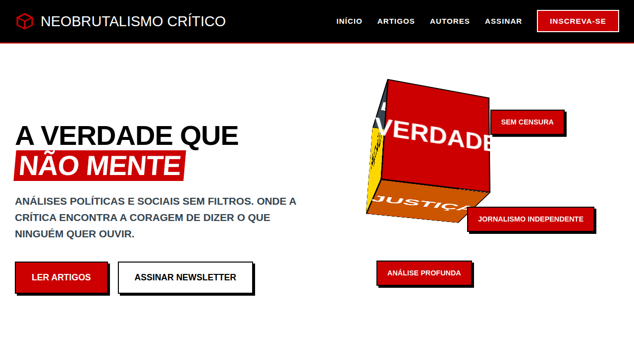
Design a bold and provocative neobrutalist landing page for a disruptive design agency. Use: clashing colors (black, vibrant yellow, bright red), oversized bold typography, overlapping elements, thick borders, hard shadows, asymmetrical layouts, aggressive click micro-interactions, subtle glitch effects, raw and experimental feel.

## CSS Technical

```css
background: #FFFFFF, color: #000000, border: 3px solid #000000, box-shadow: 5px 5px 0px #FFD700, font-family: "Impact, sans-serif", transition: all 0.2s ease-in-out, .oversized-text, .overlapping-element, .hard-shadow.
```

## Design System Variables

```css
--black-bg: #000000, --vibrant-yellow: #FFD700, --bright-red: #FF0000, --white-text: #FFFFFF, --border-thick: 3px solid #000000, --shadow-brutal: 5px 5px 0px #FFD700, --font-bold: "Impact, sans-serif".
```

## Implementation Checklist

- ☐ Cores contrastantes
- ☐ Tipografia oversized
- ☐ Elementos sobrepostos
- ☐ Bordas grossas
- ☐ Sombras duras
- ☐ Layouts assimétricos.

## Execution Rules

1. Strictly follow the defined visual style.
2. Use high-quality inline SVG icons (Heroicons or Lucide style) — NEVER use emojis as icons.
3. Add `cursor-pointer` and smooth `hover` states (transition-all) on all interactive elements.
4. Required Page Structure:
   - Navbar (Logo + Links + CTA)
   - Hero Section (Impactful Headline + Subtitle + 2 buttons + 3D/Abstract visual element via CSS)
   - Features (3 cards with icons)
   - Testimonials (3 cards)
   - Pricing (3 tiers, highlight the middle one)
   - Final CTA
   - Full Footer with social links, privacy policy, terms of use, contact and SEO links.
5. All text content must be in English.
6. The visual must be CLEARLY distinct — do not create a "default Bootstrap" design. Force the use of the provided design system variables.
7. Use `<style>` tags in the head for custom classes (especially for complex backdrop-filter effects and animations) that Tailwind CDN doesn't cover.
8. Full Responsiveness: Layout must adapt perfectly to Mobile, Tablet and Desktop (vertical stack on mobile).
9. Include basic SEO, Viewport and Open Graph meta tags in `<head>`.
10. Footer must contain: Copyright 2026, Secondary navigation links and Social media icons.
11. Make the creative decisions needed to deliver the complete, functional result now.
Related
Last synced: 4/1/2026