Mini World
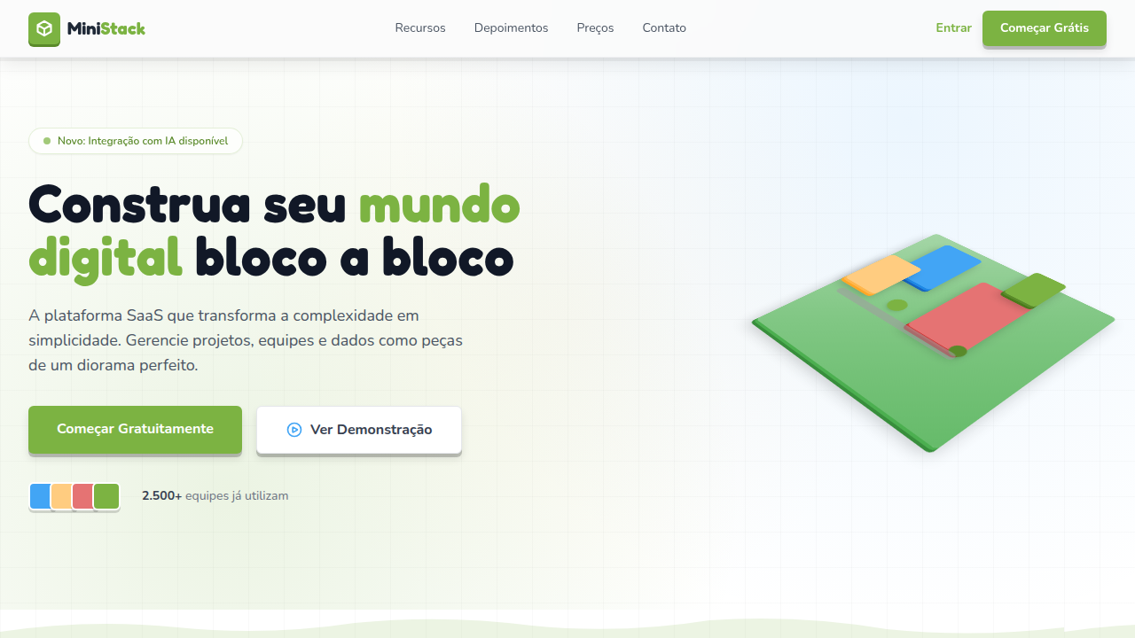
Miniature world / diorama-style landing page. Ideal for games indie, educação infantil, projetos criativos, portfólios lúdicos. AI-ready template.
Use case: Indie games, Children's education, Creative projects, Playful portfolios
Historical Context
The miniature aesthetic in digital design traces back to tilt-shift photography's explosion in the mid-2000s — that deliberate shallow depth-of-field trick that made real cities look like toy models. Designers immediately recognized the psychological hook: tiny worlds demand closer inspection. They pull users in because the brain can't resist decoding something that looks simultaneously real and impossible. Isometric illustration picked up where tilt-shift left off. The fixed camera angle borrowed from architectural drafting gave digital artists a framework to build entire universes at desk scale. Games like Monument Valley and Alto's Adventure proved that miniaturized worlds weren't just decorative — they were narrative devices. The constraint of smallness forced clarity. What makes this aesthetic endure is its inherent warmth. Dioramas feel handmade even when they're purely digital. There's a craft sensibility — the suggestion that someone carefully placed every tiny element with tweezers and intention. In an era of flat, scalable, system-generated interfaces, miniature worlds feel authored. They carry fingerprints.
When to Use
Deploy miniature aesthetics when you need users to slow down and explore rather than scan and bounce. Perfect for product showcases where you want objects to feel precious and considered. Strong choice for creative portfolios that need to signal craft obsession. Works beautifully in gaming contexts where world-building matters more than photorealism. Use for storytelling interfaces where spatial narrative replaces linear scrolling. Avoid when speed-to-information is the priority — tiny worlds reward patience, not efficiency.
Design Principles
- Establish a consistent light source and shadow direction — miniatures look fake the moment lighting contradicts itself across elements
- Maintain strict scale relationships between objects; the illusion breaks when a coffee cup is the same size as a building
- Use selective focus and atmospheric depth to guide the eye — not everything in the scene deserves equal sharpness
- Limit your color palette per scene; real dioramas use curated materials, not the entire Pantone book
- Add subtle imperfection — a slightly tilted element, visible texture grain, minor asymmetry — to avoid the sterile CGI trap
DESIGN.md
---
version: "alpha"
name: "Mini World"
description: "Miniature world / diorama-style landing page. Ideal for games indie, educação infantil, projetos criativos, portfólios lúdicos. AI-ready template."
colors:
  primary: "#7CB342"
  secondary: "#42A5F5"
  tertiary: "#FFCC80"
  neutral: "#E57373"
  surface: "#FAFAFA"
  accent: "#9E9E9E"
typography:
  h1:
    fontFamily: System UI stack
    fontSize: 2.25rem
    fontWeight: 700
  body-md:
    fontFamily: System UI stack
    fontSize: 1rem
    fontWeight: 400
  label-caps:
    fontFamily: System UI stack
    fontSize: 0.75rem
    fontWeight: 500
spacing:
  sm: 1.5rem
  md: 3.0rem
  lg: 6.0rem
components:
  button-primary:
    backgroundColor: "{colors.primary}"
    textColor: "{colors.neutral}"
    padding: 12px
---

## Overview

Miniature world / diorama-style landing page. Ideal for games indie, educação infantil, projetos criativos, portfólios lúdicos. AI-ready template. The miniature aesthetic in digital design traces back to tilt-shift photography's explosion in the mid-2000s — that deliberate shallow depth-of-field trick that made real cities look like toy models. Designers immediately recognized the psychological hook: tiny worlds demand closer inspection. They pull users in because the brain can't resist decoding something that looks simultaneously real and impossible.

Isometric illustration picked up where tilt-shift left off. The fixed camera angle borrowed from architectural drafting gave digital artists a framework to build entire universes at desk scale. Games like Monument Valley and Alto's Adventure proved that miniaturized worlds weren't just decorative — they were narrative devices. The constraint of smallness forced clarity.

What makes this aesthetic endure is its inherent warmth. Dioramas feel handmade even when they're purely digital. There's a craft sensibility — the suggestion that someone carefully placed every tiny element with tweezers and intention. In an era of flat, scalable, system-generated interfaces, miniature worlds feel authored. They carry fingerprints.

- Density: 5/10 — Balanced
- Variance: 4/10 — Moderate
- Motion: 8/10 — Cinematic

- **Style:** Miniature, Isometric, Blocky, Diorama
- **Keywords:** miniature, diorama, isometric, blocky characters, geometric shapes, tilt-shift, depth, toy-like, small world
- **Era:** 2020s Modern / Indie Game Aesthetic
- **Light/Dark:** ✓ Full / ◐ Partial

## Colors

- **Grass Green** (#7CB342) — Primary surface or dominant color
- **Sky Blue** (#42A5F5) — Accent highlight, links and focus states
- **Warm Sand** (#FFCC80) — Supporting palette color
- **Brick Red** (#E57373) — Error states, destructive actions
- **Soft White** (#FAFAFA) — Secondary surface
- **Stone Grey** (#9E9E9E) — Secondary text, borders, muted elements
- **Water Blue** (#29B6F6) — Secondary accent
- **Wood Brown** (#8D6E63) — Extended palette, decorative use


## Typography

- **Display / Hero:** System UI stack (-apple-system, sans-serif) — Weight 700, tight tracking, used for headline impact
- **Body:** System UI stack (-apple-system, sans-serif) — Weight 400, 16px/1.6 line-height, max 72ch per line
- **UI Labels / Captions:** System UI stack (-apple-system, sans-serif) — 0.875rem, weight 500, slight letter-spacing
- **Monospace:** JetBrains Mono — Used for code, metadata, and technical values

Scale:
- Hero: clamp(2.5rem, 5vw, 4rem)
- H1: 2.25rem
- H2: 1.5rem
- Body: 1rem / 1.6
- Small: 0.875rem


## Layout

- **Grid:** CSS Grid primary. Max-width containment: 1280px centered with 1.5rem side padding.
- **Spacing rhythm:** Balanced. Base unit: 0.5rem (8px).
- **Section vertical gaps:** clamp(4rem, 8vw, 8rem).
- **Hero layout:** Split-screen (text left, visual right).
- **Feature sections:** Zig-zag alternating text+image rows. No 3-equal-columns.
- **Mobile collapse:** All multi-column layouts collapse below 768px. No horizontal overflow.
- **z-index contract:** base (0) / sticky-nav (100) / overlay (200) / modal (300) / toast (500).


## Elevation & Depth

Tilt-shift blur effect on edges, isometric grid layout, CSS 3D transforms for depth, box-shadow layers for elevation, subtle parallax on scroll, 200-300ms hover transitions

- **Physics:** Spring — stiffness 120, damping 20. Confident, weighted transitions.
- **Entry animations:** Fade + translate-Y (16px → 0) over 540ms ease-out. Staggered cascades for lists: 120ms between items.
- **Hover states:** Scale(1.03) + shadow lift over 200ms.
- **Page transitions:** Fade + slide (300ms).
- **Performance:** Only transform and opacity animated. No layout-triggering properties.


## Shapes

Base corner radius: 24px. See rounded tokens in front matter for the full scale.


## Components

- **Primary Button:** Generously rounded (1.5rem) shape. Accent color fill. Hover: 8% darken + subtle lift shadow. Active: -1px translate tactile press. Font weight 600. No outer glows.
- **Secondary / Ghost Button:** Outline variant. 1.5px border in muted color. Text in primary color. Hover: subtle background fill.
- **Cards:** Generously rounded (1.5rem) corners. Surface background. Subtle shadow (0 2px 12px rgba(0,0,0,0.06)). 1px border stroke.
- **Inputs:** Label above input. 1px border stroke. Focus ring: 2px accent color offset 2px. Error text below in semantic red. No floating labels.
- **Navigation:** Primary surface background. Active item: accent color indicator. Font weight 500 when active.
- **Skeletons:** Shimmer animation matching component dimensions. No circular spinners.
- **Empty States:** Icon-based composition with descriptive text and action button.


## Do's and Don'ts

- No emojis in UI — use icon system only (Lucide, Heroicons)
- No pure black (#000000) — use off-black or charcoal variants
- No oversaturated accent colors (saturation cap: 80%)
- No 3-column equal-width feature layouts — use zig-zag or asymmetric grid
- No `h-screen` — use `min-h-[100dvh]`
- No AI copywriting clichés: "Elevate", "Seamless", "Unleash", "Next-Gen"
- No broken external image links — use picsum.photos or inline SVG
- No generic lorem ipsum in demos

- Do Isometric/diorama perspective visible
- Do Blocky geometric shapes used
- Do Tilt-shift blur on edges
- Do Layered depth with shadows
- Do Warm saturated color palette
- Do Responsive grid layout


## Use Case

Indie games, Children's education, Creative projects, Playful portfolios
Technical Specs
CSS
transform: rotateX(45deg) rotateZ(45deg) for isometric feel, box-shadow: multiple layers for depth, filter: blur() on edges for tilt-shift, perspective: 800px, border-radius: 4-8px for blocky look, background: layered gradients for terrain
Variables
--perspective: 800px, --block-radius: 6px, --depth-shadow: 4-layer box-shadow, --tilt-blur: 2-4px edges, --grid-gap: 1.5rem, --elevation-step: 4px
Checklist
☐ Isometric/diorama perspective visible, ☐ Blocky geometric shapes used, ☐ Tilt-shift blur on edges, ☐ Layered depth with shadows, ☐ Warm saturated color palette, ☐ Responsive grid layout
Colors
Primary
Secondary
Effects
Tilt-shift blur effect on edges, isometric grid layout, CSS 3D transforms for depth, box-shadow layers for elevation, subtle parallax on scroll, 200-300ms hover transitions
Light/Dark
✓ Full / ◐ Partial
AI Prompt
Act as a Senior Frontend Engineer and Expert UI Designer.
Your task is to code a complete Landing Page on the first attempt.
- Landing Page Theme: <INSERT THEME>
- Sections to add: <INSERT SECTIONS>

Generate the final code immediately following these definitions:

## Style

- **Name:** Mini World
- **Type:** Miniature, Isometric, Blocky, Diorama
- **Keywords:** miniature, diorama, isometric, blocky characters, geometric shapes, tilt-shift, depth, toy-like, small world
- **Era:** 2020s Modern / Indie Game Aesthetic
- **Light/Dark:** ✓ Full / ◐ Partial

## Color Palette

- **Primary:** Grass Green #7CB342, Sky Blue #42A5F5, Warm Sand #FFCC80, Brick Red #E57373
- **Secondary:** Soft White #FAFAFA, Stone Grey #9E9E9E, Water Blue #29B6F6, Wood Brown #8D6E63

## Visual Effects

Tilt-shift blur effect on edges, isometric grid layout, CSS 3D transforms for depth, box-shadow layers for elevation, subtle parallax on scroll, 200-300ms hover transitions

## AI Visual Direction

Design a miniature world / diorama-style landing page. Use isometric perspective with geometric blocky shapes, tilt-shift blur on edges, layered depth with CSS transforms. Characters and elements should look like tiny toy figures. Use warm, saturated colors. Create a sense of looking down at a small world from above. Grid-based layout with 3D-extruded card elements.

## CSS Technical

```css
transform: rotateX(45deg) rotateZ(45deg) for isometric feel, box-shadow: multiple layers for depth, filter: blur() on edges for tilt-shift, perspective: 800px, border-radius: 4-8px for blocky look, background: layered gradients for terrain
```

## Design System Variables

```css
--perspective: 800px, --block-radius: 6px, --depth-shadow: 4-layer box-shadow, --tilt-blur: 2-4px edges, --grid-gap: 1.5rem, --elevation-step: 4px
```

## Implementation Checklist

- ☐ Isometric/diorama perspective visible
- ☐ Blocky geometric shapes used
- ☐ Tilt-shift blur on edges
- ☐ Layered depth with shadows
- ☐ Warm saturated color palette
- ☐ Responsive grid layout

## Execution Rules

1. Strictly follow the defined visual style.
2. Use high-quality inline SVG icons (Heroicons or Lucide style) — NEVER use emojis as icons.
3. Add `cursor-pointer` and smooth `hover` states (transition-all) on all interactive elements.
4. Required Page Structure:
   - Navbar (Logo + Links + CTA)
   - Hero Section (Impactful Headline + Subtitle + 2 buttons + 3D/Abstract visual element via CSS)
   - Features (3 cards with icons)
   - Testimonials (3 cards)
   - Pricing (3 tiers, highlight the middle one)
   - Final CTA
   - Full Footer with social links, privacy policy, terms of use, contact and SEO links.
5. All text content must be in English.
6. The visual must be CLEARLY distinct — do not create a "default Bootstrap" design. Force the use of the provided design system variables.
7. Use `<style>` tags in the head for custom classes (especially for complex backdrop-filter effects and animations) that Tailwind CDN doesn't cover.
8. Full Responsiveness: Layout must adapt perfectly to Mobile, Tablet and Desktop (vertical stack on mobile).
9. Include basic SEO, Viewport and Open Graph meta tags in `<head>`.
10. Footer must contain: Copyright 2026, Secondary navigation links and Social media icons.
11. Make the creative decisions needed to deliver the complete, functional result now.
Related
Last synced: 4/1/2026