IBM Plex Sans Typography
Render a 2D isolated text on a solid background. Ideal for enterprise products, design systems, documentation, and tech brands.. AI-ready template.
Use case: Enterprise products, design systems, documentation, and tech brands.
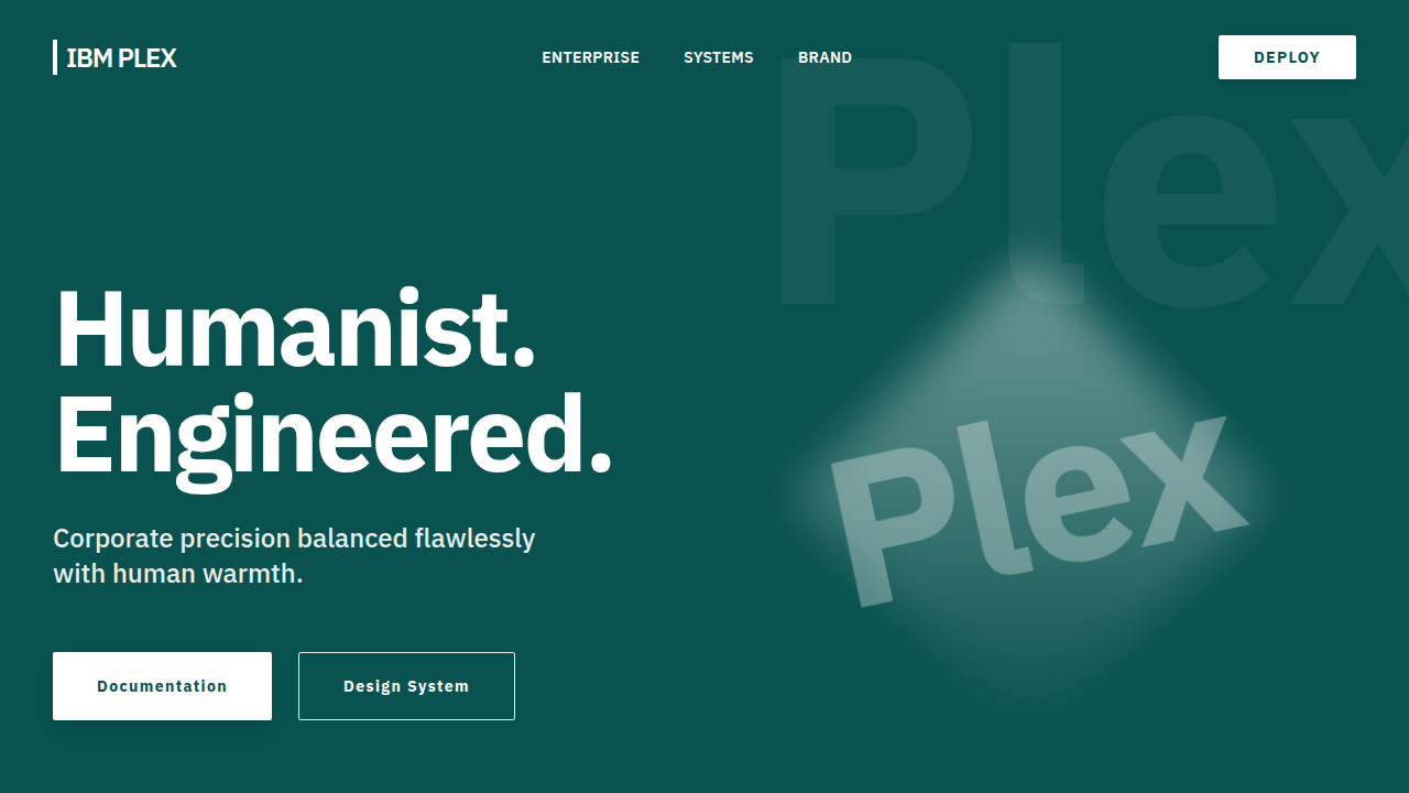
Historical Context
IBM Plex Sans arrived in 2017 as the replacement for Helvetica Neue across IBM's entire ecosystem — a move that signaled something bigger than a rebrand. For decades, IBM licensed Helvetica, paying millions annually for a typeface that said nothing about who they actually were. Plex was IBM's declaration of typographic independence: engineered in-house with Mike Abbink and Bold Monday, released under the Open Font License, and built to carry the weight of one of computing's oldest institutions without borrowing someone else's voice. The design itself is a fascinating negotiation between warmth and precision. Plex takes the grotesque skeleton — that rational, engineered DNA — and introduces subtle humanist details: the slightly angled terminals, the open apertures, the gentle curve on the lowercase 'l' that prevents confusion with the numeral '1'. These aren't decorative choices. They're functional decisions made by people who understood that IBM's typography would live on terminal screens, in documentation, on conference stages, and in code editors simultaneously. What makes Plex genuinely interesting in the type landscape is its philosophical position. It's corporate typography that refuses to be generic. It's engineered but not cold. It's open-source from a company that once epitomized proprietary everything. That tension — between institutional authority and open collaboration — is baked into every glyph.
When to Use
Plex earns its place when you need typography that communicates institutional credibility without defaulting to the sterility of system fonts. It's the right call for enterprise platforms, technical documentation, developer tools, and open-source projects that want to signal professionalism without corporate stuffiness. The mono and serif companions make it a complete typographic system — rare for open-source families. Avoid it when you need personality or warmth; Plex is deliberately restrained, and fighting that restraint produces mediocre results.
Design Principles
- Pair Plex Sans with Plex Mono in technical interfaces — they share identical metrics, so mixing them in inline code blocks produces zero layout shift
- Use Medium (500) for UI labels and Semi-Bold (600) for headings — Regular gets lost at small sizes on low-contrast enterprise dashboards
- Set body text between 15–17px with 1.5–1.6 line-height; Plex's open apertures need breathing room to maintain the clarity they were designed for
- Leverage the tabular figures (font-feature-settings: 'tnum') in data tables and dashboards — Plex's default proportional figures misalign in columns
- Keep letter-spacing at zero or slightly negative for headings; Plex was drawn with generous built-in spacing that becomes airy if you add tracking
DESIGN.md
---
version: "alpha"
name: "IBM Plex Sans Typography"
description: "Render a 2D isolated text on a solid background. Ideal for enterprise products, design systems, documentation, and tech brands.. AI-ready template."
colors:
  primary: "#FFFFFF"
  secondary: "#09524F"
typography:
  h1:
    fontFamily: IBM Plex Sans
    fontSize: 2.5rem
    fontWeight: 700
  body-md:
    fontFamily: IBM Plex Sans
    fontSize: 1rem
    fontWeight: 400
components:
  button-primary:
    backgroundColor: "{colors.primary}"
    padding: 12px
---

## Overview

Render a 2D isolated text on a solid background. Ideal for enterprise products, design systems, documentation, and tech brands.. AI-ready template. IBM Plex Sans arrived in 2017 as the replacement for Helvetica Neue across IBM's entire ecosystem — a move that signaled something bigger than a rebrand. For decades, IBM licensed Helvetica, paying millions annually for a typeface that said nothing about who they actually were. Plex was IBM's declaration of typographic independence: engineered in-house with Mike Abbink and Bold Monday, released under the Open Font License, and built to carry the weight of one of computing's oldest institutions without borrowing someone else's voice.

The design itself is a fascinating negotiation between warmth and precision. Plex takes the grotesque skeleton — that rational, engineered DNA — and introduces subtle humanist details: the slightly angled terminals, the open apertures, the gentle curve on the lowercase 'l' that prevents confusion with the numeral '1'. These aren't decorative choices. They're functional decisions made by people who understood that IBM's typography would live on terminal screens, in documentation, on conference stages, and in code editors simultaneously.

What makes Plex genuinely interesting in the type landscape is its philosophical position. It's corporate typography that refuses to be generic. It's engineered but not cold. It's open-source from a company that once epitomized proprietary everything. That tension — between institutional authority and open collaboration — is baked into every glyph.

- Density: 7/10 — Compact
- Variance: 2/10 — Structured
- Motion: 4/10 — Subtle

- **Style:** Corporate, engineered humanist sans
- **Keywords:** IBM Plex Sans, corporate, engineered, tech brands, technical precision
- **Era:** Contemporary Web
- **Light/Dark:** ✗ No / ✓ Full

## Colors

- **#FFFFFF** (#FFFFFF) — Primary surface or dominant color
- **#09524F** (#09524F) — Extended palette, decorative use


## Typography

- **Display / Hero:** IBM Plex Sans — Weight 700, tight tracking, used for headline impact
- **Body:** IBM Plex Sans — Weight 400, 16px/1.6 line-height, max 72ch per line
- **UI Labels / Captions:** IBM Plex Sans — 0.875rem, weight 500, slight letter-spacing
- **Monospace:** JetBrains Mono — Used for code, metadata, and technical values

Scale:
- Hero: clamp(2.5rem, 5vw, 4rem)
- H1: 2.25rem
- H2: 1.5rem
- Body: 1rem / 1.6
- Small: 0.875rem


## Layout

- **Grid:** CSS Grid primary. Max-width containment: 1280px centered with 1.5rem side padding.
- **Spacing rhythm:** Balanced. Base unit: 0.5rem (8px).
- **Section vertical gaps:** clamp(4rem, 8vw, 8rem).
- **Hero layout:** Split-screen (text left, visual right).
- **Feature sections:** Zig-zag alternating text+image rows. No 3-equal-columns.
- **Mobile collapse:** All multi-column layouts collapse below 768px. No horizontal overflow.
- **z-index contract:** base (0) / sticky-nav (100) / overlay (200) / modal (300) / toast (500).


## Elevation & Depth

Tight tracking (-3%), 90% leading

- **Physics:** Ease-out curves, 200-300ms duration. Smooth and predictable.
- **Entry animations:** Fade + translate-Y (16px → 0) over 420ms ease-out. Staggered cascades for lists: 80ms between items.
- **Hover states:** Subtle color shift + shadow adjustment over 200ms.
- **Page transitions:** Fade only (200ms).
- **Performance:** Only transform and opacity animated. No layout-triggering properties.


## Shapes

Base corner radius: 8px. See rounded tokens in front matter for the full scale.


## Components

- **Primary Button:** Subtly rounded (0.5rem) shape. Accent color fill. Hover: 8% darken + subtle lift shadow. Active: -1px translate tactile press. Font weight 600. No outer glows.
- **Secondary / Ghost Button:** Outline variant. 1.5px border in muted color. Text in primary color. Hover: subtle background fill.
- **Cards:** Subtly rounded (0.5rem) corners. Surface background. Subtle shadow (0 2px 12px rgba(0,0,0,0.06)). 1px border stroke.
- **Inputs:** Label above input. 1px border stroke. Focus ring: 2px accent color offset 2px. Error text below in semantic red. No floating labels.
- **Navigation:** Primary surface background. Active item: accent color indicator. Font weight 500 when active.
- **Skeletons:** Shimmer animation matching component dimensions. No circular spinners.
- **Empty States:** Icon-based composition with descriptive text and action button.


## Do's and Don'ts

- No emojis in UI — use icon system only (Lucide, Heroicons)
- No pure black (#000000) — use off-black or charcoal variants
- No oversaturated accent colors (saturation cap: 80%)
- No 3-column equal-width feature layouts — use zig-zag or asymmetric grid
- No `h-screen` — use `min-h-[100dvh]`
- No AI copywriting clichés: "Elevate", "Seamless", "Unleash", "Next-Gen"
- No broken external image links — use picsum.photos or inline SVG
- No generic lorem ipsum in demos

- Do IBM Plex Sans Font
- Do Color: #FFFFFF
- Do Tracking -3%
- Do Background #09524F


## Use Case

Enterprise products, design systems, documentation, and tech brands.
Technical Specs
CSS
font-family: 'IBM Plex Sans', sans-serif; color: #FFFFFF; letter-spacing: -0.03em; line-height: 0.9;
Variables
--font-family: 'IBM Plex Sans', --text-color: #FFFFFF, --bg-color: #09524F
Checklist
☐ IBM Plex Sans Font, ☐ Color: #FFFFFF, ☐ Tracking -3%, ☐ Background #09524F
Colors
Primary
Secondary
Effects
Tight tracking (-3%), 90% leading
Light/Dark
✗ No / ✓ Full
AI Prompt
Act as a Senior Frontend Engineer and Expert UI Designer.
Your task is to code a complete Landing Page on the first attempt.
- Landing Page Theme: <INSERT THEME>
- Sections to add: <INSERT SECTIONS>

Generate the final code immediately following these definitions:

## Style

- **Name:** IBM Plex Sans Typography
- **Type:** Corporate, engineered humanist sans
- **Keywords:** IBM Plex Sans, corporate, engineered, tech brands, technical precision
- **Era:** Contemporary Web
- **Light/Dark:** ✗ No / ✓ Full

## Color Palette

- **Primary:** #FFFFFF
- **Secondary:** #09524F

## Visual Effects

Tight tracking (-3%), 90% leading

## AI Visual Direction

Render a 2D isolated text on a solid background. Font Family: @IBM Plex Sans Font, Color: Hex #FFFFFF, Background: #09524F, Tracking: Tight (-3%), Leading: 90%, Alignment: Strictly Left Aligned, Position: Center, Scale: 50%.

## CSS Technical

```css
font-family: 'IBM Plex Sans', sans-serif; color: #FFFFFF; letter-spacing: -0.03em; line-height: 0.9;
```

## Design System Variables

```css
--font-family: 'IBM Plex Sans', --text-color: #FFFFFF, --bg-color: #09524F
```

## Implementation Checklist

- ☐ IBM Plex Sans Font
- ☐ Color: #FFFFFF
- ☐ Tracking -3%
- ☐ Background #09524F

## Execution Rules

1. Strictly follow the defined visual style.
2. Use high-quality inline SVG icons (Heroicons or Lucide style) — NEVER use emojis as icons.
3. Add `cursor-pointer` and smooth `hover` states (transition-all) on all interactive elements.
4. Required Page Structure:
   - Navbar (Logo + Links + CTA)
   - Hero Section (Impactful Headline + Subtitle + 2 buttons + 3D/Abstract visual element via CSS)
   - Features (3 cards with icons)
   - Testimonials (3 cards)
   - Pricing (3 tiers, highlight the middle one)
   - Final CTA
   - Full Footer with social links, privacy policy, terms of use, contact and SEO links.
5. All text content must be in English.
6. The visual must be CLEARLY distinct — do not create a "default Bootstrap" design. Force the use of the provided design system variables.
7. Use `<style>` tags in the head for custom classes (especially for complex backdrop-filter effects and animations) that Tailwind CDN doesn't cover.
8. Full Responsiveness: Layout must adapt perfectly to Mobile, Tablet and Desktop (vertical stack on mobile).
9. Include basic SEO, Viewport and Open Graph meta tags in `<head>`.
10. Footer must contain: Copyright 2026, Secondary navigation links and Social media icons.
11. Make the creative decisions needed to deliver the complete, functional result now.
Last synced: 4/1/2026