HR SaaS Hero
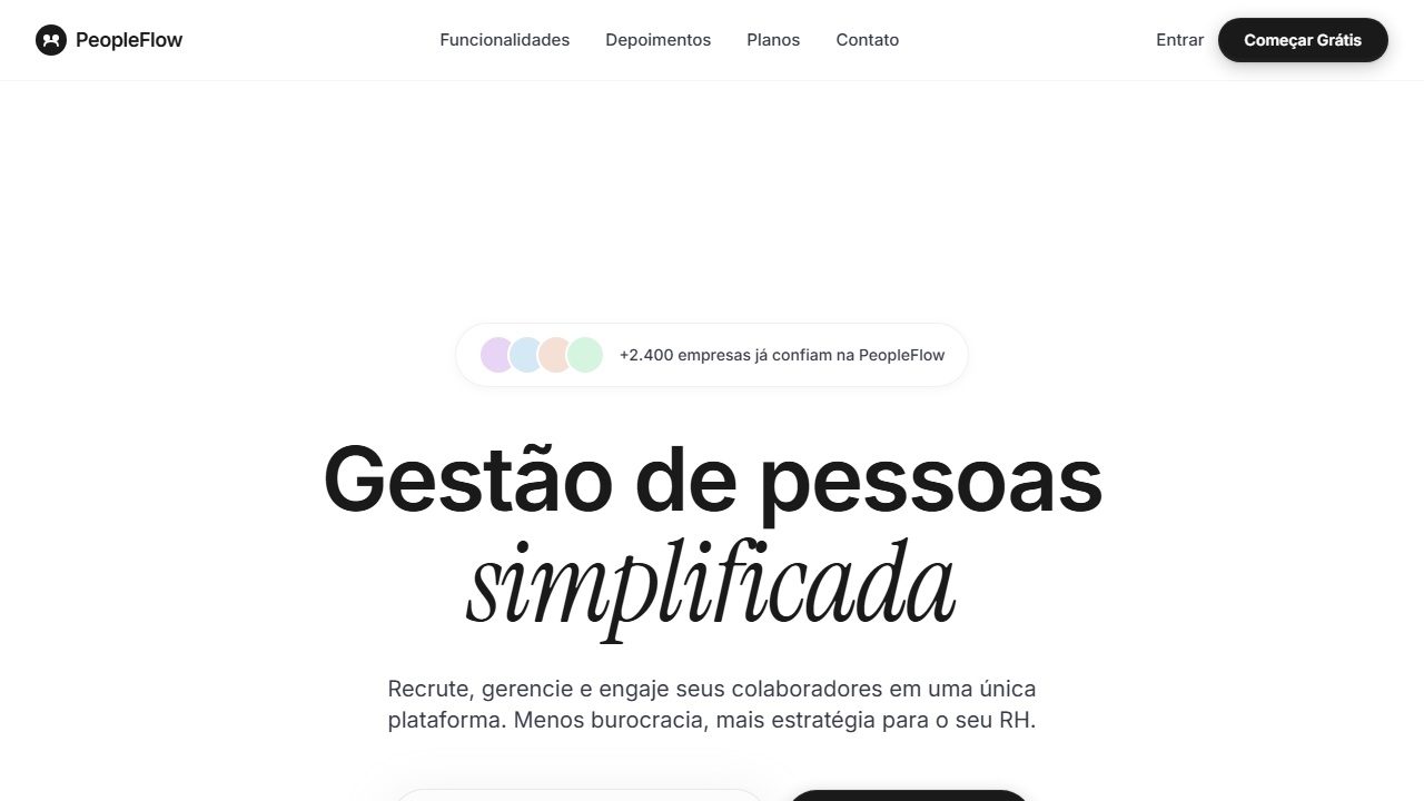
Minimalist white SaaS hero with background video vertically flipped scaleY(-1) and white gradient overlay (transparent at 26.4% to white at 66.9%). Ideal for saas de rh, gestão de equipes remotas, ferramentas de colaboração, plataformas de onboarding. AI-ready template.
Use case: SaaS de RH, Gestão de equipes remotas, Tools de colaboração, Platforms de onboarding
Historical Context
The Swiss International Style didn't survive six decades by accident. Its obsession with grid systems, negative space, and typographic hierarchy created a visual language so disciplined that it still outperforms most contemporary approaches — especially in enterprise software where cognitive load is the real enemy. HR platforms inherited the worst habits of early SaaS: cramped layouts, gratuitous gradients, stock photography of people high-fiving in conference rooms. The minimalist white hero emerged as a direct rejection of that visual noise. Inverted video as a hero element traces back to editorial design's use of reversed-out imagery — high contrast, immediate focal point, zero decoration. When applied to SaaS landing pages, it creates an arresting moment without resorting to illustration or photography that dates within months. The technique works because it treats motion as typography: communicative, not decorative. What makes this pattern specifically potent for HR software is the implicit message. White space signals confidence. A company selling people management tools needs to communicate clarity and calm — the opposite of the chaos their product resolves. The restraint IS the selling point.
When to Use
Deploy this when your HR product needs to communicate sophistication without coldness. It works for platforms where the buyer is a VP of People or CHRO — someone who's seen a hundred dashboards and responds to restraint over spectacle. Ideal for recruitment tools positioning against cluttered incumbents, people analytics platforms where data density demands a calm entry point, and any HR SaaS that sells to companies with 200+ employees. Skip it if your product is playful, targets SMBs who want warmth, or if you lack strong product footage for the inverted video element.
Design Principles
- Negative space is structural, not leftover — every white pixel is a deliberate decision that reduces cognitive load and signals product confidence
- Video replaces illustration as the hero medium: inverted/contrast-shifted footage communicates product value without the datedness of static imagery or the genericness of motion graphics
- Typography carries the entire emotional weight — one typeface, two weights maximum, size contrast doing the work that color refuses to
- Color is rationed to a single accent at interaction points; the palette is white, near-black, and one functional hue that earns its presence through scarcity
- Grid rigidity is non-negotiable — Swiss-derived columns with mathematical spacing create the subconscious order that HR buyers associate with a product that actually works
DESIGN.md
---
version: "alpha"
name: "HR SaaS Hero"
description: "Minimalist white SaaS hero with background video vertically flipped scaleY(-1) and white gradient overlay (transparent at 26.4% to white at 66.9%). Ideal for saas de rh, gestão de equipes remotas, ferramentas de colaboração, plataformas de onboarding. AI-ready template."
colors:
  primary: "#FFFFFF"
  secondary: "#1A1A1A"
  tertiary: "#373a46"
  neutral: "#fcfcfc"
typography:
  h1:
    fontFamily: Geist
    fontSize: 2.5rem
    fontWeight: 700
  body-md:
    fontFamily: Geist
    fontSize: 1rem
    fontWeight: 400
rounded:
  sm: 40px
  md: 80px
  lg: 120px
components:
  button-primary:
    backgroundColor: "{colors.primary}"
    textColor: "{colors.neutral}"
    rounded: "{rounded.sm}"
    padding: 12px
---

## Overview

Minimalist white SaaS hero with background video vertically flipped scaleY(-1) and white gradient overlay (transparent at 26.4% to white at 66.9%). Ideal for saas de rh, gestão de equipes remotas, ferramentas de colaboração, plataformas de onboarding. AI-ready template. The Swiss International Style didn't survive six decades by accident. Its obsession with grid systems, negative space, and typographic hierarchy created a visual language so disciplined that it still outperforms most contemporary approaches — especially in enterprise software where cognitive load is the real enemy. HR platforms inherited the worst habits of early SaaS: cramped layouts, gratuitous gradients, stock photography of people high-fiving in conference rooms. The minimalist white hero emerged as a direct rejection of that visual noise.

Inverted video as a hero element traces back to editorial design's use of reversed-out imagery — high contrast, immediate focal point, zero decoration. When applied to SaaS landing pages, it creates an arresting moment without resorting to illustration or photography that dates within months. The technique works because it treats motion as typography: communicative, not decorative.

What makes this pattern specifically potent for HR software is the implicit message. White space signals confidence. A company selling people management tools needs to communicate clarity and calm — the opposite of the chaos their product resolves. The restraint IS the selling point.

- Density: 3/10 — Airy
- Variance: 2/10 — Structured
- Motion: 8/10 — Cinematic

- **Style:** SaaS, Minimalist White, Flipped Video, Geist Font, Multi-Layer Button, Editorial Spacing
- **Keywords:** SaaS, minimalista branco, vídeo invertido, Geist font, Instrument Serif italic, botão multi-camada, espaçamento editorial, gradient overlay branco, input email, social proof
- **Era:** 2024-2026 SaaS Minimalist White
- **Light/Dark:** ✓ Full / ✗ Not Recommended

## Colors

- **Branco** (#FFFFFF) — Light surface, card backgrounds
- **Preto Texto** (#1A1A1A) — Dark surface, primary background
- **Cinza Slate** (#373a46) — Secondary text, borders, muted elements
- **Cinza Input** (#fcfcfc) — Secondary text, borders, muted elements
- **Sombra Input** (rgba(194,194,194,0.25)) — Extended palette, decorative use
- **Sombra Botão Interna** (rgba(201,201,201,0.08)) — Extended palette, decorative use
- **Sombra Botão Escura** (rgba(29,29,29,0.24)) — Extended palette, decorative use
- **Borda Sutil** (rgba(0,0,0,0.08)) — Extended palette, decorative use


## Typography

- **Display / Hero:** Geist — Weight 700, tight tracking, used for headline impact
- **Accent:** Instrument Serif — Used for decorative or emphasis text
- **Body:** Geist — Weight 400, 16px/1.6 line-height, max 72ch per line
- **UI Labels / Captions:** Geist — 0.875rem, weight 500, slight letter-spacing
- **Monospace:** JetBrains Mono — Used for code, metadata, and technical values

Scale:
- Hero: clamp(2.5rem, 5vw, 4rem)
- H1: 2.25rem
- H2: 1.5rem
- Body: 1rem / 1.6
- Small: 0.875rem


## Layout

- **Grid:** CSS Grid primary. Max-width containment: 1280px centered with 1.5rem side padding.
- **Spacing rhythm:** Balanced. Base unit: 0.5rem (8px).
- **Section vertical gaps:** clamp(4rem, 8vw, 8rem).
- **Hero layout:** Split-screen (text left, visual right).
- **Feature sections:** Zig-zag alternating text+image rows. No 3-equal-columns.
- **Mobile collapse:** All multi-column layouts collapse below 768px. No horizontal overflow.
- **z-index contract:** base (0) / sticky-nav (100) / overlay (200) / modal (300) / toast (500).


## Elevation & Depth

VÍDEO: Vídeo abstrato com tons claros e suaves, possivelmente cenas de natureza, nuvens ou formas orgânicas em movimento lento. Invertido verticalmente via CSS scaleY(-1) para criar efeito visual único. Gradient overlay branco (from transparent at 26.4% to white at 66.9%) funde suavemente o vídeo no fundo branco da página, criando uma transição etérea entre o vídeo e o conteúdo minimalista. | EFEITOS CSS: Vídeo de fundo invertido verticalmente (scaleY(-1)) com object-cover, gradient overlay branco (from transparent at 26.4% to white at 66.9%), espaçamento editorial pesado (290px top padding), headline 80px Geist medium tracking -0.04em com palavra em Instrument Serif italic 100px, input email arredondado 40px com sombra suave, botão CTA escuro multi-camada com inner shadow complexo, social proof com badge de reviews, animações staggered fade+slide-up via Motion

- **Physics:** Spring — stiffness 120, damping 20. Confident, weighted transitions.
- **Entry animations:** Fade + translate-Y (16px → 0) over 540ms ease-out. Staggered cascades for lists: 120ms between items.
- **Hover states:** Scale(1.03) + shadow lift over 200ms.
- **Page transitions:** Fade + slide (300ms).
- **Performance:** Only transform and opacity animated. No layout-triggering properties.


## Shapes

Base corner radius: 40px. See rounded tokens in front matter for the full scale.


## Components

- **Primary Button:** Rounded (40px input) shape. Accent color fill. Hover: 8% darken + subtle lift shadow. Active: -1px translate tactile press. Font weight 600. No outer glows.
- **Secondary / Ghost Button:** Outline variant. 1.5px border in muted color. Text in primary color. Hover: subtle background fill.
- **Cards:** Rounded (40px input) corners. Surface background. Subtle shadow (0 2px 12px rgba(0,0,0,0.06)). 1px border stroke.
- **Inputs:** Label above input. 1px border stroke. Focus ring: 2px accent color offset 2px. Error text below in semantic red. No floating labels.
- **Navigation:** Primary surface background. Active item: accent color indicator. Font weight 500 when active.
- **Skeletons:** Shimmer animation matching component dimensions. No circular spinners.
- **Empty States:** Icon-based composition with descriptive text and action button.


## Do's and Don'ts

- No emojis in UI — use icon system only (Lucide, Heroicons)
- No decorative gradients — flat color only
- No shadows heavier than 0 2px 8px rgba(0,0,0,0.08)
- No pure black (#000000) — use off-black or charcoal variants
- No oversaturated accent colors (saturation cap: 80%)
- No 3-column equal-width feature layouts — use zig-zag or asymmetric grid
- No `h-screen` — use `min-h-[100dvh]`
- No AI copywriting clichés: "Elevate", "Seamless", "Unleash", "Next-Gen"
- No broken external image links — use picsum.photos or inline SVG
- No generic lorem ipsum in demos

- Do Vídeo invertido scaleY(-1) gradient overlay branco
- Do Padding top 290px
- Do Headline 80px Geist + 100px Instrument Serif italic
- Do Input email arredondado 40px sombra
- Do Botão CTA inner shadows complexos
- Do Social proof badge reviews
- Do Animações staggered
- Do Descrição 18px opacity 80%
- Do Responsivo


## Use Case

SaaS de RH, Gestão de equipes remotas, Tools de colaboração, Platforms de onboarding
Technical Specs
CSS
font-family: 'Geist' / 'Instrument Serif' italic, background: #FFFFFF, video: object-cover scaleY(-1) with white gradient overlay, padding-top: 290px, font-size: 80px / 100px italic, border-radius: 40px input, box-shadow: 0px 10px 40px 5px rgba(194,194,194,0.25), button shadow: inset complex, animation: staggered fade+slide-up
Variables
--bg-primary: #FFFFFF, --text-primary: #1A1A1A, --text-muted: #373a46, --input-bg: #fcfcfc, --input-radius: 40px, --input-shadow: 0px 10px 40px 5px rgba(194,194,194,0.25), --font-body: 'Geist', --font-accent: 'Instrument Serif', --headline-size: 80px, --padding-top: 290px
Checklist
☐ Vídeo invertido scaleY(-1) gradient overlay branco, ☐ Padding top 290px, ☐ Headline 80px Geist + 100px Instrument Serif italic, ☐ Input email arredondado 40px sombra, ☐ Botão CTA inner shadows complexos, ☐ Social proof badge reviews, ☐ Animações staggered, ☐ Descrição 18px opacity 80%, ☐ Responsivo
Colors
Primary
Effects
VÍDEO: Vídeo abstrato com tons claros e suaves, possivelmente cenas de natureza, nuvens ou formas orgânicas em movimento lento. Invertido verticalmente via CSS scaleY(-1) para criar efeito visual único. Gradient overlay branco (from transparent at 26.4% to white at 66.9%) funde suavemente o vídeo no fundo branco da página, criando uma transição etérea entre o vídeo e o conteúdo minimalista. | EFEITOS CSS: Vídeo de fundo invertido verticalmente (scaleY(-1)) com object-cover, gradient overlay branco (from transparent at 26.4% to white at 66.9%), espaçamento editorial pesado (290px top padding), headline 80px Geist medium tracking -0.04em com palavra em Instrument Serif italic 100px, input email arredondado 40px com sombra suave, botão CTA escuro multi-camada com inner shadow complexo, social proof com badge de reviews, animações staggered fade+slide-up via Motion
Light/Dark
✓ Full / ✗ Not Recommended
AI Prompt
Act as a Senior Frontend Engineer and Expert UI Designer.
Your task is to code a complete Landing Page on the first attempt.
- Landing Page Theme: <INSERT THEME>
- Sections to add: <INSERT SECTIONS>

Generate the final code immediately following these definitions:

## Style

- **Name:** HR SaaS Hero
- **Type:** SaaS, Minimalist White, Flipped Video, Geist Font, Multi-Layer Button, Editorial Spacing
- **Keywords:** SaaS, minimalista branco, vídeo invertido, Geist font, Instrument Serif italic, botão multi-camada, espaçamento editorial, gradient overlay branco, input email, social proof
- **Era:** 2024-2026 SaaS Minimalist White
- **Light/Dark:** ✓ Full / ✗ Not Recommended

## Color Palette

- **Primary:** Branco #FFFFFF, Preto Texto #1A1A1A, Cinza Slate #373a46, Cinza Input #fcfcfc
- **Secondary:** Sombra Input rgba(194,194,194,0.25), Sombra Botão Interna rgba(201,201,201,0.08), Sombra Botão Escura rgba(29,29,29,0.24), Borda Sutil rgba(0,0,0,0.08)

## Visual Effects

VÍDEO: Vídeo abstrato com tons claros e suaves, possivelmente cenas de natureza, nuvens ou formas orgânicas em movimento lento. Invertido verticalmente via CSS scaleY(-1) para criar efeito visual único. Gradient overlay branco (from transparent at 26.4% to white at 66.9%) funde suavemente o vídeo no fundo branco da página, criando uma transição etérea entre o vídeo e o conteúdo minimalista. | EFEITOS CSS: Vídeo de fundo invertido verticalmente (scaleY(-1)) com object-cover, gradient overlay branco (from transparent at 26.4% to white at 66.9%), espaçamento editorial pesado (290px top padding), headline 80px Geist medium tracking -0.04em com palavra em Instrument Serif italic 100px, input email arredondado 40px com sombra suave, botão CTA escuro multi-camada com inner shadow complexo, social proof com badge de reviews, animações staggered fade+slide-up via Motion

## AI Visual Direction

Design a minimalist white SaaS hero with background video vertically flipped scaleY(-1) and white gradient overlay (transparent at 26.4% to white at 66.9%). Heavy editorial top padding 290px. Headline 80px Geist medium tracking -0.04em with word in Instrument Serif italic 100px. Rounded email input 40px radius subtle shadow. Dark multi-layer CTA with complex inner shadows. Social proof badge. Staggered fade+slide-up animations.

## CSS Technical

```css
font-family: 'Geist' / 'Instrument Serif' italic, background: #FFFFFF, video: object-cover scaleY(-1) with white gradient overlay, padding-top: 290px, font-size: 80px / 100px italic, border-radius: 40px input, box-shadow: 0px 10px 40px 5px rgba(194,194,194,0.25), button shadow: inset complex, animation: staggered fade+slide-up
```

## Design System Variables

```css
--bg-primary: #FFFFFF, --text-primary: #1A1A1A, --text-muted: #373a46, --input-bg: #fcfcfc, --input-radius: 40px, --input-shadow: 0px 10px 40px 5px rgba(194,194,194,0.25), --font-body: 'Geist', --font-accent: 'Instrument Serif', --headline-size: 80px, --padding-top: 290px
```

## Implementation Checklist

- ☐ Vídeo invertido scaleY(-1) gradient overlay branco
- ☐ Padding top 290px
- ☐ Headline 80px Geist + 100px Instrument Serif italic
- ☐ Input email arredondado 40px sombra
- ☐ Botão CTA inner shadows complexos
- ☐ Social proof badge reviews
- ☐ Animações staggered
- ☐ Descrição 18px opacity 80%
- ☐ Responsivo

## Execution Rules

1. Strictly follow the defined visual style.
2. Use high-quality inline SVG icons (Heroicons or Lucide style) — NEVER use emojis as icons.
3. Add `cursor-pointer` and smooth `hover` states (transition-all) on all interactive elements.
4. Required Page Structure:
   - Navbar (Logo + Links + CTA)
   - Hero Section (Impactful Headline + Subtitle + 2 buttons + 3D/Abstract visual element via CSS)
   - Features (3 cards with icons)
   - Testimonials (3 cards)
   - Pricing (3 tiers, highlight the middle one)
   - Final CTA
   - Full Footer with social links, privacy policy, terms of use, contact and SEO links.
5. All text content must be in English.
6. The visual must be CLEARLY distinct — do not create a "default Bootstrap" design. Force the use of the provided design system variables.
7. Use `<style>` tags in the head for custom classes (especially for complex backdrop-filter effects and animations) that Tailwind CDN doesn't cover.
8. Full Responsiveness: Layout must adapt perfectly to Mobile, Tablet and Desktop (vertical stack on mobile).
9. Include basic SEO, Viewport and Open Graph meta tags in `<head>`.
10. Footer must contain: Copyright 2026, Secondary navigation links and Social media icons.
11. Make the creative decisions needed to deliver the complete, functional result now.
Related
Last synced: 4/1/2026