HealthTech Plataforma Clínica
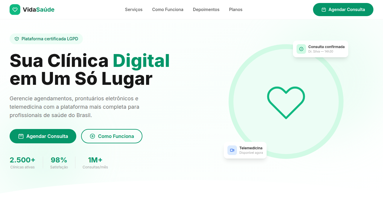
Healthtech landing, medical icons, clinic portal, healthcare green, patient journey, appointments, doctors, trust, clean, accessible, digital health. Ideal for landing pages, modern websites. AI-ready template.
Use case: Landing pages, Modern websites
Historical Context
Hospital software used to look like it was designed by someone who actively hated the people using it. Grey backgrounds, tiny serif fonts, interfaces that screamed 'you are in an institution.' For decades, clinical tools prioritized data density over human comprehension — and patients never even saw the screen. Everything lived behind a desk. Then telemedicine happened. Suddenly patients needed to navigate these systems themselves. The pandemic didn't invent the problem, but it made ignoring it impossible. Clinics scrambled to build patient portals that didn't terrify people already anxious about their health. Trust became a design variable, not just a brand value. What emerged was a specific visual language: generous whitespace, muted blues and greens, rounded corners softening clinical edges. HIPAA didn't just influence backend architecture — it shaped UI decisions too. You can't show a notification preview with PHI. You can't cache certain screens. Every tooltip, every modal, every error state carries compliance weight. The constraint bred clarity. Calm wasn't an aesthetic choice; it was the only responsible one.
When to Use
Reach for this when you're building anything patients touch directly — portals where they book appointments, view lab results, message their provider. It works for telemedicine interfaces, clinical dashboards that non-technical staff use daily, and health record viewers. If your users are stressed, possibly sick, and definitely not here to admire your UI — this is the system. Also appropriate for internal clinic tools where cognitive load reduction prevents actual medical errors.
Design Principles
- Calm over clever — reduce visual noise ruthlessly; anxious users don't need delight, they need clarity
- Trust through consistency — every interaction pattern must be predictable; surprise erodes confidence in medical contexts
- Accessibility as baseline, not afterthought — WCAG AA minimum, high contrast defaults, screen reader semantics baked into every component
- Information hierarchy that protects — sensitive data never appears without intentional user action; progressive disclosure isn't optional, it's compliance
- Warm neutrality — clinical doesn't mean cold; soft radii, breathable spacing, and human language over medical jargon in UI copy
DESIGN.md
---
version: "alpha"
name: "HealthTech Plataforma Clínica"
description: "Healthtech landing, medical icons, clinic portal, healthcare green, patient journey, appointments, doctors, trust, clean, accessible, digital health. Ideal for landing pages, modern websites. AI-ready template."
colors:
  primary: "#FFFFFF"
typography:
  h1:
    fontFamily: Inter
    fontSize: 2.5rem
    fontWeight: 700
  body-md:
    fontFamily: Inter
    fontSize: 1rem
    fontWeight: 400
rounded:
  sm: 12px
  md: 24px
  lg: 36px
components:
  button-primary:
    backgroundColor: "{colors.primary}"
    rounded: "{rounded.sm}"
    padding: 12px
---

## Overview

Healthtech landing, medical icons, clinic portal, healthcare green, patient journey, appointments, doctors, trust, clean, accessible, digital health. Ideal for landing pages, modern websites. AI-ready template. Hospital software used to look like it was designed by someone who actively hated the people using it. Grey backgrounds, tiny serif fonts, interfaces that screamed 'you are in an institution.' For decades, clinical tools prioritized data density over human comprehension — and patients never even saw the screen. Everything lived behind a desk.

Then telemedicine happened. Suddenly patients needed to navigate these systems themselves. The pandemic didn't invent the problem, but it made ignoring it impossible. Clinics scrambled to build patient portals that didn't terrify people already anxious about their health. Trust became a design variable, not just a brand value.

What emerged was a specific visual language: generous whitespace, muted blues and greens, rounded corners softening clinical edges. HIPAA didn't just influence backend architecture — it shaped UI decisions too. You can't show a notification preview with PHI. You can't cache certain screens. Every tooltip, every modal, every error state carries compliance weight. The constraint bred clarity. Calm wasn't an aesthetic choice; it was the only responsible one.

- Density: 3/10 — Airy
- Variance: 3/10 — Restrained
- Motion: 4/10 — Subtle

- **Style:** Clean, Trustworthy, Accessible
- **Keywords:** healthtech landing, medical icons, clinic portal, healthcare green, patient journey, appointments, doctors, trust, clean, accessible, digital health
- **Era:** 2020s HealthTech
- **Light/Dark:** ✓ Full / ✗ No

## Colors

- **White** (#FFFFFF) — Secondary surface


## Typography

- **Display / Hero:** Como funciona — Weight 700, tight tracking, used for headline impact
- **Accent:** Inter — Used for decorative or emphasis text
- **Body:** Como funciona — Weight 400, 16px/1.6 line-height, max 72ch per line
- **UI Labels / Captions:** Como funciona — 0.875rem, weight 500, slight letter-spacing
- **Monospace:** JetBrains Mono — Used for code, metadata, and technical values

Scale:
- Hero: clamp(2.5rem, 5vw, 4rem)
- H1: 2.25rem
- H2: 1.5rem
- Body: 1rem / 1.6
- Small: 0.875rem


## Layout

- **Grid:** CSS Grid primary. Max-width containment: 1280px centered with 1.5rem side padding.
- **Spacing rhythm:** Balanced. Base unit: 0.5rem (8px).
- **Section vertical gaps:** clamp(4rem, 8vw, 8rem).
- **Hero layout:** Split-screen (text left, visual right).
- **Feature sections:** Zig-zag alternating text+image rows. No 3-equal-columns.
- **Mobile collapse:** All multi-column layouts collapse below 768px. No horizontal overflow.
- **z-index contract:** base (0) / sticky-nav (100) / overlay (200) / modal (300) / toast (500).


## Elevation & Depth

Formas orgânicas (curvas suaves) como separadores, animação de pulso cardíaco, campos de formulário com foco destacado (borda e sombra em verde), seção 'Como funciona' em passos.

- **Physics:** Ease-out curves, 200-300ms duration. Smooth and predictable.
- **Entry animations:** Fade + translate-Y (16px → 0) over 420ms ease-out. Staggered cascades for lists: 80ms between items.
- **Hover states:** Subtle color shift + shadow adjustment over 200ms.
- **Page transitions:** Fade only (200ms).
- **Performance:** Only transform and opacity animated. No layout-triggering properties.


## Shapes

Base corner radius: 12px. See rounded tokens in front matter for the full scale.


## Components

- **Primary Button:** Rounded (12px) shape. Accent color fill. Hover: 8% darken + subtle lift shadow. Active: -1px translate tactile press. Font weight 600. No outer glows.
- **Secondary / Ghost Button:** Outline variant. 1.5px border in muted color. Text in primary color. Hover: subtle background fill.
- **Cards:** Rounded (12px) corners. Surface background. Subtle shadow (0 2px 12px rgba(0,0,0,0.06)). 1px border stroke.
- **Inputs:** Label above input. 1px border stroke. Focus ring: 2px accent color offset 2px. Error text below in semantic red. No floating labels.
- **Navigation:** Primary surface background. Active item: accent color indicator. Font weight 500 when active.
- **Skeletons:** Shimmer animation matching component dimensions. No circular spinners.
- **Empty States:** Icon-based composition with descriptive text and action button.


## Do's and Don'ts

- No emojis in UI — use icon system only (Lucide, Heroicons)
- No pure black (#000000) — use off-black or charcoal variants
- No oversaturated accent colors (saturation cap: 80%)
- No 3-column equal-width feature layouts — use zig-zag or asymmetric grid
- No `h-screen` — use `min-h-[100dvh]`
- No AI copywriting clichés: "Elevate", "Seamless", "Unleash", "Next-Gen"
- No broken external image links — use picsum.photos or inline SVG
- No generic lorem ipsum in demos

- Do Navbar + Hero
- Do Serviços/Funcionalidades
- Do Como Funciona (passos)
- Do Testimonials
- Do CTA 'Agendar consulta'
- Do Meta tags SEO
- Do Footer com LGPD
- Do Contraste alto
- Do Animações suaves
- Do Vocabulário médico acessível.


## Use Case

Landing pages, Modern websites
Technical Specs
CSS
background: #FFFFFF, color: #1A1A1A, border-radius: 12px, box-shadow: 0 2px 8px rgba(0,0,0,0.08), font-family: 'Inter, sans-serif', @keyframes heartbeat (scale pulse), organic curve separators via SVG, focus states with green border/shadow.
Variables
--health-green: emerald palette, --bg-light: #FFFFFF, --text-dark: #1A1A1A, --radius-card: 12px, --pulse-duration: 1.5s, --font-health: 'Inter, sans-serif'.
Checklist
☐ Navbar + Hero, ☐ Serviços/Funcionalidades, ☐ Como Funciona (passos), ☐ Testimonials, ☐ CTA 'Agendar consulta', ☐ Meta tags SEO, ☐ Footer com LGPD, ☐ Contraste alto, ☐ Animações suaves, ☐ Vocabulário médico acessível.
Colors
Secondary
Effects
Formas orgânicas (curvas suaves) como separadores, animação de pulso cardíaco, campos de formulário com foco destacado (borda e sombra em verde), seção 'Como funciona' em passos.
Light/Dark
✓ Full / ✗ No
AI Prompt
Act as a Senior Frontend Engineer and Expert UI Designer.
Your task is to code a complete Landing Page on the first attempt.
- Landing Page Theme: <INSERT THEME>
- Sections to add: <INSERT SECTIONS>

Generate the final code immediately following these definitions:

## Style

- **Name:** HealthTech Plataforma Clínica
- **Type:** Clean, Trustworthy, Accessible
- **Keywords:** healthtech landing, medical icons, clinic portal, healthcare green, patient journey, appointments, doctors, trust, clean, accessible, digital health
- **Era:** 2020s HealthTech
- **Light/Dark:** ✓ Full / ✗ No

## Color Palette

- **Primary:** Emerald Green (healthcare palette), Neutral Light backgrounds
- **Secondary:** White #FFFFFF, Soft Grey, Warm Neutral tones

## Visual Effects

Formas orgânicas (curvas suaves) como separadores, animação de pulso cardíaco, campos de formulário com foco destacado (borda e sombra em verde), seção 'Como funciona' em passos.

## AI Visual Direction

healthtech landing, medical icons, clinic portal, healthcare green, patient journey, appointments, doctors, trust, clean, accessible, digital health.

## CSS Technical

```css
background: #FFFFFF, color: #1A1A1A, border-radius: 12px, box-shadow: 0 2px 8px rgba(0,0,0,0.08), font-family: 'Inter, sans-serif', @keyframes heartbeat (scale pulse), organic curve separators via SVG, focus states with green border/shadow.
```

## Design System Variables

```css
--health-green: emerald palette, --bg-light: #FFFFFF, --text-dark: #1A1A1A, --radius-card: 12px, --pulse-duration: 1.5s, --font-health: 'Inter, sans-serif'.
```

## Implementation Checklist

- ☐ Navbar + Hero
- ☐ Serviços/Funcionalidades
- ☐ Como Funciona (passos)
- ☐ Testimonials
- ☐ CTA 'Agendar consulta'
- ☐ Meta tags SEO
- ☐ Footer com LGPD
- ☐ Contraste alto
- ☐ Animações suaves
- ☐ Vocabulário médico acessível.

## Execution Rules

1. Strictly follow the defined visual style.
2. Use high-quality inline SVG icons (Heroicons or Lucide style) — NEVER use emojis as icons.
3. Add `cursor-pointer` and smooth `hover` states (transition-all) on all interactive elements.
4. Required Page Structure:
   - Navbar (Logo + Links + CTA)
   - Hero Section (Impactful Headline + Subtitle + 2 buttons + 3D/Abstract visual element via CSS)
   - Features (3 cards with icons)
   - Testimonials (3 cards)
   - Pricing (3 tiers, highlight the middle one)
   - Final CTA
   - Full Footer with social links, privacy policy, terms of use, contact and SEO links.
5. All text content must be in English.
6. The visual must be CLEARLY distinct — do not create a "default Bootstrap" design. Force the use of the provided design system variables.
7. Use `<style>` tags in the head for custom classes (especially for complex backdrop-filter effects and animations) that Tailwind CDN doesn't cover.
8. Full Responsiveness: Layout must adapt perfectly to Mobile, Tablet and Desktop (vertical stack on mobile).
9. Include basic SEO, Viewport and Open Graph meta tags in `<head>`.
10. Footer must contain: Copyright 2026, Secondary navigation links and Social media icons.
11. Make the creative decisions needed to deliver the complete, functional result now.
Related
Last synced: 4/1/2026