Glitch UI Dystopian Terminal
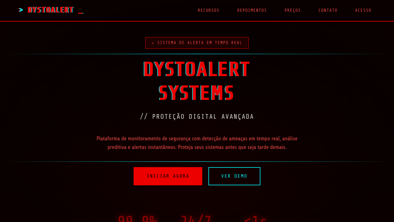
Glitch ui landing page, dystopian terminal, red alert style, digital interference, chaotic design, scanlines, warning aesthetic. Ideal for landing pages, modern websites. AI-ready template.
Use case: Landing pages, Modern websites
Historical Context
The glitch aesthetic didn't emerge from design studios. It crawled out of broken CRT monitors, corrupted VHS tapes, and the visual noise of failing hardware. In the late 1990s, artists like Jodi.org and Rosa Menkman began treating digital errors not as flaws but as raw material — exposing the fragility beneath polished interfaces. The dystopian terminal takes this further, channeling the paranoid energy of early hacker culture and Cold War-era command lines into something deliberately hostile and beautiful. What makes this style endure is its honesty. Every scanline, every chromatic aberration, every flickering cursor says: this system is alive, unstable, possibly watching you. It owes as much to Ridley Scott's set design and William Gibson's prose as it does to actual Unix terminals. The green-on-black wasn't chosen for readability — it was chosen because phosphor burns felt dangerous. Today the glitch-terminal aesthetic sits at the intersection of nostalgia and anxiety. We romanticize the command line precisely because GUIs made computing safe. This style rejects that safety.
When to Use
Deploy when your product needs to feel dangerous, technical, or deliberately uncomfortable. Cybersecurity dashboards that should communicate threat. Hacker games where atmosphere matters more than usability. Experimental art installations rejecting corporate polish. CTF platforms. Penetration testing tools. Any context where trust in the system is intentionally undermined — where the interface itself becomes unreliable narrator. Not for onboarding flows. Not for e-commerce. This is a mood, not a utility.
Design Principles
- Entropy is the feature — introduce controlled randomness through scanlines, pixel displacement, and timing jitter that never repeats identically
- Monospace is non-negotiable — proportional fonts destroy the terminal illusion instantly; let the grid dictate every spatial decision
- Color through damage — chromatic aberration, RGB channel splitting, and phosphor decay replace traditional palette thinking; color is a byproduct of signal failure
- Motion implies instability — nothing should feel settled; subtle flickers, cursor blinks at irregular intervals, and text that renders character-by-character maintain perpetual unease
- Layered noise over flat surfaces — CRT curvature, scan lines, static grain, and vignetting create depth without traditional elevation or shadow systems
DESIGN.md
---
version: "alpha"
name: "Glitch UI Dystopian Terminal"
description: "Glitch ui landing page, dystopian terminal, red alert style, digital interference, chaotic design, scanlines, warning aesthetic. Ideal for landing pages, modern websites. AI-ready template."
colors:
  primary: "#050000"
  secondary: "#FF5050"
  tertiary: "#FF0000"
  neutral: "#E0E0E0"
  surface: "#00FFFF"
  accent: "#330000"
typography:
  h1:
    fontFamily: Share Tech
    fontSize: 2.5rem
    fontWeight: 700
  body-md:
    fontFamily: Share Tech
    fontSize: 1rem
    fontWeight: 400
components:
  button-primary:
    backgroundColor: "{colors.primary}"
    textColor: "{colors.neutral}"
    padding: 12px
---

## Overview

Glitch ui landing page, dystopian terminal, red alert style, digital interference, chaotic design, scanlines, warning aesthetic. Ideal for landing pages, modern websites. AI-ready template. The glitch aesthetic didn't emerge from design studios. It crawled out of broken CRT monitors, corrupted VHS tapes, and the visual noise of failing hardware. In the late 1990s, artists like Jodi.org and Rosa Menkman began treating digital errors not as flaws but as raw material — exposing the fragility beneath polished interfaces. The dystopian terminal takes this further, channeling the paranoid energy of early hacker culture and Cold War-era command lines into something deliberately hostile and beautiful.

What makes this style endure is its honesty. Every scanline, every chromatic aberration, every flickering cursor says: this system is alive, unstable, possibly watching you. It owes as much to Ridley Scott's set design and William Gibson's prose as it does to actual Unix terminals. The green-on-black wasn't chosen for readability — it was chosen because phosphor burns felt dangerous.

Today the glitch-terminal aesthetic sits at the intersection of nostalgia and anxiety. We romanticize the command line precisely because GUIs made computing safe. This style rejects that safety.

- Density: 8/10 — Dense
- Variance: 8/10 — Expressive
- Motion: 4/10 — Subtle

- **Style:** Urgent, Computational, Retro-Futuristic
- **Keywords:** glitch, dystopian, terminal, warning, red, dark, chaos, digital, error
- **Era:** Dystopian Future
- **Light/Dark:** ✗ No / ✓ Full

## Colors

- **Background** (#050000) — Primary background surface
- **Text** (#FF5050) — Primary text color
- **Accent** (#FF0000) — Primary accent, CTAs and interactive elements
- **Static White** (#E0E0E0) — Secondary surface
- **Glitch Cyan** (#00FFFF) — Secondary accent
- **Dark Red** (#330000) — Deep contrast surface


## Typography

- **Display / Hero:** Share Tech — Weight 700, tight tracking, used for headline impact
- **Body:** Share Tech — Weight 400, 16px/1.6 line-height, max 72ch per line
- **UI Labels / Captions:** Share Tech — 0.875rem, weight 500, slight letter-spacing
- **Monospace:** JetBrains Mono — Used for code, metadata, and technical values

Scale:
- Hero: clamp(2.5rem, 5vw, 4rem)
- H1: 2.25rem
- H2: 1.5rem
- Body: 1rem / 1.6
- Small: 0.875rem


## Layout

- **Grid:** CSS Grid primary. Max-width containment: 1280px centered with 1.5rem side padding.
- **Spacing rhythm:** Balanced. Base unit: 0.5rem (8px).
- **Section vertical gaps:** clamp(4rem, 8vw, 8rem).
- **Hero layout:** Asymmetric composition.
- **Feature sections:** Asymmetric grid with varied card sizes. No 3-equal-columns.
- **Mobile collapse:** All multi-column layouts collapse below 768px. No horizontal overflow.
- **z-index contract:** base (0) / sticky-nav (100) / overlay (200) / modal (300) / toast (500).


## Elevation & Depth

Digital HUD layout, glitch artifacts, horizontal interference lines, wireframe iconography, CRT monitor scanlines, screen burn-in.

- **Physics:** Ease-out curves, 200-300ms duration. Smooth and predictable.
- **Entry animations:** Fade + translate-Y (16px → 0) over 420ms ease-out. Staggered cascades for lists: 80ms between items.
- **Hover states:** Subtle color shift + shadow adjustment over 200ms.
- **Page transitions:** Fade only (200ms).
- **Performance:** Only transform and opacity animated. No layout-triggering properties.


## Shapes

Base corner radius: 8px. See rounded tokens in front matter for the full scale.


## Components

- **Primary Button:** Subtly rounded (0.5rem) shape. Accent color fill. Hover: 8% darken + subtle lift shadow. Active: -1px translate tactile press. Font weight 600. No outer glows.
- **Secondary / Ghost Button:** Outline variant. 1.5px border in muted color. Text in primary color. Hover: subtle background fill.
- **Cards:** Subtly rounded (0.5rem) corners. Surface background. Subtle shadow (0 2px 12px rgba(0,0,0,0.06)). 1px border stroke.
- **Inputs:** Label above input. 1px border stroke. Focus ring: 2px accent color offset 2px. Error text below in semantic red. No floating labels.
- **Navigation:** Primary surface background. Active item: accent color indicator. Font weight 500 when active.
- **Skeletons:** Shimmer animation matching component dimensions. No circular spinners.
- **Empty States:** Icon-based composition with descriptive text and action button.


## Do's and Don'ts

- No emojis in UI — use icon system only (Lucide, Heroicons)
- No pure white (#FFFFFF) backgrounds — use off-white or dark surfaces
- No oversaturated accent colors (saturation cap: 80%)
- No 3-column equal-width feature layouts — use zig-zag or asymmetric grid
- No `h-screen` — use `min-h-[100dvh]`
- No AI copywriting clichés: "Elevate", "Seamless", "Unleash", "Next-Gen"
- No broken external image links — use picsum.photos or inline SVG
- No generic lorem ipsum in demos

- Do Black background
- Do Red dominant color scheme
- Do Glitch/Distortion animations
- Do Technical/HUD elements
- Do Monospace or Tech fonts


## Use Case

Landing pages, Modern websites
Technical Specs
CSS
background-color: #050000; color: #FF5050; font-family: 'Share Tech', sans-serif; animation: glitch 1s linear infinite; text-shadow: 2px 0 red, -2px 0 cyan;
Variables
--bg-black: #050000, --alert-red: #FF0000, --text-error: #FF5050, --glitch-cyan: #00FFFF, --font-tech: 'Share Tech', sans-serif
Checklist
☐ Black background, ☐ Red dominant color scheme, ☐ Glitch/Distortion animations, ☐ Technical/HUD elements, ☐ Monospace or Tech fonts
Colors
Primary
Secondary
Effects
Digital HUD layout, glitch artifacts, horizontal interference lines, wireframe iconography, CRT monitor scanlines, screen burn-in.
Light/Dark
✗ No / ✓ Full
AI Prompt
Act as a Senior Frontend Engineer and Expert UI Designer.
Your task is to code a complete Landing Page on the first attempt.
- Landing Page Theme: <INSERT THEME>
- Sections to add: <INSERT SECTIONS>

Generate the final code immediately following these definitions:

## Style

- **Name:** Glitch UI Dystopian Terminal
- **Type:** Urgent, Computational, Retro-Futuristic
- **Keywords:** glitch, dystopian, terminal, warning, red, dark, chaos, digital, error
- **Era:** Dystopian Future
- **Light/Dark:** ✗ No / ✓ Full

## Color Palette

- **Primary:** Background #050000, Text #FF5050, Accent #FF0000
- **Secondary:** Static White #E0E0E0, Glitch Cyan #00FFFF, Dark Red #330000

## Visual Effects

Digital HUD layout, glitch artifacts, horizontal interference lines, wireframe iconography, CRT monitor scanlines, screen burn-in.

## AI Visual Direction

glitch ui landing page, dystopian terminal, red alert style, digital interference, chaotic design, scanlines, warning aesthetic.

## CSS Technical

```css
background-color: #050000; color: #FF5050; font-family: 'Share Tech', sans-serif; animation: glitch 1s linear infinite; text-shadow: 2px 0 red, -2px 0 cyan;
```

## Design System Variables

```css
--bg-black: #050000, --alert-red: #FF0000, --text-error: #FF5050, --glitch-cyan: #00FFFF, --font-tech: 'Share Tech', sans-serif
```

## Implementation Checklist

- ☐ Black background
- ☐ Red dominant color scheme
- ☐ Glitch/Distortion animations
- ☐ Technical/HUD elements
- ☐ Monospace or Tech fonts

## Execution Rules

1. Strictly follow the defined visual style.
2. Use high-quality inline SVG icons (Heroicons or Lucide style) — NEVER use emojis as icons.
3. Add `cursor-pointer` and smooth `hover` states (transition-all) on all interactive elements.
4. Required Page Structure:
   - Navbar (Logo + Links + CTA)
   - Hero Section (Impactful Headline + Subtitle + 2 buttons + 3D/Abstract visual element via CSS)
   - Features (3 cards with icons)
   - Testimonials (3 cards)
   - Pricing (3 tiers, highlight the middle one)
   - Final CTA
   - Full Footer with social links, privacy policy, terms of use, contact and SEO links.
5. All text content must be in English.
6. The visual must be CLEARLY distinct — do not create a "default Bootstrap" design. Force the use of the provided design system variables.
7. Use `<style>` tags in the head for custom classes (especially for complex backdrop-filter effects and animations) that Tailwind CDN doesn't cover.
8. Full Responsiveness: Layout must adapt perfectly to Mobile, Tablet and Desktop (vertical stack on mobile).
9. Include basic SEO, Viewport and Open Graph meta tags in `<head>`.
10. Footer must contain: Copyright 2026, Secondary navigation links and Social media icons.
11. Make the creative decisions needed to deliver the complete, functional result now.
Related
Last synced: 4/1/2026