FinTech Plataforma Financeira
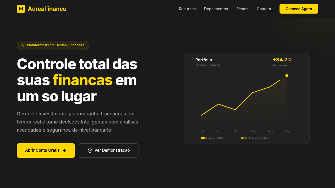
Fintech landing, finance dashboard, charts, security, gold and dark palette, premium, trust, transactions, cards, modern UI. Ideal for landing pages, modern websites. AI-ready template.
Use case: Landing pages, Modern websites
Historical Context
Before 2015, banking interfaces were hostile territory. Dense tables, cryptic transaction codes, layouts that screamed "we built this for mainframes and never looked back." Then Revolut, N26, and Nubank flipped the script. They understood something incumbents refused to see: money is emotional, and the interface should respect that. The neobank revolution wasn't just about mobile-first. It was about treating the card as product — a physical artifact that extended the brand into wallets and Instagram posts. Nubank's purple card became a cultural symbol in Brazil. N26's transparent card whispered minimalism. Revolut's metal cards said "I'm in on this." The visual metaphor worked because it collapsed the distance between brand and daily life. What followed was a design language shift across the entire finance vertical. Dark dashboards with glowing accent colors. Smooth transaction feeds that felt like social timelines. Charts that actually invited exploration instead of punishing curiosity. Fintech made finance feel approachable — not by dumbing it down, but by finally designing it for humans who carry phones, not briefcases.
When to Use
Reach for this theme when you're building anything that touches money and needs to feel trustworthy without feeling stiff. Neobank onboarding flows, payment confirmations, investment dashboards, transaction histories, spending breakdowns. It works for consumer fintech apps that compete on experience, and for B2B financial platforms that need to signal modernity to enterprise buyers still stuck on legacy interfaces. If your product shows balances, moves funds, or visualizes financial data — start here.
Design Principles
- Trust through clarity — every number, every status, every action must be immediately parseable. Ambiguity in finance isn't a UX problem, it's an anxiety trigger.
- Data density without overwhelm — financial interfaces carry more information per square centimeter than almost any other vertical. Use hierarchy, whitespace, and progressive disclosure ruthlessly.
- Motion as confirmation — subtle animations on transactions, balance updates, and transfers aren't decoration. They're receipts. They tell users "yes, that happened."
- Color with intent — green for gains, red for losses, sure. But go deeper. Use color temperature to separate accounts, muted tones for historical data, vibrant accents only for actionable moments.
- The card metaphor scales — rounded rectangles with subtle shadows aren't just aesthetic. They map to the mental model of cards, accounts, and containers that users already carry in their pockets.
DESIGN.md
---
version: "alpha"
name: "FinTech Plataforma Financeira"
description: "Fintech landing, finance dashboard, charts, security, gold and dark palette, premium, trust, transactions, cards, modern UI. Ideal for landing pages, modern websites. AI-ready template."
colors:
  primary: "#FFD700"
  secondary: "#1A1A1A"
  tertiary: "#000000"
  neutral: "#FFFFFF"
  surface: "#C9A84C"
  accent: "#333333"
typography:
  h1:
    fontFamily: Inter
    fontSize: 2.5rem
    fontWeight: 700
  body-md:
    fontFamily: Inter
    fontSize: 1rem
    fontWeight: 400
rounded:
  sm: 8px
  md: 16px
  lg: 24px
components:
  button-primary:
    backgroundColor: "{colors.primary}"
    textColor: "{colors.neutral}"
    rounded: "{rounded.sm}"
    padding: 12px
---

## Overview

Fintech landing, finance dashboard, charts, security, gold and dark palette, premium, trust, transactions, cards, modern UI. Ideal for landing pages, modern websites. AI-ready template. Before 2015, banking interfaces were hostile territory. Dense tables, cryptic transaction codes, layouts that screamed "we built this for mainframes and never looked back." Then Revolut, N26, and Nubank flipped the script. They understood something incumbents refused to see: money is emotional, and the interface should respect that.

The neobank revolution wasn't just about mobile-first. It was about treating the card as product — a physical artifact that extended the brand into wallets and Instagram posts. Nubank's purple card became a cultural symbol in Brazil. N26's transparent card whispered minimalism. Revolut's metal cards said "I'm in on this." The visual metaphor worked because it collapsed the distance between brand and daily life.

What followed was a design language shift across the entire finance vertical. Dark dashboards with glowing accent colors. Smooth transaction feeds that felt like social timelines. Charts that actually invited exploration instead of punishing curiosity. Fintech made finance feel approachable — not by dumbing it down, but by finally designing it for humans who carry phones, not briefcases.

- Density: 8/10 — Dense
- Variance: 4/10 — Moderate
- Motion: 4/10 — Subtle

- **Style:** Premium, Dark, Trustworthy
- **Keywords:** fintech landing, finance dashboard, charts, security, gold and dark palette, premium, trust, transactions, cards, modern UI
- **Era:** 2020s FinTech
- **Light/Dark:** ✗ No / ✓ Full

## Colors

- **Gold** (#FFD700) — Premium accent, decorative highlights
- **Dark Grey** (#1A1A1A) — Dark surface, primary background
- **Black** (#000000) — Dark surface, primary background
- **White** (#FFFFFF) — Secondary surface
- **Soft Gold** (#C9A84C) — Premium accent, decorative highlights
- **Charcoal** (#333333) — Deep contrast surface


## Typography

- **Display / Hero:** Inter — Weight 700, tight tracking, used for headline impact
- **Body:** Inter — Weight 400, 16px/1.6 line-height, max 72ch per line
- **UI Labels / Captions:** Inter — 0.875rem, weight 500, slight letter-spacing
- **Monospace:** JetBrains Mono — Used for code, metadata, and technical values

Scale:
- Hero: clamp(2.5rem, 5vw, 4rem)
- H1: 2.25rem
- H2: 1.5rem
- Body: 1rem / 1.6
- Small: 0.875rem


## Layout

- **Grid:** CSS Grid primary. Max-width containment: 1280px centered with 1.5rem side padding.
- **Spacing rhythm:** Balanced. Base unit: 0.5rem (8px).
- **Section vertical gaps:** clamp(4rem, 8vw, 8rem).
- **Hero layout:** Split-screen (text left, visual right).
- **Feature sections:** Zig-zag alternating text+image rows. No 3-equal-columns.
- **Mobile collapse:** All multi-column layouts collapse below 768px. No horizontal overflow.
- **z-index contract:** base (0) / sticky-nav (100) / overlay (200) / modal (300) / toast (500).


## Elevation & Depth

Fundo escuro com detalhes em dourado, gráficos minimalistas em SVG, hover com glow sutil (box-shadow), animações de números incrementais, cards com sombra e borda suave.

- **Physics:** Ease-out curves, 200-300ms duration. Smooth and predictable.
- **Entry animations:** Fade + translate-Y (16px → 0) over 420ms ease-out. Staggered cascades for lists: 80ms between items.
- **Hover states:** Subtle color shift + shadow adjustment over 200ms.
- **Page transitions:** Fade only (200ms).
- **Performance:** Only transform and opacity animated. No layout-triggering properties.


## Shapes

Base corner radius: 8px. See rounded tokens in front matter for the full scale.


## Components

- **Primary Button:** Rounded (8px) shape. Accent color fill. Hover: 8% darken + subtle lift shadow. Active: -1px translate tactile press. Font weight 600. No outer glows.
- **Secondary / Ghost Button:** Outline variant. 1.5px border in muted color. Text in primary color. Hover: subtle background fill.
- **Cards:** Rounded (8px) corners. Surface background. Subtle shadow (0 2px 12px rgba(0,0,0,0.06)). 1px border stroke.
- **Inputs:** Label above input. 1px border stroke. Focus ring: 2px accent color offset 2px. Error text below in semantic red. No floating labels.
- **Navigation:** Primary surface background. Active item: accent color indicator. Font weight 500 when active.
- **Skeletons:** Shimmer animation matching component dimensions. No circular spinners.
- **Empty States:** Icon-based composition with descriptive text and action button.


## Do's and Don'ts

- No emojis in UI — use icon system only (Lucide, Heroicons)
- No pure white (#FFFFFF) backgrounds — use off-white or dark surfaces
- No oversaturated accent colors (saturation cap: 80%)
- No 3-column equal-width feature layouts — use zig-zag or asymmetric grid
- No `h-screen` — use `min-h-[100dvh]`
- No AI copywriting clichés: "Elevate", "Seamless", "Unleash", "Next-Gen"
- No broken external image links — use picsum.photos or inline SVG
- No generic lorem ipsum in demos

- Do Navbar + Hero com números/benefícios
- Do Metrics + Security
- Do Testimonials + Pricing
- Do CTA 'Criar conta'
- Do Meta tags SEO
- Do Contraste texto/fundo escuro
- Do Animações de números
- Do Ícones SVG financeiros.


## Use Case

Landing pages, Modern websites
Technical Specs
CSS
background: #1A1A1A, color: #FFFFFF, box-shadow: 0 0 15px rgba(255,215,0,0.2), border-radius: 8px, font-family: 'Inter, sans-serif', @keyframes counter-increment, SVG chart elements, gold accent borders.
Variables
--gold: #FFD700, --dark-bg: #1A1A1A, --black: #000000, --white: #FFFFFF, --glow-gold: rgba(255,215,0,0.2), --font-fintech: 'Inter, sans-serif'.
Checklist
☐ Navbar + Hero com números/benefícios, ☐ Metrics + Security, ☐ Testimonials + Pricing, ☐ CTA 'Criar conta', ☐ Meta tags SEO, ☐ Contraste texto/fundo escuro, ☐ Animações de números, ☐ Ícones SVG financeiros.
Colors
Primary
Secondary
Effects
Fundo escuro com detalhes em dourado, gráficos minimalistas em SVG, hover com glow sutil (box-shadow), animações de números incrementais, cards com sombra e borda suave.
Light/Dark
✗ No / ✓ Full
AI Prompt
Act as a Senior Frontend Engineer and Expert UI Designer.
Your task is to code a complete Landing Page on the first attempt.
- Landing Page Theme: <INSERT THEME>
- Sections to add: <INSERT SECTIONS>

Generate the final code immediately following these definitions:

## Style

- **Name:** FinTech Plataforma Financeira
- **Type:** Premium, Dark, Trustworthy
- **Keywords:** fintech landing, finance dashboard, charts, security, gold and dark palette, premium, trust, transactions, cards, modern UI
- **Era:** 2020s FinTech
- **Light/Dark:** ✗ No / ✓ Full

## Color Palette

- **Primary:** Gold #FFD700, Dark Grey #1A1A1A, Black #000000
- **Secondary:** White #FFFFFF, Soft Gold #C9A84C, Charcoal #333333

## Visual Effects

Fundo escuro com detalhes em dourado, gráficos minimalistas em SVG, hover com glow sutil (box-shadow), animações de números incrementais, cards com sombra e borda suave.

## AI Visual Direction

fintech landing, finance dashboard, charts, security, gold and dark palette, premium, trust, transactions, cards, modern UI.

## CSS Technical

```css
background: #1A1A1A, color: #FFFFFF, box-shadow: 0 0 15px rgba(255,215,0,0.2), border-radius: 8px, font-family: 'Inter, sans-serif', @keyframes counter-increment, SVG chart elements, gold accent borders.
```

## Design System Variables

```css
--gold: #FFD700, --dark-bg: #1A1A1A, --black: #000000, --white: #FFFFFF, --glow-gold: rgba(255,215,0,0.2), --font-fintech: 'Inter, sans-serif'.
```

## Implementation Checklist

- ☐ Navbar + Hero com números/benefícios
- ☐ Metrics + Security
- ☐ Testimonials + Pricing
- ☐ CTA 'Criar conta'
- ☐ Meta tags SEO
- ☐ Contraste texto/fundo escuro
- ☐ Animações de números
- ☐ Ícones SVG financeiros.

## Execution Rules

1. Strictly follow the defined visual style.
2. Use high-quality inline SVG icons (Heroicons or Lucide style) — NEVER use emojis as icons.
3. Add `cursor-pointer` and smooth `hover` states (transition-all) on all interactive elements.
4. Required Page Structure:
   - Navbar (Logo + Links + CTA)
   - Hero Section (Impactful Headline + Subtitle + 2 buttons + 3D/Abstract visual element via CSS)
   - Features (3 cards with icons)
   - Testimonials (3 cards)
   - Pricing (3 tiers, highlight the middle one)
   - Final CTA
   - Full Footer with social links, privacy policy, terms of use, contact and SEO links.
5. All text content must be in English.
6. The visual must be CLEARLY distinct — do not create a "default Bootstrap" design. Force the use of the provided design system variables.
7. Use `<style>` tags in the head for custom classes (especially for complex backdrop-filter effects and animations) that Tailwind CDN doesn't cover.
8. Full Responsiveness: Layout must adapt perfectly to Mobile, Tablet and Desktop (vertical stack on mobile).
9. Include basic SEO, Viewport and Open Graph meta tags in `<head>`.
10. Footer must contain: Copyright 2026, Secondary navigation links and Social media icons.
11. Make the creative decisions needed to deliver the complete, functional result now.
Related
Last synced: 4/1/2026