Expo Luminous Developer
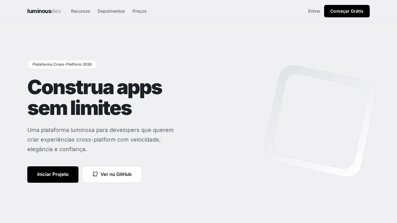
Design an Expo-inspired luminous developer landing page. Ideal for plataformas cross-platform, react native, sdks mobile, ferramentas de build. AI-ready template.
Use case: Platforms cross-platform, React Native, SDKs mobile, Tools de build
Historical Context
Expo emerged as the antidote to React Native's notoriously painful setup process. What started as a managed workflow for beginners evolved into a legitimate production toolchain that companies like Shopify and Discord rely on daily. The shift happened around 2020-2021 when Expo stopped being "training wheels" and became the recommended way to build React Native apps — period. The "Luminous Developer" aesthetic captures a specific moment in dev tooling design: the post-dark-mode era where tools started competing on visual identity, not just functionality. Think VS Code themes, Vercel's design language, Linear's interface. Developer tools finally admitted that aesthetics matter, that a beautiful CLI output or a well-designed error screen actually improves productivity. This futuristic tech direction leans into luminous gradients, glowing UI elements, and high-contrast dark interfaces that signal "cutting edge" without falling into cyberpunk cliché. It's the visual language of tools that respect developers as designers of their own workflows.
When to Use
Deploy this system when building developer-facing products in the React Native ecosystem — documentation sites, CLI interfaces, dashboard panels, or developer portals. It works particularly well for tools that need to communicate technical sophistication while remaining approachable. Ideal for startups positioning themselves as modern alternatives to legacy mobile toolchains, or for internal tools where developer experience directly impacts shipping velocity.
Design Principles
- Luminous accents on dark substrates — glowing elements should feel like they emit light, not like colored rectangles on black backgrounds
- Information density over decoration — developers scan, they don't browse. Every pixel of chrome you add is a pixel of signal you remove
- Progressive disclosure of complexity — surface the simple path, reveal the advanced controls contextually. Mirror how Expo itself layers abstraction
- Monospace as structural element, not nostalgic decoration — use it where alignment and scanning matter, proportional everywhere else
- Motion as state communication — transitions should telegraph what changed and why, never animate for atmosphere alone
DESIGN.md
---
version: "alpha"
name: "Expo Luminous Developer"
description: "Design an Expo-inspired luminous developer landing page. Ideal for plataformas cross-platform, react native, sdks mobile, ferramentas de build. AI-ready template."
colors:
  primary: "#f0f0f3"
  secondary: "#000000"
  tertiary: "#1c2024"
  neutral: "#ffffff"
  surface: "#60646c"
  accent: "#b0b4ba"
typography:
  h1:
    fontFamily: Inter
    fontSize: 2.5rem
    fontWeight: 700
  body-md:
    fontFamily: Inter
    fontSize: 1rem
    fontWeight: 400
rounded:
  sm: 6px
  md: 12px
  lg: 18px
components:
  button-primary:
    backgroundColor: "{colors.primary}"
    textColor: "{colors.neutral}"
    rounded: "{rounded.sm}"
    padding: 12px
---

## Overview

Design an Expo-inspired luminous developer landing page. Ideal for plataformas cross-platform, react native, sdks mobile, ferramentas de build. AI-ready template. Expo emerged as the antidote to React Native's notoriously painful setup process. What started as a managed workflow for beginners evolved into a legitimate production toolchain that companies like Shopify and Discord rely on daily. The shift happened around 2020-2021 when Expo stopped being "training wheels" and became the recommended way to build React Native apps — period.

The "Luminous Developer" aesthetic captures a specific moment in dev tooling design: the post-dark-mode era where tools started competing on visual identity, not just functionality. Think VS Code themes, Vercel's design language, Linear's interface. Developer tools finally admitted that aesthetics matter, that a beautiful CLI output or a well-designed error screen actually improves productivity.

This futuristic tech direction leans into luminous gradients, glowing UI elements, and high-contrast dark interfaces that signal "cutting edge" without falling into cyberpunk cliché. It's the visual language of tools that respect developers as designers of their own workflows.

- Density: 5/10 — Balanced
- Variance: 4/10 — Moderate
- Motion: 4/10 — Subtle

- **Style:** Luminous Canvas, Pill Geometry, Monochromatic, Gallery Spacing, Inter Full Range
- **Keywords:** expo, luminous, developer, pill geometry, monochromatic, gallery spacing, Inter, cloud gray, whisper shadows, cross-platform
- **Era:** 2024-2026 Cross-Platform Developer
- **Light/Dark:** ✓ Full / ✗ Not Recommended

## Colors

- **Cloud Gray** (#f0f0f3) — Secondary text, borders, muted elements
- **Preto** (#000000) — Dark surface, primary background
- **Quase Preto** (#1c2024) — Dark surface, primary background
- **Branco** (#ffffff) — Light surface, card backgrounds
- **Slate Gray** (#60646c) — Secondary text, borders, muted elements
- **Silver** (#b0b4ba) — Extended palette, decorative use
- **Cobalt Link** (#0d74ce) — Primary text color
- **Borda Lavanda** (#e0e1e6) — Extended palette, decorative use


## Typography

- **Display / Hero:** Inter — Weight 700, tight tracking, used for headline impact
- **Body:** Inter — Weight 400, 16px/1.6 line-height, max 72ch per line
- **UI Labels / Captions:** Inter — 0.875rem, weight 500, slight letter-spacing
- **Monospace:** JetBrains Mono — Used for code, metadata, and technical values

Scale:
- Hero: clamp(2.5rem, 5vw, 4rem)
- H1: 2.25rem
- H2: 1.5rem
- Body: 1rem / 1.6
- Small: 0.875rem


## Layout

- **Grid:** CSS Grid primary. Max-width containment: 1280px centered with 1.5rem side padding.
- **Spacing rhythm:** Balanced. Base unit: 0.5rem (8px).
- **Section vertical gaps:** clamp(4rem, 8vw, 8rem).
- **Hero layout:** Split-screen (text left, visual right).
- **Feature sections:** Zig-zag alternating text+image rows. No 3-equal-columns.
- **Mobile collapse:** All multi-column layouts collapse below 768px. No horizontal overflow.
- **z-index contract:** base (0) / sticky-nav (100) / overlay (200) / modal (300) / toast (500).


## Elevation & Depth

Canvas luminoso cool-white (#f0f0f3) com espaçamento vertical de galeria. Estritamente monocromático — cor apenas em screenshots de produto. Geometria pill em todo lugar (24px-9999px). Headlines massivas (64px) com letter-spacing extremo negativo (-1.6px a -3px). Inter como única fonte, pesos 400-900. Sombras whisper-soft que mal levantam elementos. Cards brancos flutuando sobre Cloud Gray.

- **Physics:** Ease-out curves, 200-300ms duration. Smooth and predictable.
- **Entry animations:** Fade + translate-Y (16px → 0) over 420ms ease-out. Staggered cascades for lists: 80ms between items.
- **Hover states:** Subtle color shift + shadow adjustment over 200ms.
- **Page transitions:** Fade only (200ms).
- **Performance:** Only transform and opacity animated. No layout-triggering properties.


## Shapes

Base corner radius: 6px. See rounded tokens in front matter for the full scale.


## Components

- **Primary Button:** Pill-shaped (9999px) shape. Accent color fill. Hover: 8% darken + subtle lift shadow. Active: -1px translate tactile press. Font weight 600. No outer glows.
- **Secondary / Ghost Button:** Outline variant. 1.5px border in muted color. Text in primary color. Hover: subtle background fill.
- **Cards:** Pill-shaped (9999px) corners. Surface background. Subtle shadow (0 2px 12px rgba(0,0,0,0.06)). 1px border stroke.
- **Inputs:** Label above input. 1px border stroke. Focus ring: 2px accent color offset 2px. Error text below in semantic red. No floating labels.
- **Navigation:** Primary surface background. Active item: accent color indicator. Font weight 500 when active.
- **Skeletons:** Shimmer animation matching component dimensions. No circular spinners.
- **Empty States:** Icon-based composition with descriptive text and action button.


## Do's and Don'ts

- No emojis in UI — use icon system only (Lucide, Heroicons)
- No pure black (#000000) — use off-black or charcoal variants
- No oversaturated accent colors (saturation cap: 80%)
- No 3-column equal-width feature layouts — use zig-zag or asymmetric grid
- No `h-screen` — use `min-h-[100dvh]`
- No AI copywriting clichés: "Elevate", "Seamless", "Unleash", "Next-Gen"
- No broken external image links — use picsum.photos or inline SVG
- No generic lorem ipsum in demos

- Do Canvas cool-white #f0f0f3
- Do Monocromático — cor só em screenshots
- Do Pill geometry 24px-9999px
- Do Headlines 64px tracking negativo extremo
- Do Inter 400-900
- Do Sombras whisper
- Do Espaçamento de galeria 96px+
- Do Responsivo


## Use Case

Platforms cross-platform, React Native, SDKs mobile, Tools de build
Technical Specs
CSS
background: #f0f0f3; color: #1c2024; accent: #0d74ce; border: 1px solid #e0e1e6; box-shadow: rgba(0,0,0,0.08) 0px 3px 6px; font-family: 'Inter', sans-serif; font-weight: 700-900 display; letter-spacing: -3px at 64px; border-radius: 6px buttons, 24px containers, 9999px pills
Variables
--bg: #f0f0f3; --card: #ffffff; --text: #1c2024; --text-secondary: #60646c; --text-muted: #b0b4ba; --link: #0d74ce; --border: #e0e1e6; --radius-btn: 6px; --radius-container: 24px; --radius-pill: 9999px
Checklist
☐ Canvas cool-white #f0f0f3, ☐ Monocromático — cor só em screenshots, ☐ Pill geometry 24px-9999px, ☐ Headlines 64px tracking negativo extremo, ☐ Inter 400-900, ☐ Sombras whisper, ☐ Espaçamento de galeria 96px+, ☐ Responsivo
Colors
Primary
Secondary
Effects
Canvas luminoso cool-white (#f0f0f3) com espaçamento vertical de galeria. Estritamente monocromático — cor apenas em screenshots de produto. Geometria pill em todo lugar (24px-9999px). Headlines massivas (64px) com letter-spacing extremo negativo (-1.6px a -3px). Inter como única fonte, pesos 400-900. Sombras whisper-soft que mal levantam elementos. Cards brancos flutuando sobre Cloud Gray.
Light/Dark
✓ Full / ✗ Not Recommended
AI Prompt
Act as a Senior Frontend Engineer and Expert UI Designer.
Your task is to code a complete Landing Page on the first attempt.
- Landing Page Theme: <INSERT THEME>
- Sections to add: <INSERT SECTIONS>

Generate the final code immediately following these definitions:

## Style

- **Name:** Expo Luminous Developer
- **Type:** Luminous Canvas, Pill Geometry, Monochromatic, Gallery Spacing, Inter Full Range
- **Keywords:** expo, luminous, developer, pill geometry, monochromatic, gallery spacing, Inter, cloud gray, whisper shadows, cross-platform
- **Era:** 2024-2026 Cross-Platform Developer
- **Light/Dark:** ✓ Full / ✗ Not Recommended

## Color Palette

- **Primary:** Cloud Gray #f0f0f3, Preto #000000, Quase Preto #1c2024, Branco #ffffff
- **Secondary:** Slate Gray #60646c, Silver #b0b4ba, Cobalt Link #0d74ce, Borda Lavanda #e0e1e6

## Visual Effects

Canvas luminoso cool-white (#f0f0f3) com espaçamento vertical de galeria. Estritamente monocromático — cor apenas em screenshots de produto. Geometria pill em todo lugar (24px-9999px). Headlines massivas (64px) com letter-spacing extremo negativo (-1.6px a -3px). Inter como única fonte, pesos 400-900. Sombras whisper-soft que mal levantam elementos. Cards brancos flutuando sobre Cloud Gray.

## AI Visual Direction

Design an Expo-inspired luminous developer landing page. Cool-white canvas (#f0f0f3) with gallery-like vertical spacing (96px+). Strictly monochromatic — product screenshots provide the only color. Pill-shaped geometry everywhere (24px-9999px radius). Massive display headlines at 64px with extreme negative letter-spacing (-1.6px to -3px). Inter as sole typeface at weights 400-900. Whisper-soft shadows. White cards floating on Cloud Gray background. Black (#000000) for headlines and primary CTAs.

## CSS Technical

```css
background: #f0f0f3; color: #1c2024; accent: #0d74ce; border: 1px solid #e0e1e6; box-shadow: rgba(0,0,0,0.08) 0px 3px 6px; font-family: 'Inter', sans-serif; font-weight: 700-900 display; letter-spacing: -3px at 64px; border-radius: 6px buttons, 24px containers, 9999px pills
```

## Design System Variables

```css
--bg: #f0f0f3; --card: #ffffff; --text: #1c2024; --text-secondary: #60646c; --text-muted: #b0b4ba; --link: #0d74ce; --border: #e0e1e6; --radius-btn: 6px; --radius-container: 24px; --radius-pill: 9999px
```

## Implementation Checklist

- ☐ Canvas cool-white #f0f0f3
- ☐ Monocromático — cor só em screenshots
- ☐ Pill geometry 24px-9999px
- ☐ Headlines 64px tracking negativo extremo
- ☐ Inter 400-900
- ☐ Sombras whisper
- ☐ Espaçamento de galeria 96px+
- ☐ Responsivo

## Execution Rules

1. Strictly follow the defined visual style.
2. Use high-quality inline SVG icons (Heroicons or Lucide style) — NEVER use emojis as icons.
3. Add `cursor-pointer` and smooth `hover` states (transition-all) on all interactive elements.
4. Required Page Structure:
   - Navbar (Logo + Links + CTA)
   - Hero Section (Impactful Headline + Subtitle + 2 buttons + 3D/Abstract visual element via CSS)
   - Features (3 cards with icons)
   - Testimonials (3 cards)
   - Pricing (3 tiers, highlight the middle one)
   - Final CTA
   - Full Footer with social links, privacy policy, terms of use, contact and SEO links.
5. All text content must be in English.
6. The visual must be CLEARLY distinct — do not create a "default Bootstrap" design. Force the use of the provided design system variables.
7. Use `<style>` tags in the head for custom classes (especially for complex backdrop-filter effects and animations) that Tailwind CDN doesn't cover.
8. Full Responsiveness: Layout must adapt perfectly to Mobile, Tablet and Desktop (vertical stack on mobile).
9. Include basic SEO, Viewport and Open Graph meta tags in `<head>`.
10. Footer must contain: Copyright 2026, Secondary navigation links and Social media icons.
11. Make the creative decisions needed to deliver the complete, functional result now.
Related
Last synced: 4/1/2026