Estilo Suíço Educacional
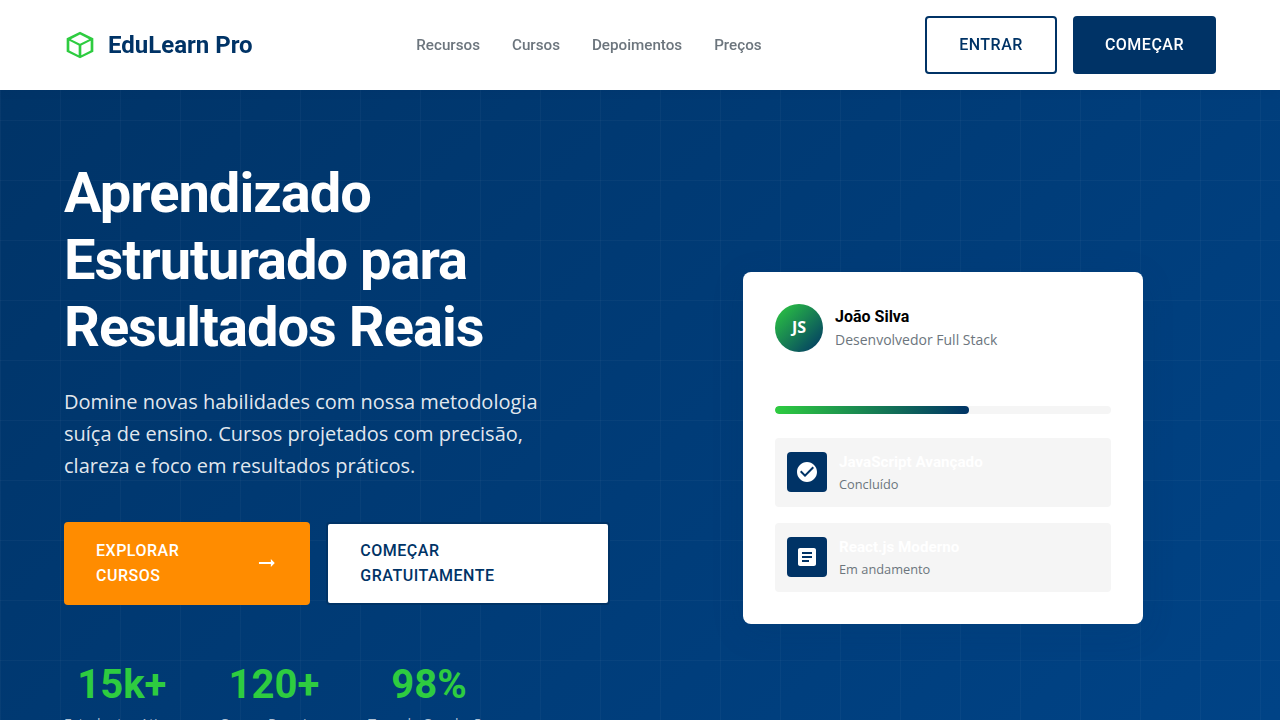
Design an educational and structured Swiss Style landing page for an online course platform. Ideal for landing pages, modern websites. AI-ready template.
Use case: Landing pages, Modern websites
Historical Context
Swiss design found its way into education long before screens existed. The International Typographic Style — born in Zurich and Basel during the 1950s — was essentially a teaching methodology disguised as graphic design. Grid systems, clear hierarchy, restrained color. These weren't aesthetic choices. They were cognitive ones. When Josef Müller-Brockmann laid out his grids, he was solving for comprehension, not beauty. The translation from textbook to screen happened almost naturally. Educational publishers had been using Swiss principles for decades — structured layouts that guide the eye, typography that establishes clear information hierarchy, whitespace that gives the brain room to process. Digital learning interfaces inherited this DNA directly. The best course platforms today look like they could have been designed in 1962, and that's not nostalgia — it's because the problem hasn't changed. People need to absorb complex information without friction. What makes Swiss style particularly suited to technical education is its refusal to decorate. When you're teaching someone to code or master a new framework, every ornamental element is cognitive load. Every gradient is a distraction. The Swiss approach strips the interface down to pure signal.
When to Use
Deploy this when content density is high and comprehension is non-negotiable. Coding bootcamps, technical certification platforms, structured course sequences — anywhere learners need to focus on material rather than navigate decoration. Works exceptionally well for platforms with progressive curricula, where clear visual hierarchy maps directly to learning paths. Less suited for creative or exploratory learning environments where serendipity matters more than structure.
Design Principles
- Grid as pedagogy — use the layout itself to teach sequence and relationship, not just to organize
- Typography carries the entire hierarchy — no icons, no color coding, no shortcuts; weight and scale do the work
- Whitespace is active instruction — generous margins signal pause points and section boundaries to the learner's brain
- Monochrome with surgical accent — one functional color for progress and interaction, everything else in grayscale
- Content-first density — pack information tightly within grid cells but maintain absolute clarity between them
DESIGN.md
---
version: "alpha"
name: "Estilo Suíço Educacional"
description: "Design an educational and structured Swiss Style landing page for an online course platform. Ideal for landing pages, modern websites. AI-ready template."
colors:
  primary: "#FFFFFF"
  secondary: "#003366"
  tertiary: "#F5F5F5"
  neutral: "#000000"
  surface: "#2ECC40"
  accent: "#FF8C00"
typography:
  h1:
    fontFamily: Roboto
    fontSize: 2.5rem
    fontWeight: 700
  body-md:
    fontFamily: Roboto
    fontSize: 1rem
    fontWeight: 400
spacing:
  sm: 20.0px
  md: 40.0px
  lg: 80.0px
components:
  button-primary:
    backgroundColor: "{colors.primary}"
    textColor: "{colors.neutral}"
    padding: 12px
---

## Overview

Design an educational and structured Swiss Style landing page for an online course platform. Ideal for landing pages, modern websites. AI-ready template. Swiss design found its way into education long before screens existed. The International Typographic Style — born in Zurich and Basel during the 1950s — was essentially a teaching methodology disguised as graphic design. Grid systems, clear hierarchy, restrained color. These weren't aesthetic choices. They were cognitive ones. When Josef Müller-Brockmann laid out his grids, he was solving for comprehension, not beauty.

The translation from textbook to screen happened almost naturally. Educational publishers had been using Swiss principles for decades — structured layouts that guide the eye, typography that establishes clear information hierarchy, whitespace that gives the brain room to process. Digital learning interfaces inherited this DNA directly. The best course platforms today look like they could have been designed in 1962, and that's not nostalgia — it's because the problem hasn't changed. People need to absorb complex information without friction.

What makes Swiss style particularly suited to technical education is its refusal to decorate. When you're teaching someone to code or master a new framework, every ornamental element is cognitive load. Every gradient is a distraction. The Swiss approach strips the interface down to pure signal.

- Density: 3/10 — Airy
- Variance: 2/10 — Structured
- Motion: 4/10 — Subtle

- **Style:** Educational, Structured, Clear
- **Keywords:** online education, courses, technical skills, structured, clear, functional, precise, legible, professional, efficient
- **Era:** 2026+ Aprendizado Estruturado
- **Light/Dark:** ✓ Full / ✗ No

## Colors

- **Branco** (#FFFFFF) — Light surface, card backgrounds
- **Azul Escuro** (#003366) — Dark surface, primary background
- **Cinza Claro** (#F5F5F5) — Secondary text, borders, muted elements
- **Preto** (#000000) — Dark surface, primary background
- **Verde Esmeralda** (#2ECC40) — Success states, positive indicators
- **Laranja** (#FF8C00) — Warm accent, call-to-action secondary
- **Roxo** (#8A2BE2) — Accent color, emphasis elements
- **Cinza Médio** (#6C757D) — Secondary text, borders, muted elements


## Typography

- **Display / Hero:** Roboto — Weight 700, tight tracking, used for headline impact
- **Body:** Roboto — Weight 400, 16px/1.6 line-height, max 72ch per line
- **UI Labels / Captions:** Roboto — 0.875rem, weight 500, slight letter-spacing
- **Monospace:** JetBrains Mono — Used for code, metadata, and technical values

Scale:
- Hero: clamp(2.5rem, 5vw, 4rem)
- H1: 2.25rem
- H2: 1.5rem
- Body: 1rem / 1.6
- Small: 0.875rem


## Layout

- **Grid:** CSS Grid primary. Max-width containment: 1280px centered with 1.5rem side padding.
- **Spacing rhythm:** Balanced. Base unit: 0.5rem (8px).
- **Section vertical gaps:** clamp(4rem, 8vw, 8rem).
- **Hero layout:** Split-screen (text left, visual right).
- **Feature sections:** Zig-zag alternating text+image rows. No 3-equal-columns.
- **Mobile collapse:** All multi-column layouts collapse below 768px. No horizontal overflow.
- **z-index contract:** base (0) / sticky-nav (100) / overlay (200) / modal (300) / toast (500).


## Elevation & Depth

Layouts de grid para organização de cursos, tipografia sans-serif (Roboto/Open Sans) com alta legibilidade, ícones informativos, gráficos de progresso limpos, micro-interações de destaque de curso, transições de seção diretas e funcionais.

- **Physics:** Ease-out curves, 200-300ms duration. Smooth and predictable.
- **Entry animations:** Fade + translate-Y (16px → 0) over 420ms ease-out. Staggered cascades for lists: 80ms between items.
- **Hover states:** Subtle color shift + shadow adjustment over 200ms.
- **Page transitions:** Fade only (200ms).
- **Performance:** Only transform and opacity animated. No layout-triggering properties.


## Shapes

Base corner radius: 8px. See rounded tokens in front matter for the full scale.


## Components

- **Primary Button:** Subtly rounded (0.5rem) shape. Accent color fill. Hover: 8% darken + subtle lift shadow. Active: -1px translate tactile press. Font weight 600. No outer glows.
- **Secondary / Ghost Button:** Outline variant. 1.5px border in muted color. Text in primary color. Hover: subtle background fill.
- **Cards:** Subtly rounded (0.5rem) corners. Surface background. Subtle shadow (0 2px 12px rgba(0,0,0,0.06)). 1px border stroke.
- **Inputs:** Label above input. 1px border stroke. Focus ring: 2px accent color offset 2px. Error text below in semantic red. No floating labels.
- **Navigation:** Primary surface background. Active item: accent color indicator. Font weight 500 when active.
- **Skeletons:** Shimmer animation matching component dimensions. No circular spinners.
- **Empty States:** Icon-based composition with descriptive text and action button.


## Do's and Don'ts

- No emojis in UI — use icon system only (Lucide, Heroicons)
- No pure black (#000000) — use off-black or charcoal variants
- No oversaturated accent colors (saturation cap: 80%)
- No 3-column equal-width feature layouts — use zig-zag or asymmetric grid
- No `h-screen` — use `min-h-[100dvh]`
- No AI copywriting clichés: "Elevate", "Seamless", "Unleash", "Next-Gen"
- No broken external image links — use picsum.photos or inline SVG
- No generic lorem ipsum in demos

- Do Layouts de grid para cursos
- Do Tipografia sans-serif legível
- Do Ícones informativos
- Do Gráficos de progresso limpos
- Do Micro-interações de destaque de curso
- Do Transições funcionais.


## Use Case

Landing pages, Modern websites
Technical Specs
CSS
background: #FFFFFF, color: #003366, border-bottom: 1px solid #E0E0E0, font-family: "Roboto, sans-serif", line-height: 1.5, transition: all 0.3s ease-in-out, .course-grid, .progress-chart, .icon-info.
Variables
--white-bg: #FFFFFF, --dark-blue-text: #003366, --light-grey-bg: #F5F5F5, --black-text: #000000, --font-main: "Roboto, sans-serif", --line-height-body: 1.5, --grid-column-gap: 20px.
Checklist
☐ Layouts de grid para cursos, ☐ Tipografia sans-serif legível, ☐ Ícones informativos, ☐ Gráficos de progresso limpos, ☐ Micro-interações de destaque de curso, ☐ Transições funcionais.
Colors
Primary
Secondary
Effects
Layouts de grid para organização de cursos, tipografia sans-serif (Roboto/Open Sans) com alta legibilidade, ícones informativos, gráficos de progresso limpos, micro-interações de destaque de curso, transições de seção diretas e funcionais.
Light/Dark
✓ Full / ✗ No
AI Prompt
Act as a Senior Frontend Engineer and Expert UI Designer.
Your task is to code a complete Landing Page on the first attempt.
- Landing Page Theme: <INSERT THEME>
- Sections to add: <INSERT SECTIONS>

Generate the final code immediately following these definitions:

## Style

- **Name:** Estilo Suíço Educacional
- **Type:** Educational, Structured, Clear
- **Keywords:** online education, courses, technical skills, structured, clear, functional, precise, legible, professional, efficient
- **Era:** 2026+ Aprendizado Estruturado
- **Light/Dark:** ✓ Full / ✗ No

## Color Palette

- **Primary:** Branco #FFFFFF, Azul Escuro #003366, Cinza Claro #F5F5F5, Preto #000000
- **Secondary:** Verde Esmeralda #2ECC40, Laranja #FF8C00, Roxo #8A2BE2, Cinza Médio #6C757D

## Visual Effects

Layouts de grid para organização de cursos, tipografia sans-serif (Roboto/Open Sans) com alta legibilidade, ícones informativos, gráficos de progresso limpos, micro-interações de destaque de curso, transições de seção diretas e funcionais.

## AI Visual Direction

Design an educational and structured Swiss Style landing page for an online course platform. Use: grid layouts for course organization, highly legible sans-serif typography (Roboto/Open Sans), informative icons, clean progress charts, course highlight micro-interactions, direct functional section transitions, dark blue and white palette, professional and efficient feel.

## CSS Technical

```css
background: #FFFFFF, color: #003366, border-bottom: 1px solid #E0E0E0, font-family: "Roboto, sans-serif", line-height: 1.5, transition: all 0.3s ease-in-out, .course-grid, .progress-chart, .icon-info.
```

## Design System Variables

```css
--white-bg: #FFFFFF, --dark-blue-text: #003366, --light-grey-bg: #F5F5F5, --black-text: #000000, --font-main: "Roboto, sans-serif", --line-height-body: 1.5, --grid-column-gap: 20px.
```

## Implementation Checklist

- ☐ Layouts de grid para cursos
- ☐ Tipografia sans-serif legível
- ☐ Ícones informativos
- ☐ Gráficos de progresso limpos
- ☐ Micro-interações de destaque de curso
- ☐ Transições funcionais.

## Execution Rules

1. Strictly follow the defined visual style.
2. Use high-quality inline SVG icons (Heroicons or Lucide style) — NEVER use emojis as icons.
3. Add `cursor-pointer` and smooth `hover` states (transition-all) on all interactive elements.
4. Required Page Structure:
   - Navbar (Logo + Links + CTA)
   - Hero Section (Impactful Headline + Subtitle + 2 buttons + 3D/Abstract visual element via CSS)
   - Features (3 cards with icons)
   - Testimonials (3 cards)
   - Pricing (3 tiers, highlight the middle one)
   - Final CTA
   - Full Footer with social links, privacy policy, terms of use, contact and SEO links.
5. All text content must be in English.
6. The visual must be CLEARLY distinct — do not create a "default Bootstrap" design. Force the use of the provided design system variables.
7. Use `<style>` tags in the head for custom classes (especially for complex backdrop-filter effects and animations) that Tailwind CDN doesn't cover.
8. Full Responsiveness: Layout must adapt perfectly to Mobile, Tablet and Desktop (vertical stack on mobile).
9. Include basic SEO, Viewport and Open Graph meta tags in `<head>`.
10. Footer must contain: Copyright 2026, Secondary navigation links and Social media icons.
11. Make the creative decisions needed to deliver the complete, functional result now.
Related
Last synced: 4/1/2026