Datacore SaaS Hero
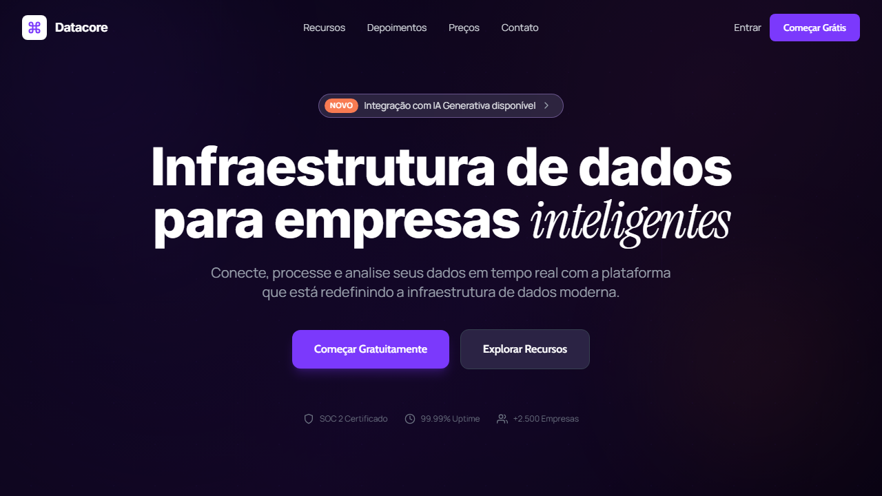
Linear-style dark SaaS hero with HLS background video and black overlay (bg-black/60). Ideal for plataformas de dados, ferramentas de infraestrutura, redes e networking, saas enterprise. AI-ready template.
Use case: Platforms de dados, Tools de infraestrutura, Redes e networking, SaaS enterprise
Historical Context
Around 2020, Linear quietly redefined what a SaaS product could look like. They took the dark UI — previously associated with code editors and terminal windows — and elevated it into something genuinely luxurious. Deep purples, precise gradients, and restrained motion. Vercel followed a similar thread with monochrome severity. Suddenly every developer tool startup wanted that aesthetic: the implicit message that your infrastructure product was as carefully crafted as the software your users were building. The purple SaaS hero became a specific genre. Not the playful purples of consumer apps — these were deeper, cooler, almost astronomical. Paired with subtle grain textures, geometric light sources, and typography that borrowed from editorial design rather than tech defaults. The hero section stopped being a feature showcase and became a mood statement. It said: we take craft seriously, we ship fast, we respect your intelligence. What makes this template lineage interesting is how opinionated it remains. You either commit to the dark premium aesthetic fully or it falls apart. There's no halfway — the moment you add a stock photo or a generic illustration, the spell breaks. The constraint is the point.
When to Use
Deploy this when your product speaks to developers, platform engineers, or technical decision-makers who associate visual craft with product quality. Ideal for developer tools, data infrastructure platforms, observability products, and API-first SaaS. Works best when your brand can sustain the dark aesthetic across the full experience — not just the marketing site. Skip it if your audience skews non-technical or if your product needs to feel approachable and warm rather than precise and powerful.
Design Principles
- Commit to depth over brightness — dark backgrounds with a single controlled light source create dimensionality without clutter
- Purple as signal, not decoration — use it structurally for gradients, glows, and focal points rather than painting everything violet
- Typography carries the hierarchy — when your palette is restrained, type weight and scale do all the heavy lifting
- Motion must feel engineered — subtle parallax, precise easing curves, and intentional delays signal craft over spectacle
- Negative space is non-negotiable — the premium feeling collapses the moment the layout feels crowded or desperate for attention
DESIGN.md
---
version: "alpha"
name: "Datacore SaaS Hero"
description: "Linear-style dark SaaS hero with HLS background video and black overlay (bg-black/60). Ideal for plataformas de dados, ferramentas de infraestrutura, redes e networking, saas enterprise. AI-ready template."
colors:
  primary: "#7b39fc"
  secondary: "#2b2344"
  tertiary: "#f87b52"
  neutral: "#000000"
  surface: "#6a2ce0"
  accent: "#352b54"
typography:
  h1:
    fontFamily: Manrope
    fontSize: 2.5rem
    fontWeight: 700
  body-md:
    fontFamily: Manrope
    fontSize: 1rem
    fontWeight: 400
components:
  button-primary:
    backgroundColor: "{colors.primary}"
    textColor: "{colors.neutral}"
    padding: 12px
---

## Overview

Linear-style dark SaaS hero with HLS background video and black overlay (bg-black/60). Ideal for plataformas de dados, ferramentas de infraestrutura, redes e networking, saas enterprise. AI-ready template. Around 2020, Linear quietly redefined what a SaaS product could look like. They took the dark UI — previously associated with code editors and terminal windows — and elevated it into something genuinely luxurious. Deep purples, precise gradients, and restrained motion. Vercel followed a similar thread with monochrome severity. Suddenly every developer tool startup wanted that aesthetic: the implicit message that your infrastructure product was as carefully crafted as the software your users were building.

The purple SaaS hero became a specific genre. Not the playful purples of consumer apps — these were deeper, cooler, almost astronomical. Paired with subtle grain textures, geometric light sources, and typography that borrowed from editorial design rather than tech defaults. The hero section stopped being a feature showcase and became a mood statement. It said: we take craft seriously, we ship fast, we respect your intelligence.

What makes this template lineage interesting is how opinionated it remains. You either commit to the dark premium aesthetic fully or it falls apart. There's no halfway — the moment you add a stock photo or a generic illustration, the spell breaks. The constraint is the point.

- Density: 5/10 — Balanced
- Variance: 4/10 — Moderate
- Motion: 8/10 — Cinematic

- **Style:** SaaS, Linear-Style, Purple Accent, HLS Video, Badge Glassmorphism
- **Keywords:** SaaS, Linear-style, roxo, HLS video, glassmorphism badge, Instrument Serif italic, Manrope, dark mode, poster fallback, mobile drawer
- **Era:** 2024-2026 Linear-Style SaaS
- **Light/Dark:** ✗ Not Recommended / ✓ Full

## Colors

- **Roxo Primário** (#7b39fc) — Accent color, emphasis elements
- **Escuro Secundário** (#2b2344) — Dark surface, primary background
- **Laranja Acento** (#f87b52) — Warm accent, call-to-action secondary
- **Preto** (#000000) — Dark surface, primary background
- **Roxo Hover** (#6a2ce0) — Accent color, emphasis elements
- **Escuro Hover** (#352b54) — Deep contrast surface
- **Vidro Borda** (rgba(164,132,215,0.5)) — Extended palette, decorative use
- **Vidro Fundo** (rgba(85,80,110,0.4)) — Primary background surface


## Typography

- **Display / Hero:** Manrope — Weight 700, tight tracking, used for headline impact
- **Accent:** Inter — Used for decorative or emphasis text
- **Body:** Manrope — Weight 400, 16px/1.6 line-height, max 72ch per line
- **UI Labels / Captions:** Manrope — 0.875rem, weight 500, slight letter-spacing
- **Monospace:** JetBrains Mono — Used for code, metadata, and technical values

Scale:
- Hero: clamp(2.5rem, 5vw, 4rem)
- H1: 2.25rem
- H2: 1.5rem
- Body: 1rem / 1.6
- Small: 0.875rem


## Layout

- **Grid:** CSS Grid primary. Max-width containment: 1280px centered with 1.5rem side padding.
- **Spacing rhythm:** Balanced. Base unit: 0.5rem (8px).
- **Section vertical gaps:** clamp(4rem, 8vw, 8rem).
- **Hero layout:** Split-screen (text left, visual right).
- **Feature sections:** Zig-zag alternating text+image rows. No 3-equal-columns.
- **Mobile collapse:** All multi-column layouts collapse below 768px. No horizontal overflow.
- **z-index contract:** base (0) / sticky-nav (100) / overlay (200) / modal (300) / toast (500).


## Elevation & Depth

VÍDEO: Stream HLS via Cloudflare com visual abstrato tecnológico. Formas digitais, linhas de dados ou partículas em rede sobre fundo escuro, evocando infraestrutura de dados e conectividade. Inclui poster/thumbnail JPG como fallback que faz fade-out quando o vídeo inicia, prevenindo flash preto. Overlay preto (bg-black/60) para legibilidade do texto. | EFEITOS CSS: Vídeo HLS de fundo com overlay preto (bg-black/60), poster/thumbnail com fade-out ao iniciar vídeo, navbar com logo ícone Command em quadrado branco, badge glassmorphism pill com tag laranja 'New', headline com palavra em Instrument Serif italic, botões roxo sólido e navy escuro, mobile full-screen overlay menu preto

- **Physics:** Spring — stiffness 120, damping 20. Confident, weighted transitions.
- **Entry animations:** Fade + translate-Y (16px → 0) over 540ms ease-out. Staggered cascades for lists: 120ms between items.
- **Hover states:** Scale(1.03) + shadow lift over 200ms.
- **Page transitions:** Fade + slide (300ms).
- **Performance:** Only transform and opacity animated. No layout-triggering properties.


## Shapes

Base corner radius: 8px. See rounded tokens in front matter for the full scale.


## Components

- **Primary Button:** Subtly rounded (0.5rem) shape. Accent color fill. Hover: 8% darken + subtle lift shadow. Active: -1px translate tactile press. Font weight 600. No outer glows.
- **Secondary / Ghost Button:** Outline variant. 1.5px border in muted color. Text in primary color. Hover: subtle background fill.
- **Cards:** Subtly rounded (0.5rem) corners. Surface background. Subtle shadow (0 2px 12px rgba(0,0,0,0.06)). 1px border stroke.
- **Inputs:** Label above input. 1px border stroke. Focus ring: 2px accent color offset 2px. Error text below in semantic red. No floating labels.
- **Navigation:** Primary surface background. Active item: accent color indicator. Font weight 500 when active.
- **Skeletons:** Shimmer animation matching component dimensions. No circular spinners.
- **Empty States:** Icon-based composition with descriptive text and action button.


## Do's and Don'ts

- No emojis in UI — use icon system only (Lucide, Heroicons)
- No pure white (#FFFFFF) backgrounds — use off-white or dark surfaces
- No oversaturated accent colors (saturation cap: 80%)
- No 3-column equal-width feature layouts — use zig-zag or asymmetric grid
- No `h-screen` — use `min-h-[100dvh]`
- No AI copywriting clichés: "Elevate", "Seamless", "Unleash", "Next-Gen"
- No broken external image links — use picsum.photos or inline SVG
- No generic lorem ipsum in demos

- Do Vídeo HLS com overlay preto bg-black/60
- Do Poster com fade-out
- Do Badge glassmorphism com tag laranja
- Do Headline com palavra serif italic
- Do Botão roxo + navy
- Do Mobile menu full-screen preto
- Do 4 Google Fonts
- Do Responsivo


## Use Case

Platforms de dados, Tools de infraestrutura, Redes e networking, SaaS enterprise
Technical Specs
CSS
font-family: 'Manrope' / 'Inter' / 'Cabin' / 'Instrument Serif', background: #000000 with bg-black/60 overlay, border: 1px solid rgba(164,132,215,0.5), background: rgba(85,80,110,0.4), button: bg-[#7b39fc] hover:bg-[#6a2ce0]
Variables
--color-purple: #7b39fc, --color-dark: #2b2344, --color-orange: #f87b52, --glass-border: rgba(164,132,215,0.5), --glass-bg: rgba(85,80,110,0.4), --font-global: 'Manrope', --font-heading: 'Inter', --font-button: 'Cabin', --font-accent: 'Instrument Serif'
Checklist
☐ Vídeo HLS com overlay preto bg-black/60, ☐ Poster com fade-out, ☐ Badge glassmorphism com tag laranja, ☐ Headline com palavra serif italic, ☐ Botão roxo + navy, ☐ Mobile menu full-screen preto, ☐ 4 Google Fonts, ☐ Responsivo
Colors
Primary
Secondary
Effects
VÍDEO: Stream HLS via Cloudflare com visual abstrato tecnológico. Formas digitais, linhas de dados ou partículas em rede sobre fundo escuro, evocando infraestrutura de dados e conectividade. Inclui poster/thumbnail JPG como fallback que faz fade-out quando o vídeo inicia, prevenindo flash preto. Overlay preto (bg-black/60) para legibilidade do texto. | EFEITOS CSS: Vídeo HLS de fundo com overlay preto (bg-black/60), poster/thumbnail com fade-out ao iniciar vídeo, navbar com logo ícone Command em quadrado branco, badge glassmorphism pill com tag laranja 'New', headline com palavra em Instrument Serif italic, botões roxo sólido e navy escuro, mobile full-screen overlay menu preto
Light/Dark
✗ Not Recommended / ✓ Full
AI Prompt
Act as a Senior Frontend Engineer and Expert UI Designer.
Your task is to code a complete Landing Page on the first attempt.
- Landing Page Theme: <INSERT THEME>
- Sections to add: <INSERT SECTIONS>

Generate the final code immediately following these definitions:

## Style

- **Name:** Datacore SaaS Hero
- **Type:** SaaS, Linear-Style, Purple Accent, HLS Video, Badge Glassmorphism
- **Keywords:** SaaS, Linear-style, roxo, HLS video, glassmorphism badge, Instrument Serif italic, Manrope, dark mode, poster fallback, mobile drawer
- **Era:** 2024-2026 Linear-Style SaaS
- **Light/Dark:** ✗ Not Recommended / ✓ Full

## Color Palette

- **Primary:** Roxo Primário #7b39fc, Escuro Secundário #2b2344, Laranja Acento #f87b52, Preto #000000
- **Secondary:** Vidro Borda rgba(164,132,215,0.5), Vidro Fundo rgba(85,80,110,0.4), Roxo Hover #6a2ce0, Escuro Hover #352b54

## Visual Effects

VÍDEO: Stream HLS via Cloudflare com visual abstrato tecnológico. Formas digitais, linhas de dados ou partículas em rede sobre fundo escuro, evocando infraestrutura de dados e conectividade. Inclui poster/thumbnail JPG como fallback que faz fade-out quando o vídeo inicia, prevenindo flash preto. Overlay preto (bg-black/60) para legibilidade do texto. | EFEITOS CSS: Vídeo HLS de fundo com overlay preto (bg-black/60), poster/thumbnail com fade-out ao iniciar vídeo, navbar com logo ícone Command em quadrado branco, badge glassmorphism pill com tag laranja 'New', headline com palavra em Instrument Serif italic, botões roxo sólido e navy escuro, mobile full-screen overlay menu preto

## AI Visual Direction

Design a Linear-style dark SaaS hero with HLS background video and black overlay (bg-black/60). Poster thumbnail fading out when video starts. Glassmorphism pill badge with orange 'New' tag. Large headline ~76px with one word in Instrument Serif italic. Purple primary button and dark navy secondary. Mobile full-screen black overlay menu. Manrope global, Inter headings, Cabin buttons.

## CSS Technical

```css
font-family: 'Manrope' / 'Inter' / 'Cabin' / 'Instrument Serif', background: #000000 with bg-black/60 overlay, border: 1px solid rgba(164,132,215,0.5), background: rgba(85,80,110,0.4), button: bg-[#7b39fc] hover:bg-[#6a2ce0]
```

## Design System Variables

```css
--color-purple: #7b39fc, --color-dark: #2b2344, --color-orange: #f87b52, --glass-border: rgba(164,132,215,0.5), --glass-bg: rgba(85,80,110,0.4), --font-global: 'Manrope', --font-heading: 'Inter', --font-button: 'Cabin', --font-accent: 'Instrument Serif'
```

## Implementation Checklist

- ☐ Vídeo HLS com overlay preto bg-black/60
- ☐ Poster com fade-out
- ☐ Badge glassmorphism com tag laranja
- ☐ Headline com palavra serif italic
- ☐ Botão roxo + navy
- ☐ Mobile menu full-screen preto
- ☐ 4 Google Fonts
- ☐ Responsivo

## Execution Rules

1. Strictly follow the defined visual style.
2. Use high-quality inline SVG icons (Heroicons or Lucide style) — NEVER use emojis as icons.
3. Add `cursor-pointer` and smooth `hover` states (transition-all) on all interactive elements.
4. Required Page Structure:
   - Navbar (Logo + Links + CTA)
   - Hero Section (Impactful Headline + Subtitle + 2 buttons + 3D/Abstract visual element via CSS)
   - Features (3 cards with icons)
   - Testimonials (3 cards)
   - Pricing (3 tiers, highlight the middle one)
   - Final CTA
   - Full Footer with social links, privacy policy, terms of use, contact and SEO links.
5. All text content must be in English.
6. The visual must be CLEARLY distinct — do not create a "default Bootstrap" design. Force the use of the provided design system variables.
7. Use `<style>` tags in the head for custom classes (especially for complex backdrop-filter effects and animations) that Tailwind CDN doesn't cover.
8. Full Responsiveness: Layout must adapt perfectly to Mobile, Tablet and Desktop (vertical stack on mobile).
9. Include basic SEO, Viewport and Open Graph meta tags in `<head>`.
10. Footer must contain: Copyright 2026, Secondary navigation links and Social media icons.
11. Make the creative decisions needed to deliver the complete, functional result now.
Related
Last synced: 4/1/2026