Corporate Radial Process
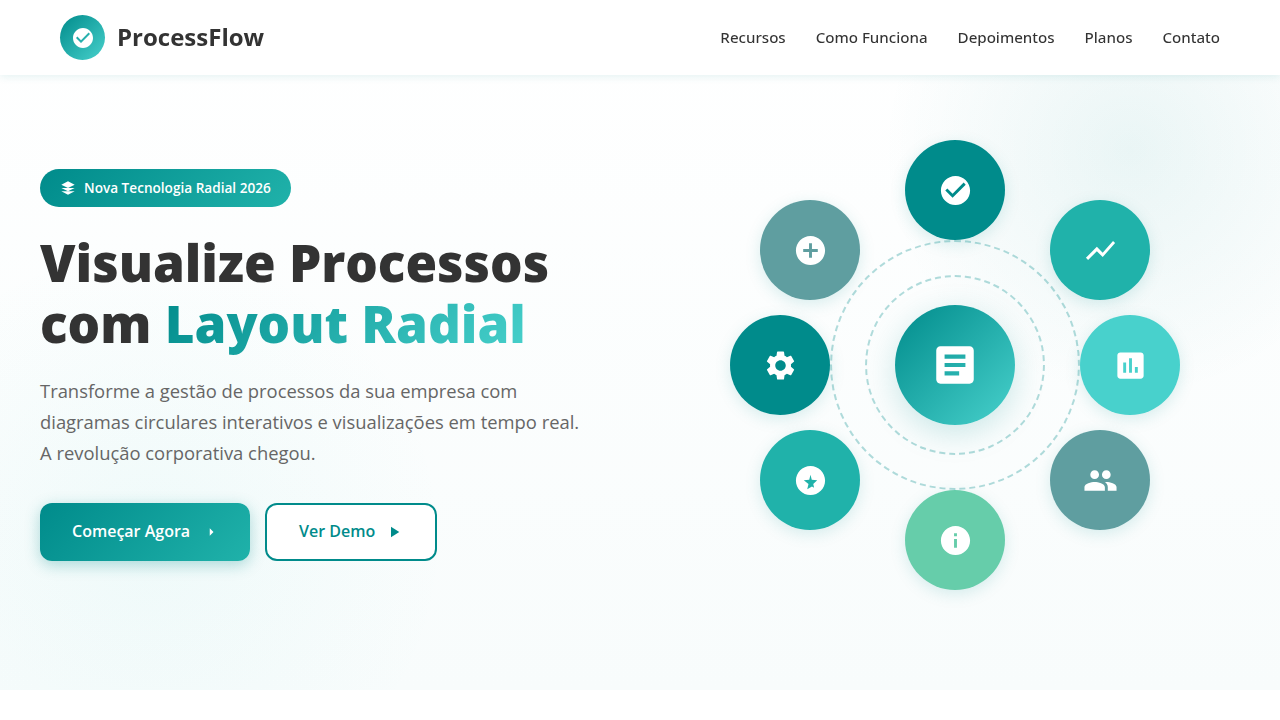
Corporate landing page, radial process visualization, clean white background, teal accent, structured layout, flat design. Ideal for landing pages, modern websites. AI-ready template.
Use case: Landing pages, Modern websites
Historical Context
Radial process diagrams didn't start on screens. They started on whiteboards, napkins, and the backs of strategy decks where someone drew a circle with arrows because linear thinking wasn't cutting it. The idea that business processes loop — that output feeds input, that review informs planning — is ancient. But visualizing it cleanly? That took decades of bad clip art and worse PowerPoint templates. The corporate world latched onto circular flow diagrams in the late '90s when consulting firms needed ways to make iterative methodology look inevitable. McKinsey had cycles. Deloitte had wheels. Every strategy deck featured some variation of arrows chasing each other around a center point. The visual grammar was established: rotation equals continuity, segments equal phases, and the center holds the governing idea. The jump from static slides to interactive web components changed what radial diagrams could do. Suddenly segments could expand, phases could animate in sequence, and hover states could reveal depth without cluttering the overview. The form stayed familiar — executives still recognize the shape instantly — but the medium finally caught up with the complexity these diagrams were always trying to communicate.
When to Use
Reach for radial process components when your content is genuinely cyclical — when step five feeds back into step one, when there's no true beginning or end. They work beautifully in strategy decks where you need to communicate continuous improvement, iterative methodology, or recurring business cycles. Corporate presentations love them because they compress complex workflows into a single glanceable shape. But be honest with yourself: if your process is actually linear with a fixed start and finish, a radial layout will confuse more than clarify. The circle implies perpetual motion. Use it when that's true.
Design Principles
- Equal visual weight per segment — if one phase dominates visually, viewers assume it dominates temporally, which breaks the cyclical contract
- Directional flow must be unambiguous — clockwise is the default reading direction in Western contexts, and any deviation needs explicit arrow indicators
- The center is prime real estate — use it for the governing concept or leave it empty; never waste it on decorative elements
- Limit segments to 3–7 phases — beyond seven, the slices become too thin to label legibly and the diagram collapses into visual noise
- Animation should reinforce sequence, not decorate — if segments animate in, they should follow the flow direction at a pace that lets each label register before the next appears
DESIGN.md
---
version: "alpha"
name: "Corporate Radial Process"
description: "Corporate landing page, radial process visualization, clean white background, teal accent, structured layout, flat design. Ideal for landing pages, modern websites. AI-ready template."
colors:
  primary: "#FFFFFF"
  secondary: "#333333"
  tertiary: "#008B8B"
  neutral: "#008B8B"
  surface: "#20B2AA"
  accent: "#48D1CC"
typography:
  h1:
    fontFamily: Open Sans
    fontSize: 2.5rem
    fontWeight: 700
  body-md:
    fontFamily: Open Sans
    fontSize: 1rem
    fontWeight: 400
components:
  button-primary:
    backgroundColor: "{colors.primary}"
    textColor: "{colors.neutral}"
    padding: 12px
---

## Overview

Corporate landing page, radial process visualization, clean white background, teal accent, structured layout, flat design. Ideal for landing pages, modern websites. AI-ready template. Radial process diagrams didn't start on screens. They started on whiteboards, napkins, and the backs of strategy decks where someone drew a circle with arrows because linear thinking wasn't cutting it. The idea that business processes loop — that output feeds input, that review informs planning — is ancient. But visualizing it cleanly? That took decades of bad clip art and worse PowerPoint templates.

The corporate world latched onto circular flow diagrams in the late '90s when consulting firms needed ways to make iterative methodology look inevitable. McKinsey had cycles. Deloitte had wheels. Every strategy deck featured some variation of arrows chasing each other around a center point. The visual grammar was established: rotation equals continuity, segments equal phases, and the center holds the governing idea.

The jump from static slides to interactive web components changed what radial diagrams could do. Suddenly segments could expand, phases could animate in sequence, and hover states could reveal depth without cluttering the overview. The form stayed familiar — executives still recognize the shape instantly — but the medium finally caught up with the complexity these diagrams were always trying to communicate.

- Density: 3/10 — Airy
- Variance: 2/10 — Structured
- Motion: 4/10 — Subtle

- **Style:** Professional, Structured, Organizational
- **Keywords:** radial, process, timeline, corporate, clean, vector, flat, organization
- **Era:** Modern Corporate
- **Light/Dark:** ✓ Full / ✗ No

## Colors

- **Background** (#FFFFFF) — Primary background surface
- **Text** (#333333) — Primary text color
- **Accent** (#008B8B) — Primary accent, CTAs and interactive elements
- **Segment 1** (#008B8B) — Extended palette, decorative use
- **Segment 2** (#20B2AA) — Extended palette, decorative use
- **Segment 3** (#48D1CC) — Extended palette, decorative use


## Typography

- **Display / Hero:** Open Sans — Weight 700, tight tracking, used for headline impact
- **Body:** Open Sans — Weight 400, 16px/1.6 line-height, max 72ch per line
- **UI Labels / Captions:** Open Sans — 0.875rem, weight 500, slight letter-spacing
- **Monospace:** JetBrains Mono — Used for code, metadata, and technical values

Scale:
- Hero: clamp(2.5rem, 5vw, 4rem)
- H1: 2.25rem
- H2: 1.5rem
- Body: 1rem / 1.6
- Small: 0.875rem


## Layout

- **Grid:** CSS Grid primary. Max-width containment: 1280px centered with 1.5rem side padding.
- **Spacing rhythm:** Balanced. Base unit: 0.5rem (8px).
- **Section vertical gaps:** clamp(4rem, 8vw, 8rem).
- **Hero layout:** Split-screen (text left, visual right).
- **Feature sections:** Zig-zag alternating text+image rows. No 3-equal-columns.
- **Mobile collapse:** All multi-column layouts collapse below 768px. No horizontal overflow.
- **z-index contract:** base (0) / sticky-nav (100) / overlay (200) / modal (300) / toast (500).


## Elevation & Depth

Semi-circular timeline, segmented process arc, white simple glyphs inside colored segments, flat vector clean matte finish.

- **Physics:** Ease-out curves, 200-300ms duration. Smooth and predictable.
- **Entry animations:** Fade + translate-Y (16px → 0) over 420ms ease-out. Staggered cascades for lists: 80ms between items.
- **Hover states:** Subtle color shift + shadow adjustment over 200ms.
- **Page transitions:** Fade only (200ms).
- **Performance:** Only transform and opacity animated. No layout-triggering properties.


## Shapes

Base corner radius: 9999px. See rounded tokens in front matter for the full scale.


## Components

- **Primary Button:** Rounded (50%) shape. Accent color fill. Hover: 8% darken + subtle lift shadow. Active: -1px translate tactile press. Font weight 600. No outer glows.
- **Secondary / Ghost Button:** Outline variant. 1.5px border in muted color. Text in primary color. Hover: subtle background fill.
- **Cards:** Rounded (50%) corners. Surface background. Subtle shadow (0 2px 12px rgba(0,0,0,0.06)). 1px border stroke.
- **Inputs:** Label above input. 1px border stroke. Focus ring: 2px accent color offset 2px. Error text below in semantic red. No floating labels.
- **Navigation:** Primary surface background. Active item: accent color indicator. Font weight 500 when active.
- **Skeletons:** Shimmer animation matching component dimensions. No circular spinners.
- **Empty States:** Icon-based composition with descriptive text and action button.


## Do's and Don'ts

- No emojis in UI — use icon system only (Lucide, Heroicons)
- No pure black (#000000) — use off-black or charcoal variants
- No oversaturated accent colors (saturation cap: 80%)
- No 3-column equal-width feature layouts — use zig-zag or asymmetric grid
- No `h-screen` — use `min-h-[100dvh]`
- No AI copywriting clichés: "Elevate", "Seamless", "Unleash", "Next-Gen"
- No broken external image links — use picsum.photos or inline SVG
- No generic lorem ipsum in demos

- Do Radial/Circular layout elements
- Do Clean white background
- Do Teal/Cyan color palette
- Do Step-by-step process visualization
- Do Simple glyph icons


## Use Case

Landing pages, Modern websites
Technical Specs
CSS
background-color: #FFFFFF; color: #333333; font-family: 'Open Sans', sans-serif; border-radius: 50%; display: flex; align-items: center; justify-content: center;
Variables
--bg-white: #FFFFFF, --text-grey: #333333, --accent-teal: #008B8B, --radius-circle: 50%, --font-corp: 'Open Sans', sans-serif
Checklist
☐ Radial/Circular layout elements, ☐ Clean white background, ☐ Teal/Cyan color palette, ☐ Step-by-step process visualization, ☐ Simple glyph icons
Colors
Primary
Secondary
Effects
Semi-circular timeline, segmented process arc, white simple glyphs inside colored segments, flat vector clean matte finish.
Light/Dark
✓ Full / ✗ No
AI Prompt
Act as a Senior Frontend Engineer and Expert UI Designer.
Your task is to code a complete Landing Page on the first attempt.
- Landing Page Theme: <INSERT THEME>
- Sections to add: <INSERT SECTIONS>

Generate the final code immediately following these definitions:

## Style

- **Name:** Corporate Radial Process
- **Type:** Professional, Structured, Organizational
- **Keywords:** radial, process, timeline, corporate, clean, vector, flat, organization
- **Era:** Modern Corporate
- **Light/Dark:** ✓ Full / ✗ No

## Color Palette

- **Primary:** Background #FFFFFF, Text #333333, Accent #008B8B
- **Secondary:** Segment 1 #008B8B, Segment 2 #20B2AA, Segment 3 #48D1CC

## Visual Effects

Semi-circular timeline, segmented process arc, white simple glyphs inside colored segments, flat vector clean matte finish.

## AI Visual Direction

corporate landing page, radial process visualization, clean white background, teal accent, structured layout, flat design.

## CSS Technical

```css
background-color: #FFFFFF; color: #333333; font-family: 'Open Sans', sans-serif; border-radius: 50%; display: flex; align-items: center; justify-content: center;
```

## Design System Variables

```css
--bg-white: #FFFFFF, --text-grey: #333333, --accent-teal: #008B8B, --radius-circle: 50%, --font-corp: 'Open Sans', sans-serif
```

## Implementation Checklist

- ☐ Radial/Circular layout elements
- ☐ Clean white background
- ☐ Teal/Cyan color palette
- ☐ Step-by-step process visualization
- ☐ Simple glyph icons

## Execution Rules

1. Strictly follow the defined visual style.
2. Use high-quality inline SVG icons (Heroicons or Lucide style) — NEVER use emojis as icons.
3. Add `cursor-pointer` and smooth `hover` states (transition-all) on all interactive elements.
4. Required Page Structure:
   - Navbar (Logo + Links + CTA)
   - Hero Section (Impactful Headline + Subtitle + 2 buttons + 3D/Abstract visual element via CSS)
   - Features (3 cards with icons)
   - Testimonials (3 cards)
   - Pricing (3 tiers, highlight the middle one)
   - Final CTA
   - Full Footer with social links, privacy policy, terms of use, contact and SEO links.
5. All text content must be in English.
6. The visual must be CLEARLY distinct — do not create a "default Bootstrap" design. Force the use of the provided design system variables.
7. Use `<style>` tags in the head for custom classes (especially for complex backdrop-filter effects and animations) that Tailwind CDN doesn't cover.
8. Full Responsiveness: Layout must adapt perfectly to Mobile, Tablet and Desktop (vertical stack on mobile).
9. Include basic SEO, Viewport and Open Graph meta tags in `<head>`.
10. Footer must contain: Copyright 2026, Secondary navigation links and Social media icons.
11. Make the creative decisions needed to deliver the complete, functional result now.
Related
Last synced: 4/1/2026