Coral
Coral — Cream and coral on near-black, set in oversized Bebas Neue. Bebas Neue typography. near-black canvas, warm cream paper for content, and a saturated coral accent th. Best for fashion / beauty pitch, fitness brand, F&B brand deck. AI-ready design system.
Use case: fashion / beauty pitch, fitness brand, F&B brand deck, lifestyle launch, creative agency
Historical Context
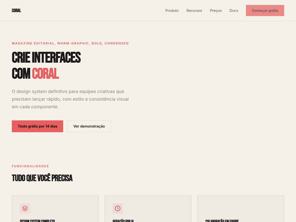
Coral as a design accent has roots in the Memphis Group's rejection of modernist restraint — those Italian radicals in the 1980s who decided beige was a moral failing. But the specific pairing of coral against near-black canvas owes more to the editorial tradition of contrast-driven hierarchy. Think Brodovitch at Harper's Bazaar, where a single warm tone against darkness created immediate visual authority. Bebas Neue enters this lineage as the democratic condensed sans-serif — born from Ryoichi Tsunekawa's 2010 release, it became the typeface that proved you don't need a Grilli Type license to achieve editorial punch. Its tall, narrow letterforms demand vertical space and reward generous leading. When set large against a #1a1a1a canvas with coral (#FF6F61 or thereabouts) as the sole chromatic relief, you get something that feels like a magazine cover without the magazine's budget. This combination works because it respects a fundamental truth: constraint produces elegance. One typeface, one accent, one dark ground. Everything else is hierarchy and whitespace.
When to Use
Deploy this when the brief says 'bold' and the client means it. Creative agency portfolios that need to feel curated, not templated. Brand statements where the typography IS the design — no illustration crutch, no gradient safety net. Editorial layouts where content hierarchy must be immediately legible at any viewport. Kill it if the project requires warmth, approachability, or more than two content density levels. This palette intimidates — that's the point.
Design Principles
- One accent, zero negotiation — coral carries all chromatic weight; introducing a second hue collapses the entire system
- Type as architecture — Bebas Neue at display sizes isn't decoration, it's structural; treat letterforms as load-bearing elements
- Near-black is not black — use #1a1a1a or #121212, never #000000; true black kills perceived depth and makes coral feel cheap
- Whitespace is the third color — the negative space between coral and near-black does more work than either element alone
- Hierarchy through scale, not weight — with a single typeface family, size differentials of 3:1 minimum between heading and body create the editorial tension this system demands
Technical Specs
Colors
Primary
Secondary
Effects
display font Bebas Neue for hero headlines, bold hover color shift (150ms), high-contrast active states, alternating light/dark sections for rhythm, near-black full-bleed sections alternating with cream cards
Light/Dark
✓ Full / ◐ Partial
Related

Last synced: 5/6/2026