Construtivismo Dinâmico Tech
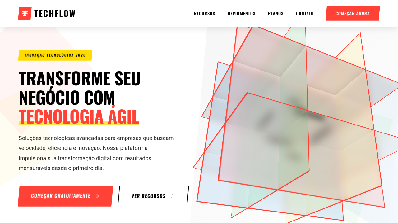
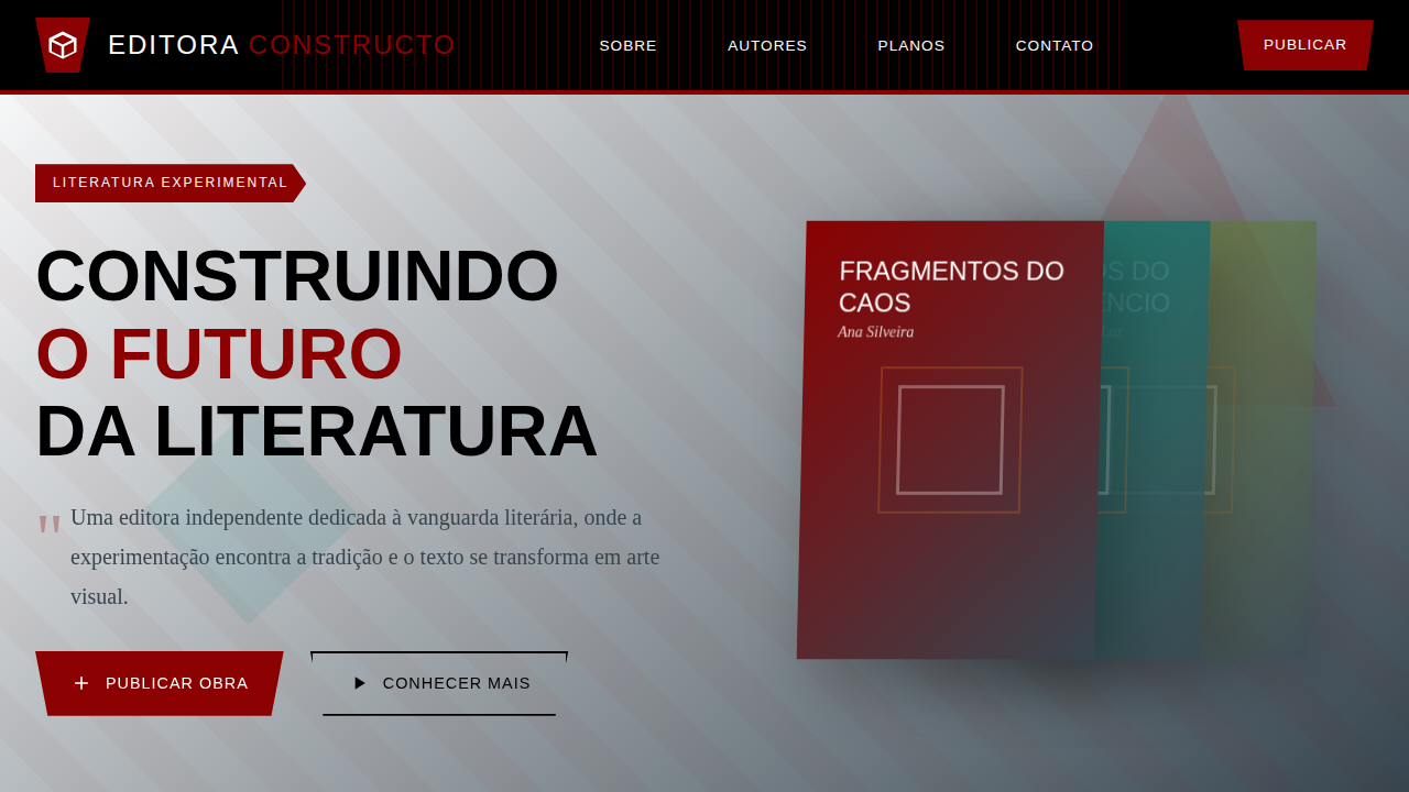
Functional and dynamic constructivist landing page for an agile tech startup. Ideal for landing pages, modern websites. AI-ready template.
Use case: Landing pages, Modern websites
Historical Context
Russian Constructivism wasn't decoration. It was propaganda machinery — visual systems engineered to move masses. Rodchenko's diagonal compositions shattered the picture plane deliberately. El Lissitzky's Prouns floated geometric forms in impossible space, treating the canvas as an architectural site. These weren't aesthetic choices. They were ideological ones. Every angled line carried velocity. Every red wedge drove a point home. Fast-forward a century and the same visual DNA powers tech landing pages. The diagonal momentum that once sold revolution now sells sprints. Bold geometric overlaps that communicated collective power now communicate product velocity. There's an honest logic to it — Constructivism was always about building systems, about the machine, about progress through structure. Startups inherited that language because they share the obsession: dismantle the old, construct the new, ship it yesterday. The difference matters though. Rodchenko served a collective. Your Series A deck serves shareholders. Borrow the energy, respect the source. Use the tension of competing angles to create genuine dynamism — not just slap a red triangle on a hero section and call it disruption.
When to Use
When your product moves fast and needs to look like it. Agile platforms, CI/CD tools, dev productivity software — anything where momentum is the message. Works beautifully for sprint-themed dashboards, release announcements, and developer conference branding. Avoid if your product requires trust-first impressions (fintech, healthcare). The angular tension reads as unstable to conservative audiences. Best paired with monospace type and high-contrast palettes.
Design Principles
- Diagonal dominance — compositions tilted 15-30° off-axis create inherent forward motion without animation
- Restricted palette with ideological weight — red/black/white primary, with one accent that earns its place through scarcity
- Geometric collision over geometric harmony — overlapping forms create tension points that guide the eye through friction
- Typography as architecture — text blocks become structural elements with mass and position, never floating decoration
- Asymmetric balance through counterweight — heavy elements anchored by negative space, not mirrored by equivalent mass
DESIGN.md
---
version: "alpha"
name: "Construtivismo Dinâmico Tech"
description: "Functional and dynamic constructivist landing page for an agile tech startup. Ideal for landing pages, modern websites. AI-ready template."
colors:
  primary: "#FF4136"
  secondary: "#000000"
  tertiary: "#FFFFFF"
  neutral: "#333333"
  surface: "#0074D9"
  accent: "#FFDC00"
typography:
  h1:
    fontFamily: Oswald
    fontSize: 2.5rem
    fontWeight: 700
  body-md:
    fontFamily: Oswald
    fontSize: 1rem
    fontWeight: 400
components:
  button-primary:
    backgroundColor: "{colors.primary}"
    textColor: "{colors.neutral}"
    padding: 12px
---

## Overview

Functional and dynamic constructivist landing page for an agile tech startup. Ideal for landing pages, modern websites. AI-ready template. Russian Constructivism wasn't decoration. It was propaganda machinery — visual systems engineered to move masses. Rodchenko's diagonal compositions shattered the picture plane deliberately. El Lissitzky's Prouns floated geometric forms in impossible space, treating the canvas as an architectural site. These weren't aesthetic choices. They were ideological ones. Every angled line carried velocity. Every red wedge drove a point home.

Fast-forward a century and the same visual DNA powers tech landing pages. The diagonal momentum that once sold revolution now sells sprints. Bold geometric overlaps that communicated collective power now communicate product velocity. There's an honest logic to it — Constructivism was always about building systems, about the machine, about progress through structure. Startups inherited that language because they share the obsession: dismantle the old, construct the new, ship it yesterday.

The difference matters though. Rodchenko served a collective. Your Series A deck serves shareholders. Borrow the energy, respect the source. Use the tension of competing angles to create genuine dynamism — not just slap a red triangle on a hero section and call it disruption.

- Density: 5/10 — Balanced
- Variance: 2/10 — Structured
- Motion: 4/10 — Subtle

- **Style:** Functional, Geometry-Driven, Dynamic
- **Keywords:** tech startup, agile, software development, dynamic, geometric, efficient, innovative, structured, modern, fast-paced
- **Era:** 2026+ Inovação Ágil
- **Light/Dark:** ✓ Full / ✗ No

## Colors

- **Vermelho Vibrante** (#FF4136) — Error states, destructive actions
- **Preto** (#000000) — Dark surface, primary background
- **Branco** (#FFFFFF) — Light surface, card backgrounds
- **Cinza Escuro** (#333333) — Dark surface, primary background
- **Azul Elétrico** (#0074D9) — Secondary accent
- **Amarelo Sol** (#FFDC00) — Warning states, attention indicators
- **Verde Limão** (#2ECC40) — Success states, positive indicators
- **Cinza Claro** (#AAAAAA) — Secondary text, borders, muted elements


## Typography

- **Display / Hero:** Oswald — Weight 700, tight tracking, used for headline impact
- **Body:** Oswald — Weight 400, 16px/1.6 line-height, max 72ch per line
- **UI Labels / Captions:** Oswald — 0.875rem, weight 500, slight letter-spacing
- **Monospace:** JetBrains Mono — Used for code, metadata, and technical values

Scale:
- Hero: clamp(2.5rem, 5vw, 4rem)
- H1: 2.25rem
- H2: 1.5rem
- Body: 1rem / 1.6
- Small: 0.875rem


## Layout

- **Grid:** CSS Grid primary. Max-width containment: 1280px centered with 1.5rem side padding.
- **Spacing rhythm:** Balanced. Base unit: 0.5rem (8px).
- **Section vertical gaps:** clamp(4rem, 8vw, 8rem).
- **Hero layout:** Split-screen (text left, visual right).
- **Feature sections:** Zig-zag alternating text+image rows. No 3-equal-columns.
- **Mobile collapse:** All multi-column layouts collapse below 768px. No horizontal overflow.
- **z-index contract:** base (0) / sticky-nav (100) / overlay (200) / modal (300) / toast (500).


## Elevation & Depth

Layouts assimétricos com forte senso de movimento, formas geométricas proeminentes, tipografia sans-serif condensada e ousada, colagens de fotos em preto e branco sobre fundos coloridos, micro-interações de clique com feedback angular, animações de transição rápidas e lineares.

- **Physics:** Ease-out curves, 200-300ms duration. Smooth and predictable.
- **Entry animations:** Fade + translate-Y (16px → 0) over 420ms ease-out. Staggered cascades for lists: 80ms between items.
- **Hover states:** Subtle color shift + shadow adjustment over 200ms.
- **Page transitions:** Fade only (200ms).
- **Performance:** Only transform and opacity animated. No layout-triggering properties.


## Shapes

Base corner radius: 12px. See rounded tokens in front matter for the full scale.


## Components

- **Primary Button:** Moderately rounded (0.75rem) shape. Accent color fill. Hover: 8% darken + subtle lift shadow. Active: -1px translate tactile press. Font weight 600. No outer glows.
- **Secondary / Ghost Button:** Outline variant. 1.5px border in muted color. Text in primary color. Hover: subtle background fill.
- **Cards:** Moderately rounded (0.75rem) corners. Surface background. Subtle shadow (0 2px 12px rgba(0,0,0,0.06)). 1px border stroke.
- **Inputs:** Label above input. 1px border stroke. Focus ring: 2px accent color offset 2px. Error text below in semantic red. No floating labels.
- **Navigation:** Primary surface background. Active item: accent color indicator. Font weight 500 when active.
- **Skeletons:** Shimmer animation matching component dimensions. No circular spinners.
- **Empty States:** Icon-based composition with descriptive text and action button.


## Do's and Don'ts

- No emojis in UI — use icon system only (Lucide, Heroicons)
- No pure black (#000000) — use off-black or charcoal variants
- No oversaturated accent colors (saturation cap: 80%)
- No 3-column equal-width feature layouts — use zig-zag or asymmetric grid
- No `h-screen` — use `min-h-[100dvh]`
- No AI copywriting clichés: "Elevate", "Seamless", "Unleash", "Next-Gen"
- No broken external image links — use picsum.photos or inline SVG
- No generic lorem ipsum in demos

- Do Layouts assimétricos
- Do Formas geométricas
- Do Tipografia sans-serif ousada
- Do Colagens P&B/coloridas
- Do Micro-interações angulares
- Do Animações rápidas.


## Use Case

Landing pages, Modern websites
Technical Specs
CSS
background: #FFFFFF, color: #000000, border-bottom: 2px solid #FF4136, transform: skewX(-5deg), font-family: "Oswald, sans-serif", transition: all 0.3s ease-in-out, .geometric-shape, .collage-effect, .skewed-section.
Variables
--vibrant-red: #FF4136, --black-text: #000000, --white-bg: #FFFFFF, --dark-grey: #333333, --border-accent: 2px solid #FF4136, --font-condensed: "Oswald, sans-serif", --skew-angle: -5deg.
Checklist
☐ Layouts assimétricos, ☐ Formas geométricas, ☐ Tipografia sans-serif ousada, ☐ Colagens P&B/coloridas, ☐ Micro-interações angulares, ☐ Animações rápidas.
Colors
Primary
Secondary
Effects
Layouts assimétricos com forte senso de movimento, formas geométricas proeminentes, tipografia sans-serif condensada e ousada, colagens de fotos em preto e branco sobre fundos coloridos, micro-interações de clique com feedback angular, animações de transição rápidas e lineares.
Light/Dark
✓ Full / ✗ No
AI Prompt
Act as a Senior Frontend Engineer and Expert UI Designer.
Your task is to code a complete Landing Page on the first attempt.
- Landing Page Theme: <INSERT THEME>
- Sections to add: <INSERT SECTIONS>

Generate the final code immediately following these definitions:

## Style

- **Name:** Construtivismo Dinâmico Tech
- **Type:** Functional, Geometry-Driven, Dynamic
- **Keywords:** tech startup, agile, software development, dynamic, geometric, efficient, innovative, structured, modern, fast-paced
- **Era:** 2026+ Inovação Ágil
- **Light/Dark:** ✓ Full / ✗ No

## Color Palette

- **Primary:** Vermelho Vibrante #FF4136, Preto #000000, Branco #FFFFFF, Cinza Escuro #333333
- **Secondary:** Azul Elétrico #0074D9, Amarelo Sol #FFDC00, Verde Limão #2ECC40, Cinza Claro #AAAAAA

## Visual Effects

Layouts assimétricos com forte senso de movimento, formas geométricas proeminentes, tipografia sans-serif condensada e ousada, colagens de fotos em preto e branco sobre fundos coloridos, micro-interações de clique com feedback angular, animações de transição rápidas e lineares.

## AI Visual Direction

Design a functional and dynamic constructivist landing page for an agile tech startup. Use: asymmetrical layouts with strong movement, prominent geometric shapes, bold condensed sans-serif typography, black and white photo collages over vibrant backgrounds, angular click micro-interactions, fast linear transition animations, vibrant red and electric blue accents, innovative and fast-paced feel.

## CSS Technical

```css
background: #FFFFFF, color: #000000, border-bottom: 2px solid #FF4136, transform: skewX(-5deg), font-family: "Oswald, sans-serif", transition: all 0.3s ease-in-out, .geometric-shape, .collage-effect, .skewed-section.
```

## Design System Variables

```css
--vibrant-red: #FF4136, --black-text: #000000, --white-bg: #FFFFFF, --dark-grey: #333333, --border-accent: 2px solid #FF4136, --font-condensed: "Oswald, sans-serif", --skew-angle: -5deg.
```

## Implementation Checklist

- ☐ Layouts assimétricos
- ☐ Formas geométricas
- ☐ Tipografia sans-serif ousada
- ☐ Colagens P&B/coloridas
- ☐ Micro-interações angulares
- ☐ Animações rápidas.

## Execution Rules

1. Strictly follow the defined visual style.
2. Use high-quality inline SVG icons (Heroicons or Lucide style) — NEVER use emojis as icons.
3. Add `cursor-pointer` and smooth `hover` states (transition-all) on all interactive elements.
4. Required Page Structure:
   - Navbar (Logo + Links + CTA)
   - Hero Section (Impactful Headline + Subtitle + 2 buttons + 3D/Abstract visual element via CSS)
   - Features (3 cards with icons)
   - Testimonials (3 cards)
   - Pricing (3 tiers, highlight the middle one)
   - Final CTA
   - Full Footer with social links, privacy policy, terms of use, contact and SEO links.
5. All text content must be in English.
6. The visual must be CLEARLY distinct — do not create a "default Bootstrap" design. Force the use of the provided design system variables.
7. Use `<style>` tags in the head for custom classes (especially for complex backdrop-filter effects and animations) that Tailwind CDN doesn't cover.
8. Full Responsiveness: Layout must adapt perfectly to Mobile, Tablet and Desktop (vertical stack on mobile).
9. Include basic SEO, Viewport and Open Graph meta tags in `<head>`.
10. Footer must contain: Copyright 2026, Secondary navigation links and Social media icons.
11. Make the creative decisions needed to deliver the complete, functional result now.
Related
Last synced: 4/1/2026