Composio Cyber Nocturnal
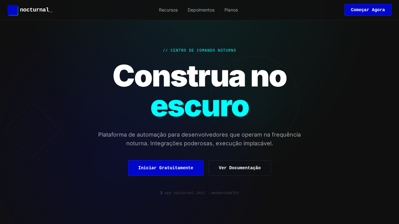
Composio-inspired nocturnal landing page. Ideal for integrações de ferramentas, apis, plataformas developer, automação de agentes. AI-ready template.
Use case: Integrações de tools, APIs, Platforms developer, Automação de agentes
Historical Context
The nocturnal interface didn't emerge from nowhere. It's the logical endpoint of a decade-long drift away from the sterile white dashboards that dominated developer tooling through the 2010s. When terminal culture collided with modern UI expectations, we got dark themes. But dark themes alone are lazy — they're just inverted colors with no soul. The cyan glow aesthetic traces back to sci-fi film UI (think Tron Legacy's light disc sequences, Blade Runner 2049's holographic interfaces) and the real-world glow of CRT phosphors that early hackers stared at until 3am. Composio's visual language takes that lineage seriously. The cyan-on-dark palette isn't decorative — it's functional hierarchy borrowed from cockpit instrumentation, where luminous accents against deep backgrounds reduce cognitive load during extended sessions. This matters when your users are developers wiring up AI agent integrations at midnight, not browsing a lifestyle brand at lunch. The futuristic tech aesthetic has matured past the 'slap a gradient on it' phase. What works now is restraint: selective luminosity, deep blacks that actually breathe, and typography that doesn't fight the glow for attention. Composio Cyber Nocturnal represents that maturity — it knows when to pulse and when to recede.
When to Use
Deploy this when you're building tools that developers and engineers will live inside for hours. AI agent platforms, integration dashboards, API orchestration layers, workflow builders — anything where the user is in flow state and ambient light is low. It's wrong for consumer-facing marketing sites or anything requiring warmth and approachability. This is a workhorse aesthetic for serious tooling that respects the user's attention and doesn't pretend to be friendly. If your product connects systems, automates pipelines, or orchestrates agents, this is your visual territory.
Design Principles
- Selective luminosity over uniform brightness — cyan glow earns its presence through hierarchy, never decoration. Every glowing element must carry information or indicate state.
- Deep blacks as negative space — backgrounds aren't just dark, they're compositional. Use true depth (not grey pretending to be dark) to create layers that separate content zones without borders.
- Motion as signal, not spectacle — subtle pulse animations on active connections, gentle breathing on live states. If it moves, it means something. Kill any animation that exists purely to look cool.
- Typography yields to the system — type stays neutral and high-contrast. No glowing text, no neon fonts. Let the interface chrome carry the aesthetic while content remains instantly scannable.
- Density without claustrophobia — developer tools need information density, but nocturnal palettes compress perceived space. Counter with generous padding on containers and strict vertical rhythm between data clusters.
DESIGN.md
---
version: "alpha"
name: "Composio Cyber Nocturnal"
description: "Composio-inspired nocturnal landing page. Ideal for integrações de ferramentas, apis, plataformas developer, automação de agentes. AI-ready template."
colors:
  primary: "#0f0f0f"
  secondary: "#000000"
  tertiary: "#0007cd"
  neutral: "#ffffff"
  surface: "#00ffff"
  accent: "#0089ff"
typography:
  h1:
    fontFamily: system-ui for body
    fontSize: 2.25rem
    fontWeight: 700
  body-md:
    fontFamily: system-ui for body
    fontSize: 1rem
    fontWeight: 400
  label-caps:
    fontFamily: system-ui for body
    fontSize: 0.75rem
    fontWeight: 500
components:
  button-primary:
    backgroundColor: "{colors.primary}"
    textColor: "{colors.neutral}"
    padding: 12px
---

## Overview

Composio-inspired nocturnal landing page. Ideal for integrações de ferramentas, apis, plataformas developer, automação de agentes. AI-ready template. The nocturnal interface didn't emerge from nowhere. It's the logical endpoint of a decade-long drift away from the sterile white dashboards that dominated developer tooling through the 2010s. When terminal culture collided with modern UI expectations, we got dark themes. But dark themes alone are lazy — they're just inverted colors with no soul. The cyan glow aesthetic traces back to sci-fi film UI (think Tron Legacy's light disc sequences, Blade Runner 2049's holographic interfaces) and the real-world glow of CRT phosphors that early hackers stared at until 3am.

Composio's visual language takes that lineage seriously. The cyan-on-dark palette isn't decorative — it's functional hierarchy borrowed from cockpit instrumentation, where luminous accents against deep backgrounds reduce cognitive load during extended sessions. This matters when your users are developers wiring up AI agent integrations at midnight, not browsing a lifestyle brand at lunch.

The futuristic tech aesthetic has matured past the 'slap a gradient on it' phase. What works now is restraint: selective luminosity, deep blacks that actually breathe, and typography that doesn't fight the glow for attention. Composio Cyber Nocturnal represents that maturity — it knows when to pulse and when to recede.

- Density: 8/10 — Dense
- Variance: 4/10 — Moderate
- Motion: 4/10 — Subtle

- **Style:** Nocturnal Command Center, Cyan Glow, Brutalist Shadows, abcDiatype, Ultra-Tight Headlines
- **Keywords:** composio, nocturnal, cyan glow, brutalist shadows, abcDiatype, JetBrains Mono, bioluminescent, developer terminal, hard-offset shadows
- **Era:** 2024-2026 Nocturnal Developer
- **Light/Dark:** ✗ Not Recommended / ✓ Full

## Colors

- **Void Black** (#0f0f0f) — Dark surface, primary background
- **Preto** (#000000) — Dark surface, primary background
- **Cobalt** (#0007cd) — Supporting palette color
- **Branco** (#ffffff) — Light surface, card backgrounds
- **Cyan Elétrico** (#00ffff) — Secondary accent
- **Signal Blue** (#0089ff) — Secondary accent
- **Charcoal** (#2c2c2c) — Deep contrast surface
- **Smoke** (#444444) — Extended palette, decorative use


## Typography

- **Display / Hero:** system-ui for body — Weight 700, tight tracking, used for headline impact
- **Body:** system-ui for body — Weight 400, 16px/1.6 line-height, max 72ch per line
- **UI Labels / Captions:** system-ui for body — 0.875rem, weight 500, slight letter-spacing
- **Monospace:** JetBrains Mono — Used for code, metadata, and technical values

Scale:
- Hero: clamp(2.5rem, 5vw, 4rem)
- H1: 2.25rem
- H2: 1.5rem
- Body: 1rem / 1.6
- Small: 0.875rem


## Layout

- **Grid:** CSS Grid primary. Max-width containment: 1280px centered with 1.5rem side padding.
- **Spacing rhythm:** Balanced. Base unit: 0.5rem (8px).
- **Section vertical gaps:** clamp(4rem, 8vw, 8rem).
- **Hero layout:** Split-screen (text left, visual right).
- **Feature sections:** Zig-zag alternating text+image rows. No 3-equal-columns.
- **Mobile collapse:** All multi-column layouts collapse below 768px. No horizontal overflow.
- **z-index contract:** base (0) / sticky-nav (100) / overlay (200) / modal (300) / toast (500).


## Elevation & Depth

Canvas pitch-black (#0f0f0f) com bordas near-invisible (rgba branco 4-12%). Cyan elétrico (#00ffff) em low opacity para glows bioluminescentes. Sombras hard-offset brutalist (4px 4px). Headlines ultra-tight (line-height 0.87). abcDiatype geométrico para conteúdo, JetBrains Mono para credibilidade técnica. Gradientes cyan glow radiais. Hierarquia monocromática com cor apenas nos momentos de maior sinal.

- **Physics:** Ease-out curves, 200-300ms duration. Smooth and predictable.
- **Entry animations:** Fade + translate-Y (16px → 0) over 420ms ease-out. Staggered cascades for lists: 80ms between items.
- **Hover states:** Subtle color shift + shadow adjustment over 200ms.
- **Page transitions:** Fade only (200ms).
- **Performance:** Only transform and opacity animated. No layout-triggering properties.


## Shapes

Base corner radius: 0px. See rounded tokens in front matter for the full scale.


## Components

- **Primary Button:** Sharp edges (0px) shape. Accent color fill. Hover: 8% darken + subtle lift shadow. Active: -1px translate tactile press. Font weight 600. No outer glows.
- **Secondary / Ghost Button:** Outline variant. 1.5px border in muted color. Text in primary color. Hover: subtle background fill.
- **Cards:** Sharp edges (0px) corners. Surface background. Subtle shadow (0 2px 12px rgba(0,0,0,0.06)). 1px border stroke.
- **Inputs:** Label above input. 1px border stroke. Focus ring: 2px accent color offset 2px. Error text below in semantic red. No floating labels.
- **Navigation:** Primary surface background. Active item: accent color indicator. Font weight 500 when active.
- **Skeletons:** Shimmer animation matching component dimensions. No circular spinners.
- **Empty States:** Icon-based composition with descriptive text and action button.


## Do's and Don'ts

- No emojis in UI — use icon system only (Lucide, Heroicons)
- No rounded corners — sharp edges only
- No subtle shadows — use hard borders instead
- No pure black (#000000) — use off-black or charcoal variants
- No oversaturated accent colors (saturation cap: 80%)
- No 3-column equal-width feature layouts — use zig-zag or asymmetric grid
- No `h-screen` — use `min-h-[100dvh]`
- No AI copywriting clichés: "Elevate", "Seamless", "Unleash", "Next-Gen"
- No broken external image links — use picsum.photos or inline SVG
- No generic lorem ipsum in demos

- Do Canvas pitch-black
- Do Cyan glow bioluminescente
- Do Sombras brutalist 4px 4px
- Do Headlines line-height 0.87
- Do Bordas near-invisible
- Do JetBrains Mono
- Do Responsivo


## Use Case

Integrações de tools, APIs, Platforms developer, Automação de agentes
Technical Specs
CSS
background:#0f0f0f;color:#ffffff;accent:#0007cd;glow:rgba(0,255,255,0.12);border:1px solid rgba(255,255,255,0.10);box-shadow:4px 4px brutalist;font-family:system-ui for body,monospace for code;line-height:0.87 headlines
Variables
--bg:#0f0f0f;--text:#ffffff;--cobalt:#0007cd;--cyan:rgba(0,255,255,0.12);--border-10:rgba(255,255,255,0.10);--border-06:rgba(255,255,255,0.06);--smoke:#444444;--ghost:rgba(255,255,255,0.6)
Checklist
☐ Canvas pitch-black, ☐ Cyan glow bioluminescente, ☐ Sombras brutalist 4px 4px, ☐ Headlines line-height 0.87, ☐ Bordas near-invisible, ☐ JetBrains Mono, ☐ Responsivo
Colors
Primary
Secondary
Effects
Canvas pitch-black (#0f0f0f) com bordas near-invisible (rgba branco 4-12%). Cyan elétrico (#00ffff) em low opacity para glows bioluminescentes. Sombras hard-offset brutalist (4px 4px). Headlines ultra-tight (line-height 0.87). abcDiatype geométrico para conteúdo, JetBrains Mono para credibilidade técnica. Gradientes cyan glow radiais. Hierarquia monocromática com cor apenas nos momentos de maior sinal.
Light/Dark
✗ Not Recommended / ✓ Full
AI Prompt
Act as a Senior Frontend Engineer and Expert UI Designer.
Your task is to code a complete Landing Page on the first attempt.
- Landing Page Theme: <INSERT THEME>
- Sections to add: <INSERT SECTIONS>

Generate the final code immediately following these definitions:

## Style

- **Name:** Composio Cyber Nocturnal
- **Type:** Nocturnal Command Center, Cyan Glow, Brutalist Shadows, abcDiatype, Ultra-Tight Headlines
- **Keywords:** composio, nocturnal, cyan glow, brutalist shadows, abcDiatype, JetBrains Mono, bioluminescent, developer terminal, hard-offset shadows
- **Era:** 2024-2026 Nocturnal Developer
- **Light/Dark:** ✗ Not Recommended / ✓ Full

## Color Palette

- **Primary:** Void Black #0f0f0f, Preto #000000, Cobalt #0007cd, Branco #ffffff
- **Secondary:** Cyan Elétrico #00ffff, Signal Blue #0089ff, Charcoal #2c2c2c, Smoke #444444

## Visual Effects

Canvas pitch-black (#0f0f0f) com bordas near-invisible (rgba branco 4-12%). Cyan elétrico (#00ffff) em low opacity para glows bioluminescentes. Sombras hard-offset brutalist (4px 4px). Headlines ultra-tight (line-height 0.87). abcDiatype geométrico para conteúdo, JetBrains Mono para credibilidade técnica. Gradientes cyan glow radiais. Hierarquia monocromática com cor apenas nos momentos de maior sinal.

## AI Visual Direction

Design a Composio-inspired nocturnal landing page. Pitch-black canvas (#0f0f0f). Near-invisible white borders (rgba 4-12%). Electric cyan (#00ffff) at low opacity for bioluminescent glows. Hard-offset brutalist shadows (4px 4px). Ultra-tight headline line-heights (0.87). Geometric sans-serif for content, JetBrains Mono for technical credibility. Radial cyan glow gradients. Monochrome hierarchy with color only at highest-signal moments.

## CSS Technical

```css
background:#0f0f0f;color:#ffffff;accent:#0007cd;glow:rgba(0,255,255,0.12);border:1px solid rgba(255,255,255,0.10);box-shadow:4px 4px brutalist;font-family:system-ui for body,monospace for code;line-height:0.87 headlines
```

## Design System Variables

```css
--bg:#0f0f0f;--text:#ffffff;--cobalt:#0007cd;--cyan:rgba(0,255,255,0.12);--border-10:rgba(255,255,255,0.10);--border-06:rgba(255,255,255,0.06);--smoke:#444444;--ghost:rgba(255,255,255,0.6)
```

## Implementation Checklist

- ☐ Canvas pitch-black
- ☐ Cyan glow bioluminescente
- ☐ Sombras brutalist 4px 4px
- ☐ Headlines line-height 0.87
- ☐ Bordas near-invisible
- ☐ JetBrains Mono
- ☐ Responsivo

## Execution Rules

1. Strictly follow the defined visual style.
2. Use high-quality inline SVG icons (Heroicons or Lucide style) — NEVER use emojis as icons.
3. Add `cursor-pointer` and smooth `hover` states (transition-all) on all interactive elements.
4. Required Page Structure:
   - Navbar (Logo + Links + CTA)
   - Hero Section (Impactful Headline + Subtitle + 2 buttons + 3D/Abstract visual element via CSS)
   - Features (3 cards with icons)
   - Testimonials (3 cards)
   - Pricing (3 tiers, highlight the middle one)
   - Final CTA
   - Full Footer with social links, privacy policy, terms of use, contact and SEO links.
5. All text content must be in English.
6. The visual must be CLEARLY distinct — do not create a "default Bootstrap" design. Force the use of the provided design system variables.
7. Use `<style>` tags in the head for custom classes (especially for complex backdrop-filter effects and animations) that Tailwind CDN doesn't cover.
8. Full Responsiveness: Layout must adapt perfectly to Mobile, Tablet and Desktop (vertical stack on mobile).
9. Include basic SEO, Viewport and Open Graph meta tags in `<head>`.
10. Footer must contain: Copyright 2026, Secondary navigation links and Social media icons.
11. Make the creative decisions needed to deliver the complete, functional result now.
Related
Last synced: 4/1/2026