Scientific2020s Contemporary
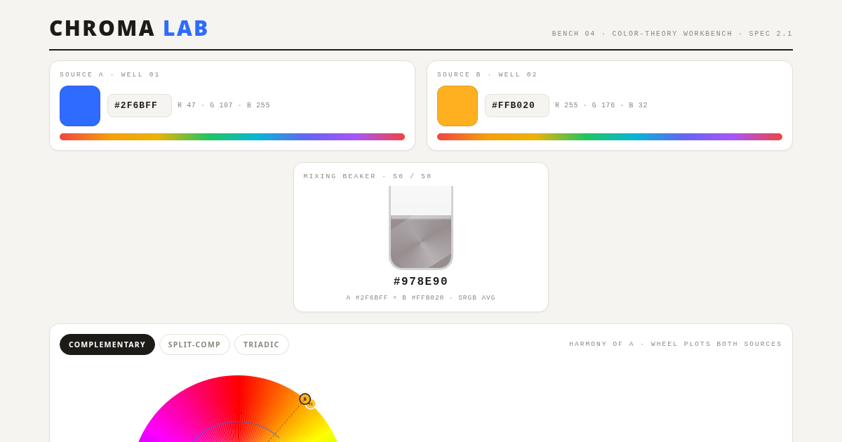
CHROMA LAB — a color theory bench
Scientific style inspired by "CHROMA LAB — a color theory bench". CSS Grid, Flexbox, Blend Modes. With animations.
colormixerscientificanimatedgradientblurgrid-layout
Use case: Scientific apps, Creative landing pages, Experimental projects
Historical Context
Contemporary style (2020s Contemporary) combining CSS Grid and Flexbox with Blur and Gradients.
When to Use
Use for scientific projects that need Blur and Gradients effects.
Design Principles
- Leverage CSS Grid for layout structure
- Apply Blur consistently across components
- Maintain visual consistency
DESIGN.md
---
version: "alpha"
name: "CHROMA LAB — a color theory bench"
description: "Scientific style with CSS Grid and Flexbox."
colors:
  primary: "#F5F4F0"
  secondary: "#FFFFFF"
  tertiary: "#1C1B18"
typography:
  h1:
    fontFamily: system-ui
    fontSize: 2.5rem
    fontWeight: 700
  body-md:
    fontFamily: system-ui
    fontSize: 1rem
    fontWeight: 400
rounded:
  sm: 4px
  md: 8px
  lg: 16px
spacing:
  sm: 1rem
  md: 2rem
  lg: 4rem
---

## Overview

CHROMA LAB — a color theory bench - Scientific style from the 2020s Contemporary era.

- Density: 5/10
- Variance: 6/10
- Motion: 8/10 — Animated

- **Style:** Scientific
- **Keywords:** color, lab, mixer
- **Era:** 2020s Contemporary
- **Light/Dark:** ✓ Light / ○ Dark

## Colors

- **#F5F4F0**
- **#FFFFFF**
- **#1C1B18**
- **#8B887F**
- **#E3E1D8**

## Typography

- **system-ui**
- **var(--mono)**

## Layout

- **Features:** CSS Grid, Flexbox, Blend Modes, CSS Filters, Keyframe Animations, Transitions, Transforms, Gradients, Box Shadows, Border Radius, Aspect Ratio

## Effects

- Blur
- Gradients
- Hover Effects

## Use Case

Scientific apps, Landing pages, Experimental projects.
Technical Specs
CSS
CSS Grid, Flexbox, Blend Modes, CSS Filters, Keyframe Animations, Transitions, Transforms, Gradients, Box Shadows, Border Radius, Aspect Ratio
Variables
--bench: #F5F4F0, --card: #FFFFFF, --ink: #1C1B18, --dim: #8B887F, --line: #E3E1D8
Checklist
☐ CSS Grid ☐ Flexbox ☐ Blend Modes ☐ Responsive ☐ Acessibilidade
Colors
Primary
#F5F4F0
#FFFFFF
#1C1B18
Secondary
#8B887F
#E3E1D8
#2F6BFF
Effects
Blur, Gradients, Hover Effects
Light/Dark
✓ Light / ○ Dark
AI Prompt
Act as a Senior Frontend Engineer and Expert UI Designer.
Your task is to code a complete Landing Page on the first attempt.
- Landing Page Theme: <INSERT THEME>
- Sections to add: <INSERT SECTIONS>

Generate the final code immediately following these definitions:

## Style

- **Name:** CHROMA LAB — a color theory bench
- **Type:** Scientific
- **Keywords:** color, mixer, scientific, animated, gradient, blur, grid-layout
- **Era:** 2020s Contemporary
- **Light/Dark:** ✓ Light / ○ Dark

## Color Palette

- **Primary:** #F5F4F0, #FFFFFF, #1C1B18
- **Secondary:** #8B887F, #E3E1D8, #2F6BFF

## Visual Effects

Blur, Gradients, Hover Effects

## AI Visual Direction

Design a scientific landing page inspired by "CHROMA LAB — a color theory bench". Use: CSS Grid, Flexbox, Blend Modes, CSS Filters. Colors: #F5F4F0, #FFFFFF, #1C1B18. Effects: Blur, Gradients, Hover Effects.

## CSS Technical

```css
CSS Grid, Flexbox, Blend Modes, CSS Filters, Keyframe Animations, Transitions, Transforms, Gradients, Box Shadows, Border Radius, Aspect Ratio
```

## Design System Variables

```css
--bench: #F5F4F0, --card: #FFFFFF, --ink: #1C1B18, --dim: #8B887F, --line: #E3E1D8
```

## Implementation Checklist

- ☐ CSS Grid ☐ Flexbox ☐ Blend Modes ☐ Responsive ☐ Acessibilidade

## Execution Rules

1. Strictly follow the defined visual style.
2. Use high-quality inline SVG icons (Heroicons or Lucide style) — NEVER use emojis as icons.
3. Add `cursor-pointer` and smooth `hover` states (transition-all) on all interactive elements.
4. Required Page Structure:
   - Navbar (Logo + Links + CTA)
   - Hero Section (Impactful Headline + Subtitle + 2 buttons + 3D/Abstract visual element via CSS)
   - Features (3 cards with icons)
   - Testimonials (3 cards)
   - Pricing (3 tiers, highlight the middle one)
   - Final CTA
   - Full Footer with social links, privacy policy, terms of use, contact and SEO links.
5. All text content must be in English.
6. The visual must be CLEARLY distinct — do not create a "default Bootstrap" design. Force the use of the provided design system variables.
7. Use `<style>` tags in the head for custom classes (especially for complex backdrop-filter effects and animations) that Tailwind CDN doesn't cover.
8. Full Responsiveness: Layout must adapt perfectly to Mobile, Tablet and Desktop (vertical stack on mobile).
9. Include basic SEO, Viewport and Open Graph meta tags in `<head>`.
10. Footer must contain: Copyright 2026, Secondary navigation links and Social media icons.
11. Make the creative decisions needed to deliver the complete, functional result now.
Last synced: 8/15/2026