Cobalt Grid
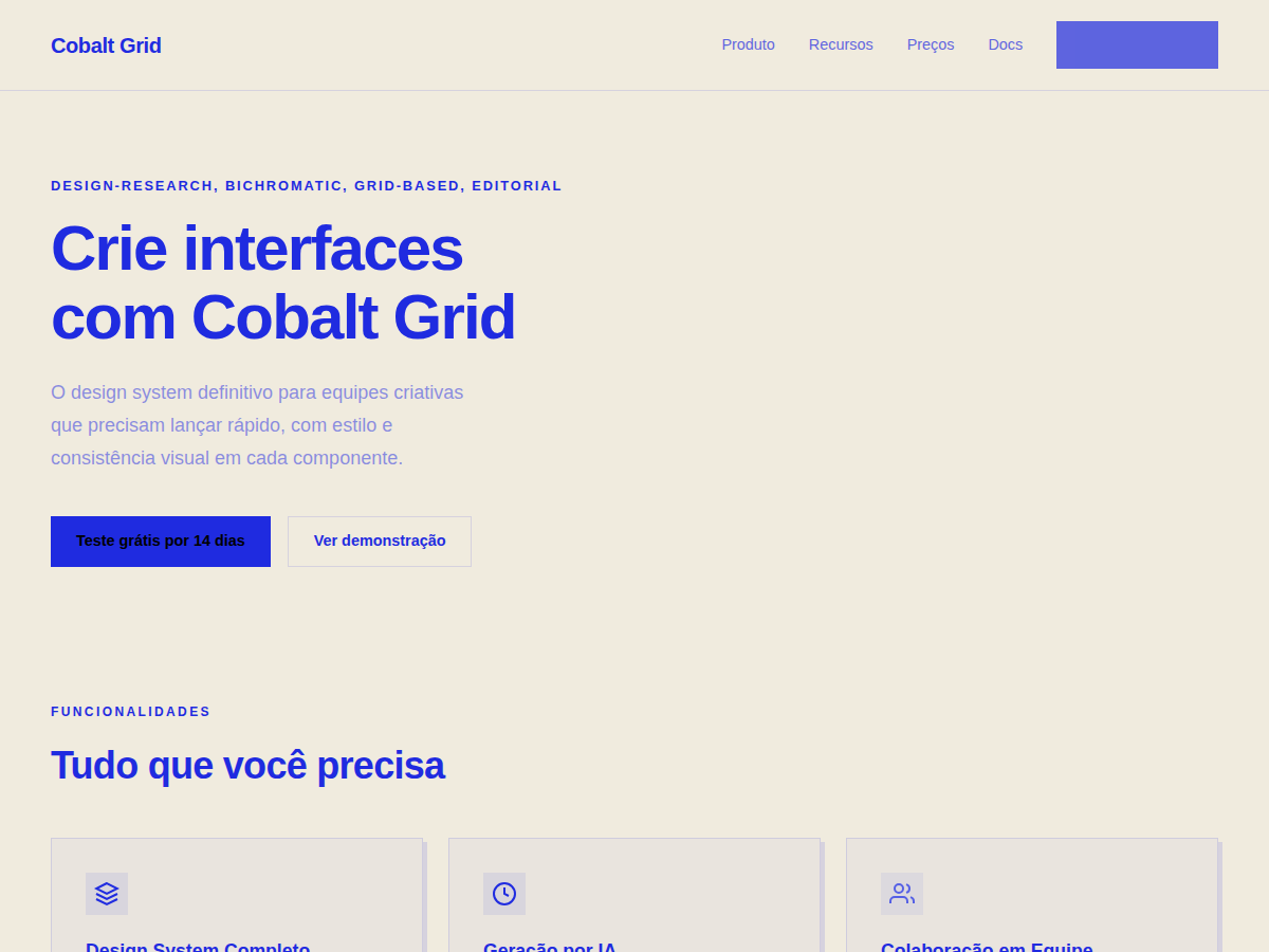
Cobalt Grid — Electric cobalt italic serifs on a graph-paper canvas, anchored by stair-stepped pixel-glitch decorations and slim hairline rules. Newsreader (italic) typography. warm cream / ivory paper canvas with one strict accent of electric cobalt royal . Best for design trend or research report, studio annual or seasonal bulletin, creative agency capabilities deck. AI-ready design system.
Use case: design trend or research report, studio annual or seasonal bulletin, creative agency capabilities deck, art or architecture publication, academic / curatorial publication, newsletter or zine pitch
Historical Context
The graph-paper grid didn't start as a design choice — it started as an engineering necessity. Millimeter paper, isometric sheets, the blue-lined notebooks that aerospace engineers filled with thrust calculations in the 1960s. That substrate wasn't decorative. It was infrastructure for precision thinking. Cobalt Grid takes that lineage seriously. The electric cobalt isn't arbitrary — it descends from the cyanotype process, the original blueprinting method where ferric ammonium citrate met UV light and produced that unmistakable Prussian blue. Engineers didn't choose blue; chemistry chose it for them. What we're doing here is acknowledging that constraint as aesthetic heritage. The bichromatic restriction is the real statement. Two colors force hierarchy through weight, density, and spatial rhythm rather than chromatic variety. It's the typographic equivalent of proving your argument without raising your voice. Every technical publication worth remembering — from Tufte's work to the original Braun manuals — understood that restraint communicates competence.
When to Use
Deploy Cobalt Grid when your product speaks to people who read datasheets for fun. Developer tools, engineering platforms, scientific instrumentation interfaces, fintech dashboards where precision isn't a feature — it's the entire value proposition. This system falls apart the moment you need warmth or approachability. That's not a flaw. It's a filter. If your brand needs to feel human and friendly, walk away. If it needs to feel correct, you're home.
Design Principles
- Precision over decoration — every grid line serves spatial logic, never ornament. If a line doesn't help the eye measure or align, delete it.
- Bichromatic discipline — two colors maximum. Hierarchy lives in weight, opacity, and density. The moment you reach for a third hue, you've lost the plot.
- Typography carries the load — with color restrained, type size contrast does the heavy lifting. Set your scale ratio aggressive: 1.414 minimum. Timid scales disappear against the grid.
- The grid is content, not background — treat the graph-paper substrate as a first-class design element. It participates in composition. It's not wallpaper behind your layout; it IS your layout's skeleton made visible.
- Engineered whitespace — space isn't empty, it's measured. Margins and gutters should feel calculated, not comfortable. This system rewards mathematical spacing over optical balancing.
Technical Specs
Colors
Primary
Effects
display font Newsreader (italic) for hero headlines, smooth hover transitions (200-250ms), subtle lift shadows, graph-paper grid overlay (10% cobalt), stair-step pixel decorations, hairline rules
Light/Dark
✓ Full / ✗ None
Related


Last synced: 5/6/2026